Characteristics of a Form
 |
Characteristics of a Form |
Anatomy of a Form
The Form's Tab
As mentioned for a table, a form can display with a tab
or a title bar. In the Form View or in Design View, a form's top section
displays an icon
![]() .
.
![]() Practical Learning: Introducing Forms Properties
Practical Learning: Introducing Forms Properties
Tabbed Documents or Overlapped Windows?
When a form displays with a tab, the right section of the
tab(s) has a close button ![]() that you can use to close the form. To replace the tab of a form, click File and click Options. In the left frame of the Access Options dialog box, click Current
Database. Click the Overlapping Windows radio button:
that you can use to close the form. To replace the tab of a form, click File and click Options. In the left frame of the Access Options dialog box, click Current
Database. Click the Overlapping Windows radio button:
After making the selection, click OK. You will be asked to close and reopen the database:

The Title Bar
The middle section of the title bar is actually referred to as the title bar. It can be used to change the view of the form after right-clicking it.
The Caption of a Form
The caption of a form is text that displays on the title bar or the tab of the form. By default, the caption of a form is its name. To specify or change the caption of a form, access its Property Sheet and, in the Format or the All tab, click Caption and type the desired string.
![]() Practical Learning: Specifying the Caption of a Form
Practical Learning: Specifying the Caption of a Form


The Control Box
If you display a form as overlapped, it would be equipped
with three system buttons
![]() ,
,
![]() or
or
![]() ,
,
![]() . The group of these buttons is called the Control Box. If you do not
want these system buttons at all, access the Property Sheet of the form and set the
Control Box Boolean property to No from its Yes default value.
. The group of these buttons is called the Control Box. If you do not
want these system buttons at all, access the Property Sheet of the form and set the
Control Box Boolean property to No from its Yes default value.
The System Menu
A form has a system menu on its top-left icon. To display this menu, the user can click the form's system icon:

The presence of the form's system icon is partly controlled by the Control Box property of a form.
The Form's Borders
The borders of a form specify where a form starts and where it ends. If a database is configured to show overlapped windows, the borders of a form are controlled using the Border Style property. If you set it to None, the form would appear without borders.
The Sections of a Form
The Detail Section
The Detail section serves as the main host of other controls. There are two main ways you can change the Detail section's height at design time:

The Form Header and the Form Footer
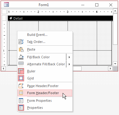
A form can be equipped with a Form Header and a Form Footer sections. To add these sections, right-click the middle of the form and click Form Header/Footer:


Although two sections are added, you can reduce one completely so it would not appear to the user. This means that you can keep one section and hide the other. If you create a form using the Form Wizard, both the header and the footer sections are added but the footer section is completely reduced so it would not appear to the user. If you want to display it to the user, you must expand it.
![]() Practical Learning: Creating the Sections of a Form
Practical Learning: Creating the Sections of a Form
The Page Header and the Page Footer
A form can also be equipped with two Page Header and Page Footer sections. To get them, right-click the middle of the form and click Page Header/Footer.
Dividing Lines
A form is equipped with dividing horizontal lines used to visually separate sections of a form. To equip a form with dividing lines, add a header and a footer sections. The presence or absence of the horizontal lines is controlled by the Boolean Dividing Lines property.
The Size of a Form
The Width of a Form
The width of a form is the distance from its left border to its right border. All sections use the same width. To widen or narrow a form, click and drag the right border:

The width of a form is controlled by the Width field in the Properties Sheet.
![]() Practical Learning: Changing the Width of a Form
Practical Learning: Changing the Width of a Form
The Height of a Form
The height of a form is controlled by its sections. Each section has a Height field in the Property Sheet.
![]() Practical Learning: Changing the Height of a Form
Practical Learning: Changing the Height of a Form
The Width and Height of a Form
To change both the width and the height of a form at the same time, position the mouse on the lower-right corner:

Then click and drag left, right, up, down, or diagonally.
Automatically Sizing the Form to Fit Its Content
As mentioned already, when a form displays in Form View, if its content is wider or taller than the current size can show, the form would be equipped with scroll bars. If you (in fact the user) want to resize the form enough to show its whole content, on the Ribbon, click Home. In the Window section, click Size To Fit Form.
Automatically Centering a Form
When you open a form from the Navigation Pane, it is positioned from the top-left corner of Microsoft Access. If you want the form to be automatically centered, access its Property Sheet and, in the Format or the All tab, set its Auto Center Boolean property to Yes from its default No value.
Colors on Forms and Reports
The Background Color of a Section
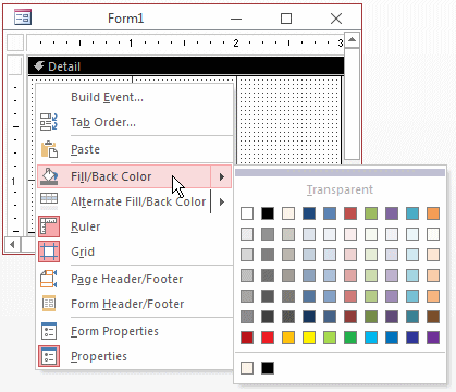
To support background colors, when you select an object such as a form or a report, the Ribbon provides a button labeled Shape Fill. Use it to set a color to the object.
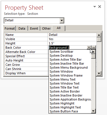
To support the background color, the forms and the reports have a property named Back Color in the Property Sheet. The field is equipped with two buttons. The down-pointing arrow allows you to select a common or known color:

The Browse button allows you to select or create a color. As another technique, you can provide the value of a color as a hexadecimal number. For example, the red color is #FF0000, the blue color is #0000FF, and so on.
To change the background color of a section of a form or a report:

![]() Practical Learning: Setting Background Color
Practical Learning: Setting Background Color
|
The Background Picture of a Form Introduction You can cover a form with a picture. To use a picture as a background, open the form in Design View, access the Property Sheet for the form. In the Format or the All tab, click Picture and click its browse button. Here is an example:
This would produce:
Linking or Embedding the Picture Picture embedding or linking is controlled by the Picture Type enumerated property whose two values are Embedded (the default) and Linked:
The Picture Alignment The position of the background picture is controlled by the Picture Alignment property whose default value is Center. Its other values are: Top Left, Top Right, Center and Form Center, Bottom Left, and Bottom Right.
Tiling the Picture To use a picture smaller than the form but have it repeat itself on the form, in the Format or the All tab of the Property Sheet, set the Picture Tiling Boolean property to Yes. Consider the following example:
If you set the Picture Tiling property to Yes, this would produce:
Zooming or Stretching a Picture Zooming or stretching is controlled by the Picture Size Mode property. Its values are Clip, Stretch, Stretch Horizontal, Stretch Vertical, and Zoom.
|
|
|
||
| Previous | Copyright © 2002-2021, FunctionX, Inc. | Next |
|
|
||