Like a radio button, a check box does not indicate what it is used for. Therefore, it is usually accompanied by a caption that displays an explicit and useful string. The caption can be positioned on either part of the square box, depending on the programmer who implemented it. Unlike the radio buttons that implement a
mutual-exclusive choice, a check box can appear by itself or in a group.
When a check box appears in a group with other similar controls, it
assumes a completely independent behavior and it must be implemented as
its own entity. This means that clicking a check box has no influence on
the other controls.
To provide a check box to an application, on the Toolbox, click the Check Box button and click the desired area on the dialog box. If you require more than one check box, you can keep adding them as you judge necessary. Like the radio button, a check box is based on the CButton class. Therefore, to programmatically create a check box, declare CButton variable or pointer using its constructor. Here is an example: CButton *HotTempered = new CButton; After declaring a variable or a pointer to CButton, you can call its Create() member function to initialize the control. The syntax is the same as for the radio button. To make the button a check box, its style must include the BS_CHECKBOX style. If you want the control to display or hide a check mark when it gets clicked, create it with the BS_AUTOCHECKBOX style. Like the radio button, a check box is a button with just a different style. Therefore, it shares the same characteristics as the radio button. This means that we can simply avoid repeating the descriptions we reviewed for the radio control.
To indicate what it is used for, a check box should be accompanied by static, which is its caption. The caption appears to the left or the right side of the square box. To visually specify the caption, after selecting the check box on the dialog box, in the Properties window, click Caption and type the desired string. If you are programmatically creating the check box, pass its caption as the first argument of the Create() member function. Here are examples: BOOL CExample1Dlg::OnInitDialog()
{
CDialogEx::OnInitDialog();
// Set the icon for this dialog. The framework does this automatically
// when the application's main window is not a dialog
SetIcon(m_hIcon, TRUE); // Set big icon
SetIcon(m_hIcon, FALSE); // Set small icon
// TODO: Add extra initialization here
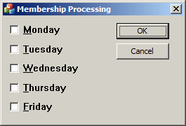
CButton *chkDay[5];
chkDay[0] = new CButton;
chkDay[0]->Create(_T("&Monday"),
WS_CHILD | WS_VISIBLE | BS_AUTOCHECKBOX,
CRect(10, 5, 140, 35), this, 0x11);
chkDay[1] = new CButton;
chkDay[1]->Create(_T("&Tuesday"),
WS_CHILD | WS_VISIBLE | BS_AUTOCHECKBOX,
CRect(10, 40, 140, 55), this, 0x12);
chkDay[2] = new CButton;
chkDay[2]->Create(_T("&Wednesday"),
WS_CHILD | WS_VISIBLE | BS_AUTOCHECKBOX,
CRect(10, 65, 140, 85), this, 0x13);
chkDay[3] = new CButton;
chkDay[3]->Create(_T("&Thursday"),
WS_CHILD | WS_VISIBLE | BS_AUTOCHECKBOX,
CRect(10, 95, 140, 110), this, 0x14);
chkDay[4] = new CButton;
chkDay[4]->Create(_T("&Friday"),
WS_CHILD | WS_VISIBLE | BS_AUTOCHECKBOX,
CRect(10, 120, 140, 140), this, 0x15);
return TRUE; // return TRUE unless you set the focus to a control
}
To use a check box, the user can click it. When this is done, the control sends a BN_CLICKED message. In some cases, it can also send a BN_DOUBLECLICKED message, which originates when the user double-clicks the control. If you need to, you can use either the events of the parent window or hand code the messages yourself.
To use a check box, the user cal click it. As a result, a check box can be checked or unchecked. The check box as a control adds a third state for its appearance. Instead of definitely appearing as checked or unchecked, a check box can appear "half-checked". This is considered as a third state. To visually apply this behavior to a check box, set its Tri-State property to True or add the BS_3STATE style to it:
A check box that has the Tri-State property set or the BS_3STATE style, can appear checked, unchecked, or dimmed. When using this kind of check box, the user may have to click the control three times in order to get the necessary state.
To let you programmatically check or uncheck the control, you have two uptions: The CWnd or the CButton class. The CWnd class provides the CheckDlgButton() member function whose syntax is: void CheckDlgButton( int nIDButton, UINT nCheck ); The nIDButton argument is the identifier of the check box whose state you want to modify. The nCheck argument is the value to apply. It can have one of the following values:
Here is an example that automatically sets a check box to a dimmed appearance when the dialog box comes up: BOOL CCheckBoxes::OnInitDialog()
{
CDialog::OnInitDialog();
// TODO: Add extra initialization here
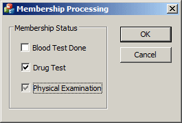
CheckDlgButton(IDC_CHECK_PHYSICAL, BST_INDETERMINATE);
return TRUE; // return TRUE unless you set the focus to a control
// EXCEPTION: OCX Property Pages should return FALSE
}
Alternatively, to change the state of a check box, you can call the CButton::SetCheck() and pass of the above state values. For a check box, to set a dimmed check mark, here is an example: BOOL CCheckBoxes::OnInitDialog()
{
CDialog::OnInitDialog();
// TODO: Add extra initialization here
CButton *ChkPhysical = new CButton;
ChkPhysical = reinterpret_cast<CButton *>(GetDlgItem(IDC_CHECK_PHYSICAL));
ChkPhysical->SetCheck(BST_INDETERMINATE);
return TRUE; // return TRUE unless you set the focus to a control
// EXCEPTION: OCX Property Pages should return FALSE
}
To get the current state of a check box, you can call the CWnd::IsDlgButtonChecked() member function. If a check mark appears in the square box, this member function will return 1. If the square box is empty, this member function returns 0. If the check box control has the BS_3STATE style, the member function can return 2 to indicate that the check mark that appears in the square box is dimmed. |
|
||||||||||||||||||||||||||||||||||||||||||||||||||||||||||||||||||||||||||||||||||||||||||||||||||||||||||||||||||||||||||||||||||||||||||||||||||||||||||||||||||||||||||||||||||||||||||||||||||||||||||||||||||||||||||||||||||||||||||||||||||||||||||||||||||||||||||||||||||||||||||||||||||||||||||||||||||||||||||||||||||||||||||||||||||||
|
|
|||||||||||||||||||||||||||||||||||||||||||||||||||||||||||||||||||||||||||||||||||||||||||||||||||||||||||||||||||||||||||||||||||||||||||||||||||||||||||||||||||||||||||||||||||||||||||||||||||||||||||||||||||||||||||||||||||||||||||||||||||||||||||||||||||||||||||||||||||||||||||||||||||||||||||||||||||||||||||||||||||||||||||||||||||||
 .
When this empty square is clicked, it gets marked by a check symbol
.
When this empty square is clicked, it gets marked by a check symbol
 .
These two states control the check box as checked
.
These two states control the check box as checked
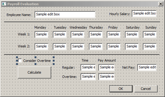
 Practical
Learning: Introducing Check Boxes
Practical
Learning: Introducing Check Boxes