|
Characteristics of the Date Picker Control
|
|
In US English, a date can be displayed as a short date
or a long date, as specified in the Control Panel. To visually make a date
picker display in short date, in the Properties window, set the Format field
to Short Date. To programmatically set the short date option, add the
DTS_SHORTDATEFORMAT style. This type displays the numeric
month, followed by the numeric day, and followed by the year.
If you prefer a date that includes the names of the
month and the weekday, in the Properties window, set the Format field to
Long Date. To set this option programmatically, add the
DTS_LONGDATEFORMAT style.
|
 Practical
Learning: Setting a Long Date Format Practical
Learning: Setting a Long Date Format
|
|
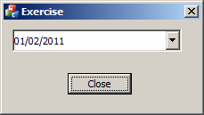
- On the dialog box, right-click the top date picker and click
Properties
- In the Properties window, click Format and change its value to Long
Date
- On the dialog box, click the other date picker
- In the Properties window, click Format and change its value to Long
Date
|
The Month Calendar of the Date Picker
|
|
Unlike the date picker is in fact two controls,
combining a combo box and a calendar. Because the calendar part enjoys all
the functionality of the month calendar control, you have the ability to
manipulate, separately, any of its characteristics, as they are related to
the month calendar control. To manipulate this calendar as a control, you
would need to access it first by its handle. To get a handle to the calendar
of the date picker, call the GetMonthCalCtrl() member
function. Its syntax is:
CMonthCalCtrl *GetMonthCalCtrl() const;
This would be done as follows:
BOOL CExerciseDlg::OnInitDialog()
{
    CDialogEx::OnInitDialog();

    // Set the icon for this dialog.  The framework does this automatically
    //  when the application's main window is not a dialog
    SetIcon(m_hIcon, TRUE);			// Set big icon
    SetIcon(m_hIcon, FALSE);		// Set small icon

    // TODO: Add extra initialization here
    CDateTimeCtrl * ctrlDateHired = new CDateTimeCtrl;

    ctrlDateHired->Create(WS_CHILD | WS_VISIBLE,
	                  CRect(10, 10, 200, 35),
		          this,
			  IDC_DATE_HIRED);

    CMonthCalCtrl *mc = ctrlDateHired->GetMonthCalCtrl();

    return TRUE;  // return TRUE  unless you set the focus to a control
}
|
Practical
Learning: Configuring the Calendar
|
|
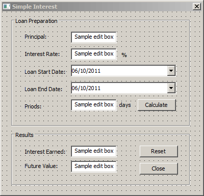
- In the Class View, expand the project and, in the top section, click
CSimpleInterestDlg
- In the lower section of the Class View, double-click OnInitDialog
- Change the appearances of the calendars of the date pickers as
follows:
BOOL CSimpleInterest1Dlg::OnInitDialog()
{
CDialogEx::OnInitDialog();
// Set the icon for this dialog. The framework does this automatically
// when the application's main window is not a dialog
SetIcon(m_hIcon, TRUE); // Set big icon
SetIcon(m_hIcon, FALSE); // Set small icon
// TODO: Add extra initialization here
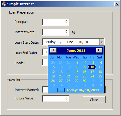
m_LoanStartDate.SetMonthCalColor(MCSC_TITLEBK, RGB(0, 0, 128));
m_LoanStartDate.SetMonthCalColor(MCSC_MONTHBK, RGB(70, 170, 255));
m_LoanStartDate.SetMonthCalColor(MCSC_TEXT, RGB(250, 240, 50));
m_LoanStartDate.SetMonthCalColor(MCSC_TITLETEXT, RGB(255, 255, 0));
m_LoanStartDate.SetMonthCalColor(MCSC_BACKGROUND, RGB(190, 225, 240));
m_LoanStartDate.SetMonthCalColor(MCSC_TRAILINGTEXT, RGB(150, 200, 255));
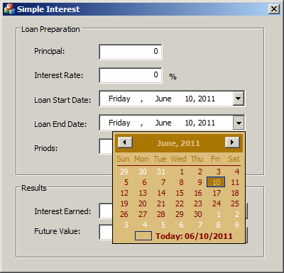
m_LoanEndDate.SetMonthCalColor(MCSC_TITLEBK, RGB(170, 120, 5));
m_LoanEndDate.SetMonthCalColor(MCSC_MONTHBK, RGB(220, 190, 125));
m_LoanEndDate.SetMonthCalColor(MCSC_TEXT, RGB(128, 0, 0));
m_LoanEndDate.SetMonthCalColor(MCSC_TITLETEXT, RGB(220, 190, 125));
m_LoanEndDate.SetMonthCalColor(MCSC_BACKGROUND, RGB(250, 175, 10));
m_LoanEndDate.SetMonthCalColor(MCSC_TRAILINGTEXT, RGB(255, 255, 255));
return TRUE; // return TRUE unless you set the focus to a control
}
- Execute the application to see the result
- Close the dialog box and return to your programming environment
|
The Up-Down Control of a Date Picker
|
|
By default, the date picker control displays a combo
box. If you don't like the combo box, you can display a spin button instead.
To set this option at design time, change the value of the Use Spin Control
property from False (the default) to True. To programmatically set this
option, add the DTS_UPDOWN style. This would be done as
follows:
BOOL CExerciseDlg::OnInitDialog()
{
    CDialogEx::OnInitDialog();

    // Set the icon for this dialog.  The framework does this automatically
    //  when the application's main window is not a dialog
    SetIcon(m_hIcon, TRUE);			// Set big icon
    SetIcon(m_hIcon, FALSE);		// Set small icon

    // TODO: Add extra initialization here
    CDateTimeCtrl * ctrlDateHired = new CDateTimeCtrl;

    ctrlDateHired->Create(WS_CHILD | WS_VISIBLE | DTS_UPDOWN,
	                  CRect(10, 10, 200, 35),
		  	  this,
			  IDC_DATE_HIRED);

    return TRUE;  // return TRUE  unless you set the focus to a control
}
When the control has the Use Spin Control property set
to False and if the user clicks the arrow of the control, a calendar
displays to the bottom-left or the bottom-right side of the combo box. To
control this alignment, change the value of the Right Align field in the
Properties window. Its default value is set to True, which means that the
calendar would be aligned to the right. To programmatically set this
property, add the DTS_RIGHTALIGN property.
The displayed month calendar object allows the user to
select a date using the same techniques of the month calendar control. The
month calendar of the date picker control displays using the same colors and
other properties of the month calendar control. After the user has selected
a date, the date value displays in the edit control of the combo box and the
calendar disappears.
If the control displays a spin button, the object is
divided in different sections that can each be changed individually:

To change either the day, the month, or the year, the
user must click the desired section and use either the arrows of the button
or the arrow keys on the keyboard to increase or decrease the selected
value.
If you want to control the range of dates the user can
select, call the CDateTimeCtrl::SetRange() member function.
It is overloaded in two versions whose syntaxes are:
BOOL SetRange(const COleDateTime* pMinRange,
	      const COleDateTime* pMaxRange);
BOOL SetRange(const CTime* pMinRange,
	      const CTime* pMaxRange);
This member function takes two arguments. The first is
the lowest date that the user can navigate to. The second is the highest
date that the user can navigate to.
To know the range of values that the user is allowed to
navigate to, call the CDateTimeCtrl::GetRange() member
function. It is overloaded in two versions whose syntaxes are:
DWORD GetRange(COleDateTime* pMinRange,
	       COleDateTime* pMaxRange);
DWORD GetRange(CTime* pMinRange,
 	       CTime* pMaxRange);
When you add the Date Time Picker control to your form
or container, it displays the date of the computer at the time the control
was added. If you want the control to display a different date, set the
desired value using the SetTime() member function. This
function is provided in three versions whose syntaxes are:
BOOL SetTime(const COleDateTime& timeNew);
BOOL SetTime(const CTime* pTimeNew);
BOOL SetTime(LPSYSTEMTIME pTimeNew = NULL);
At any time, you can find out what value the Date Picker
has by retrieving the value of the GetTime() member
function of the TDateTimeCtrl class. This function comes in
three versions whose syntaxes are:
BOOL GetTime(COleDateTime& timeDest) const;
DWORD GetTime(CTime& timeDest) const;
DWORD GetTime(LPSYSTEMTIME pTimeDest) const;
|
Practical
Learning: Getting a Date
|
|
- On the dialog box, double-click the bottom date picker
- Implement its event as follows:
void CSimpleInterest1Dlg::OnDtnDatetimechangeLoanEndDate(NMHDR *pNMHDR, LRESULT *pResult)
{
    LPNMDATETIMECHANGE pDTChange = reinterpret_cast<LPNMDATETIMECHANGE>(pNMHDR);
    // TODO: Add your control notification handler code here
    *pResult = 0;

    CTimeSpan tsPeriods;
    CTime tmLoanStartDate, tmLoanEndDate;

    UpdateData();

    if( tmLoanEndDate < tmLoanStartDate )
    {
	AfxMessageBox(L"Invalidate Date Sequence: "
                      L"the end date must occur after the start date");
	return;
    }

    m_LoanStartDate.GetTime(tmLoanStartDate);
    m_LoanEndDate.GetTime(tmLoanEndDate);
    tsPeriods = tmLoanEndDate - tmLoanStartDate;

    m_Periods = tsPeriods.GetDays();
    UpdateData(FALSE);
}
- Return to the dialog box and double-click the Calculate button
- Implement its event as follows:
void CSimpleInterest1Dlg::OnBnClickedCalculate()
{
    // TODO: Add your control notification handler code here
    CTimeSpan tsPeriods;
    CTime tmLoanStartDate, tmLoanEndDate;
    double interestRate, interestEarned, principal;

    UpdateData();

    m_LoanStartDate.GetTime(tmLoanStartDate);
    m_LoanEndDate.GetTime(tmLoanEndDate);

    if( tmLoanEndDate < tmLoanStartDate )
    {
	AfxMessageBox(L"Invalidate Date Sequence: "
                      L"the end date must occur after the start date");
	return;
    }

    m_InterestEarned = m_Principal * (m_InterestRate / 100) * (m_Periods / 365);
    m_FutureValue = m_Principal + m_InterestEarned;

    UpdateData(FALSE);
}
- Execute the application and test it
- Enter an amount as principal, an interest rate, and select the dates
on both time pickers
- Click the Calculate button. Here is an example:
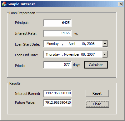
- Close the dialog box and return to your programming environment
|
The Format of the Displayed Date
|
|
By default, the date picker displays using either the
Short Date or the Long Date formats of Control Panel. If you want to
customize the way the date is displayed, call the
CDateTimeCtrl::SetFormat() member function. Its syntax is:
BOOL SetFormat(LPCTSTR pstrFormat);
This function takes one argument that uses a combination
of specific letters and symbols. The letters used to create a format are as
follows:
| Format |
Used For |
Description |
| d |
Days |
Displays the day as a number from 1 to 31 |
| dd |
Days |
Displays the day as a number with a leading 0 if the number
is less than 10 |
| ddd |
Weekdays |
Displays a weekday name with 3 letters as Mon, Tue, etc |
| dddd |
Weekdays |
Displays the complete name of a week day as Monday, etc |
| M |
Months |
Displays the numeric month from 1 to 12 |
| MM |
Months |
Displays the numeric month with a leading 0 if the number is
less than 10 |
| MMM |
Months |
Displays the short name of the month as Jan, Feb, Mar, etc |
| MMMM |
Months |
Displays the complete name of the month as January, etc |
| yy |
Years |
Displays two digits for the year as 00 for 2000 or 03 for
2003 |
| yyyy |
Years |
Displays the numeric year with 4 digits |
Here is an example:
BOOL CExerciseDlg::OnInitDialog()
{
CDialogEx::OnInitDialog();
// Set the icon for this dialog. The framework does this automatically
// when the application's main window is not a dialog
SetIcon(m_hIcon, TRUE); // Set big icon
SetIcon(m_hIcon, FALSE); // Set small icon
// TODO: Add extra initialization here
CDateTimeCtrl * ctrlDateHired = new CDateTimeCtrl;
ctrlDateHired->Create(WS_CHILD | WS_VISIBLE | DTS_UPDOWN,
CRect(10, 10, 200, 35),
this,
IDC_DATE_HIRED);
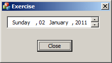
ctrlDateHired->SetFormat(_T("dddd, dd MMMM, yyyy"));
return TRUE; // return TRUE unless you set the focus to a control
}
This would produce:
To retrieve the current format used on the control, you
can call its GetFormat() member function.
|
Manually Editing the Date
|
|
The user may want to edit the date value of the control,
including typing the month, day, year, the name of the month or the name of
the weekday. The date picker object is equipped to control the types of
values that can be entered. For example, the user cannot type the name of a
month, only a number, and the control would display the corresponding name
of the month. This is the default scenario where you let this object help
you control the values that the user can type. If you want to take matters
into your own hands, that is, if you want to allow the user to type the
value of the date or time of the control, at design time set the Allow Edit
Boolean property to True (its default value is False). To set this option
programmatically, add the DTS_APPCANPARSE style.
If you allow the user to manually enter the date value,
if the value is incorrect, when the control looses focus, the compiler would
make an attempt to convert the date entered into a valid and true date. If
the user enters an invalid value, the compiler would throw an error. This
means that you should be reluctant to let the users type whatever they want.
The less they type, the less checking you need to do.
|
|
