|
Characteristics of a Slider
|
|
|
The Orientation of a Slider
|
|
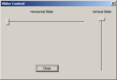
After placing a slider control on a dialog box, by
default, it assumes a horizontal position. If you want a vertical slider,
change the value of the Orientation property. If you were dynamically
creating the control, its default orientation would be horizontal whose
style is TBS_HORZ. If you want a vertical slider, apply the
TBS_VERT style:
BOOL CDlgSlide::OnInitDialog()
{
    CDialog::OnInitDialog();

    // TODO: Add extra initialization here
    CSliderCtrl *Taskbar = new CSliderCtrl;

    Taskbar->Create(WS_CHILD | WS_VISIBLE | TBS_VERT,
		    CRect(20, 20, 60, 280), this, IDC_SLIDER_CONTROL);

    return TRUE; // return TRUE unless you set the focus to a control
    // EXCEPTION: OCX Property Pages should return FALSE
}
|
 Practical
Learning: Adding a Slider Practical
Learning: Adding a Slider
|
|
- Complete the dialog design as follows:
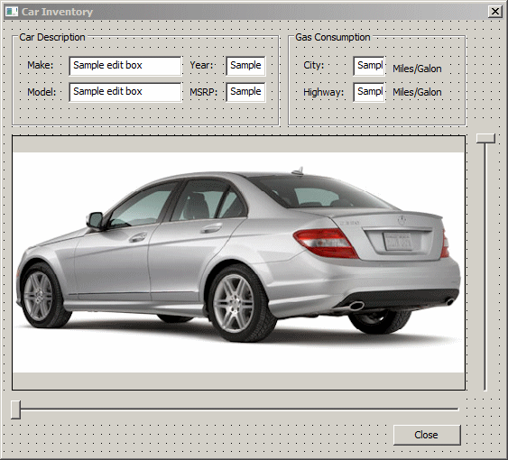 |
| Control |
ID |
Additional Properties |
| Slider Control |
 |
|
|
| Slider Control |
|
|
|
|
- Right-click the bottom slider and click Add Variable...
- Make sure the Categoory is set to Control and the Variable Type to
CSliderCtrl.
Set the Name to m_Makes
- Click Finish
- Right-click the right slider and click Add Variable...
- Make sure the Categoory is set to Control and the Variable Type to
CSliderCtrl.
Set the Name to m_Models
- Click Finish
A slider is a control that provides a range of values
between which the user can navigate using the control's thumb or by clicking
on the slider's line. Usually, the first aspect you may need to configure on
your control is to specify its limit values. To specify the minimum value of
a slider control, you can call the CSliderCtrl::SetRangeMin()
member function. Its syntax is:
void SetRangeMin(int nMin, BOOL bRedraw = FALSE);
The nMin value is the new minimum value that
the slider can assume. The control is typically redrawn once the new value
has been set. If you do not want the control to be redrawn, pass a second
argument with the FALSE value. If the lowest value of the control has
already been set and you want to find out what that value is, you can call
the CSliderCtrl::GetRangeMin() member function. Its syntax
is:
int GetRangeMin() const;
This member function simply returns the lowest value
that the slider can assume when the user has dragged the thumb to the
extreme left or bottom.
To set the highest value of a slider control, you can
call the CSliderCtrl::SetRangeMax() member function. Its
syntax is:
void SetRangeMax(int nMax, BOOL bRedraw = FALSE);
The nMax argument holds the new maximum value
for the control. Here is an example:
BOOL CControlsDlg::OnInitDialog()
{
    CDialog::OnInitDialog();

    // TODO: Add extra initialization here
    m_Slider.SetRangeMin(0);
    m_Slider.SetRangeMax(50);

    return TRUE; // return TRUE unless you set the focus to a control
    // EXCEPTION: OCX Property Pages should return FALSE
}
If the maximum value of the control had previously been
set, you can find it out by calling the SliderCtrl::GetRangeMax()
member function. Its syntax is:
int GetRangeMax() const;
This member function returns the highest value that the
slider control can have.
To set both the minimum and the maximum values of the
slider with one line of code, you can call the
CSliderCtrl::SetRange() member function. Its syntax is:
void SetRange(int nMin, int nMax, BOOL bRedraw = FALSE);
The nMin and the nMax arguments hold the
lowest and the highest respective values of the control. Here is an example:
BOOL CControlsDlg::OnInitDialog()
{
    CDialog::OnInitDialog();

    // TODO: Add extra initialization here
    m_Slider.SetRange(0, 50);

    return TRUE; // return TRUE unless you set the focus to a control
    // EXCEPTION: OCX Property Pages should return FALSE
}
If the control is already functioning and you want to
know its limit values, you can call the CSliderCtrl::SetRange()
member function whose syntax is:
void GetRange(int& nMin, int& nMax) const;
This member function returns two values, namely the
lowest value, as nMin, and the highest value, as nMax.
Once the minimum and maximum values have been set, the
user can slide the thumb to select a value or a range. This value is what
mostly interests you. While sliding the thumb, the value of the slider is
called its position. At startup or at any time, you can set a specific
position for the thumb. This can be done by calling the
CSliderCtrl::SetPos() member function. Its syntax is:
void SetPos(int nPos);
The nPos argument holds the new position of the
slider. Here is an example:
BOOL CControlsDlg::OnInitDialog()
{
    CDialog::OnInitDialog();

    // TODO: Add extra initialization here
    m_Slider.SetRange(0, 50);
    m_Slider.SetPos(32);

    return TRUE; // return TRUE unless you set the focus to a control
    // EXCEPTION: OCX Property Pages should return FALSE
}
The value specified using the SetPos() member
function should be in the range nMax - nMin of the SetRange()
member function. If there is a possibility that this value is outside the
valid range, you can call the CSliderCtrl::VerifyPos()
member function to check it. Its syntax is:
void VerifyPos();
When the position of the thumb has change and you want
to find out what it is, call the CSliderCtrl::GetPos() member
function whose syntax is:
int GetPos() const;
If the slider control was specified to let the user
select a range, you can define your own selected range at any time by
calling the CSliderCtrl::SetSelection() member function. Its syntax
is:
void SetSelection(int nMin, int nMax);
When calling this member function, make sure you specify
the nMin and the nMax values so that this nMin is
greater than the minimum value of the slider and this nMax is less
than the highest possible value of the slider. Furthermore, the value of
this nMin must be less than that of nMax. This
relationship can be illustrated as follows:
Minimum <= nMin < nMax <= Maximum
Here is an example:
BOOL CControlsDlg::OnInitDialog()
{
    CDialog::OnInitDialog();

    // TODO: Add extra initialization here
    m_Slider.SetRange(0, 50);
    m_Slider.SetPos(32);
    m_Slider.SetSelection(22, 42);

    return TRUE; // return TRUE unless you set the focus to a control
    // EXCEPTION: OCX Property Pages should return FALSE
}
If a selected range has been performed on the slider, if
you want to get the minimum and the maximum values of the selection, you can
call the CSliderCtrl::GetSelection() member function whose syntax is:
void GetSelection(int& nMin, int& nMax) const;
This member function returns two values, the minimum as
nMin and the maximum as nMax.
If the slider control is configured to display ticks,
you can specify their frequency with a call to the
CSliderCtrl::SetTicFreq() member function. Its syntax is:
void SetTicFreq(int nFreq);
|
Practical
Learning: Controlling the Frequency
|
|
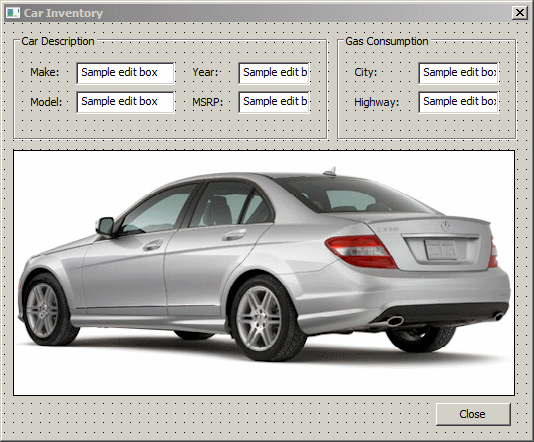
- In the Class View, expand the project and, in the top section, click
CCarInventory1Dlg
- In the bottom section of the Class View, double-click OnInitDialog
- Change the event as follows:
BOOL CCarInventory1Dlg::OnInitDialog()
{
CDialogEx::OnInitDialog();
// Add "About..." menu item to system menu.
// IDM_ABOUTBOX must be in the system command range.
ASSERT((IDM_ABOUTBOX & 0xFFF0) == IDM_ABOUTBOX);
ASSERT(IDM_ABOUTBOX < 0xF000);
CMenu* pSysMenu = GetSystemMenu(FALSE);
if (pSysMenu != NULL)
{
BOOL bNameValid;
CString strAboutMenu;
bNameValid = strAboutMenu.LoadString(IDS_ABOUTBOX);
ASSERT(bNameValid);
if (!strAboutMenu.IsEmpty())
{
pSysMenu->AppendMenu(MF_SEPARATOR);
pSysMenu->AppendMenu(MF_STRING, IDM_ABOUTBOX, strAboutMenu);
}
}
// Set the icon for this dialog. The framework does this automatically
// when the application's main window is not a dialog
SetIcon(m_hIcon, TRUE); // Set big icon
SetIcon(m_hIcon, FALSE); // Set small icon
// TODO: Add extra initialization here
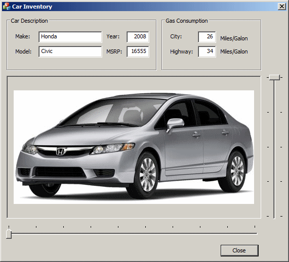
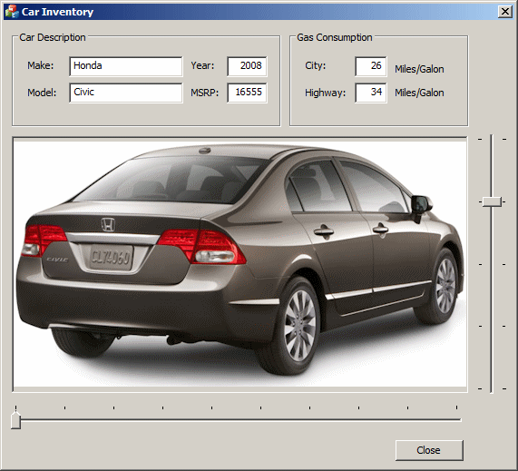
Cars[0].Make = "Honda";
Cars[0].Model = "Civic";
Cars[0].CarYear = 2008;
Cars[0].MSRP = 16555;
Cars[0].ConsumptionCity = 26;
Cars[0].ConsumptionHighway = 34;
Cars[0].CarPicture = IDB_CIVIC1;
Pictures0[0] = IDB_CIVIC1;
Pictures0[1] = IDB_CIVIC2;
Pictures0[2] = IDB_CIVIC3;
Pictures0[3] = IDB_CIVIC4;
Pictures0[4] = IDB_CIVIC5;
Cars[1].Make = "Mercedes Benz";
Cars[1].Model = "Class-C";
Cars[1].CarYear = 2011;
Cars[1].MSRP = 35900;
Cars[1].ConsumptionCity = 18;
Cars[1].ConsumptionHighway = 26;
Cars[1].CarPicture = IDB_CLASSC1;
Pictures1[0] = IDB_CLASSC1;
Pictures1[1] = IDB_CLASSC2;
Pictures1[2] = IDB_CLASSC3;
Pictures1[3] = IDB_CLASSC4;
Cars[2].Make = "Chevrolet";
Cars[2].Model = "Express Passenger";
Cars[2].CarYear = 2009;
Cars[2].MSRP = 30020;
Cars[2].ConsumptionCity = 13;
Cars[2].ConsumptionHighway = 16;
Cars[2].CarPicture = IDB_EXPRESS1;
Pictures2[0] = IDB_EXPRESS1;
Pictures2[1] = IDB_EXPRESS2;
Pictures2[2] = IDB_EXPRESS3;
Pictures2[3] = IDB_EXPRESS4;
Pictures2[4] = IDB_EXPRESS5;
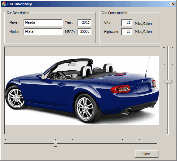
Cars[3].Make = "Mazda";
Cars[3].Model = "Miata";
Cars[3].CarYear = 2011;
Cars[3].MSRP = 25300;
Cars[3].ConsumptionCity = 21;
Cars[3].ConsumptionHighway = 28;
Cars[3].CarPicture = IDB_MIATA1;
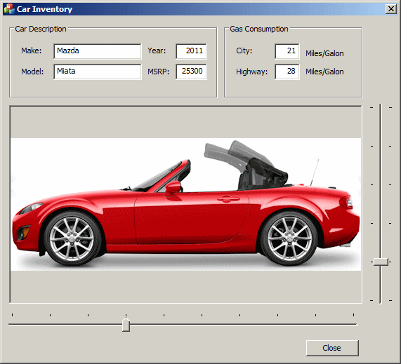
Pictures3[0] = IDB_MIATA1;
Pictures3[1] = IDB_MIATA2;
Pictures3[2] = IDB_MIATA3;
Pictures3[3] = IDB_MIATA4;
Pictures3[4] = IDB_MIATA5;
Pictures3[5] = IDB_MIATA6;
Cars[4].Make = "Acura";
Cars[4].Model = "RDX";
Cars[4].CarYear = 2010;
Cars[4].MSRP = 34620;
Cars[4].ConsumptionCity = 17;
Cars[4].ConsumptionHighway = 22;
Cars[4].CarPicture = IDB_RDX1;
Pictures4[0] = IDB_RDX1;
Pictures4[1] = IDB_RDX2;
Pictures4[2] = IDB_RDX3;
Pictures4[3] = IDB_RDX4;
Pictures4[4] = IDB_RDX5;
Cars[5].Make = "Volvo";
Cars[5].Model = "S40";
Cars[5].CarYear = 2010;
Cars[5].MSRP = 31150;
Cars[5].ConsumptionCity = 21;
Cars[5].ConsumptionHighway = 30;
Cars[5].CarPicture = IDB_S40A;
Pictures5[0] = IDB_S40A;
Pictures5[1] = IDB_S40B;
Pictures5[2] = IDB_S40C;
Pictures5[3] = IDB_S40D;
Pictures5[4] = IDB_S40E;
Cars[6].Make = "Toyota";
Cars[6].Model = "Tacoma";
Cars[6].CarYear = 2008;
Cars[6].MSRP = 24390;
Cars[6].ConsumptionCity = 18;
Cars[7].ConsumptionHighway = 21;
Cars[6].CarPicture = IDB_TACOMA1;
Pictures6[0] = IDB_TACOMA1;
Pictures6[1] = IDB_TACOMA2;
Pictures6[2] = IDB_TACOMA3;
Pictures6[3] = IDB_TACOMA4;
Pictures6[4] = IDB_TACOMA5;
Cars[7].Make = "Ford";
Cars[7].Model = "Taurus";
Cars[7].CarYear = 2011;
Cars[7].MSRP = 28690;
Cars[7].ConsumptionCity = 18;
Cars[7].ConsumptionHighway = 27;
Cars[7].CarPicture = IDB_TAURUS1;
Pictures7[0] = IDB_TAURUS1;
Pictures7[1] = IDB_TAURUS2;
Pictures7[2] = IDB_TAURUS3;
Pictures7[3] = IDB_TAURUS4;
Pictures7[4] = IDB_TAURUS5;
Pictures7[5] = IDB_TAURUS6;
Pictures7[6] = IDB_TAURUS7;
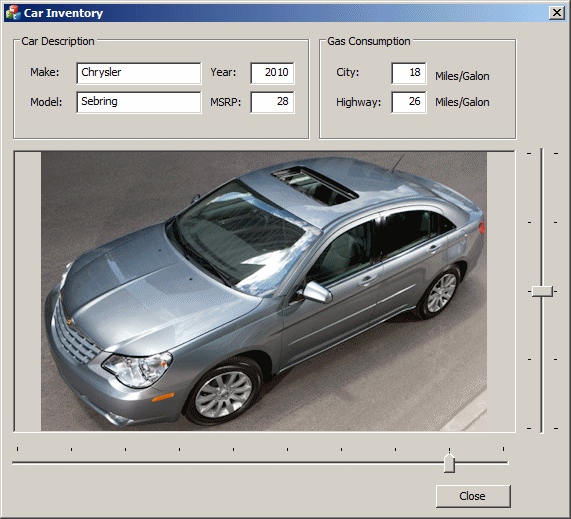
Cars[8].Make = "Chrysler";
Cars[8].Model = "Sebring";
Cars[8].CarYear = 2010;
Cars[8].MSRP = 28,118;
Cars[8].ConsumptionCity = 18;
Cars[8].ConsumptionHighway = 26;
Cars[8].CarPicture = IDB_SEBRING1;
Pictures8[0] = IDB_SEBRING1;
Pictures8[1] = IDB_SEBRING2;
Pictures8[2] = IDB_SEBRING3;
Pictures8[3] = IDB_SEBRING4;
Pictures8[4] = IDB_SEBRING5;
Cars[9].Make = "Volkswagen";
Cars[9].Model = "Passat";
Cars[9].CarYear = 2010;
Cars[9].MSRP = 28755;
Cars[9].ConsumptionCity = 22;
Cars[9].ConsumptionHighway = 31;
Cars[9].CarPicture = IDB_PASSAT1;
Pictures9[0] = IDB_PASSAT1;
Pictures9[1] = IDB_PASSAT2;
Pictures9[2] = IDB_PASSAT3;
Pictures9[3] = IDB_PASSAT4;
Pictures9[4] = IDB_PASSAT5;
CurrentPicture = IDB_CIVIC1;
m_Make = Cars[0].Make;
m_Model = Cars[0].Model;
m_Year = Cars[0].CarYear;
m_MSRP = Cars[0].MSRP;
m_ConsumptionCity = Cars[0].ConsumptionCity;
m_ConsumptionHighway = Cars[0].ConsumptionHighway;
m_Makes.SetRange(0, 9);
m_Makes.SetTicFreq(1);
m_Models.SetRange(0, 4);
m_Models.SetTicFreq(1);
UpdateData(FALSE);
return TRUE; // return TRUE unless you set the focus to a control
}
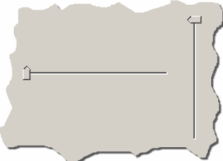
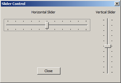
The new slider appears as one line, horizontal or
vertical, that guides the user with the area to slide the thumb. When
sliding the thumb along the line, the user can set only the value where the
thumb is positioned. Alternatively, if you want the user to be able to
select a range of values instead of just a value, at design time, you can
set the Enable Selection Range property to True. This is equivalent to
adding the TBS_ENABLESELECTION style. A slider equipped
with this style displays a 3-D "whole" in the body of the slider:

The selection area allows the user to select a range of
values.
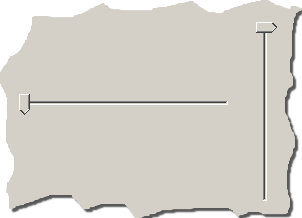
The thumb of a slider can assume one of three shapes. By
default, it appears as a rectangular box. Alternatively, you can convert one
of its shorter borders to appear as an arrow. The shape of the thumb is
controlled at design time by the Point property. Its
default value is Both, which gives it a rectangular shape.
You can get this same shape by omitting or adding the TBS_BOTH
value.
For a horizontal slider, you can make the thumb's arrow
point to the left by changing the Point property to Top/Left.
If the slider were horizontal, this Point value would
orient the thumb arrow to the top:
To make the thumb of a dynamically created horizontal
slider point up, add the TBS_TOP. If the slider is
vertical, to point its thumb to the left, add the TBS_LEFT
style to it.
If you want the thumb to point down for a horizontal
slider, set the Point property to Bottom/Right.
This same value would make the thumb of a vertical slider point n the right
direction:
To point the thumb up for a horizontal slider you are
programmatically creating, add the TBS_BOTTOM. For the
thumb of a vertical slider to point right, add the TBS_RIGHT
to it.
|
The Tick Marks of a Slider
|
|
If you want to guide the user with some ticks on the
control, at design time, set the Tick Marks property to
True. If you are dynamically creating the slider and you
want it to display ticks, simply adding the either the TBS_VERT
or the TBS_HORZ style equips the slider with ticks. If you
do not want to display the ticks at all, at design time, clear the
Tick Marks property or set its value to False.
The ticks are positioned on the side the thumb is
pointing. If the slider is created with the Both value for
the Point property or the TBS_BOTH style,
the ticks would appear on both sides the thumb.
The thumb of a slider is used to scroll from one minimum
value to another. The range of these extreme values can be divided in
regular increments that can further guide the user with value selection. To
display where these increments are set, at design time, set the Auto
Ticks property to True or add the TBS_AUTOTICKS
style:
|
Practical
Learning: Setting the Tick Marks
|
|
- On the dialog box, click the right slider control
- In the Properties window, set Auto Ticks to True
- Set the Tick Marks to True
- Set the Tooltips to True
- On the dialog box, click the bottom slider control
- In the Properties window, set Auto Ticks to True
- Set the Tick Marks to True
- Set its Point property to Top/Left
- Set the Tooltips to True
On its own, the slider controls can send three
notification messages:
- The NM_OUTOFMEMORY message is sent when the slider
has run out of memory and could not complete a task
- The NM_RELEASECAPTURE message is sent when the user
releases the mouse on the slider
- The NM_CUSTOMDRAW message is used if you want to
draw something on the slider or you want to customize the appearance of
the slider beyond what Visual C++ proposes
For its functionality, the slider highly relies on its
parent. When the user clicks the thumb or any part of the slider, which
causes it to slide, a scroll event is fired. If the slider is horizontal,
the CWnd::OnHScroll() event is sent. If the slider is
vertical, the CWnd::OnVScroll() event is sent.
|
Practical
Learning: Using a Slider Control
|
|
- Click an unoccupied area of the dialog box
- In the Properties window, click the Messages button
- Click WM_HSCROLL, then click the arrow of its box and select the
option
- Implement the event as follows:
void CCarInventory1Dlg::OnHScroll(UINT nSBCode, UINT nPos, CScrollBar* pScrollBar)
{
    // TODO: Add your message handler code here and/or call default
    int CurPos = m_Makes.GetPos();

    Invalidate();

    m_Make		 = Cars[CurPos].Make;
    m_Mode		 = Cars[CurPos].Model;
    m_Year		 = Cars[CurPos].CarYear;
    m_MSRP		 = Cars[CurPos].MSRP;
    m_ConsumptionCity	 = Cars[CurPos].ConsumptionCity;
    m_ConsumptionHighway = Cars[CurPos].ConsumptionHighway;
    CurrentPicture       = Cars[CurPos].CarPicture;

    switch(CurPos)
    {
	case 0:
		m_Models.SetRange(0, 4);
		break;
	case 1:
		m_Models.SetRange(0, 3);
		break;
	case 2:
		m_Models.SetRange(0, 4);
		break;
	case 3:
		m_Models.SetRange(0, 5);
		break;
	case 4:
		m_Models.SetRange(0, 4);
		break;
	case 5:
		m_Models.SetRange(0, 4);
		break;
	case 6:
		m_Models.SetRange(0, 4);
		break;
	case 7:
		m_Models.SetRange(0, 4);
		break;
	case 8:
		m_Models.SetRange(0, 4);
		break;
	case 9:
		m_Models.SetRange(0, 6);
		break;
    }

    m_Models.SetTicFreq(1);
    UpdateData(FALSE);

    CDialogEx::OnHScroll(nSBCode, nPos, pScrollBar);
}
- Return to the dialog box and click an unoccupied area
- In the Messages section of the Properties window, click WM_VSCROLL.
Then click the arrow of the box and select the option
- Implement the event follows:
void CCarInventory1Dlg::OnVScroll(UINT nSBCode, UINT nPos, CScrollBar* pScrollBar)
{
    // TODO: Add your message handler code here and/or call default
    int CurPos = m_Models.GetPos();

    switch(m_Makes.GetPos())
    {
    case 0:
	CurrentPicture = Pictures0[CurPos];
	break;
    case 1:
    	CurrentPicture = Pictures1[CurPos];
	break;
    case 2:
    	CurrentPicture = Pictures2[CurPos];
	break;
    case 3:
    	CurrentPicture = Pictures3[CurPos];
	break;
    case 4:
    	CurrentPicture = Pictures4[CurPos];
	break;
    case 5:
    	CurrentPicture = Pictures5[CurPos];
	break;
    case 6:
    	CurrentPicture = Pictures6[CurPos];
	break;
    case 7:
    	CurrentPicture = Pictures7[CurPos];
	break;
    case 8:
    	CurrentPicture = Pictures8[CurPos];
	break;
    case 9:
    	CurrentPicture = Pictures9[CurPos];
	break;
    }

    Invalidate();

    UpdateData(FALSE);

    CDialogEx::OnVScroll(nSBCode, nPos, pScrollBar);
}
- To test the application, press F5
- Close the dialog box and return to your programming environment
|