Introductory Characteristics of Windows Controls

Introductory Characteristics of Windows Controls
Dynamic Control Creation
Introduction to the Control Class
To provide common features to Windows controls, the .NET Framework provides a class named Control. This is a huge class that includes all the fundamental characteristics of a Windows control. In fact, the classes of all controls inherit directly or indirectly from this class. Some of the characteristics and features of the Control class are the ability to add a control to an application (such as adding a form to a project), the ability to position a control on a form, the ability for an object to host other controls, the ability to receive or lose focus, the ability to perform actions through methods, etc.
In our lessons, you will not use the Control class directly. Instead, you will use graphical controls and their classes, but use the characteristics that those controls inherit from the Control class.
 Practical Learning: Introducing Graphical Applications
 |
Author NoteIf you want, using the form of the application you created, you can apply the descriptions in the following sections to experiment with, and get, the same results. |
Introduction to Windows Controls
The objects used in a Windows Forms App are defined in various libraries (or assemblies). To add one of these controls to your application, you must first know the name of its class. With this information, you can declare a variable of its class. For example, a command button is an object of type Button that is based on a class named Button. Like most controls you will use in your Windows Forms applications, the Button class is defined in the System.Windows.Forms namespace of the System.Windows.Forms.dll assembly. Based on this, to create a button, you can declare a variable of type Button. Here is an example:
using System.Windows.Forms;

public class Exercise
{
    Button btnSubmit;
}
This is also referred to as dynamically creating a control. After declaring the variable, you can use the new operator to allocate memory for it. This can be done as follows:
using System.Windows.Forms;

public class Exercise
{
    public Exercise()
    {
        Button btnSubmit = new Button();
    }
}
Control Derivation
If you are using a .NET Framework control, you must know the name of the class on which the control is based (and each control is based on a particular class). If you have examined the types of classes available in the .NET Framework but none of them implements the behavior you need, you can first locate a class that is close to the behavior you are looking for, then use that class as a base to derive a new class.
To derive a class from an existing control, you can use your knowledge of class inheritance. Here is an example:
public class Numeric : System.Windows.Forms.TextBox
{
}
If you want to perform some early initialization to customize your new control, you can create a constructor in the new class. Here is an example:
public class Numeric : System.Windows.Forms.TextBox
{
    public Numeric()
    {
    }
}
Besides the constructor, in your class, you can add the fields, properties, and methods as you see fit. You can also use it to globally set a value for a field of the parent class. Once the control is ready, you can dynamically use it like any other control. Here is an example:
using System.Windows.Forms;

public class Numeric : System.Windows.Forms.TextBox
{
    public Numeric()
    {
    }
}

public class Exercise
{
    private Numeric txtBox;
}
You can also declare a variable of that class in your Windows Forms App. Here is another example:
using System.Windows.Forms;

public partial class Exercise : Form
{
    private void InitializeComponent()
    {
        txtBox = new Numeric();
        Controls.Add(txtBox);
    }

    public Exercise()
    {
        InitializeComponent();
    }
}
Control Identification
Introduction
Most of the controls you will use to create your applications are defined in the .NET Framework and each is based on a particular class. To provide them with basic and common characteristics, all visual Windows controls of the .NET Framework are based on the Control class.
A Control's Handle
For a long time, Microsoft Windows programmers relied on a library called Win32 to create applications for the operating system. The Win32 library was the only resource for classes (in fact structures), functions, etc, that gave functional instructions to the operating system. The other languages such as Pascal, Visual Basic, etc, used these resources directly or indirectly in their own "dialect" to communicate with Microsoft Windows.
The Win32 library uses a concept called handle to represent each object of an application. A handle in Win32 is simply an unsigned integer used in place of a control. The new .NET Framework also uses handles to internally represent controls but defines a handle as a pointer to an integer. Based on this, every control has a handle. You have a choice of using it or not, but it exists. The handle is created by the operating system when the application comes up. This means that you don't need to create it but you can access it to retrieve its value.
To access the handle of a control, you can get its Handle property. In the .NET Framework, the Handle property is defined as an IntPtr value. To retrieve the handle of a control, you can access its Handle property.
A Variable for a Windows Control
As mentioned already, a Windows control is an object that is used to add functionality to a form or an application. Microsoft Windows supports various types of controls with different goals. Therefore, you will select a control depending on what you are trying to accomplish.
Most controls can be created visually by selecting them in the Toolbox and clicking the object that will host them, such as a form. All controls are represented in the .NET Framework by a class. Therefore, to programmatically use a control, declare a variable using its class. Initialize the variable using the new operator and call the default constructor of the class.
You can declare the variable of a control in a method or in a class as we saw already. You can also declare more than one variable of a control. Here are example:
using System.Windows.Forms;

public class Exercise
{
    int width;
    Form frmExercise;
    Form Preparation;
    string? caption;

    Form Taxes;

    private void DoIt()
    {
    	Form dlgBox;
        Form messenger;

    	string? message;
    }
}
If you are creating controls that use the same class, you can declare their variables using the common class. Here are examples:
using System.Windows.Forms;

class Exercise
{
    int width;
    Form frmExercise, Preparation;
    string? caption;

    Form Taxes;

    private void DoIt()
    {
    	Form dlgBox, messenger;

        string? message;
    }
}
Remember that, when you visually add a control or declare a variable for it, the control primarily inherits its characteristics from the Control class.
Many Windows controls share some characteristics. To start, every control is created from a class. Each class has properties that are used to describe the control. Every class also has methods that can perform actions for the control.
Introduction to Textual Characteristics of a Windows Control
The Text of a Control
Many controls are made to display text. Not all controls display text and many controls have different ways to create, display, and manage their text. For the controls that display simple text, their classes are equipped with a property named Text. To visually specify the text of a control, select the control on the form. In the Properties window, click Text and type the desired string:

To programmatically specify the text of a control, access the Text property of its variable and assign the desired string to it. Here is an example:
using System.Windows.Forms;

class WaterDistribution
{
    private void Create()
    {
        // Form: Bill Preparation
        Form billPreparation = new Form();

        // Label: Meter Reading Start
        Label lblMeterReadingStart = new Label();

        lblMeterReadingStart.Text = "Meter Reading Start";
    }
}
The title of a form is also referred to as its caption. To visually specify the caption of a form, first click an unoccupied area of the form. Then, in the Properties window, click the Text field and type the desired text:

To programmatically set the caption of a form, somewhere in the source code of the form, type Text and assign the desired value to it.
Control's Names
To create a control, the primary piece of information you must provide is its name. This allows you and the compiler to know what control you are referring to when the program is running. Specifying the name of a control may depend on the technique you decide to use to create the control.
After adding a control to a form, it automatically receives a name. In the Properties window, the control's name displays in the (Name) field.
|
The Name property is in parentheses so that, since it is the most regularly used property, if you alphabetically arrange the names of properties in the Properties window, the (Name) property will be on top. This would help you to easily find it. |
The default name of a newly added control reflects the name of its control. To differentiate newly added controls of the same class, the Properties window adds an incremental number. For example, if you click the TextBox button on the Toolbox and click the form, the control would be named textBox1. If you add a second TextBox control, it would be named textBox2. This causes the default names to be incremental. Since a program usually consists of many controls, it is usually a good idea to rename your controls and give them meaningful and friendlier names. The name should help you identify what the button is used for.
To change the name of a control, on the Properties window, click the (Name) field, type the desired name and press Enter.
When you add a control to a form, the Forms Designer declares a variable for it. To hold the names of controls on a form, Microsoft Visual Studio creates and associates an additional file to the form. This file is called Form_Name.Designer.cs and you can open it from the Solution Explorer. When you change the name of a control in the Properties window, the studio also changes that name in the designer file.
After creating a control in the Forms Designer, you can change its name programmatically but you should avoid doing that unless you have a good reason. To change the name of a control, use the Properties window where you would click the (Name) field and type the desired name. If you change the name of a control in the Properties window, the studio automatically makes the necessary changes in the designer file but, if you had used the previous name in your code, you must manually update your code: the studio would not do it for you.
If you are creating a control with code, after declaring its variable and allocating memory for it, you can access its Name property and assign it a string as the name. The name must follow the rules of C# names. Here is an example:
public class Exercise : Form
{
    private Button btnSubmit;

    private void InitializeComponent()
    {
        btnSubmit = new Button();
        btnSubmit.Name = "Submit";
    }
}
To programmatically change the name of a control, access its Name property and assign a string, using the C# rules of variable names. To retrieve the name of a control, access its Name property.
The Content Alignment of a Control
When a control can be resized, or it has been configured to be sizable, as it would be the case for a label or a button, you can specify in what part of its confined borders the text should display. To support this characteristic, the classes of those controls are equipped with a property named TextAlign. To specify the alignment of text during design, access the Properties window for a control and use the TextAlign field:

The TextAlign property is from an enumeration named ContentAlignment. The members and results of this enumeration are:
| TopLeft | TopCenter | TopRight |
 |
 |
 |
| MiddleLeft | MiddleCenter | MiddleRight |
 |
 |
 |
| BottomLeft | BottomCenter | BottomRight |
 |
 |
 |
To programmatically specify the text alignment of a control, access its TextAlign property and assign it the desired member of the ContentAlignment enumeration.
The Text Alignment of a Text Box
Some human languages have a policy on how numbers should be aligned with regards to their contenir. For example in the English language, a numeric value is usually aligned to the right side, such as to the right of a text box.
To support the alignment of the value of a text box, the class of the text box is equipped with a property named TextAlign. The TextAlign property is based on an enumeration named HorizontalAlignment:
public System.Windows.Forms.HorizontalAlignment TextAlign { get; set; }
The HorizontalAlignment enumeration has three members defined as follows:
| Value | Member | Description |
| 0 | Left | The value is aligned to the left side |
| 1 | Right | The value is aligned to the left side |
| 2 | Center | The value is aligned to the center |
To let you specify the alignment of the content of a text box, the Properties window of a Text Box control is equipped with a field named TextAlign. After selecting a text box on a form, you can set the alignment in the Properties window. To programmatically specify the value of a text box, access its TextAlign property and set the desired value.
Converting a Value to a Natural Number
To use a text box, a user may be asked to type a value in it. As is the case for most controls, the value that a text box displays is primarily treated as text. If you want to involve it in a numeric operation, you must first convert it. As we saw for console applications, you have many choices. One one solution, the int data type has a method named Parse. You can use it to convert a value to an integer using a formula as follows:
variable = int.Parse(text);
Start with a variable and assign it int.Parse(). In the parentheses, pass the value to convert. It could be the Text property of a control. Here is an example:
public class Exercise
{
    public void Create()
    {
        string? strSide = "258";

        int side = int.Parse(strSide);
    }

    public static void Main()
    {
        Exercise exo = new Exercise();
    }
}
Converting a Value to a Decimal Format
The basic formula to convert text to a decimal number is:
variable = double.Parse(text);
The description is the same as for the integer.
To display a value to a text-based control, you must convert that value to text. The string must actually contain a valid number. If the number is not valid, you (or the user) would receive an error. Otherwise, after converting the value, you can involve it in any valid operation you want.
As wwe saw for console applications, the primary formula to convert a value to text is:
value.ToString();
Here is an example:
using System.Windows.Forms;

class DepartmentStore
{
    public void Create()
    {
        double unitPrice = 249.5;

        TextBox txtUnitPrice = new TextBox();

        txtUnitPrice.Text = unitPrice.ToString();
    }
}
Converting a Value to a Fixed Decimal Number
A number is in a fixed decimal format if it displays with two decimal places. To convert a number to that format, pass "F" to ToString(). Here is an example:
using System.Windows.Forms;

class DepartmentStore
{
    private Form Inventory;

    public void Create()
    {
        double unitPrice = 249.5;

        TextBox txtUnitPrice = new TextBox();

        txtUnitPrice.Text = unitPrice.ToString("F");
    }
}
Message Boxes
A message box is a relatively small window that displays a message. You as the programmer can decide when to present that message and why (such as in response to what event).
To create a message box, you use a static class named MessageBox. It is equipped with a method named Show that you can call. To specify the text that the message must display, pass a string to that method. Here is an example:
using System.Windows.Forms;

namespace Exercises
{
    public partial class Exercise : Form
    {
        public Exercise()
        {
            InitializeComponent();
        }

        private void btnMessageBox_Click(object sender, EventArgs e)
        {
            MessageBox.Show("Make sure you complete the survey before leaving.");
        }
    }
}
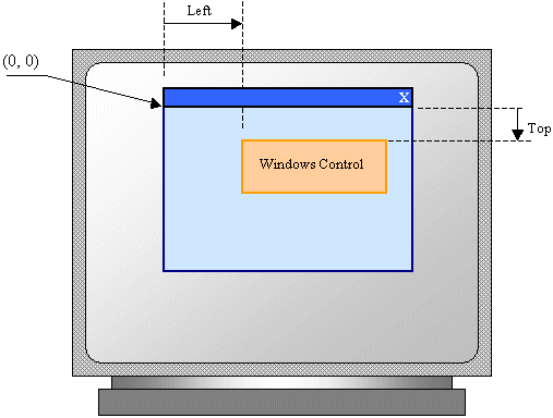
The Location of a Windows Control
The Left Position of a Control
The position of a control is the area where it is located within its parent container. For this reason it is also called its location. One of the characteristics of a position is the distance from the left border of its container to its own left border. To support this left position, the class of every control inherits a property named Left from the Control class.
To visually specify the left location of a control, select the control of the form. In the Properties window, expand the Location field. Click its X field and type the desired integer. To programmatically specify the left location of a control, access the Left property of its variable and assign the desired integer to it. Here is an example:
using System.Windows.Forms;

class WaterDistribution
{
    private void Create()
    {
        // Form: Bill Preparation
        Form billPreparation = new Form();

        billPreparation.Text = "Water Distribution Company - Bill Preparation";

        // Label: Meter Reading Start
        Label lblMeterReadingStart = new Label();

        lblMeterReadingStart.Left = 18;
    }
}
The Top Position of a Control
The top position or top location of a control is the distance from the top border of its parent to its own top border. To support this characteristic, every control is equipped with a property named Top inherited from the Control class.
To visually specify the top location of a control, select the control of the form. In the Properties window, expand the Location field. Click its Y field and type the desired integer. To programmatically specify the top location of a control, access the Top property of its variable and assign the desired integer to it. Here is an example:
using System.Windows.Forms;

class WaterDistribution
{
    private void Create()
    {
        // Form: Bill Preparation
        Form billPreparation = new Form();

        billPreparation.Text = "Water Distribution Company - Bill Preparation";

        // Label: Meter Reading Start
        Label lblMeterReadingStart = new Label();

        lblMeterReadingStart.Left = 18;;

        lblMeterReadingStart.Top = 17;
    }
}
The Location of a Control
You can combine the top and left position of a contron in one value. To support this, the Control class is equipped with a property named Location, which is of type Point:
public System.Drawing.Point Location { get; set; }
Based on the Point structure, the location of a control is defined by two values:
The location of a Windows control can be illustrated as follows:
Based on this property, to specify the location of a control, access the Location property on the variable of the control, assign a constructor of the Point structure, and pass the desired values. This can be done as follows:
namespace Exercises
{
    public partial class Exercise : Form
    {
        private Button btnSubmit;

        public Exercise()
        {
            InitializeComponent();

            btnSubmit = new Button();
            btnSubmit.Location = new Point(100, 50);
            Controls.Add(btnSubmit);
        }
    }
}
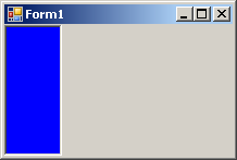
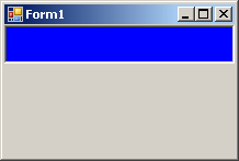
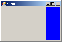
Control Docking
When a control is added to a host, depending on the control, it may be automatically positioned where the mouse landed. In some cases, you will want the control to be attached to a border or to a corner of its parent. To support this characteristic, the classes of the Windows controls are equipped with a property named Dock. This property is based on an enumeration named DockStyle.
To visually set the docking style of a control, select the object on a form. In the Properties window, click the arrow of the Dock field:

As you can see, the Dock option displays a window from which you can select the desired options(s). The members of the DockStyle enumeration are:
Fill: The control will use the whole client area of its parent.
None: The control will be kept where it was positioned on the parent:

Left: The control will be attached to the left border of its parent:
 |
 |
Top: The control will be attached to the top border of its parent:
 |
 |
Right: The control will be attached to the right border of its parent:
 |
 |
Bottom: The control will be attached to the bottom border of its parent:
 |
 |
To programmatically specify the docking option of a control, access its Dock property and assign the desired member of the DockStyle enumeration. Here is an example:
public class Exercise : Form
{
    private Button btnSubmit;

    private void InitializeComponent()
    {
        btnSubmit = new Button();
        btnSubmit.Text = "Submit";
        btnSubmit.Dock = DockStyle.Right;
    }
}
The Size of a Windows Control
The Width of a Control
The width of a control is the distance from its left to its right borders. To support the width of controls, the Control class is equipped with a property named Width that the class of every control inherits.
To visually specify the width of a control, after selecting the control on a form, in the Properties window, expand the Size field. Click Width and type the desired value. To programmatically control the width of the control, access the Width property of its variable and assign a natural number to it. Here is an example:
using System.Windows.Forms;

class WaterDistribution
{
    private Form Inventory;
    private Label lblItemNumber;

    private void Create()
    {
        Inventory = new Form();

        billPreparation.Text = "Water Distribution Company - Bill Preparation";
        billPreparation.Width = 634;

        lblItemNumber = new Label();

        lblItemNumber.Width = 270;

        lblItemNumber.Text = "Meter Reading Start";
    }
}
The Height of a Control
The height of a control is the distance from its top to its bottom borders. To support the heights of controls, the Control class a property named Height to every Windows control.
To visually or programmatically specify the height of a control, proceed as we saw for the Width. Here is an example:
using System.Windows.Forms;

class Exercise
{
    private Form frmExercise;

    public void Create()
    {
        frmExercise = new Form();
        frmExercise.Width = 528;
        frmExercise.Height = 346;

        frmExercise.Text = "Employment Application";

        Label lblMessage = new Label();

        lblMessage.Left = 20;
        lblMessage.Width = 145;

        lblMessage.Height = 23;

        lblMessage.Text = "Employment Application";
    }
}
All controls have a default height that is applied if you don't provide a new height. For some controls (such as the text box), you should not change the height; in fact, the value you provide would be ignored.
The Size of a Control
The size of a control is the combination of its width and its height. It can be illustrated as follows:
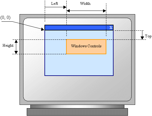
To support the size of a control, the Control class is equipped with a property named Size. This property is of type Size.
To specify the size of a control during design, access its Properties window:
Introduction to Boolean Properties
Checking a Box
Some characteristics of Windows controls have to be set as being true or false. These are referred to as Boolean propertes. As there are many Windows, some Boolean properties are shared by many controls. Some properties are used by one or only a few controls.
Some controls, such as the check box, the radio button, or the list check box, present one or more small boxes that can be checked. The classes of those controls are equipped with a Boolean property named Checked. It is defined as follows:
public bool Checked { get; set; }
To specify the value of the property dusing design, access the Properties window of the control and set the value in the Checked field. You can also set the property programmatically. Here is an example for a form equipped with a check box named chkVerified:
using System.Windows.Forms;

namespace Verifications
{
    public partial class Verification : Form
    {
        public Verification()
        {
            bool verified = true;

            InitializeComponent();

            chkVerified.Checked = verified;
        }
    }
}
Tab Ordering
A user can navigate through controls using the Tab key of the keyboard. When that key has been pressed, the focus moves from one control to the next. By their designs, not all controls can receive focus and not all controls can participate in tab navigation. Even controls that can receive focus must be primarily included in the tab sequence.
To support the participation to tab sequencing, the class of every visual control is equipped with a Boolean property named TabStop. This property is represented in the Properties window. Every visual control that can receive focus is already configured to have this property set to True. If you want to remove a control from this sequence, set its TabStop value to False.
If a control has the TabStop property set to True, to arrange the navigation order of controls, you have two main options. At design time, you can click a control on the form. Then, on the Properties window, change the value of its TabIndex field. The value must be a positive short integer.
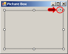
The best and easiest way to arrange the tab sequence of controls is to manage it visually. To do this, first display the form. Then, on the main menu, click View -> Tab Order. This causes a number to be positioned on every control of the form. Here is an example:

To arrange the sequence any way you like, click each control once in the desired order. Normally, static controls (such as the label, the picture box, the panel, etc) never receive focus when the application is running; therefore, you can skip such controls.
Control's Visibility
A control is referred to as visible if it can be visually located on the screen. A user can use a control only if he or she can see it. As a programmer, you decide whether a control must be seen or not and when. The visibility of an object is controlled by the a Boolean property named Visible.
At design time, when you add a control to a parent, it is visible by default. This is because its Visible property is set to True in the Properties window. In the same way, if you programmatically create a control, by default, it is made visible.
If you don't want a control to primarily appear when the form comes up, you can either set its Visible property to False or set its parent's Visible property to False. Equivalently, at run time, to hide a control, assign a False value to either its Visible property or its parent's Visible property. Keep in mind that when a parent gets hidden, it also hides its children. On the other hand, a parent can be made visible but hide one or some of its children.
To programmatically check whether a control is visible at one time, apply a conditional statement to its Visible property and check whether its value is true or false.
Control's Availability
For the user to use a control, the control must allow operations on it. For example, if a control is supposed to receive text, the user can enter characters in it only if this is made possible. To make a control available to the user, the object must be enabled. The availability of an object is controlled by a Boolean property named Enabled.
By default, after adding a control to a form, it is enabled and its Enabled property in the Properties window is set to True. An enabled control displays its text or other characteristics in their normal settings. If you want to disable a control, set its Enabled property to False. In the following picture, a text box and a button are disabled:

To programmatically find out whether a control is enabled or not, check its Enabled property.
Automatically Sizing a Label
After adding a label to a form, by default, it receives a fixed size. If you type its caption and press Enter, the text you provided would be confined to the allocated dimensions of the control. If the text is too long, part of it may disappear. You can then resize the label to provide more area. Another solution is to automatically resize the label to accommodate the length of the string you typed. This aspect is controlled by a Boolean property named AutoSize. Its default value is False. If you set this property to True, at design time, a rectangular border appears around it. If you type a string in the Text field and press Enter, the control would be resized to show the whole string but using only the necessary space.
If you programmatically create a label, it assumes a default size. If you assign it a string that is too long for that default size, part of the string may appear on a subsequent line. If you want the whole string to appear on the same line, you can set the AutoSize property to true. Here is an example:
public class Exercise : System.Windows.Forms.Form
{
    Label lblMessage;

    public Exercise()
    {
        InitializeComponent();
    }

    private void InitializeComponent()
    {
        lblMessage = new Label();
        lblMessage.Text = DateTime.Now.ToString();
        lblMessage.AutoSize = true;
    }
}
Other Characteristics of Windows Controls
The Border Style of a Control
By default, when you have added some controls, at run time, the form designer would show the borders so you can conveniently move or resize it:

At run time, unless you display an object in the control (such as the picture box) or draw a shape in it, the user would not know where the control starts and where it ends:

There is no way of knowing that the above form contains a control.
To let you control the display of the borders of a control, the classes of such controls are equipped with a property named BorderStyle which is based on an enumeration of the same name:
public System.Windows.Forms.BorderStyle BorderStyle { get; set; }
To set this property at design time, click it on the form. In the Properties window, click the + button of the BorderStyle field and selected the desired value. The BorderStyle property provides three values that you can set in the Properties window: None, FixedSingle, and Fixed3D and their effects are as follows:
| None | FixedSingle | Fixed3D | |
| Design |  |
 |
|
| Run | 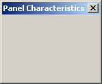 |
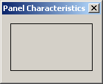 |
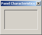 |
To programmatically specify the border style, assign the desired value to the BorderStyle property. Here is an example:
Panel pnlContainer;

private void InitializeComponent()
{
    Text     = "Domain Configuration";
    Width    = 320;
    Height   = 210;
    Location = System.Drawing.Point(140, 100);

    pnlContainer = new Panel();
    pnlContainer.Location = Point(20, 20);
    pnlContainer.Size = System.Drawing.Size(100, 60);
    pnlContainer.BorderStyle = BorderStyle.Fixed3D;

    Controls.Add(pnlContainer);
}
The Image of a Control
Some controls are made to display a picture. That's the primary purpose of some controls such as the picture box. At design time, to specify the picture that such a control would hold, first click the control on the form to select it:
In both cases, a dialog box would come up to assist you with locating and selecting a picture. The Image feature is based on a property of the same name.
The Image Location of a Control
Besides the Image property, to assist you with specifying the image to display, the PictureBox class provides a property named ImageLocation. This property, which is of type String, expects either the path to the file or the URL of the image. At design time, the difference with the Image property is that you are not asked to select a picture but to give its location. Therefore, to use it, in the Properties window, type the complete path. You can also provide a URL to the picture.
At run time, you can also specify the path or the URL to the picture by assigning it to the ImageLocation property.
After you have specified the image that the picture box would display, by default, it is located from the top-left corner of the control.
The picture box can show only as far as its size. In some cases, you want to resize either the picture to fit the control, or the control to fit the picture.
The Size Mode of a Picture Box
The SizeMode property of the PictureBox class allows you to specify how the image in the control would be displayed. This property is based on the PictureBoxSizeMode enumeration and its members are as follows: Normal, CenterImage StretchImage, Zoom, and AutoSize.
Pictures on a Label
A label is primarily meant to display a string. To make it fancier, you can display a (small) picture next to it. To do this, at design time, use the Image field of the Properties window to select a picture. You can also specify the picture at run time by assigning an Image value to the Label.Image property. After adding a picture that would accompany the label, you can specify what position the picture would hold with regards to the label. To do this, select the desired position of the ImageAlign field in the Properties window.
Instead of using a picture from the Image property, you can create a list of images using an ImageList control and assign it to the label. In fact, the advantage of an ImageList is that, unlike the Image property, it allows you to use more than one picture.
After assigning an ImageList to the label control using the Properties window or code, you can use the ImageIndex to specify what picture to display next to the label.
Aesthetic Accessories for Windows Controls
Introduction to Colors
A color is a visual perception of an object in terms of its variation from complete black to complete white and other derivations between those values.
To support colors, the .NET Framework provides a read-only structure named Color. It is defined in a namespace named System.Drawing. The Color structure is equipped with all types of methods to create a new color, identify an existing color, or manipulate a color. Also, the Color structure is equipped with many static properties that each represent the popular names of colors (Black, White, Blue, Green, Yellow, etc).
Introduction to Fonts
A font is a design that is used to draw readable characters on a computer screen, a paper, a printer, etc. As there are different types of designs, there are different types of fonts.
To support fonts, the .NET Framework provides many classes. The most fundamental class used for fonts is called Font. Most of the classes used to deal with fonts, including Font, are defined in the System.Drawing namespace. To let you apply a font to a control, the Control class is equipped with a property named Font. This property is of type Font. Because the classes of all graphical controls derive from the Control class, all visually controls are equipped with the Font property. You can access that property programmatically or visually in the Properties window.
Practical Learning: Ending the Lesson
|
|
|||
| Previous | Copyright © 2001-2025, FunctionX | Sunday 16 April 2023 | Next |
|
|
|||