
Data Analysis With Charts
 |
Data Analysis With Charts |
Overview of Charts
Introduction
A chart is a technique of displaying data using pictures and graphical representations instead of numbers or simple words. It works by drawing figures that would represent numbers, adding colors and shapes to the information presented. Good created and formatted charts can help people and businesses make decisions based on the impact that the images provide.
While data analysis as we have seen so far was performed on records displayed on datasheets or forms, data analysis on charts is done using graphics that present pictures. In addition to the pictures, you can add words, also called labels to indicate what the pictures represent.
Because a chart is used to present data in a graphical format, before creating a chart, you should plan it. That is, you should prepare it. There are two pieces of information you should have before starting: The numbers that you want to represent and the type of chart you want to use.
Creating a Chart
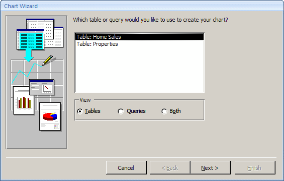
The information used to create a chart can come from a table. In some other cases, you can use a query as queries do a good job of isolating records or counting them. Before creating a chart, you should prepare it so it can be easily recognizable. Data used on a chart can be made of natural numbers or percentage values. You can also present a series of repeating words and let the chart engine count the occurrences of such words before using them as numbers.
To start a chart, display a new form in Design View and, in
the Controls section of the Ribbon, click the Insert Chart button ![]() ,
and position the mouse on the form or report. The mouse cursor would appear with
small bars:
,
and position the mouse on the form or report. The mouse cursor would appear with
small bars:
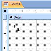
You can then click the form. You may receive a Microsoft Office Access Security Notice:
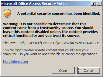
If you receive the Security Notice, you should click Open. This starts the Chart Wizard and you can continue with it as we will learn.
There are different types of charts, ranging from columns to pies, from lines to surfaces, etc, as we will review them. To present its information more efficiently, a chart is made of different sections. The main area allows users to view the graphical display of data. A legend explains the meaning of various colors on the chart. A title indicates what the chart is used for.
![]() Practical Learning: Creating a Chart
Practical Learning: Creating a Chart


The Characteristics of a Chart
A Chart and its Container
A chart cannot reside on its own: it needs a container such as a form or a report to hold it. This also implies that the chart can only fit inside the size allocated by its parent. Based on this, if the database is configured to display in Overlapped Windows, and it you want the chart to be taller or wider that the size it currently has, you must first display the form or the report that is hosting it in Design View, and then enlarge the host. Once the parent object has enough room, you can enlarge the chart as you see fit. If you are creating the chart on a report and if the chart needs room, you can enlarge the report, then enlarge the chart and set the page setup to Landscape.
![]() Practical
Learning: Resizing a Chart
Practical
Learning: Resizing a Chart

The Sections of a Chart
To present its information, a chart is made of various sections:

Most or every one of these aspects can be hidden, displayed or changed. To perform any action on these parts, after displaying the form or report that holds the chart in Design View, you use Microsoft Graph. To open it:
This would open a separate application. In Microsoft Graph, you can click or right-click the desired part.
Editing the values of a Chart
As mentioned already, to create a chart in Microsoft Access, you use values from a table or a query. When analyzing data using a chart, you may want to use "What If" scenarios. For example, if you are viewing the numbers of students per gender in a school and one gender is predominant, you may want to view the tendency if the number of members were the same for both members, if the members of the predominant gender were even more, or if the members of the other gender were predominant. Therefore, during data analysis, you can change the values used by the chart. When you have finished using the chart and you close its parent, the values you used would be lost and the chart would again use only the values stored in its Row Source.
To change the values used for a chart without changing the real values, you can open Microsoft Graph. It would present a spreadsheet:
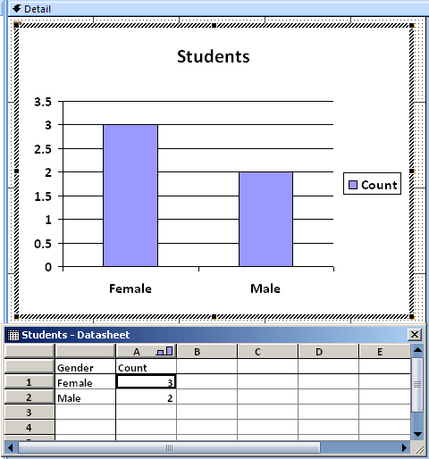
To change the value, in the Datasheet, click the cell that holds the value and type the desired one. After editing the value(s), click the body of the form or report to return to Microsoft Access. The chart would display with the new values. Remember that if you close the form or report, the chart would loose those temporary values.
A Chart's Legend
To show what the graphics on a chart represent, a chart is accompanied by an object on a side called a legend. The legend is made of at least one small square box of the same color of at least one of the graphics on the chart:

In this case, the legend contains one item named Count. Because the legend represents a graphic of the chart, when you make a change on that graphic, the legend is updated. Still, you can change the legend if you want.
To make changes to the legend, display the Microsoft Graph for the chart, right-click the legend and click Format Legend. This would open the Format Legend dialog box, make the changes, and click OK.
If you do not want to use a legend, you can delete it. To do this, right-click the legend and click Clear or click the legend and press Delete.
![]() Practical Learning: Using a Chart's Legend
Practical Learning: Using a Chart's Legend
The Title of a Chart
To indicate what it is used for, a chart can be equipped with a title. The title is a string that typically displays in the top section of a chart. In some (rare) cases, a title can also be positioned on the left or the right sides, above or below the chart. To move the title, display the form or report in Design View, click and drag the chart in the desired direction.
To format the title, you can either double-click it or right-click it and click Format Chart Title. By default, the chart displays without a border, in bold Calibri font. You can change or format it using the Format Chart Title dialog box.
When creating the chart, if you need more room for it, you can put the chart in the Detail section and remove the title. Then, for a form, you can create the title as a label in the Form Header section. For a report, you can add a label in the Report Header section and give it the same caption you would have given to the title of the chart.
![]() Practical Learning: Formatting a Chart's Title
Practical Learning: Formatting a Chart's Title

Chart Figures
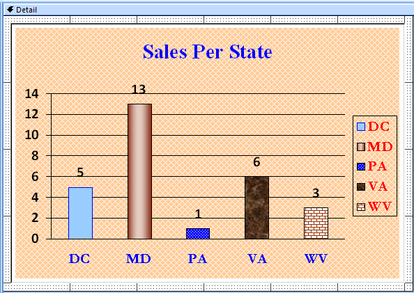
To represent its numbers, a chart draws some geometric figures, depending on the type of chart. These figures can be rectangles, pie slices, triangles, cones, etc. To paint these figures, by default, the chart engine uses some randomly selected colors from its own list. You can either change these colors or apply some preset drawings available. You can also design and use any custom picture to paint the chart's shapes.
To format the geometric figures of a chart, you can right-click one of them and click Format Data Series.
By default, when you have just created a chart that uses one column for its values, Microsoft Graph applies the same formatting, such as the same color, to all of its figures. You can keep this or treat each figure separately. To separate the figures, after opening Microsoft Graph, you can click a figure, then click it again. From then, the chart would change from one series:

To individual figures:

If you create a chart that uses more than one column, a separate category with its own color would be automatically created. You can then format each category as you see fit.
![]() Practical Learning: Formatting a Chart's Shapes
Practical Learning: Formatting a Chart's Shapes


Chart's Labels
By default, when a chart is drawn, it is equipped with shapes and a separate legend. If you want, you can display the value of each part and possibly its name close to it. This is done through a label. On a large chart, a label can also be used in the absence of a legend. In fact, you can delete a legend and simply make use of a label.
To add the labels to a chart, right-click a box on the chart and click Format Data Series. Once in the Format Data Series dialog box, click the Data Labels tab:
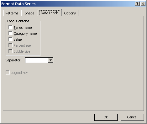
In the Label Contains group box, click the desired check box(es) and click OK.
![]() Practical
Learning: Formatting Labels on a Chart
Practical
Learning: Formatting Labels on a Chart
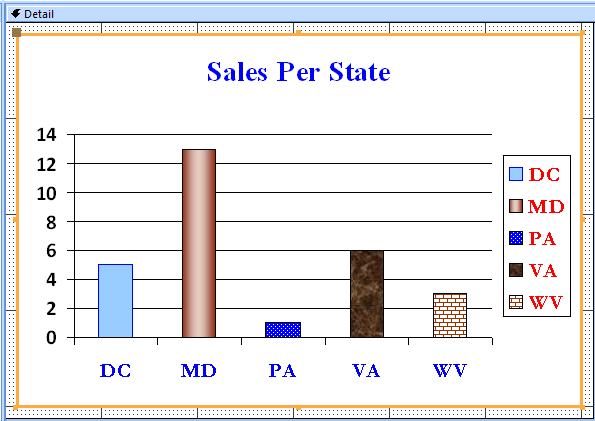

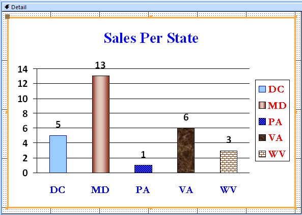
The Chart's Background
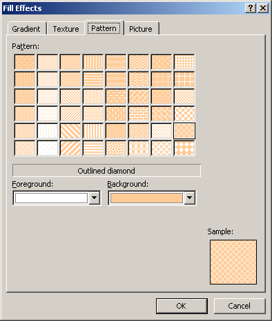
One more way you can enhance the appearance of a chart is to draw a background wall behind it. The wall is just a graphical object. By default, the background of a chart is painted in white. You can use a different color to paint it, a design pattern or a picture to cover it. Before formatting the chart, open Microsoft Graph. To format its wall, right-click the chart and click Format Chart Area... This would open the Format Chart dialog box where you can make the necessary changes.
![]() Practical Learning: Formatting a Chart's Walls
Practical Learning: Formatting a Chart's Walls
Lesson Summary
MCAS: Using Microsoft Office Access 2007 Topics
| P3 | Create and modify charts |
Exercises
Yugo National Bank
Watts A Loan
US Senate
|
|
||
| Previous | Copyright © 2008-2019, FunctionX | Next |
|
|
||