 |
Blender Materials: A Glass Object |
|
Introduction
Many of the materials used in Blender are complete by themselves. One way to enhance the effects of materials is to combine them. This operation includes the materials we have already seen: Diffusion BSDF, Glossy BSDF, and Glass BSDF. Blender provides many options to that effect.
 Practical Learning: Starting the Project
- Start Blender
- In the top menu bar, click Blender Render and select Cycles Render
- In the Properties window, in the Resolution section, click 50%, type 100 and press Enter
- Still in the Properties window, click Sampling to expand it
- In the Sampling section, click the Render value, type 2000 and press Enter
- In the Properties window, click the Object button

- Position the mouse on the default cube and press X
- On the menu that comes up, click Delete
 Practical Learning:
Creating a Classic Cup
- On the Tools window, click Create
- Click Cylinder
- On the menu bar of the 3D-View, click Object Mode and click Edit Mode
- On the menu bar of the 3D-View, click the Face Select button

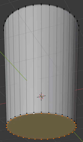
- Right-click the top face of the cylinder to select it
- Press S to resize
- Type 1.25 and press Enter
- Press G to move the face
- Press Z to move the face vertically
- Type 1.5 and press Enter:
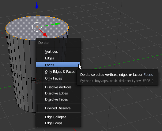
- Position the mouse on the cylinder and press X to delete
- In the menu that appears, click Faces:
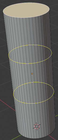
- On the menu bar of the 3D-View, click the Vertex Select button

- Press and hold Alt
- Right-click one of the top vertices to select all of them
- Release Alt:
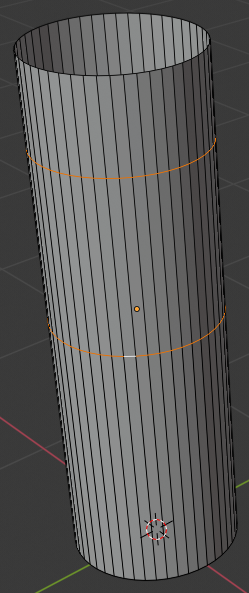
- Press E as if you wanto extrude and press Enter
- Press S as if you want to resize
- Type .95 and press Enter:
- Press Z to display in wireframe
- In the Numeric Pad, press 1 and press 5 to display the orthogonal front view
- Press E and press Enter
- Press G
- Press Z
- Type -3.25 and press Enter:
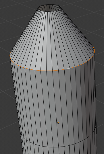
- Press S
- Type .75 and press Enter:
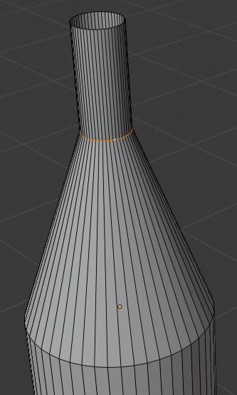
- Press Z to display in Solid view
- Press Tab to display in Solid Mode
- Move the view to display the cup in perspective:
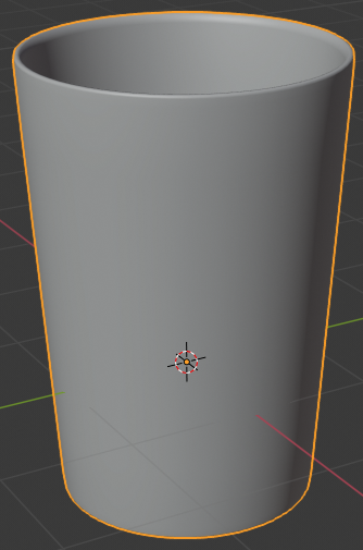
- In the Properties window, click the Object button

- Click Cube to select it
- Type Classic Cup and press Enter
- In the Properties window, click the Modifiers button

- Click Add Modifier and click Subdivision Surface:
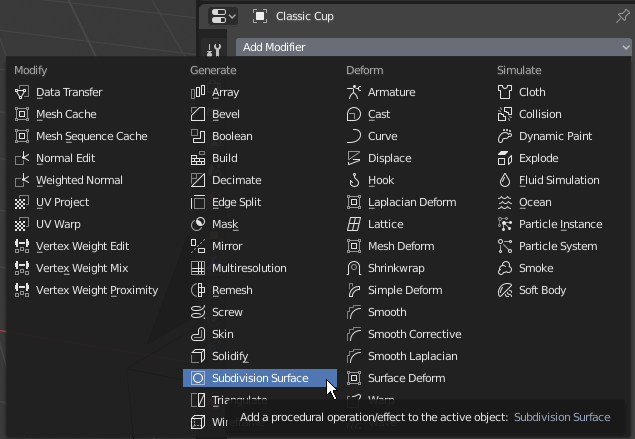
- Set the View value to 2
- Position the mouse on the cylnder and press Tab to display in Edit Mode
- Press Ctrl + R and get a horizontal ellipse on the cylinder
- Click to create a cut
- Move the cut as close as possible to the top border:
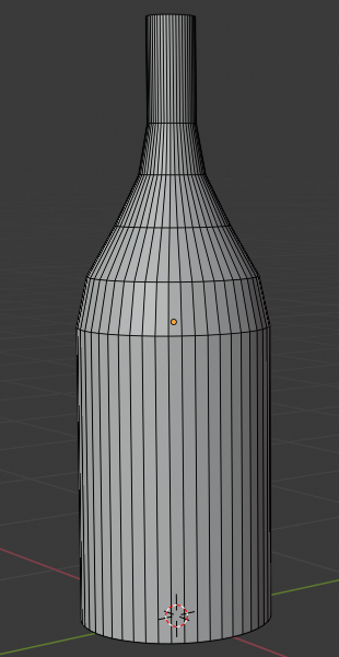
- Press Ctrl + R and get a horizontal ellipse on the cylinder
- Click to create a cut
- Move the cut as close as possible to the top border:
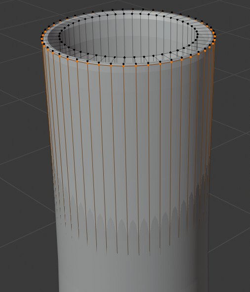
- Position the mouse inside the top border. Press Ctrl + R to get a horizontal inside cut
- Click to create a cut
- Move the inside cut as close as possible to the top border:
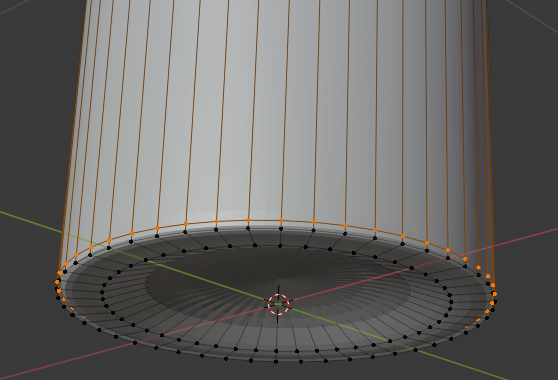
- Press Z to display in wireframe
- Psition the mouse inside the top border. Press Ctrl + R to get a horizontal inside cut
- Click once to create the cut
- Move the inside cut as close as possible to the inside bottom border:
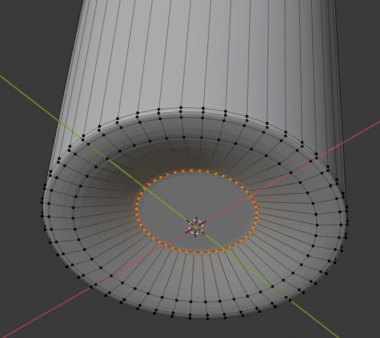
- Press Z to exit the wireframe
- Move the view so you can see the bottm side of the cylinder
- Press and hold Alt
- Right-click one of hte bottom vertices to select them
- Release Alt:
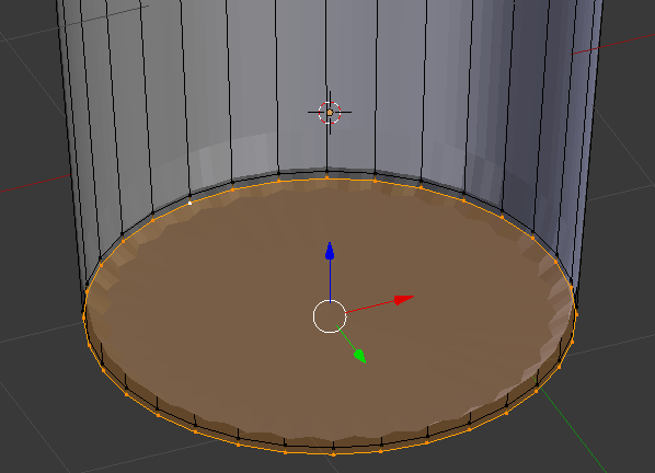
- Press E and press Enter
- Press S
- Type .95 and press Enter:
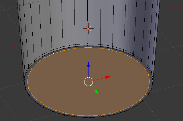
- Press Tab to display in Solid Mode
- In the Properties window, click Apply
- In the Tools window and in the Tools tab, click Smooth:
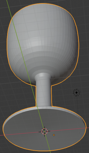
- In the Outliner, click the Restricted Viewport Visibility button (the eye) on the right side of Classic Cup
 Practical Learning: Creating a Bottle of Red Wine
- In the Tools window, click Create
- Click Cylinder
- In the Add Cylinder section below the Tools window, change the following values:
Vertices:     48
Radius:       .4
Depth:        2.5
Location - Z: 1.25
- To prepare to edit the cylinder, on the menu bar of the 3D View, click Object Mode and click Edit Mode
- Move the view and zoom in so you can see the top side of the cylinder
- On the menu bar of the 3D-View, click the Pivot Point button and select Active Element
- On the menu bar of the 3D-View, click the Face Select button

- On the cylinder, right-click the top face of the cylinder:
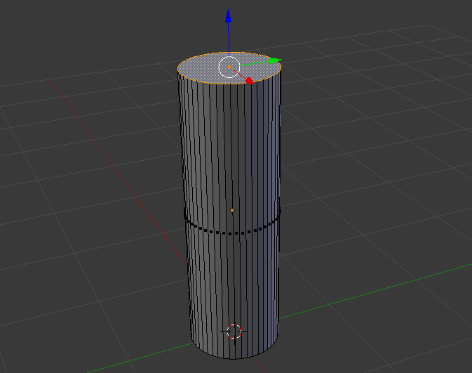
- Press X to delete
- On the menu that appears, click Faces
- Position the mouse on the cylinder, press Ctrl + R and make sure you see a horizontal ellipse or line
- Click twice to confirm the cut
- Press G and press Z to move vertically
- Type .75 and press Enter:
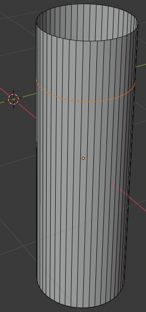
- Position the mouse above the bottom border of the cylinder, press Ctrl + R and make sure you see a horizontal ellipse or line
- Click twice to confirm the cut:
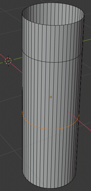
- Press G and press Z to move vertically
- Type .5 and press Enter:
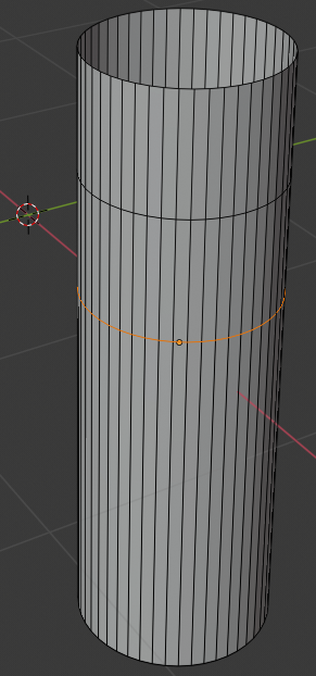
- On the menu bar of the 3D-View, click the Vertex Select button

- Press and hold Alt
- Right-click one of the vertices on the top side of the cylinder to select all top vertices of the bottle
- Release Alt:
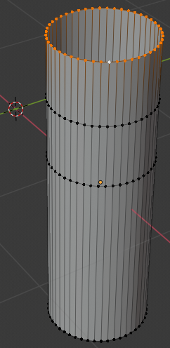
- On the menu bar of the 3D-View, click the Pivot Point button and click Median Point
- Press S to resize
- Type .25 and press Enter
- Press and hold Alt
- Right-click the second line from the top of the cylinder to select the horizoontal cut
- Release Alt:
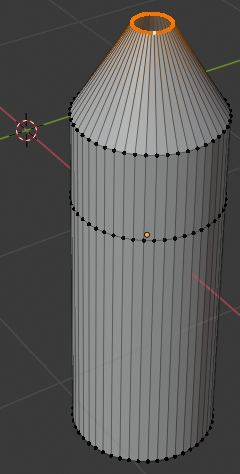
- Press S to resize
- Type .25 and press Enter:
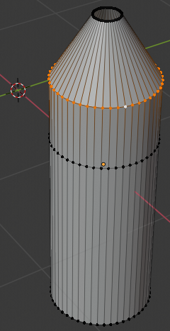
- The second and third horizontal lines are the neck of the bottle.
Position the mouse on the neck of the bottle, press Ctrl + R and make sure you see a horizontal ellipse or line
- Click twice to confirm the cut:
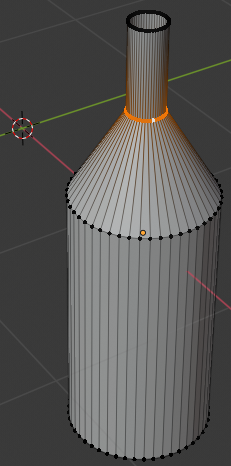
- Press S to resize
- Type 1.35 and press Enter:
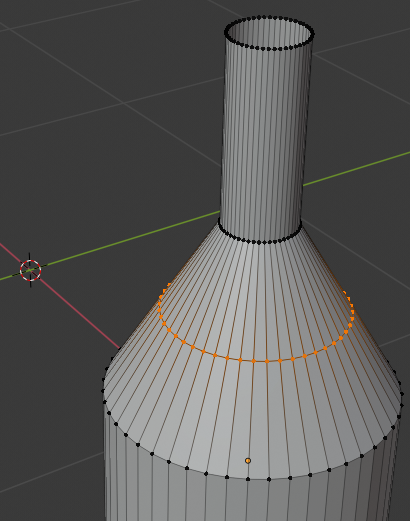
- Position the mouse between the third line from the top of the bottle and the fourth line, press Ctrl + R and make sure you see a horizontal ellipse or line
- Click twice to confirm the cut
- Press S to resize
- Type 1.05 and press Enter:
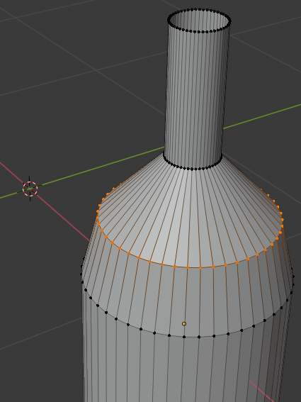
- Position the mouse between the second line from the top of the bottle and the third line, press Ctrl + R and make sure you see a horizontal ellipse or line
- Click twice to confirm the cut
- Press S to resize
- Type .85 and press Enter:
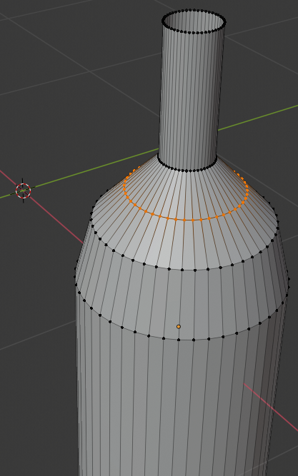
- Position the mouse between the second line from the top of the bottle and the third line, press Ctrl + R and make sure you see a horizontal ellipse or line
- Click twice to confirm the cut
- Press S to resize
- Type 1.05 and press Enter:
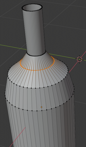
- Position the mouse between the third line from top and the fourth line from top, press Ctrl + R and make sure you see a horizontal ellipse or line
- Click twice to confirm the cut
- Press S
- Type .92 and press Enter:
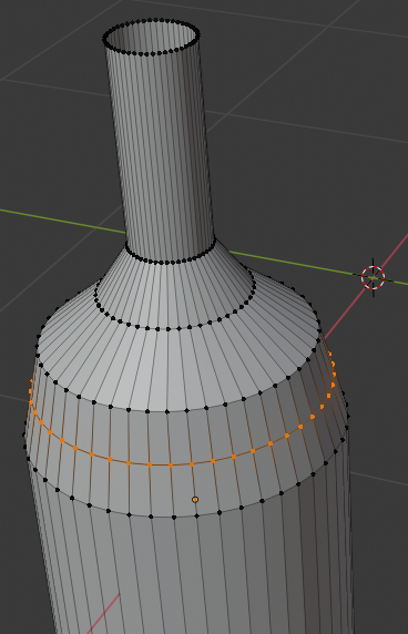
- Move the view so you can see the bottom side of the cylinder
- On the menu bar of the 3D-View, click the Vertex Select button

- Press and hold Alt
- Right-click one of the vertices on the bottom side of the cylinder to select all bottom vertices of the bottle
- Release Alt:
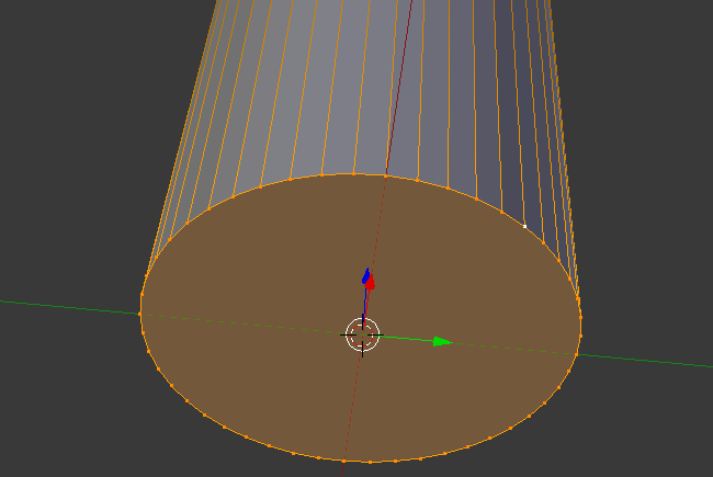
- Press E as if you want to extrude
- Press S to move the vertices
- Type .85 and press Enter:
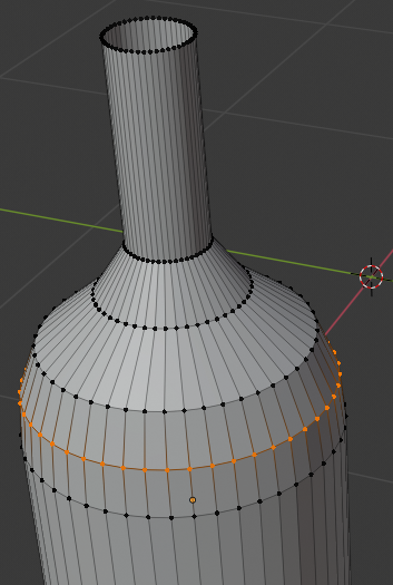
- Press E
- Press S
- Type 0 and press Enter:
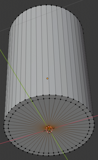
- On the cylinder, the central-bottom vertex should be selected (otherwise select it)
In the Numeric Pad, press 1 and then press 5 to get the orthogonal view
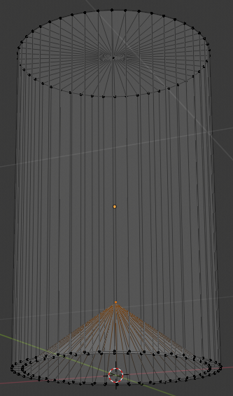
- Press Z to display the object as a wireframe
- Press G to prepare to move the vertex
- Press Z to move vertically
- Type .25 and press Enter:
- Press Z to exit from wireframe
- Press Tab to display in Object Mode
- In the Properties window, click the Object button
- Click Cylinder to select it
- Type Bottle of Red Wine and press Enter
- In the Properties window, click the Modifiers button
- Click Add Modifier and click Solidify:
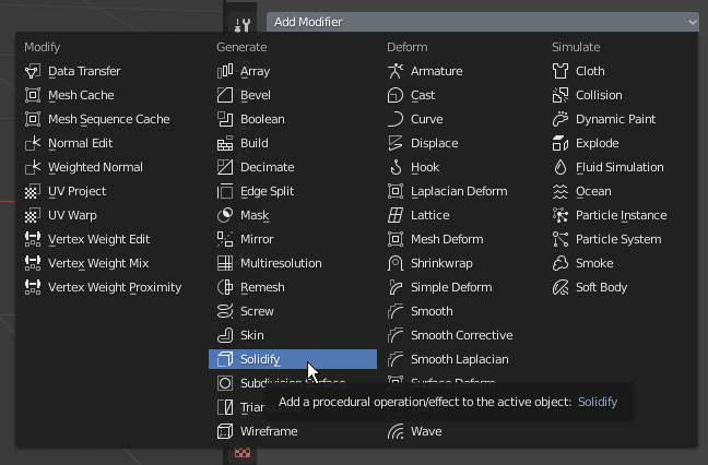
- Click the Thickness value, type.02 and press Enter
- Click Apply
- Click Add Modifier and click Subdivision Surface
- Set the View value to 2
- Position the mouse on the bottle and press Tab to display in Edit Mode
- Position the mouse in the upper section of the bottle, press Ctrl + R to get a horizontal line
- Click once to accept the line
- Move the line up as close as possible to the top border:
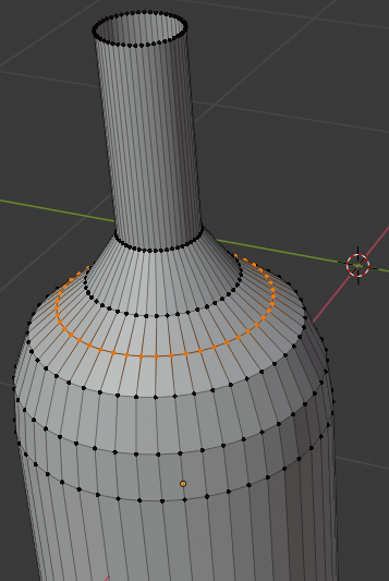
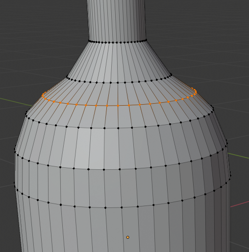
- Position the mouse inside the top opening of the bottle, press Ctrl + R to get a horizontal line
- Click once to confirm
- Move the cut up as close as possible to the top border:
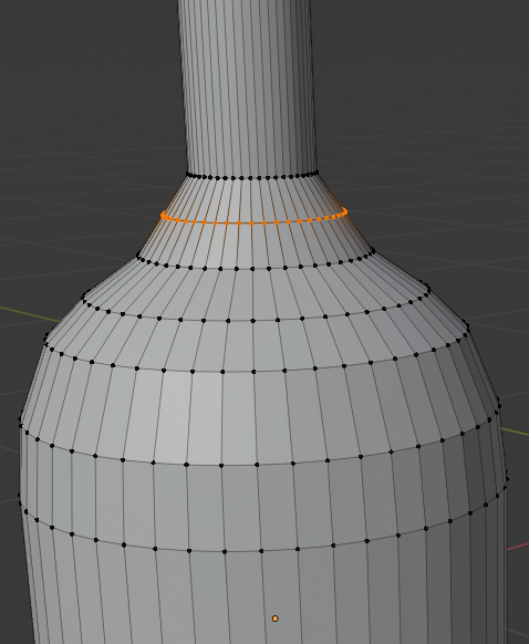
- Move the shape so you can see the lower part of the bottle
- Press Ctrl + R to get a horizontal cut and click once to cut
- Move the line down close to the bottom border:
- On the menu bar of the 3D View, click Edit Mode and click Object Mode
- In the Properties window, click Apply
- In the Tools window, click the Tools tab and click Smooth:
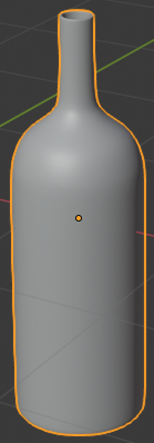
 Practical Learning: Creating an Empty Bottle
- Right-click the bottle to select it
- Press Shift + D to make a copy of the bottle and press Enter
- In the Properties window, click the Object button
- Click Bottle of Red Window.001 to select it
- Type Chantilly and press Enter
- In the Outliner, click the Restricted Viewport Visibility button on the right side of Chantilly
- On the menu bar of the 3D View, click Add -> Mesh -> Cylinder
- In the Add Cylinder section below the Tools window, change the following values:
Vertices:     32
Radius:       .105
Depth:        .25
Location - Z: 2.4
- Position the mouse in the work area and press Tab to display the cap (or cork) in Edit Mode
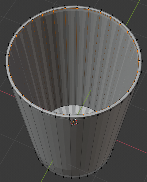
- Press Ctrl + R and create a horizontal cut on the shape, then move it up as follows:
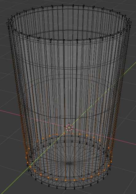
- Create another horizontal cut and position it as follows:
- On the menu bar of the 3D-View, click the Face Select button

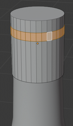
- Press and hold Shift, then right-click one of the middle faces, and release Shift:
- Press E to extrude
- Press S to move the faces
- Type 1.1 and press Enter:
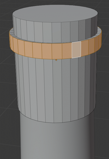
- Press Tab to display the cap (or cork) in Object Mode
- In the Tools section of the Tools window, click the Smooth button
- While the cap is still selected, in the Object section of the Properties window, click Cylinder.00X to select it
- Type Bottle Cap and press Enter
- Position the mouse in the work area, press and hold Shift
- Right-click the bottle to select it
- Release Shift
- Press Ctrl + P
- In the menu that appears, click Object
- In the Outliner, click the + button of Bottle of Red Wine to expand it
- Still in the Outliner, click the Restricted Viewport Visibility button (the eye) on the right side of Bottle Cap
- In the Outliner, click the Restricted Viewport Visibility button (the eye) on the right side of Bottle of Red Wine
 Practical Learning: Creating a Bottle of White Wine
- In the Tools window, click Create
- Click Cylinder
- In the Add Cylinder section below the Tools window, change the following values:
Vertices:     48
Radius:       .4
Depth:        2.5
Location - Z: 1.25
- In the Object section of the Properties window, click Cylinder to select it
- Type White Wine Bottle and press Enter
- Position the mouse in the work area and press Tab to display in Edit Mode
- Move the view so you can see the top side of the cylinder
- Press Ctrl + Tab and, on the menu that appears, click Face
- On the cylinder, right-click the top face of the cylinder, press X, and click Faces
- Press Ctrl + R and make sure you get a horizontal cut on the object
- Roll the middle mouse button slightly up to get 2 cuts:
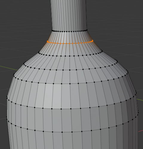
- Then click once to accept the cuts
- Move the mouse a little bit up. Here is an example:
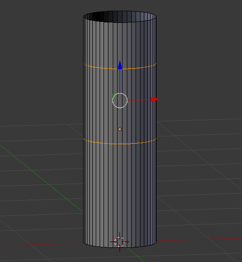
- Press Alt and right-click a vertext in the top border to select all of them
- Release Alt
- Press S, type.25 and press Enter
- Press Alt and right-click a vertext in the second cut to select those vertices
- Release Alt
- Type .25 and press Enter:
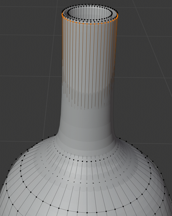
- Position the mouse in the middle part of the bottle and press Ctrl + R to get a horizontal cut
- Roll the middle mouse button to get 3 cut, then click twice to confirm. Here is an example:
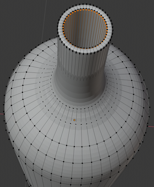
- Press and hold Alt, then right-click a cut to select its vertices, then release Alt, then press S and move the mouse to resize the cut. Model the bottle as follows:
- Move the view so you can see the bottom side of the bottle
- Press Alt, right-click a bottom vertext to select the whole border, then release Alt:
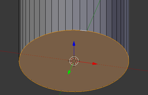
- Press E and press Enter
- Press S
- Type .9 and press Enter:
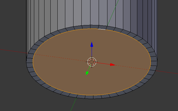
- Press E and press Enter
- Press S
- Type .5 and press Enter:
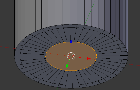
- Press G to prepare to move the vertex
- Press Z to move vertically
- Type .05 and press Enter:
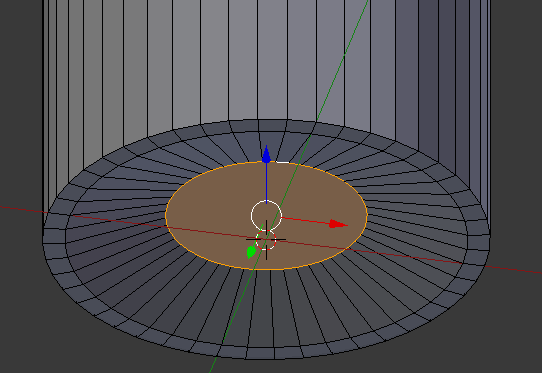
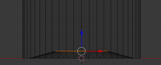
- Press Tab to display the Object Mode
- In the Properties window, click the Modifiers button
- Click Add Modifier and click Solidify:

- Click the Thickness value, type.02 and press Enter
- Click Apply
- Click Add Modifier and click Subdivision Surface
- Set the View value to 2
- Position the mouse on the bottle and press Tab to display in Edit Mode
- Position the mouse in the upper section of the bottle, press Ctrl + R to get a horizontal line
- Click twice to confirm
- Move the blue line (Z axis) up as close as possible to the top border:

- Move the view so you can see the bottom part of the bottle
- Press Ctrl + R to get a horizontal cut and press twice to confirm
- Move the line down close to the bottom border:
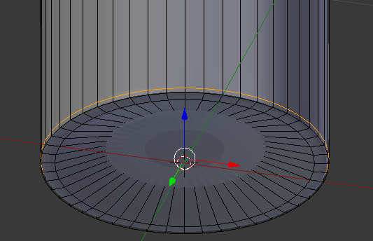
- On the menu bar of the 3D View, click Edit Mode and click Object Mode
- In the Properties window, click Apply
- In the Tools window, click the Tools tab and click Smooth:
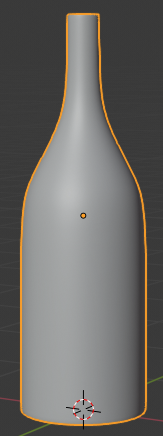
- In the Outliner, click the Restricted Viewport Visibility button (the eye) on the right side of White Wine Bottle
 Practical Learning: Creating the Red Wine
- To position the mouse cursor, press Shift + S
- On the menu that appears, click Cursor to Center
- On the menu bar of the 3D View, click the Pivot Point button and click 3D Cursor
- On the menu bar of the 3D View, click Add -> Mesh -> Cylinder
- In the Add Cylinder section below the Tools window, change the following values:
Vertices:      48
Radius:        .365
Depth:         1.2
Cap Fill Type: Triangle Fan
Location     - Z: .62
- In the Properties window, click the Object button
- In the Object section of the Properties window, click Cylinder to select it
- Type Red Wine and press Enter
- On the menu bar of the 3D View, click Object Mode and click Edit Mode
- Move the view so you can see the bottom side of the cylinder
- On the menu bar of the 3D-View, click the Vertex Select button

- Press and hold Alt
- Right-click one of the vertices on the bottom side of the cylinder to select all bottom vertices of the bottle
- Release Alt:
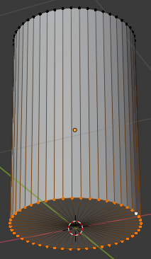
- Press E
- Press S
- Type .9 and press Enter:
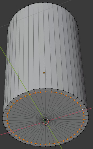
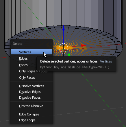
- Right-click the middle vertext to select it
- Press X to delete
- In the menu that appears, click Vertices
- Press Alt, right-clickone of the insidevertices, and relear Alt:
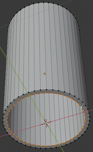
- Press E
- Press S
- Type 0 and press Enter:
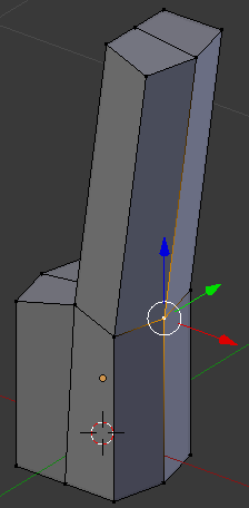
- Press Z to display in wireframe
- On the cylinder, the central-bottom vertex should be selected (otherwise select it)
Press G to prepare to move the vertex
- Press Z to move vertically
- Type .24 and press Enter:
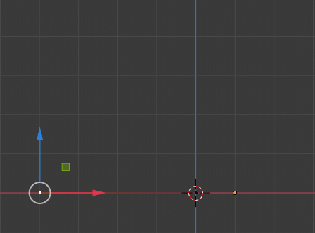
- Press Z to get out of wireframe
- On the menu bar of the 3D View, click Edit Mode and click Object Mode
- In the Tools window, click the Tools tab and click Smooth
- In the Outliner, click the Restricted Viewport Visibility button (the eye) on the right side of Red Wine to hide it
 Practical Learning: Creating an Empty Wine Glass
- In the Tools window, click Create and click Plane
- In the Object section of the Properties window, click Plane to select it
- Type Empty Glass and press Enter
- In the Transform section, change the following values:
Location - X: 1
	         Y: 1
    	     Z: 0
- Move the view and zoom in so you can see the top side of the plane
- Position the mouse on the cube and press Tab to switch to Edit Mode
- On the menu bar of the 3D View, click the Pivot Point button and click Active Element
- The Vertex Select option should be On (if you have doubt, on the menu bar of the 3D-View, click the Vertex Select button
 )
)
On the plane, right-click the vertex in the top-left side
- Press and hold Shift
- Right-click the vertex in the top-right side and the vertex in the bottom-right side
- Release Shift:
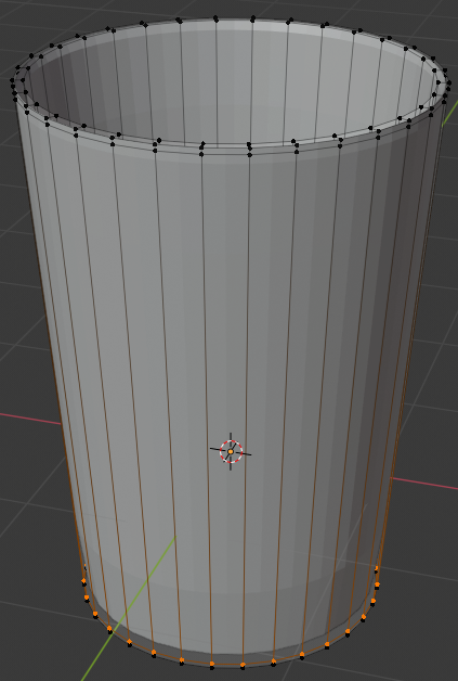
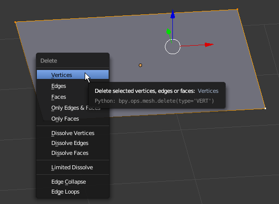
- Press X to delete
- In the menu that appears, click Vertices:
- In the Numeric Pad, press 1 (you should be in the orthogonal view; if you are not, press 5).
Also zoom in to get a bigger view
- Right-click the vertex that was left (if you don't see it, simply press A to select everything)
- Press and hold Ctrl
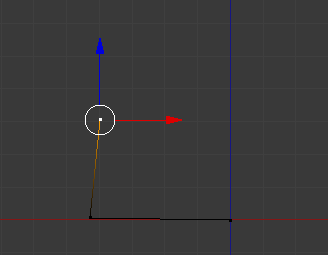
- Position the mouse on the left side by approximately 4 units and click (don't try to be precise; you will make the changes later):
- Still holding down Ctrl, position the mouse anywhere above the new vertex and click (again, don't try to be precise):
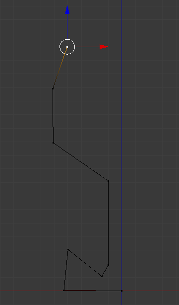
- Continue using the Ctrl key and clicking to create a shape that looks approximately as follows. Don't follow exactly the following illustration. You will make any changes later:
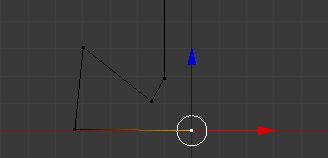
- To select a vertex, you can right-click it. Here is an example:
- To select many vertices, first select one of them, press and hold Shift, then right-click the other desired vertices, and release Shift
- To move a vertex, first select it. Then, either use the axes arrows and move them, or press G, move the mouse to the desired area, and click. Here is an example:
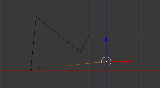
- To move many vertices, first select them, then either use the G key or the arrows to move them
- To create a new vertex, first select one on one end. Then, either hold down the Ctrl key and click in the desired area, or press E, move the mouse to the desired area, and click. Here is an example:
- To segment a line with one cut (or to create a cut), press Ctrl + R, position the mouse on the edge to be segmented until you see a dertex on it. Here is an example:
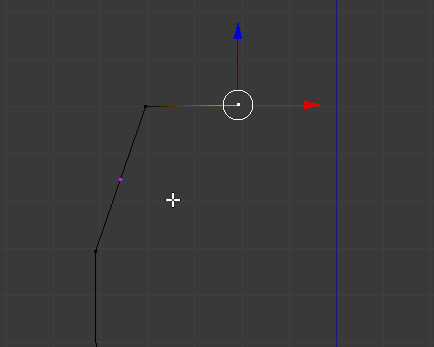
- Then click. Here is an example:
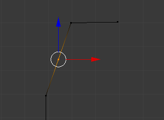
- To create many cuts, press Ctrl + R until you see an orange line on the line, then roll the middle mouse button to specify the number of cuts, then click
- Based on these techniques, create a shape approximately as follows (yours doesn't have to be exactly like the following shape; we are trying to model a glass, so use your own imagination/inspiration and taste):
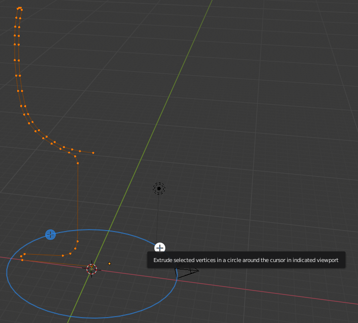
- Press Shift + S
- In the menu that appears, click Cursor to Center
- Press A to select all vertices:
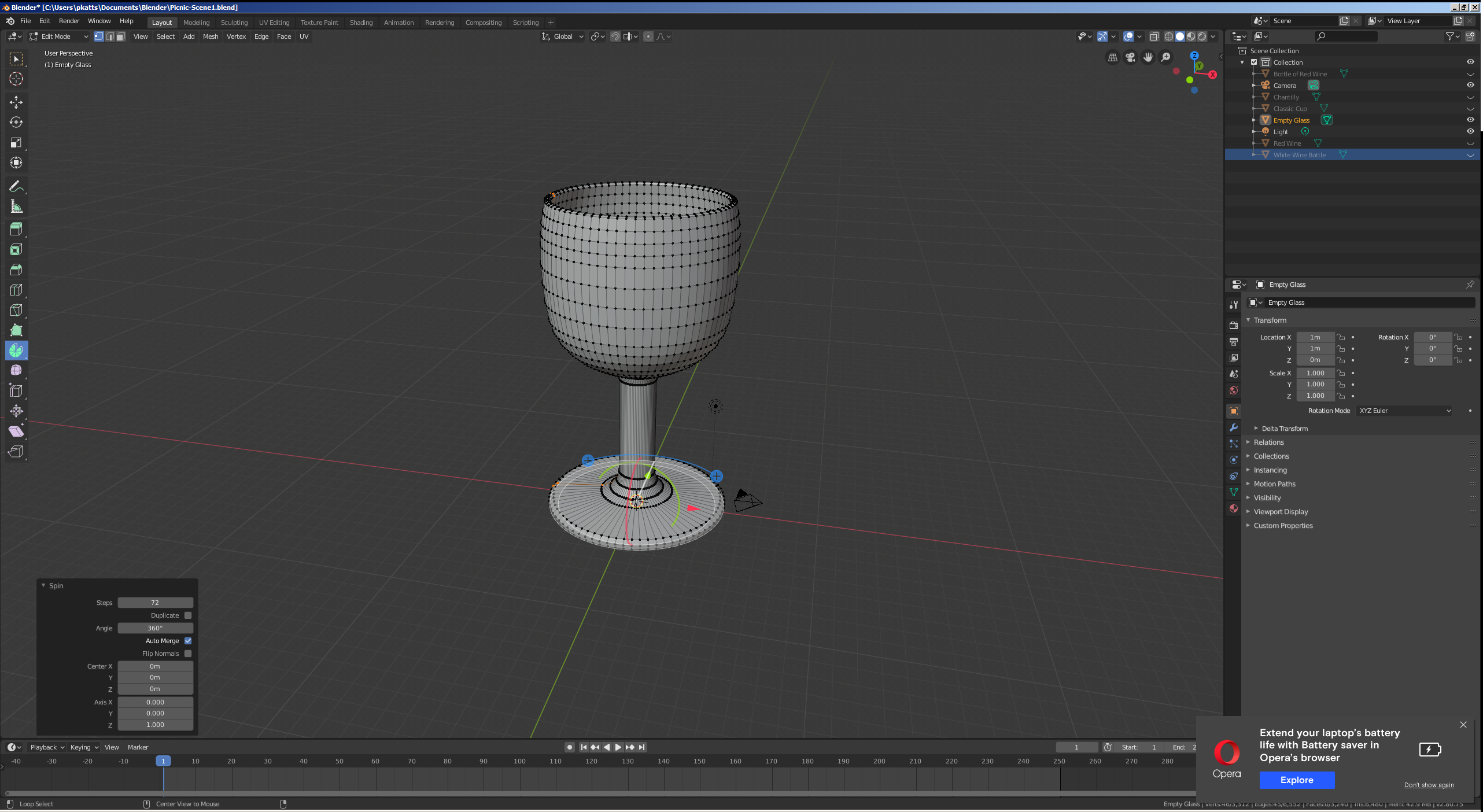
- In the Numeric Pad, press 7 to display the top view
- In the Tools menu, click the Tools tab and, in the Add section, click Spin
- In the Spin section below the Tools window, change the collowing values:
Steps: 72
Angle: 360
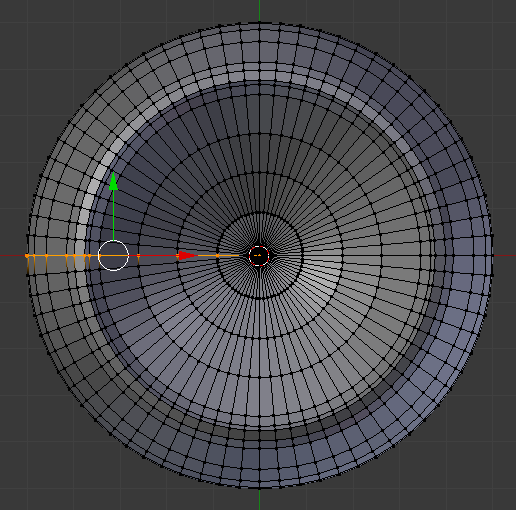
- Move the view to see the glass in perspective:
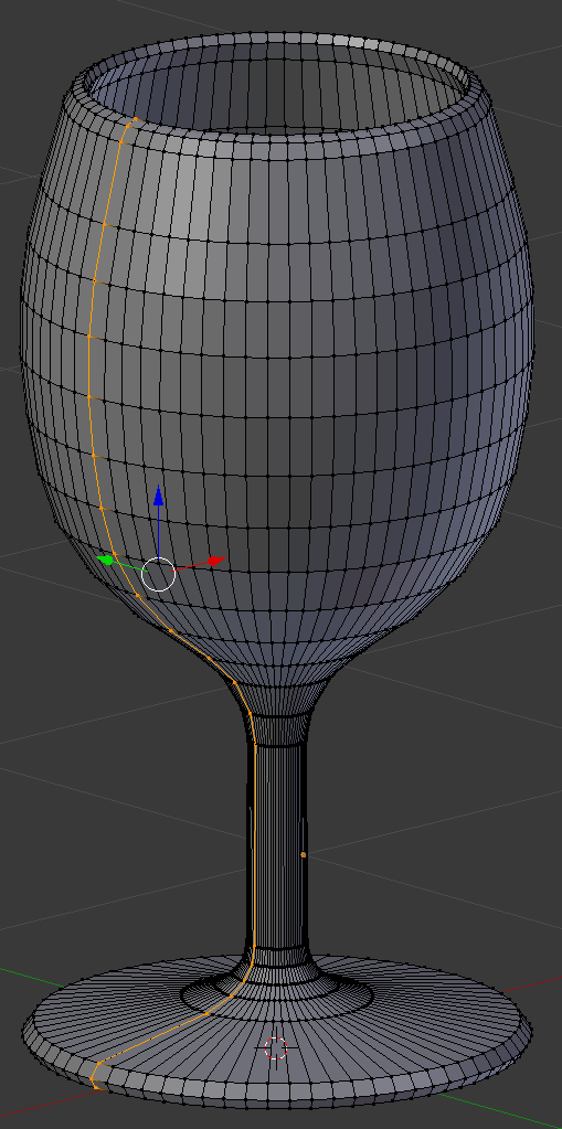
- On the menu bar of the 3D View, click Edit Mode and click Object Mode:
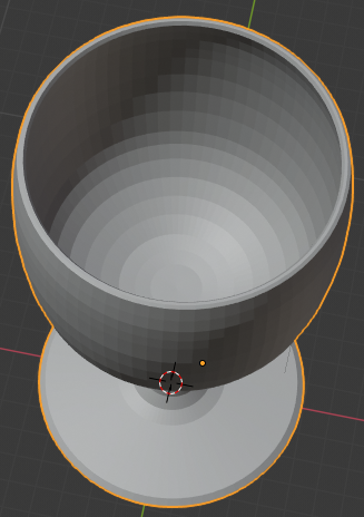
- In the Properties window, click the Modifiers button
- Click Add Modifier and click Subdivision Surface
- Set the View value to 2
- In the Tools window, click the Tools tab and click Smooth
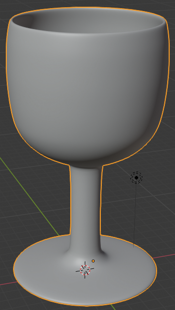
- In the Outliner, click the Restricted Viewport Visibility button (the eye) on the right side of Empty Glass to hide it
 Practical Learning: Creating an Ice Bucket
- Press Shift + S
- In the menu that appears, click Cursor to Center
- On the menu bar of the 3D View, click Add -> Mesh -> UV Sphere
- In the Numeric Pad, press 1 (the sphere should be in orthographic view; if that's not the case,. press 5)
- Zoom in to see a larger view of the sphere
- Press Tab to display the sphere in Edit Mode
- Press A to deselect everything
- Press Z to display the sphere in wireframe
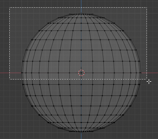
- Press B to prepare to box-select
- Draw a rectangle that selects the top portion of the sphere, including the middle line:
- Release the mouse:
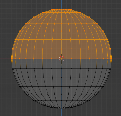
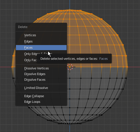
- Press X to delete
- In the menu that appears, click Faces:
- Move the view so you can see the bottom side of the object
- The Vertex Select should be On (if you have doubt, on the menu bar of the 3D-View, click the Vertex Select button
 )
)
Right-click the central-bottom vertex of the shape:
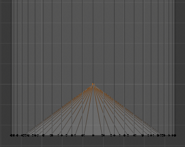
- Press G to move the vertex
- Press Z to move vertically
- Type .02 and press Enter
- In the Numeric Pad, press 1
- Press B to box-select
- Draw a rectangle that selects the group of bottom vertices:
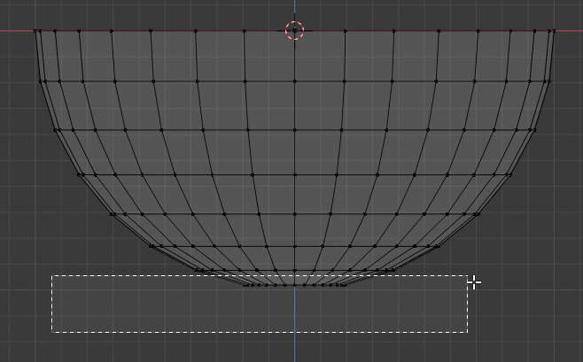
- Press G
- Press Z
- Type .06 and press Enter
- Press B to box-seect
- Draw a rectangle that selects the group of bottom vertices:
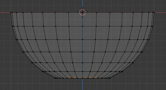
- Press G
- Press Z
- Type .1 and press Enter:
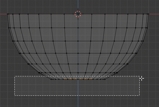
- Press Z to exit the wireframe
- Press Tab to display the shape in Object Mode:
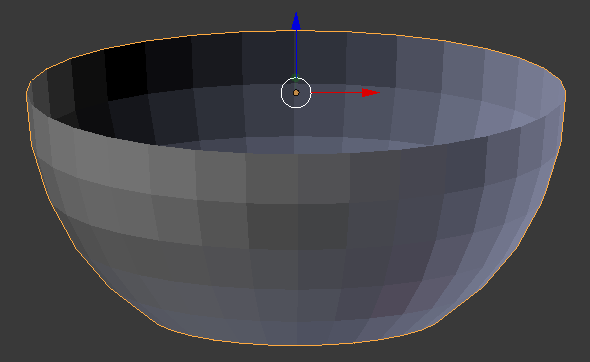
- In the Properties window, click the Object button

- Click Sphere to select it
- Type Ice Bucket and press Enter
- In the Properties window, click the Modifiers button

- Click Add Modifier and click Solidify:

- Click the Thickness value, type .05 and press Enter
- Click Apply
- Click Add Modifier and click Subdivision Surface
- Set the View to 2
- Click Apply
- In the Tools tab of the Tools window, in the Shading section, click Smooth:
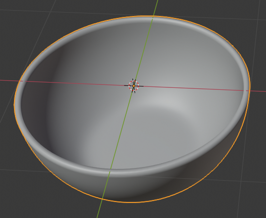
- In the Outliner, click the Restricted Viewport Visibility button (the eye) on the right side of Ice Bucket to hide it
 Practical Learning: Creating a Champaign Bucket
- To reset the cursor, press Shift + S
- In the menu that appears, click Cursor to Center
- Position the mouse in the work area, press Shift + A -> Mesh -> Cone
- In the Add Cone section below the Tools window, change the following values:
Vertices:  32
Radius 1:  1
Radius 2:  1.25
Depth:     2.5
Location - Z: 1.25
- In the Object section of the Properties widow, click Cone to select it
- Type Champaign Bucket and press Enter
- Position the mouse in the work area and press tab to display the cone in Edit Mode
- Press Ctrl + R to create a horizontal cut, click, move it down, click again to confirm:
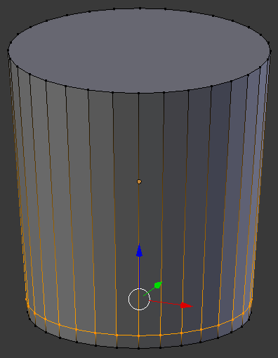
- Create another cut as follows:
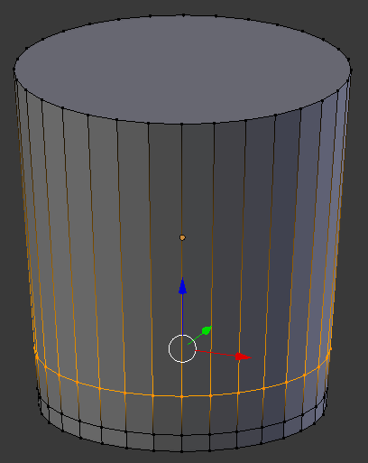
- Create another cut as follows:
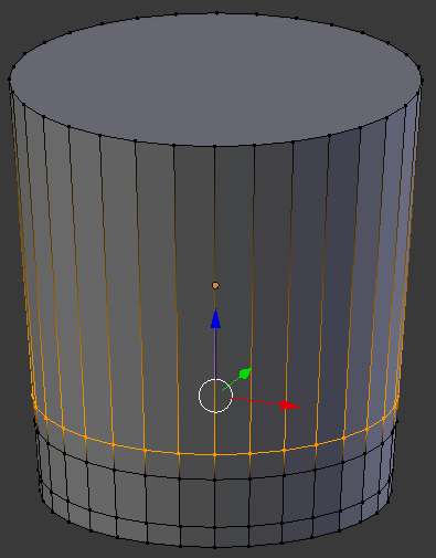
- Create another cut as follows:
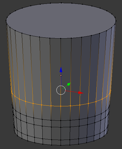
- Press Ctrl + Tab
- In the menu that appears, click Face
- Press and jold Alt, right-click one of the middle faces, and release Alt:
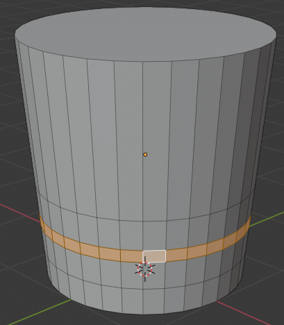
- Press S to resize
- Type .75 and press Enter:
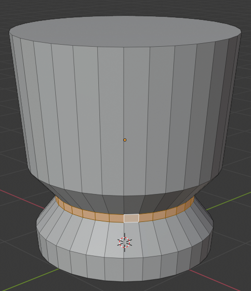
- Create a cut as follows:
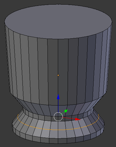
- Press S to resize
- Type .95 and press Enter
- Create a cut as follows:
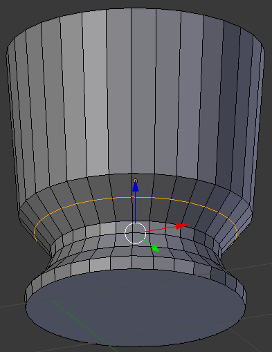
- Press S to resize
- Type .95 and press Enter:
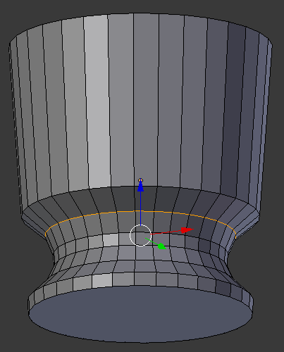
- Press Ctrl + Tab
- In the menu that appears, click Face
- Right-click the top face to select it
- Press E to extrude and press Enter
- Press G and press Z
- Type .1 and press Enter
- Press S to resize
- Type 1.05 and press Enter::
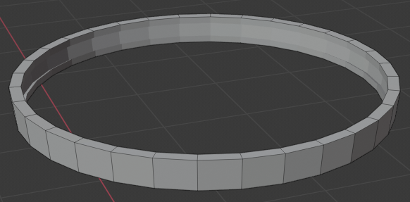
- Press E to extrude and press Enter
- Press G and press Z
- Type .1 and press Enter
- Press S to resize
- Type 1.1 and press Enter:
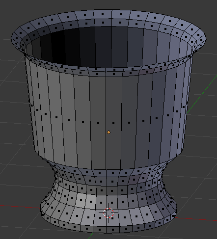
- Press X
- In the menu that appears, click Faces
- Press Tab to display the bucket in Object Mode
- In the Properties window, click the Modifiers button
- Click Add Modifier and click Solidify
- Set the Thickness value to .05
- Position the mouse in the work area and press Tab to display the bucket in Edit Mode
- To reset the cursor, press Shift + S
- In the menu that appears, click Cursor to Center
- Position the mouse in the work area, press Shift + A -> Mesh -> Cone
- In the Add Cone section below the Tools window, change the following values:
Vertices:  32
Radius 1:  1.25
Radius 2:  1.27
Depth:     .2
Location - X: 4
           Y: 0
           Z: 1.85
- Right-click the top face to select it
- Press E to extrude and press Enter
- Press S to resize
- Type .95 and press Enter
- Press X to delete
- In the menu that appears, click Faces
- Right-click the other face to select it
- Press E to extrude and press Enter
- Press S to resize
- Type .95 and press Enter
- Press X to delete
- In the menu that appears, click Faces
- In the Numeric Pad, press 7 to display the top view
- Press Z to display the wireframe
- Press B to prepare to box-select
- Draw a rectangle that covers the top part of the object
- Press B again and select the bottom edges as follows:
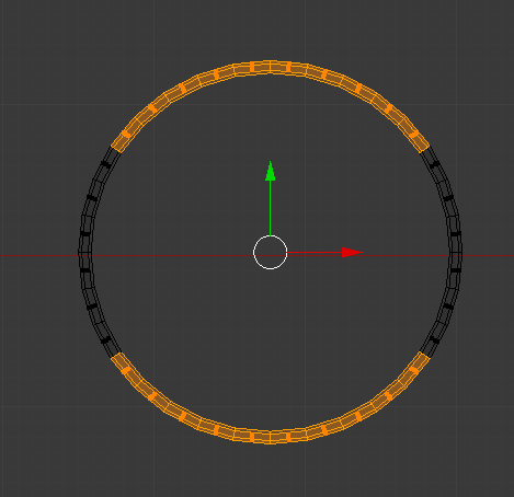
- Press X to delete
- In the menu that appears, click Faces
- Press Z to display the objects in Solid view:
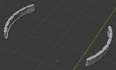
- On the menu bar of the 3D-View, click the Edge Select button

- Right-click a small edge on one side
- Press and hold Shift
- Right-click the small edge opposing it
- Release Shift:
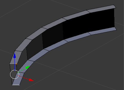
- Press F to create a face
- In the same way, create a face of the edges on the other side:
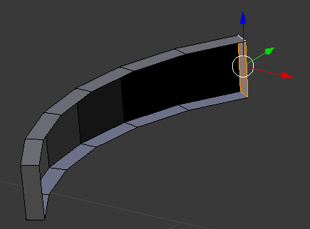
- Also create faces on the other object:
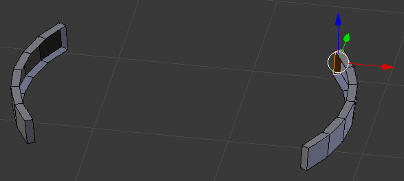
- Press A to deselect everything
- Press Z to display the wireframe
- In the Numeric Pad, press 7 to display the top view
- Press B to box-select
- Draw a rectangle that covers the whole left object
- Press Z to display the object in Solid view
- Move the view and move the object on the left side of the bucket
- In the same way, select the move the other object to the right side of the bucket
- Press Shift + S
- In the menu that appears, click Cursor to Center
- Position the mouse in the work area, press Shift + A -> Mesh -> Torus
- In the Add Torus sectiom below the Tools window, change the following values:
Location -      X: 3
			      Y: 0.00
                Z: 2
Major Segments: 24
Minor Segments: 12
Major Radius:  .35
Minor Radius:  .05
- In the Numeric Pad, press 7 to display the top view
- Press A to deselect everything
- Press Z to display in wireframe
- Press B to prepare to box-select
- Draw a rectangle that covers the edges from the left to the center, including the edges in the middle:
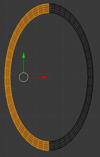
- Press X
- In the menu that appears, click Faces
- Press B again and select all edges of the object that was created
- Press Z to display the objects in Solid View
- Move the view to display the objects in perspective
- Move the torus as close as possible to the bucket::
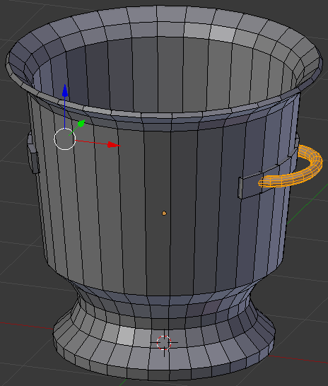
- Position the mouse in the work area, press Shift + A -> Mesh -> Torus
- In the Add Torus sectiom below the Tools window, change the following values:
Location -      X: 3
                Z: 2
Major Radius:  .35
Minor Radius:  .05
- In the Numeric Pad, press 7 to display the top view
- Press A to deselect everything
- Press Z to display in wireframe
- Press B to prepare to box-select
- Draw a rectangle that covers the edges from the right to the center, including the edges in the middle:

- Press X
- In the menu that appears, click Faces
- Press B again and select all edges of the object that was created
- Press Z to display the objects in Solid View
- Move the view to display the objects in perspective
- Move the torus as close as possible to the bucket:
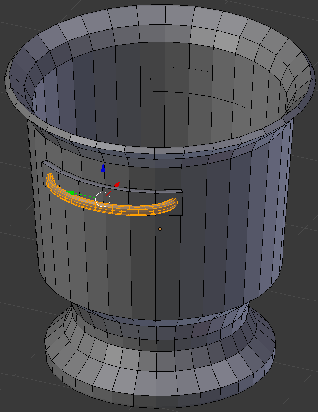
- Press Tab to display the bucket in Object Mode
- In the Modifier section of the Properties window, click Apply
- Click Add Modifier and click Subdivision Surface
- Set the View to 2
- Position the mouse in the work area and press Tab to work in Edit Mode
- Press Ctrl + R to create some cuts and position them as follows:
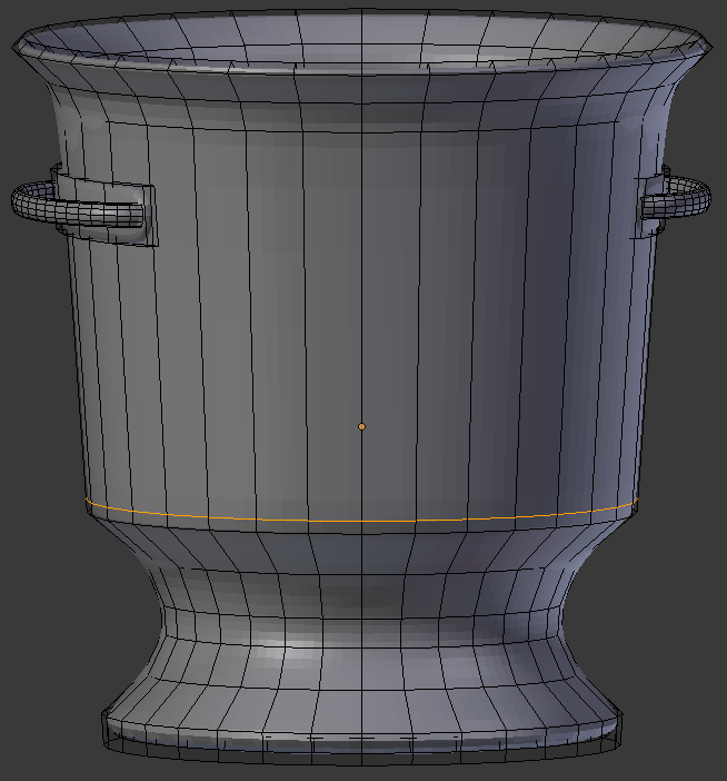
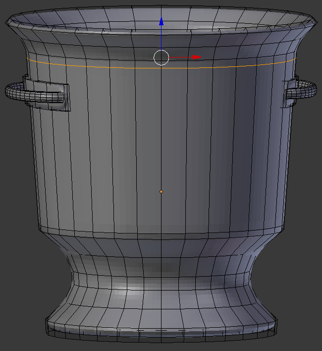
- Oress Tab
- In the Propertties window, click Apply
- In the Tools tab of the Tools window, in the Shading section, click Smooth:
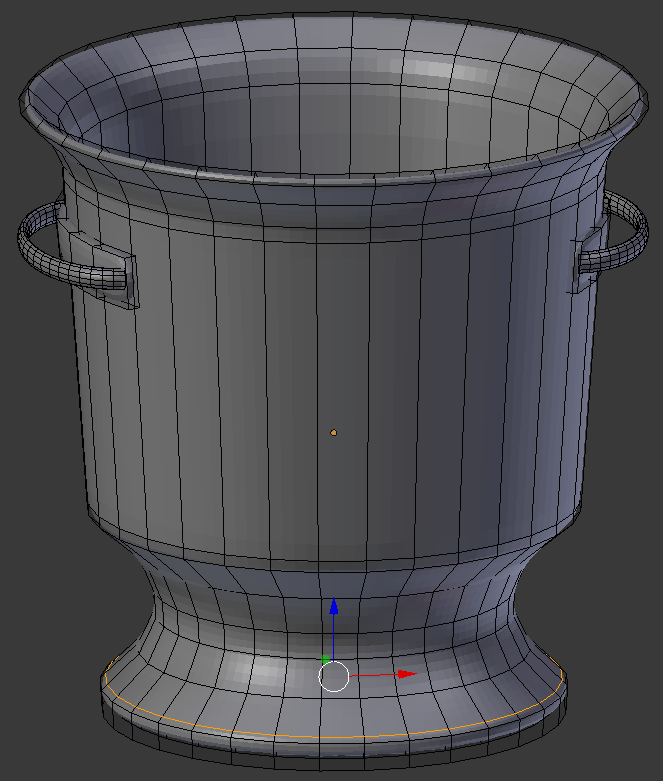
- In the Outliner, click the Restricted Viewport Visibility button (the eye) on the right side of Champaign Bucket to hide it
 Practical Learning: Creating a Picnic Table
- On the menu bar of the 3D View, click the Viewport Shading button and click Material
- Press Shift + S
- In the menu that appears, click Cursor to Center
- Position the mouse in the work area, press Shift A -> Mesh -> Cube
- In the Properties window, click the Object button

- In the Transform section, change the following values:
Location - Z:  3.1
Scale    - X: 4
	   Y: .75
	   Z: .1
- On the menu bar of the 3D View, click the Viewport Shading button and select Material
- In the Properties window, click the Material button

- Click the New button
- Double-click Material.002 to put it into edit mode
- Type Faux Wood and press Enter
- Click the Color button
- Set the RGB values as follows:
R: .73
G: .479
B: .242
- In the Properties window, click the Object button

- Position the mouse in the work area, press Shift + D to duplicate, and press Enter
- In the Properties window, below Location, click the Y value, type -1.6 and press Enter
- Position the mouse in the work area, press Shift + D to copy, and press Enter
- In the Properties window, change the Y value of the Location to 1.6 and press Enter:
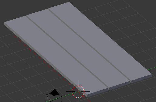
- Position the mouse in the work area, press Shift + D, and press Enter
- In the Properties window, change the following values:
Location - Y: -3.2
		     Z: 1.6
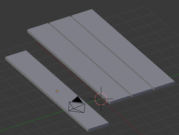
- Position the mouse in the work area, press Shift + D to copy, and press Enter
- In the Properties window, change the Y value of the Location to 3.2 and press Enter
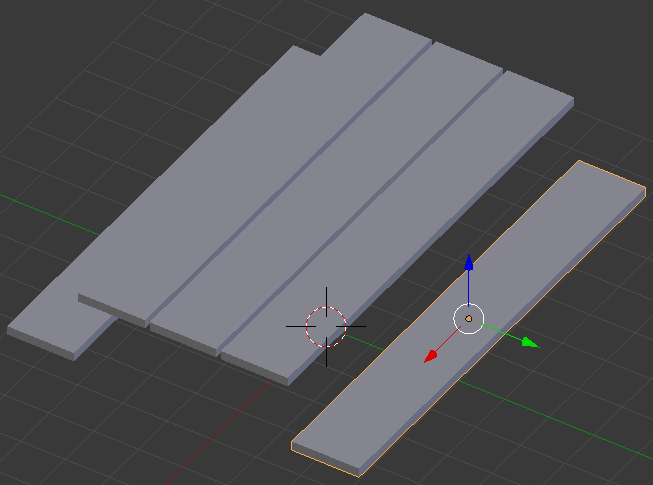
- To reposition the mouse, press Shift + S
- In the menu that appears, click Cursor to Center
- In the Tools window, click the Create tab
- In the Create tab of the Tools window, click Cube
- In the Object section of the Properties window, change the following values:
Location - X: 3.25
           Z:  2.85
Scale    - X: .1
	  	     Y: 2.35
		     Z: .15
- In the Properties window, click the Material button

- Click the button on the left side of New and select Faux Wood
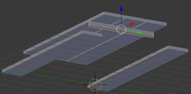
- In the Properties window, click the Object button

- Position the mouse in the work area, press Shift + D, and press Enter
- In the Properties window, under Location, click the X value, type -3.25 and press Enter
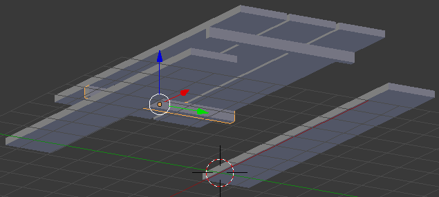
- Position the mouse in the work area, press Shift + D, and press Enter
- In the Properties window, change the following values:
Location - Z: 1.35
Scale    - Y: 4
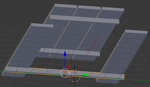
- Position the mouse in the work area, press Shift + D, and press Enter
- In the Properties window, under Location, click the X value, type 3.25 and press Enter:
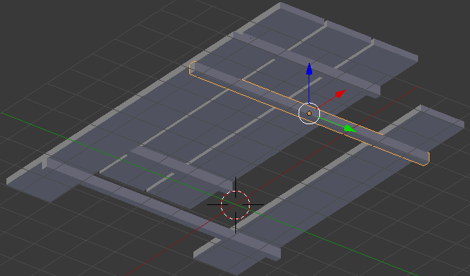
- To reposition the mouse, press Shift + S
- In the menu that appears, click Cursor to Center
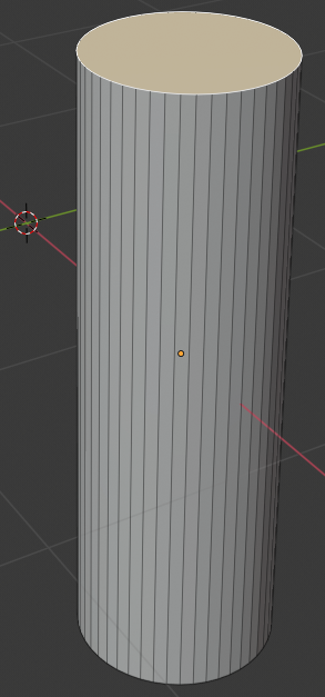
- In the Create section of the Tools tab, click Cylinder
- In the Add Cylinder section below the Tools window, change the following values:
Vertices:    12
Radius:      .15
Depth:       1.5
Location   - X: 3
	           Y: -3.25
	           Z: .75
- In the Properties window, click the Material button

- Click the New button
- Click Material.002 to put it into edit mode
- Type Worn Steel and press Enter
- Click the Color button
- Set the RGB values as follows:
R: .065
G: .025
B: .005
- In the Properties window, click the Object button

- Position the mouse in the work area, press Shift + D, and press Enter
- In the Properties window, under Location, click the X value, type -3 and press Enter:
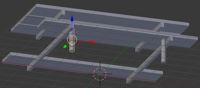
- Position the mouse in the work area, press Shift + D, and press Enter
- In the Properties window, change the Y location to 3 and press Enter:
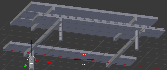
- Position the mouse in the work area, press Shift + D, and press Enter
- In the Properties window, change the X location to 3 and press Enter:
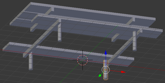
- Position the mouse in the work area, press Shift + D, and press Enter
- In the Properties window, change the following values:
Location - Y: -1.5
	         Z: 1.5
Scale  -   Z: 2
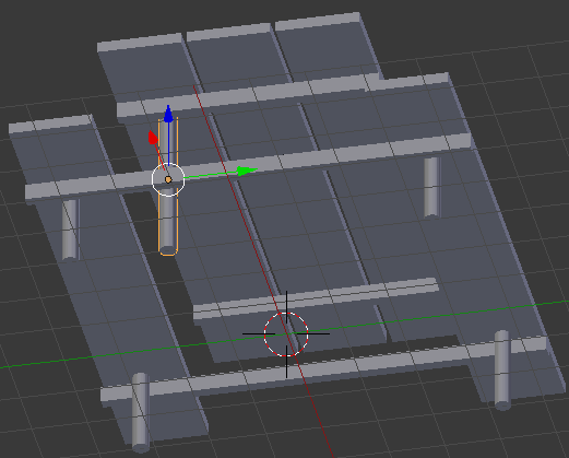
- Position the mouse in the work area, press Shift + D, and press Enter
- In the Properties window, change the Y location to 1.5 and press Enter
- Position the mouse in the work area, press Shift + D, and press Enter
- In the Properties window, change the X location to -3 and press Enter
- Position the mouse in the work area, press Shift + D, and press Enter
- In the Properties window, change the Y location to -1.5 and press Enter:
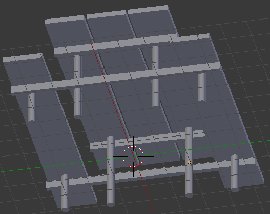
 Practical Learning: Putting the Objects Together
- In the Properties window, click the World button

- Click Use Nodes
- Click the Color button and click RGB
- Set the RGB values as follows:
R: .745
G: 1
B: 1
- Position the mouse in the work area
- In the Numeric Pad, press 1 to display the front view (make sure you are in orthogonal view)
- In the Outliner, click the Restrict Viewport Visibility button (the eye) on the right side of Ice Bucket to display it
- In the work area, right-click the ice bucket to select it
- In the Tools window, click the Physics tab
- In the Add/Remove section, click Add Passive
- Position the mouse in the work area.
Either press G or use the blue and red arrows on the screen to position the ice bucket somewhere on the top-left of the table:
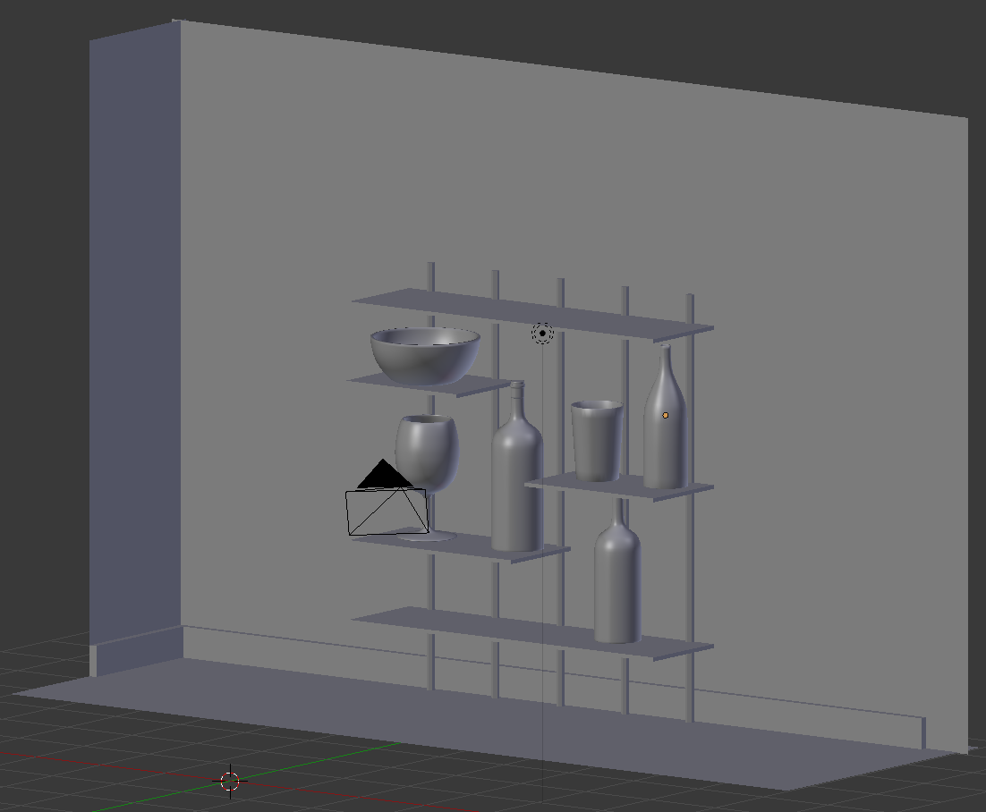
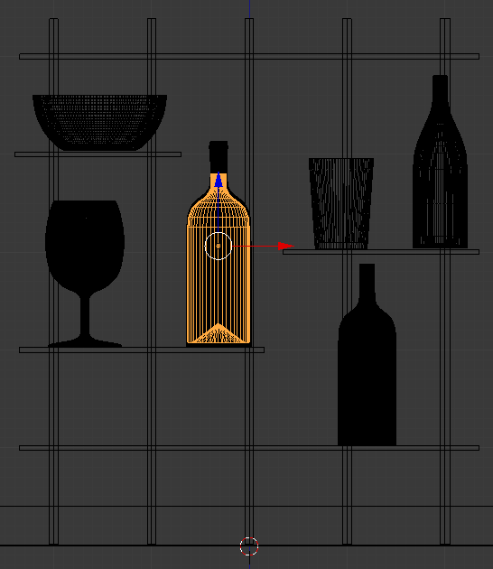
- In the Numeric Pad, press 3 to display a side view and, either make sure the bucket is on the table or position it on the table (use the green arrow to position the ice bucket). Here is an example:
- In the Numeric Pad, press 1
- On the Tools window, click Create
- Click Cube (there will be many ice cubes; we will simply duplicate one to get many)
- In the Add Cube section below the Tools window, change the radius to .1 and press Enter
- In the Tools window, click the Physics tab
- In the Add/Remove section, click Add Active
- In the Properties window, click the Material button
- Click the New button (we are creating a material on this one cube so that all duplicates ice cube will use the same material, but we are not interested in specifying the actual material at this time)
- Still in the Properties window, click the Modifiers button
- Click Add Modifier and click Bevel
- Click the Width value, type .02 and press Enter
- Position the mouse in the work area.
Press G and move the cube somewhere above the ice bucket. Here is an example:
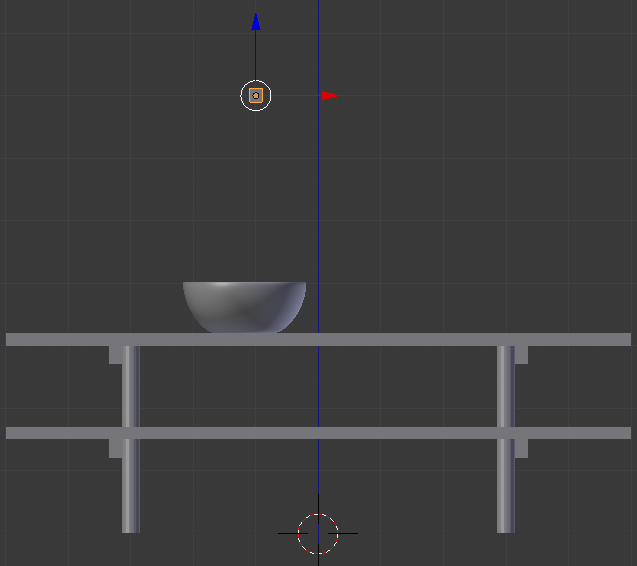
- In the Numeric Pad, press 3
- Visually position the cube above the bucket
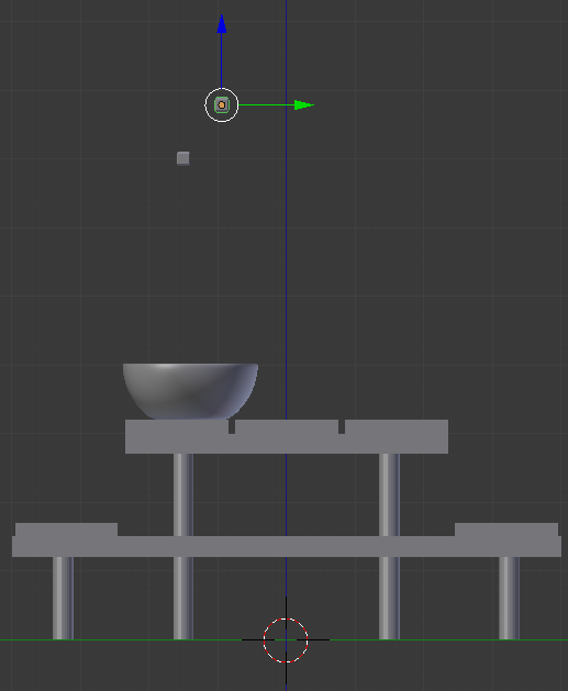
- Position the mouse in the work area. Press Shift + D and press Enter
- Press Shift + D and press Enter about 40 times (it doesn't have to be exactly 40 times; we just need 40 somehow independent cubes but we can't use an array)
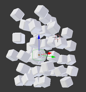
- Right-click a cube to select it, move it. Cchange to the side view, the front view, and the top view. Use the Rotate button on the menu bar of the 3D View to rotate the cube. Visually keep all ice cubes within the width of the bucket. Create the group of cubes approximately as follows (your design doesn't have to match mine):
- In the Numeric Pad, press 1
- In the Outliner, click the Restrict Viewport Visibility button on the right side of Classic Cup to display it
- In the work area, right-click the Classic Cup to select it
- Press S to resize it
- Type .35 and press Enter
- Using either the G key or the blue and red arrows on the screen, position the cup somewhere on top of the table:
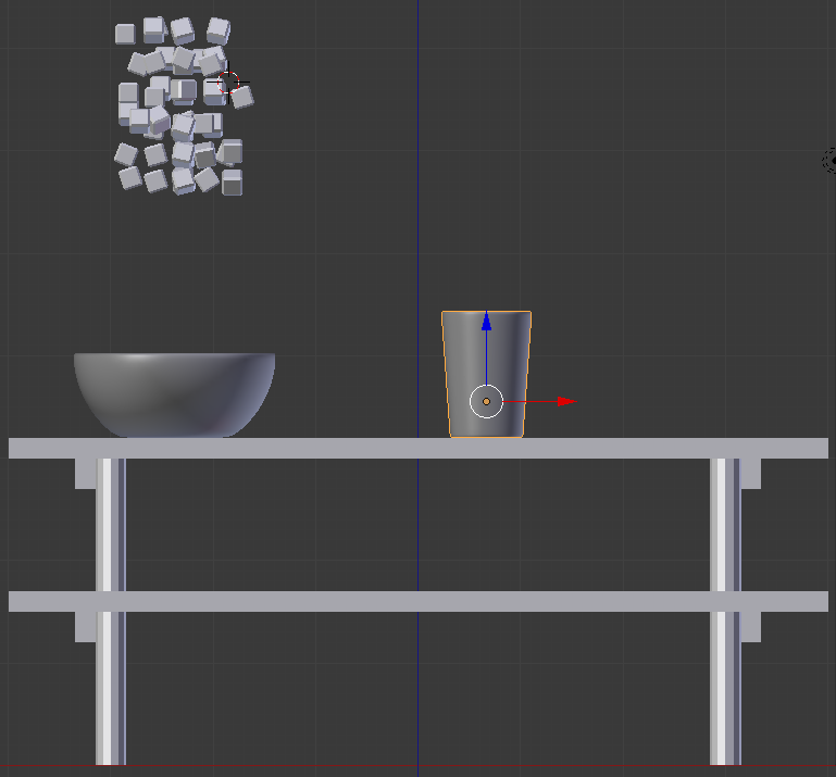
- In the Numeric Pad, press 3 to display a side view
- Use the green arrow to position the cup somwhere around the front of the table:

- In the Numeric Pad, press 1
- In the Outliner, click the Restrict Viewport Visibility button on the right side of Empty Glass to display it
- In the work area, right-click the Empty Glass to select it
- Press S to resize it
- Type .75 and press Enter
- Using either the G key or the blue and red arrows on the screen, position the Empty Glass somewhere on top of the table:
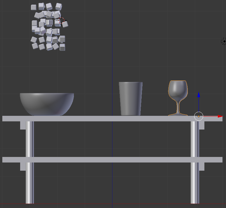
- In the Numeric Pad, press 3 to display a side view
- Use the green arrow to position the empty glass somwhere around the front side of the table:

- In the Numeric Pad, press 1
- In the Outliner, click the Restrict Viewport Visibility button on the right side of Chantlly to display it
- In the work area, right-click the Chantilly bottle to select it
- Using either the G key or the blue and red arrows on the screen, position the Chantilly bottle somewhere on top of the table:
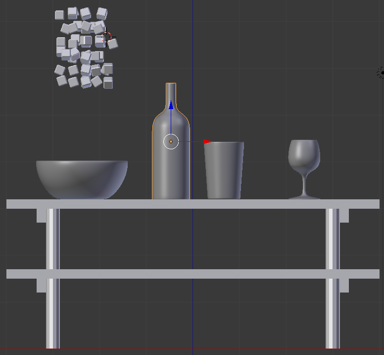
- In the Numeric Pad, press 3 to display a side view
- Use the green arrow to position the Chantilly bottle somwhere around the back side of the table:
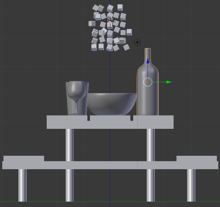
- In the Numeric Pad, press 1
- In the Outliner, click the Restrict Viewport Visibility button on the right side of White Wine Bottle to display it
- In the work area, right-click the new bottle to select it
- Using either the G key or the blue and red arrows on the screen, position the new bottle somewhere on top of the table:
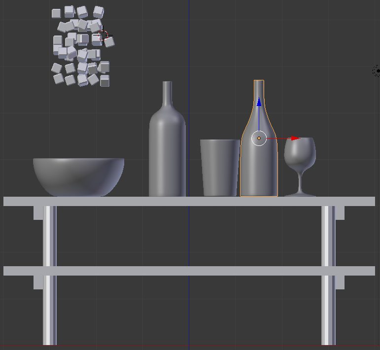
- In the Numeric Pad, press 3 to display a side view
- Use the green arrow to position the new bottle somwhere around the back side of the table:
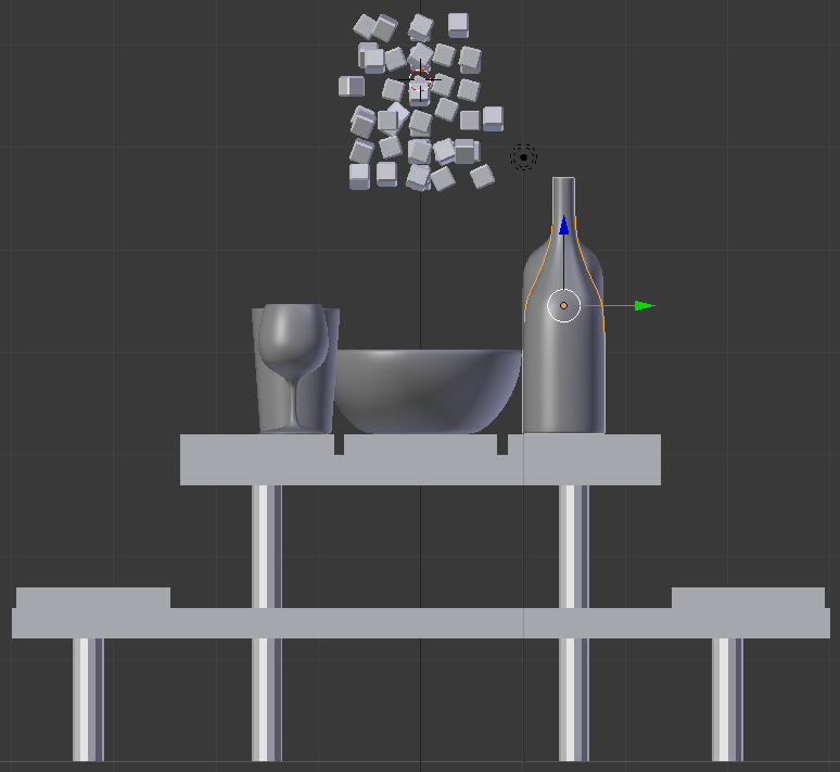
- In the Numeric Pad, press 1
- In the Outliner, click the + button of Bottle of Red Wine to expand it
- Click the Restrict Viewport Visibility button on the right side of Bottle Cap to display it
- Still in the Outliner, click the Restrict Viewport Visibility button on the right side of Bottle of Red Wine to display it
- In the work area, right-click the new bottle to select it
- Using either the G key or the blue and red arrows on the screen, position the new bottle somewhere on the top of the table:
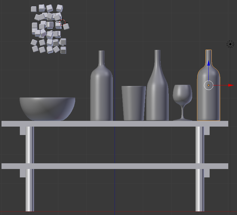
- In the Numeric Pad, press 3 to display a side view
- Use the green arrow to position the new bottle somwhere around the back side of the table:
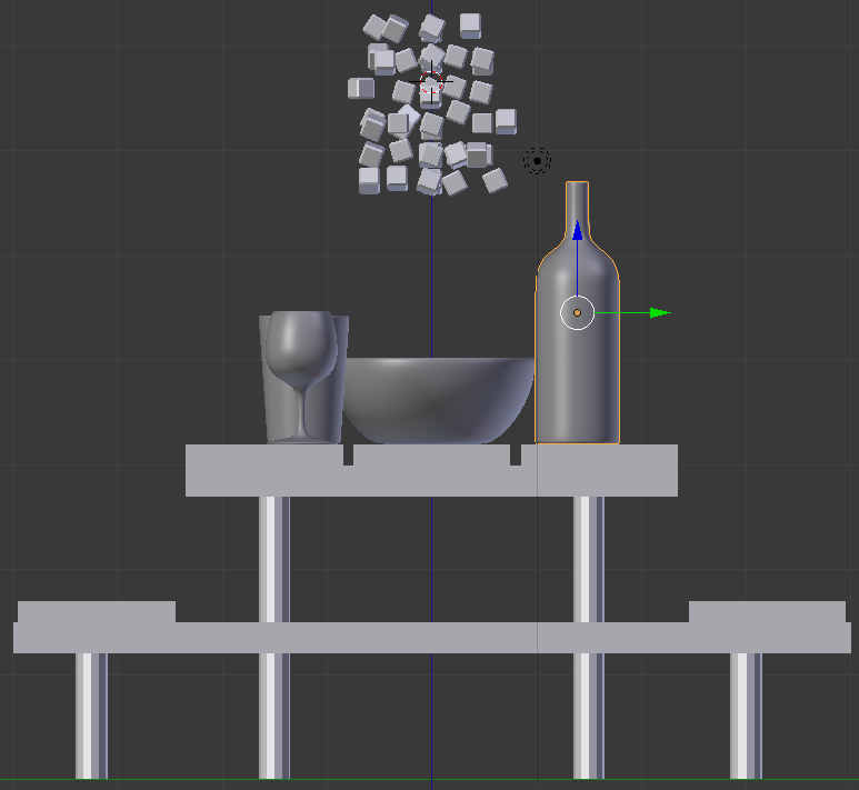
- In the Numeric Pad, press 1
- In the Outliner, click the Restrict Viewport Visibility button on the right side of Red Wine to display it
- Press Z to switch to wireframe
- In the work area, right-click the wine to select it
- Using either the G key or the blue and red arrows on the screen, position the wine within the Bottle of Red Wine on top of the table:

- In the Numeric Pad, press 3 to display a side view
- Use the green arrow to position the wine within the bottom side of the Bottle of Red Wine:
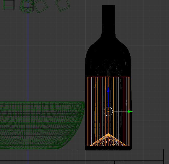
- Press Z to display the shapes in Solid Viewport:
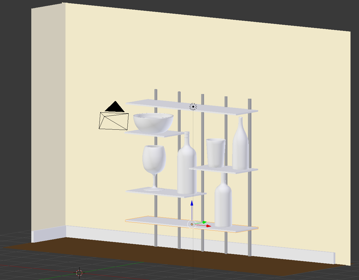
- In the Numeric Pad, press 5 to display the work area in perspective view
- In the Tools window, click Create and click Plane
- In the Add Plane below the Tools window, change the following values:
Radius:    36
Location - X: -25
           Y:  25
           Z:  .01
- On the menu bar of the 3D View, click the Viewport Shading button and select Material
- In the Properties window, click the Material button

- In the Properties window, click the New button
- Click the Color button and se the color as follows:
R: .003
G: .08
B.001
- Position the mouse on the work area and, in the Numeric Pad, press 0 to display the camera view
- Press N to display the Properties Region
- In the Properties Region, click Lock Camera to View to put a check box on it
- Use the mouse and keyboard to display the view any way you want. Here is an example::
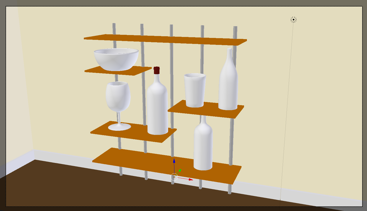
- In the Properties Region, click Lock Camera to View to remove the check box
Creating a Glass
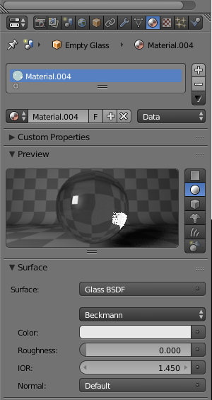
To support the ability to create transparent objects, Blender provides a material named Glass BSDF. Like the Diffuse material, the Glass BSDF material is equipped with the color characteristic that can be used to give a colored appearance to a transparent object.
 Practical Learning: Creating a Glass
- In the Outliner, click Empty Glass to select it
- In the Material section of the Properties window, click the New button
- Click the Preview button to expand it
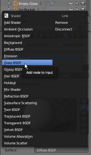
- Click Diffuse BSDF
- In the menu that appears, click Glass BSDF:
- Right-click the left border of the Properties window and click Split Area:

- Position the mouse somewhere between the top border and the center of the work area
- Click to confirm. If necessary, resize the windows
- In the bottom-left side of the new window, click the 3D Viewport button and select Node Editor

- In the Outliner, click
White Wine Bottle to select it
- In the Node Editor, click the New Button
- Zoom in the Node Editor to see the material window as much as possible
- In the Material section of the Properties window, click Diffuse BSDF and select Glass BSDF
- In the Node Editor, click the Color button
- Set the RGB value as follows:
R: .75
G: .705
B: 0.35
- In the Outliner, click Bottle of Red Wine
- On the Node Editor menu bar, click the New button
- In the Node Editor, click somewhere in the Diffuse window
- Press Delete to remove it
- On the menu bar of the Node Editor, click Add -> Shader -> Glass BSDF
- Position the mouse on the left of the Material Output window and click
- Draw the gree button from Glass BSDF to the Surface button:

The Roughness of a Glass
Like the Diffuse material, the Glass BSDF has a characteristic named Roughness. The Roughness of a glass is a decimal value between 0.0 and 1.00. When the value is set to 0 (or 0.00), the object is perfectly transparent. In this case, depending on the type of object, you may be able to see what is on the other side of the object. If/When the roughness is set to 1 (or 1.00), the transparency level of the object is semi-completely blurred.An object is referred to as glossy if it shines. To support this, Blender provides a material named Glossy BSDF.
 Practical Learning: Applying Roughness to a Glass
- In the work area, right-click any of the small cubes above the ice bucket:
- In the Node Editor, click the Roughness value
- Type .35 and press Enter
- In the Outliner, click Ice Bucket to select it
- In the Material section of the Properties window, click New
- In the Material section of the Properties window, click Diffuse BSDF and click Glass BSDF
- In the Node Editor, Click the Roughness value
- Type .05 and press Enter
- In the Outliner, click Chantilly
- On the menu bar of the Node Editor, click the New button
- In the Material section of the Properties window, click Diffuse BSDF and click Glass BSDF
- In the Node Editor, click Color and set the RGB value as follows:
R: 0.800
G: .6
B: .55
- Set the Roughness to .075

- In the Outliner, click Classic Cub
- In the Node Editor, click the New button
- In the Properties window, click Diffuse BSDF and click Glass BSDF
- Click the Roughness value, type .002 and press Enter
- In the Outliner, click Red Wine
- On the menu bar of the Node Editor, click the New button
- In the Node Editor, right-click anywhere in the Diffuse widow to select it and press X
- On the menu bar of the Node Editor, click Add -> Shader -> Glass BSDF
- Position the mouse on the left side of Material Output and click
- Drag the green button from BSDF to Surface
- Click the Color button and click Hex
- Click the Hex value, type 500508 and press Enter
- Click the Roughness value, type .85 and press Enter
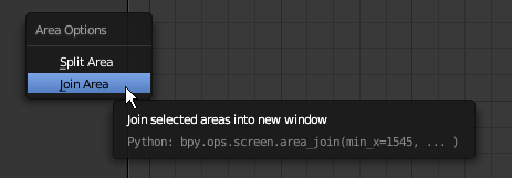
- Right-click the line between the 3D Viewport and the Node Editor
- In the menu that appears, click Join Area:
- Position the mouse in the Node Editor and click
- Press N to click the Properties Region
- In the Timeline window, set the End value to 100
- In the Properties window, click the Render button
- In the Output section, click the button on the right side of /tmp/, select the desired directory and click Accept
- Make sure the File Format is set to PNG
- Clicking the Animation button
Fundamentals of Materials
The most fundamental and most regularly used material is called Diffuse BSDF.
 Practical Learning: Introducing Glossiness
- In the Properties window, click the Object button
- In the Object section of the Properties window, change the Z location to 1.75
- The Point structure provides other constructors you can use for the location of a control.
- Click Color and click RGB
- Se the RGB values as follows:
R: .163
G: .008
G: .004
- In the top menu bar, click Blender Render and select Cycles Render
- In the Properties window, in the Resolution section, click 50%, type 100 and press Enter
- Still in the Properties window, click Sampling to expand it
- In the Properties window, click the Object button

- In the Tools window, click Create
- Click Plane
- Type Empty Glass and press Enter
- In the Transform section, change the following values:
Location - X: 1
	Y: 1
- Move the view and zoom so you can see the top side of the plane
- To prepare to edit the plane, on the menu bar of the 3D View, click Object Mode and click Edit Mode
- The Vertex Select option should be On (if you have doubt, on the menu bar of the 3D-View, click the Vertex Select button
 )
)
On the plane, right-click the vertex in the top-left side
- Press and hold Shift
- Right-click the vertex in the top-right side and the vertex in the bottom-right side
- Release Shift:

- Press X to delete
- In the menu that appears, click Vertices:

- Right-click the vertex that was left (if you don't see it, simply press A to select everything)
- Press G to move the vertex
- Press Z to move vertically
- Type .02 and press Enter
- Now we will draw a series of lines.
Press E to extrude
- Type -.02 and press Enter to move down
- Type .04 and press Enter
- Press E to extrude and press X
- Type .04 and press Enter
- Press G and press Z
- Type .04 and press Enter
- Press E and press X to extrude horizontally
- Type .85 and press Enter
- Press G and press Z to move the vertex slightly vertically
- Type .1 and press Enter
- Press E and press X
- Type .5 and press Enter
- Press E and press X
- Type .05 and press Enter
- Press G and press Z
- Type .3 and press Enter
- Press E and press X
- Type .05 and press Enter
- Press G and press Z
- Type .3 and press Enter
- Press A to select all vertices:
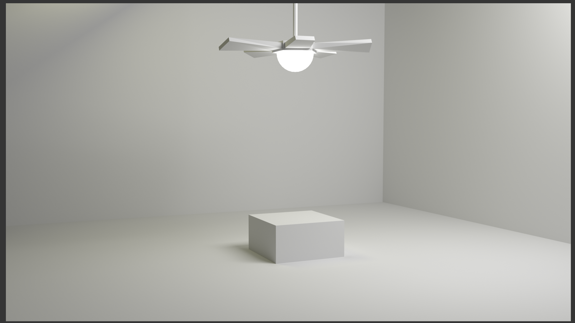
- To reposition the mouse, press Shift + S
- In the menu that appears, click Cursor to Center
- In the Numeric Pad, press 7 to display the top view (it is not required but convenient to make sure the iew is orthographic; if you have doubt, press 5 and make sure the top left corners of the work area displays Top Ortho)
- In the Tools window, click the Tools tab if necessary.
In the Add section, click Spin
- In the Spin section below the Tools window, change the following values:
Steps: 72
Angle: 360
Introduction
In Blender, the world is the environment in which everything exists. In the real world, it primarily consists of the sky whole primary color is blue but can be any other color.
- In the Tools window, click Create and click Ico Sphere
- In the Add Ico Sphere section below the Tools window, change the follos change the following value
- While the cube is selected, position the mouse in the work area, press M and, in the Layers window, click the second box
- Position the mouse on the cube and press Tab to switch to Edit Mode
- Position the mouse on the top face, press Ctrl + R and move the mouse to get a line parallel to the red arrow (the X axis)
- Click twice to confirm the cut:
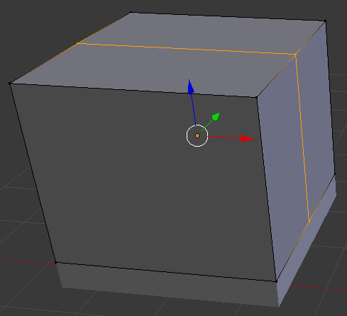
- On the menu bar of the 3D View, make sure the Edge Select button is selected.
Right-click the top line to select it
- Press G to move the line
- Press Z to move up
- Type .75 and press Enter:

- On the menu bar of the 3D View, click the Face Select button
- Select the top two faces:
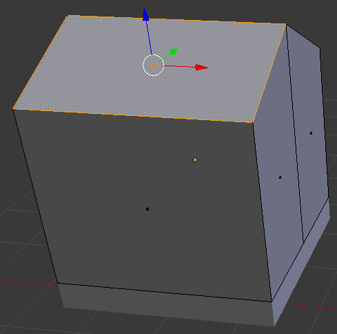
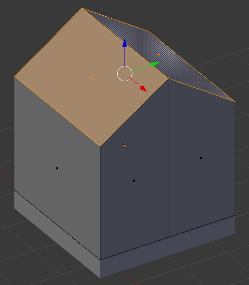
- Press P and, on the menu that appears, click Selection
- Press Tab to switch to Object mode
- Right-click the top of the house to select the roof
- Press S to resize
- Type 1.1 and press Enter:

- Press Tab to switch to Edit Mode
- Press A to select both sides of the roof
- Press E to extrude and press Enter
- Press G and press Z to move vertically
- Type .05 and press Enter
- Press Tab to switch to Object Mode
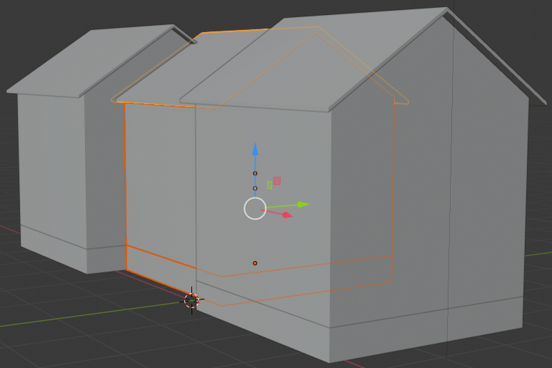
- In the Numeric Pad, press 3 to display the right view and press 5 to work in orthogonal projection
- Move the roof down to the top of the house:
- In the Numeric Pad, press 1 to display the front view
- While the roof is selected, press and hold Shift, then click the body of the mouse, and release Shift to select the house and its roof
- Press Shift + D to copy
- Press X to move the duplicate horizontally
- Move the new house to the right of the other:

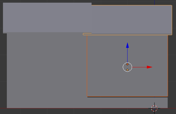
- While the new house is selected, press S to resize it
- Press Z to resize it only by its height
- Resize it a little bit:
- Move the view so you can see the house in perspective
- Move the mouse and its roof to the same floor as the first house and attach the house to the first one
- Move the Y alignment to be slightly behind the first house:

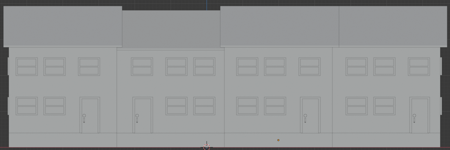
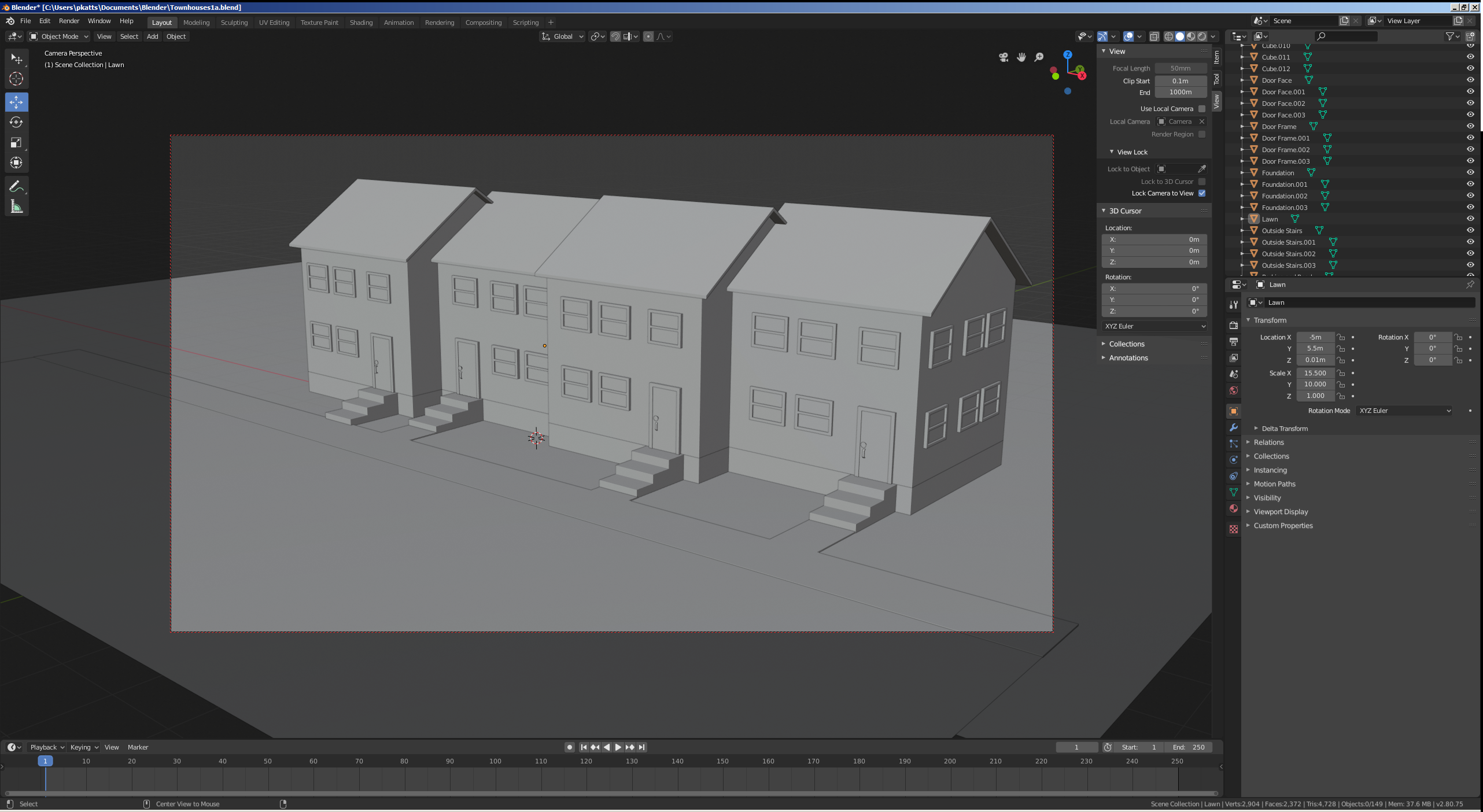
- In the same way, create a block of 4 townhouses. The houses should have the same width and same depth bu the various heights (these are not requirements, just suggestions):
- On the menu bar of the 3D View, in the Visible Layers section, click the second button
- Zoom in to have a large face facing you
- Right-click the box to select the cube:

- Press Tab to display in Edit Mode
- if necessary
Right-click a large face to select it
- Press I to create an inset on the selected face
- Type .15 and press Enter:
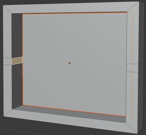
- Press E to extrude
- Type -.05 and press Enter:
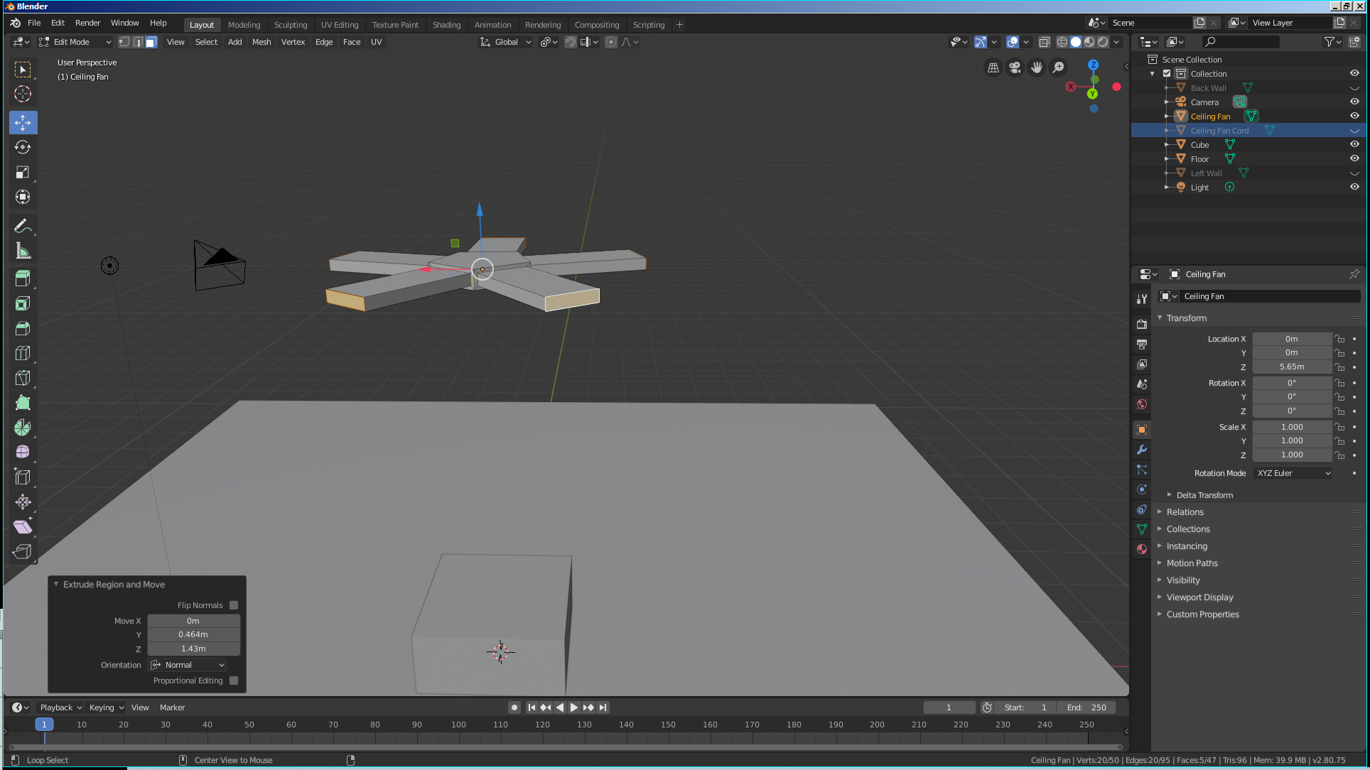
- While the face is still selected, press P to separate
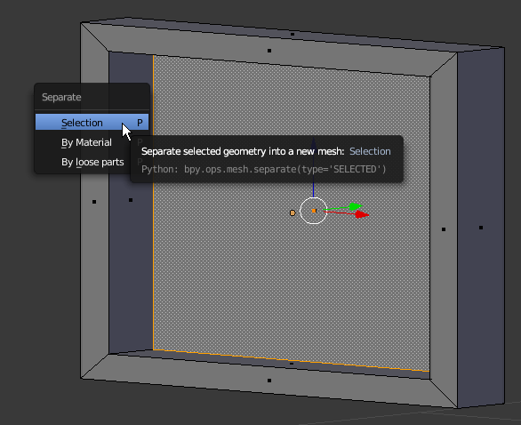
- In the menu that appears, click Selection
- Press Ctrl + R and make sure you get a horizontal cut on the window, then roll the middle mouse button to get two cuts:
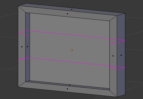
- Click twice to confirm the cuts
- On the menu bar of the 3D View, click the Pivot Point button and select Active Element
- While the cuts are still selected, press S to move them
- Press Z to move vertically
- Type .2 and press Enter:

- On the menu bar of the 3D View, click the Face Select button

- Right-click one of the small interior faces:
 z
z
- Press E
- Using the red arrow, move the small face to the opposite border:
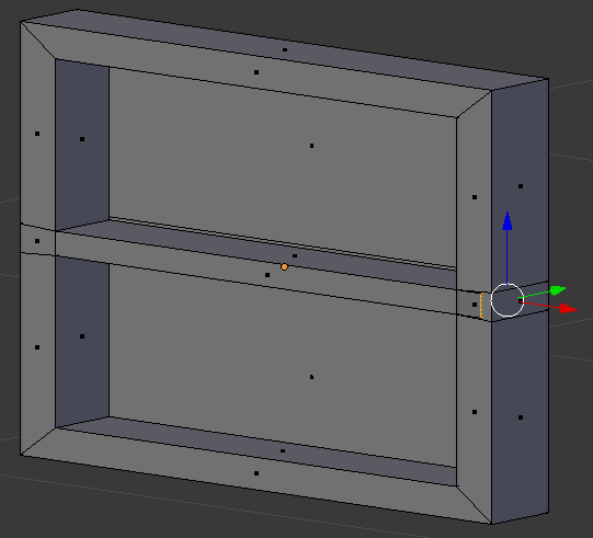
- On the menu bar of the 3D View, click Edit Mode and select Object Mode
- Right-click inside the window to select the face that was separated
- While the face is still selected, in the Properties window, click the Object button, double-click Cube.0XX, type Window Interior and press Enter
- Still in the Properties window, click Material and click New
- Double-click Material.0XX,
- In the Numeric Pad, press 1 and press Z to display the wireframe
- Press S to resize it
- Type 1.1 and press Enter:
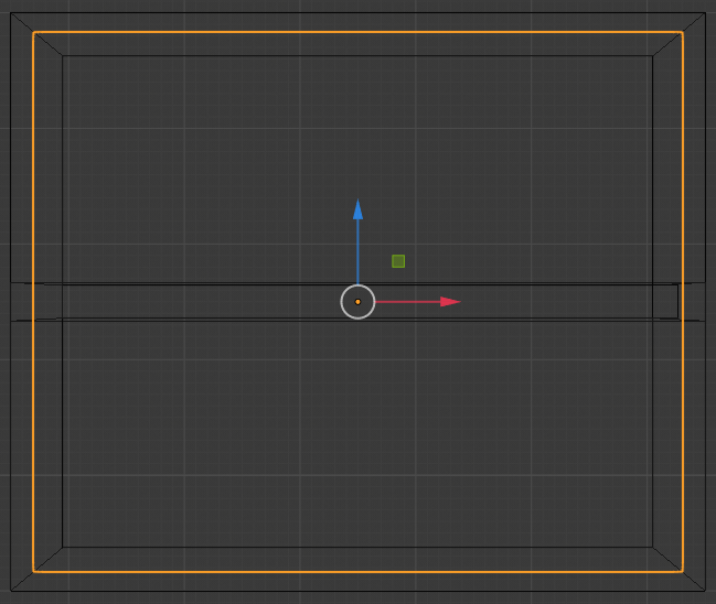
- Press Z to exit the wireframe
- While the inside face of the window is still selected, press and hold Shift, then right-click one of the borders of the window to select them both
- Press Shift + D to copy the shapes
- Press Z to move vertically
- Type 1 and press Enter
- Press Shift + D to copy
- Press X to move the copy horizontally
- Move the mouse to the right
- While the new window is still selected, press S to resize
- Press X to resize along the width only
- Type 1.5 and press Enter
- Right-click the border of the window to select its frame
- In the Object section of the Properties, double-click Cube.00X, type Odd Window Large and press Enter
- Press Tab to switch to Edit Mode
- Press Ctrl + Tab and click Face
Move the inside faces so their borders resemble those of the other windows:
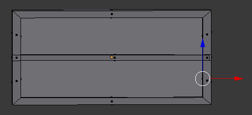
- Press Ctrl + R and make sure you get a vertical cut on the window, then roll the middle mouse button to get two cuts
- Click twice to confirm the cuts
- On the menu bar of the 3D View, click the Pivot Point button and select Median Point
- While the cuts are still selected, press S to move them
- Press X to move vertically
- Type .15 and press Enter
- On the menu bar of the 3D View, click the Face Select button

- Right-click one of the small interior faces:
 z
z
- Press E
- Using the blue arrow, move the small face to the opposite border
- In the same way, move the small face of the horizontal interior bar:
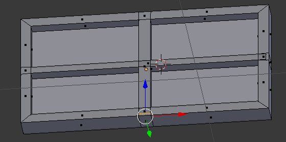
- Press Tab to display in Object Mode
- Position the mouse in the work area and ppress Shift + D to duplicate
- Press Z to move vertically
- Move the mouse down and away from the top window
- While the window is still selected, in the Object button of the Properties window, double-click Cube.00X, type Even Window Large and press Enter
- In the Properties window, click the Material button

- Right-click the border of the top-left window to select it
- In the Material section of the Properties window, click the New button
- Double-click Material.001, type Brown Frame Small and press Enter
- Right-click the border of the bottom-left window to select it
- In the Material section of the Properties window, click the New button
- Double-click Material.001, type Blue Frame Small and press Enter
- Right-click the border of the top-right window to select it
- In the Material section of the Properties window, click the New button
- Double-click Material.001, type Brown Frame Large and press Enter
- Right-click the border of the bottom-right window to select it
- In the Material section of the Properties window, click the New button
- Double-click Material.001, type Blue Frame Large and press Enter
- Select the bottom-left window and its inside
- Press Shift + D to copy them and press Enter
- Zoom out to see less of the windows
- Press M and, in the Move to Layers window, click the first button
- In the menu bar of the 3D View, click the first button of the Visible Layers section
- While the window and its inside are selected, press Shift + D to copy them
- Press Z to move the copy vertically
- Move the window up (no need for precision, you will adjust everything later):
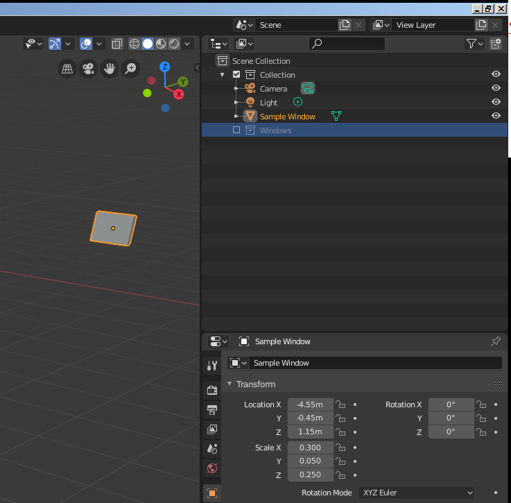
- On the menu bar of the 3D View, in the Visible Layers section, click the second button
- Right-click the inside of the large window to select its glass
- Press and hold Shift, then right-click the border of that large window, and release Shift
- Press Shift + D to duplicate and press Enter
- Press M and, in the Move to Layers window, click the first button
- On the menu bar of the 3D View, in the Visible Layers section, click the first button
- Position the window to the right of the top window (no need for precision, you can adjust everything later):

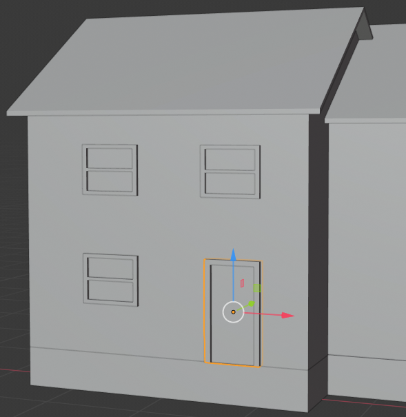
- On the menu bar of the 3D View, click Add -> Mesh -> Cube
- While the cube is selected, in the Properties window, click the Object button and change the following values:
Location - X: -3.65
           Y:  0
           Z: .5
Scale    - X: .28
           Y: .05
           Z: .5
:
- On the menu bar of the 3D View, in the Visible Layers section, click the second button
- Select the top-left window and its inside to select them
- Press Shift + D to copy and press Enter
- Press M and, in the Move to Layer window, click the first button
- On the menu bar of the 3D View, in the Visible Layers section, click the first button
- Move the window to the next house
- On the menu bar of the 3D View, in the Visible Layers section, click the second button
- Select the top-right window and its inside to select them
- Press Shift + D to copy and press Enter
- Press M and, in the Move to Layer window, click the first button
- On the menu bar of the 3D View, in the Visible Layers section, click the first button
- Move the window to the next house
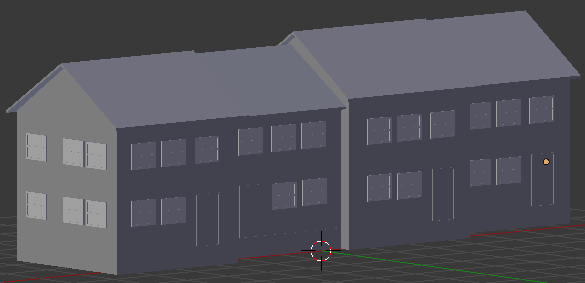
- By duplicating and moving windows and doors, complete the design to adding windows and a door to each townhouse. The placements of windows and doors don't have to follow the same pattern:

- In the Tools window, click the Create tab
- In the Create tab of the Tools window, click Plane
- In the Transform section, change the following values:
Name: Green Grass
Location - X: -6.5
           Y: -4
           Z: .01
Scale:     X: 15.5
           Y: 10
- On the menu bar of the 3D View, click Add -> Mesh ->Plane
- In the Object section of the Properties window, in the Transform section, change the following values:
Location - X: -1
           Y: -1.5
           Z: .01
Scale:     X: 10
           Y: .5
- Position the mouse in the work area and press Shift + A -> Mesh -> Plane
- In the Object section of the Properties window, in the Transform section, change the following values:
Name:      Parking and Road
Location - X: -1
           Y: -4
           Z: .02
Scale:     X: 10
           Y: 2
- In the Properties window, click the Material button

- Right-click the roof of the left house
- In the Material section of the Properties window, double-click Material to edit it
- Type Grey Shindgles and press Enter
- Click the Color button and set the color value as follows:
R: .303
G: .303
B: .293
- Right-click the body of the left house to select it
- In the Material section of the Properties window, click the + button on the left side of Data
- Click Color and set the color as follows:
R: .319
G: .133
B: 0
- Right-click the body of the second house to select it
- Click the + button on the left side of Data
- Click Color and set the color as follows:
R: .287
G: .041
B: .016
- Right-click the body of the third house to select it
- Click the + button on the left side of Data
- Click the Color button and set the color as follows:
R: .337
G: .205
B: .12
- Right-click the body of the fourth house to select it
- Click the + button on the left side of Data
- Click the Color button and set the color as follows:
R: .546
G: .319
B: 0
- In the Outliner, click Odd Window Small to select it (or right-click the border of one of the small windows of the first house to select it)
- Click the Color button and change the color as follows:
R: .107
G: .013
B: .003
- In the Outliner, click Odd Window Large
- Click the Color button and change the color as follows:
R: .107
G: .013
B: .003
- Set the color of the frames of the windows of the second and fourth houses as follows:
R: 1
G: .587
B: .169
- In the Outliner, click Window Inside (or right-click the inside of one of the windows) to select it
- In the Material section of the Properties window, click New then click Color
- Set the color value as follows:
R: .47
G: .597
B: .8
- Right-click the door of the first house to select it and click New
- Double-click Material.0XX, type Window Glass and press Enter
- Click Color of the and set the color of the door of the first house as:
R: .296
G: 0
B: 0
- Click the inside of each window
- Set the color of the door of the second house as:
R: .8
G: .184
B: .018
- Set the color of the door of the third house as:
R: .8
G: .385
B: .214
- Set the color of the door of the fourth house as:
R: .326
G: .069
B: .08
- In the Outliner, click Green Grass and click New Node
- Click the Color button and set the RGB values as follows:
R: 0
G: .142
B: 0
- In the Outliner, click Walkway and click New
- Click Color and set the color as follows::
R: .5
G: .5
B: .5
- In the Outliner, click Parking and Road and click New
- Click Color and set the RGB values as follows:
R: .125
G: .125
B: .125
- Add a plane in front of each house from the door to the walkway, using the same color as that of the walkway:
- In the Numeric Pad, press 0 to display the camera view
- Press N to display the Properties Region
- In the Properties Region, click Lock Camera to View
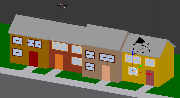
- Use the buttons on the mouse and the keyboard to get a better view. Here is an example:
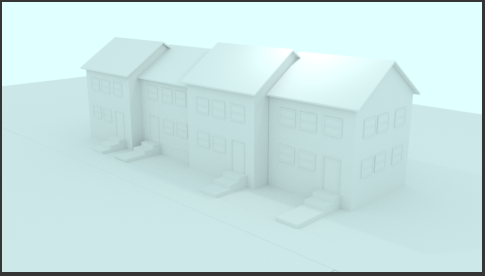
- In the Properties region, click Lock Camera to View
- Press N to close the Properties region
Creating a World
The shader used to manage the world environment is named Background. This Background shader should not be used for other objects, only to create and manage the world environment.
 Practical Learning: Introducing the World
- On the top menu, click Render -> Render Image to preview the result. Here is an example:
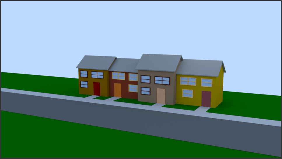
- After viewing the result, press Esc to close the render view
- Change the world color as follows:7
R: .871
G: 939
B: 1
In Blender, materials are used to paint the surface of objects, to create an environment, or to suggest special effects. Blender offers many options. The most recent is managed by a concept named Cycles Render.
In this exercise, we will review some of the techniques used to create and manade materials.
Introduction to Creating a Material
There are various ways to create a material. Cycles Render is a technique used to create materials with various options. To use Cycles Render, in the top menu bar of blender, change the combo box from Blender Render to Cycles Render.
The most fundamental technique is to first select the desired object in the work area. Then, in the Properties window, click the Material button. In the group of panels, click Add Node. There are other techniques we will review.
To assist you in managing materials, Blender provides various categories or groups of objects. A shader is the most fundamental technique used to create the appearance of an object. It can simply consist of painting an object with a certain color. It can consist of combining colors. It can consist of logically or illogically creating some type of appearance.
To distinguish them, each shader has a name. In the Properties window, the name of a shader appears in the Surface text box or combo box. That control also provides one of the ways to select a shader.
 Practical Learning: Using Cycles Render
- On the top menu bar, click Blender Render and, in the menu that appears, select Cycles Render
- On the menu bar of the 3D View, click the Viewport Shading button and select Material:
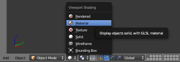
Diffusing a Color
In this exercise, we will continue to experiment with different ways to start a material and apply to the surface of an object.
Introduction
the delegate.
The Location of a Control
Introduction to the Location
Point
:
field:
Programmatically Locating a Control
You can programmatically specify the location of a control. To
support this, each control has a property named Location. To assist you
with specifying the location of a control, the Point class provides a
constructor as follows:
The Size of a Control
Introduction
The distance from the left border to the right border of a control is referred to as its
width property. In the same way, the distance from the top to the bottom borders of a control is its
height value. This can be illustrated as follows:
Programmatically Specifying the Size of a Control
To support the size of an object, the System.Drawing
namespace defines the Size structure.
There are four characteristics that define a Size value: its
location and its dimensions. A Size value must have a starting
point (X, Y) just as the Point object was illustrated earlier. The
width is the distance from the left to the right borders of a Size
object. The height represents the distance from the top to the bottom borders of
a Size value:

public Size(int width, int height);
Using this constructor, to programmatically specify the size of a control,
assign a Size value to its Size property. Here is an example:
You can also define a Size object using a Point value. To
support this, the Size structure is equipped with the following constructor:
public Size(Point pt);
After declaring a variable with this constructor, you
can access its Width and Height properties to complete the
definition of the Size object. If you already have the size of an
object, you may only want to specify the dimensions of the variable.
Besides the Size, the System.Drawing
namespace also provides the SizeF
structure. It uses the same properties as Size except that its members float
types.
To retrieve the dimensions of a control, you can get
its Size property and assign it to a Size object.
The Rectangular Location and Size of a Control
The combination of the location and size of an object is
represented as a rectangle: a geometric figure with four
sides. To support this figure, the System.Drawing namespace
provides the Rectangle and the RectangleF structures. A rectangle can be represented as follows:

Like every geometric representation in your program, a
rectangular figure is based on a coordinate system whose origin is located
on a top-left corner. The object that "owns" or defines the
rectangle also owns this origin. For example, if the rectangle belongs to
a control that is positioned on a form, then the origin is on the top-left
corner just under the title bar of the form, provided the form has a title
bar.
The distance from
the left to the right borders of the rectangle is represented by a property
called Height. The distance from the left border of the object that owns
the rectangle to the right border of the rectangle is represented by a property
called Right. The distance from the top border of the object that owns
the rectangle to the bottom border of the rectangle is represented by a property
called Bottom. Based on this, a rectangle can be illustrated as follows:

To create a rectangle, you must provide at least its
location and dimensions. The location can be represented by a Point value and
the dimensions can be represented with a Size value. Based on this, you can use
the following constructor to declare a Rectangle variable:
public Rectangle(Point location, Size size);
This constructor requires that you define a Point and a Size
in order to use it. If instead you know the integer values of the location and
dimensions, you can use the following constructor to declare a Rectangle object:
public Rectangle(int x, int y, int width, int height);
At any time, you can access or retrieve the characteristics
of a Rectangle object as illustrated in the above picture from its properties.
You use the same names we used in the picture.
Besides the Rectangle structure, the System.Drawing
namespace provides the RectangleF structure that uses the same definition
as Rectangle, except that it is defined with float values instead of integers.
The be able to recognize the location and the size of
a control, the Control class is equipped with a property named Bounds.
This property is of type Rectangle represented by the property. Therefore,
at any time, to get the location and the size of
a control, you can call its Bounds property, which produces a Rectangle
value.
Techniques of Visually Resizing a Control
Introduction
All graphical controls, including the form, can be resized using guiding mouse
cursors or the keyboard. To resize a control, first select it. Except for the form, whenever a
control is selected, there are eight handles around it. To resize the control,
position your mouse on one of the handles. The mouse pointer will change,
indicating in what direction you can move to resize the control.
|
Cursor |
Role |
 |
Moves the seized border in the North-West <-> South-East direction |
 |
Shrinks or heightens the control |
 |
Moves the seized border in the North-East <-> South-West direction |
 |
Narrows or enlarges the control |
Before resizing a control, as mentioned already, first select it. To
enlarge a control:
- Position the mouse on the right (or the left) handle. Then click and drag
in right (or left) direction. Once you get the desired width, release the
mouse
- Press and hold Shift. Then press the right arrow key as many times as you
want. Once you get the desired width, release Shift
To narrow a control:
- Position the mouse on its right (or its left) handle. Then click and drag
in the left (or the right) direction. Once you get the desired width, release the
mouse
- Press and hold Shift. Then press the left arrow key as many times as you
want. Once you get the desired width, release Shift
To heighten a control:
- Position the mouse on its top (or its bottom) handle. Then click and drag
in the top (or the bottom) direction. Once you get the desired width, release the
mouse
- Press and hold Shift. Then press the up arrow key as many times as you
want. Once you get the desired width, release Shift
To shrink a control:
- Position the mouse on its top (or its bottom) handle. Then click and drag
in the bottom (or the top) direction. Once you get the desired width, release the
mouse
- Press and hold Shift. Then press the down arrow key as many times as you
want. Once you get the desired width, release Shift
The Width and Height of a Control
Imagine you have added three controls to your form and,
after spending some time designing them, they appear as follows:

The dimensions of the controls are not set professionally.
As seen above, you can resize by dragging their borders but this might take a
while if you want them to have the same width, the same height, or both the same
height and width. The dimensions of a control or a group of controls are carried by a Size
value.
At design time, to change the dimensions of a control, first
click it. Then, in the Properties window, change the values of its Size
property.
To change the dimensions of a group of controls, first
select them. Then, in the Properties window, change the values of the Size
field. The new value would be applied to all selected controls. Alternatively,
the Form Designer provides tools to automatically do this for you.
To synchronize the widths of a group of controls, first
select them. Then, on the Layout toolbar or on the Format group of the main
menu, select:
| Button |
Name |
Format |
 |
Make Same Width |
Make Same Size -> Width |
Result: All controls,
except for the base control (the control that has the dark handles), will be
resized horizontally so they have the same width as the base control:
To set the same height to a group of controls, first select
them. Then, on the Layout toolbar or on the Format group of the main menu,
select:
| Button |
Name |
Format |
 |
Make Same Height |
Make Same Size -> Height |
Result: All controls,
except for the base control (the control that has the dark handles), will be
resized vertically so they have the same height as the base control:
To set the same width and the same height to a group of
controls, first select them. Then, on the Layout toolbar or on the Format group
of the main menu, select:
| Button |
Name |
Format |
 |
Make Same Size |
Make Same Size -> Both |
Result: The Form Designer will calculate the sum of
the heights of all controls and find their average height (AvgHeight). It
will also calculate the sum of the widths of all controls and find their average
width (AvgWidth). These averages will be applied to the height and the
width respectively of each control:
 Practical Learning: Setting the Locations and Sizes of Controls
- Star Microsoft Visual C#
- To create a new application, on the main menu, click FILE -> New ->
Project...
- In the middle list,
click Windows Application
- In the Name box, replace the content with Rectangle2 and
press Enter
- From the Toolbox and from what we learned in the previous lesson, add four
labels, four text boxes, and two buttons to the form
- Based on what we have reviewed so far, design the form as follows:

- To test the application, on the Standard toolbar, click the Start button


- While the form is displaying, drag its right border to widen it. Also drag
its bottom border to heighten it

- Close the form and return to your programming environment
- Save all
Common Properties of Controls
The Content Alignment of a Control
When a control can be resized, or it has been configured to
be sizable, as it would be the case for a label or a button, you can specify in what part of
its confined borders the text should display. This characteristics is controlled
by the TextAlign property. To specify the alignment of text during
design, access the Properties window for a control and use the TextAlign
field:

The TextAlign property is of type ContentAlignment,
which is an enumeration. The members and result of this enumeration are:
| TopLeft |
TopCenter |
TopRight |
 |
 |
 |
| MiddleLeft |
MiddleCenter |
MiddleRight |
 |
 |
 |
| BottomLeft |
BottomCenter |
BottomRight |
 |
 |
 |
To programmatically specify the text alignment of a control,
access its TextAlign property and assign it the desired member of the ContentAlignment
enumeration. Here is an example:
using System;
using System.Drawing;
using System.Windows.Forms;

public class Exercise : Form
{
    private Button btnSubmit;

    private void InitializeComponent()
    {
        btnSubmit = new Button();
        btnSubmit.Text = "Submit";
        btnSubmit.Location = new Point(20, 20);
        btnSubmit.Size = new Size(100, 60);
        btnSubmit.TextAlign = ContentAlignment.BottomRight;

        Controls.Add(btnSubmit);
    }

    public Exercise()
    {
        InitializeComponent();
    }
}

public class Program
{
    static int Main()
    {
        Application.Run(new Exercise());
        return 0;
    }
}
Anchoring a Control
If you position a (visual) control on a form and if the control
is positioned on the top left section of the form, when the user resizes the
form, the control’s position would appear static, it would not move. This could
be a concern if the control is positioned on the right, the bottom or the lower
right sections of the form. When the user resizes the form, the control’s position
would not be updated. Sometimes you will want the control to have the same location
and/or distance with regard to the bottom, the right, and/or the lower right
corners of the form.
The ability to manage a control or a group of
controls' location and size when the user resizes it is done using the Anchor property:

The Anchor property is created from the AnchorStyles
enumeration. By default, when you add a control to a form, its position is
relative to the
top left corner of its container. You can also set the control’s position with
regards to its container’s right and bottom borders. The Anchor property
can be used to "glue" one border of a control to its parent using one
of the following values:
Bottom: The control bottom border will be the same
even if the parent is heighten or shrunk
Left: The control left border will be the same even
if the parent is widened or narrowed
None: No anchoring is applied
Right: The control right border will be the same even
if the parent is widened or narrowed
Top: The control top border will be the same even if the parent is
heightened or shrunk
In the same way, you can combine AnchorStyles values to "glue" one or more
corners of a control to its parent when the parent is resized:
- To visually combine two or more AnchorStyles values, after
selecting the control(s) on the form, in the Properties window, click the
arrow of the Anchor field and click each desired Anchor button
- To programmatically combine two or more AnchorStyles values, you
use the OR bit operator, which is |
 Practical Learning: Anchoring the Controls
- On the form, select the buttons on the right side:

- In the Properties window, click Anchor and click the arrow of its combo
box
- Click the top vertical line and the right horizontal line. Click the left
horizontal line to clear it:

- On the form, select all text boxes
- In the Properties window, click Anchor and click the arrow of its combo
box. Click the right horizontal line and keep the others

- Execute the application
- Resize it horizontally and vertically to see the result

- Close the form and return to your programming environment
Control Docking
When a control is added to a host, depending on the control,
it may be automatically positioned where the mouse landed. In some cases, you
will want the control to be attached to a border or to a corner of its parent.
This can be done using the Dock property:

This property is managed through the DockStyle
enumeration. To use this property, click the control and, in the Properties
window, click the arrow of the Dock field. You can then select one of the
following values:
Bottom: The control will be attached to the bottom
border of its parent:
Fill: The control will use the whole client area of
its parent.
Left: The control will be attached to the left border
of its parent:
None: The control will be kept where it was
positioned on the parent:

Right: The control will be attached to the right
border of its parent:
Top: The control will be attached to the top border
of its parent:
To programmatically specify the docking option of a control,
access its Dock property and assign the desired member of the DockStyle
enumeration. Here is an example:
public class Exercise : Form
{
    private Button btnSubmit;

    private void InitializeComponent()
    {
        btnSubmit = new Button();
        btnSubmit.Text = "Submit";
        btnSubmit.Dock = DockStyle.Right;

        Controls.Add(btnSubmit);
    }
}
 Practical Learning: Docking a Control
- On the Toolbox, click Panel
- On the form, click and hold the mouse somewhere in the lower-left section.
Then drag right and slightly up to draw it as follows (no need for
precision):

- While the panel control is still selected, in the Properties window, click
Dock and click the arrow of its combo box
- Select the box above None (to select Bottom)

- Save all
Aesthetic Aspects of a Control
Background Color
Controls used on Microsoft Windows are painted using a color
known as Control. If you don't like the default color that paints the
background of a control, you can access the BackColor field of the
Properties window:

You can then select one of the preset colors from 3 windows
represented with tabs:
As you can see, the System and the Web tabs provide colors
by name. All regular names of colors of the English language are represented. If
you have done Windows programming before, you may recognize the names of colors
in the System tab because they are the same names you would see in Control
Panel, except that the names are in one word. If you have done web development
before, you may recognize the names because they are the same defined by
Netscape. The names in both the System and the Web tabs are defined in an
enumeration called Color.
If you are not familiar with the names of colors, you can
visually select a color in the Custom tab.
To programmatically specify the background color of a
control, access its BackColor property and assign it the desired member
of the Color enumeration. Here is an example:
public class Exercise : Form
{
    private Button btnSubmit;

    private void InitializeComponent()
    {
        btnSubmit = new Button();
        btnSubmit.Text = "Submit";
        btnSubmit.BackColor = Color.Aquamarine;

        Controls.Add(btnSubmit);
    }
}
 Practical Learning: Changing the Background Color of a Control
- On the form, click the bottom panel
- In the Properties window, click BackColor and click its arrow
- Click the Custom tab and click the color at 3rd column - 2nd row:

- Execute the application to test it
- Close the form and return to your programming environment
Background Image
Instead of a color, you may want to fill the control with a
picture. To do this, you can access the control's BackgroundImage
property. This provides an ellipsis button you can use to locate and select the
desired picture.
Border Style
Some controls display a border when they are drawn and some
others don't. Consider the following:

Some of these controls allow you to specify a type of border
you want to show surrounding the controls. This characteristic is controlled by
the BorderStyle property, which is based on BorderStyle
enumerator. Its members are:
| Value |
Example |
| Fixed3D |
 |
| FixedSingle |
 |
| None |
 |
To programmatically specify the border style of a control,
access its BorderStyle property and assign it the desired BorderStyle
member. Here is an example:
using System;
using System.Drawing;
using System.Windows.Forms;

public class Exercise : Form
{
    private Panel pnlViewer;

    private void InitializeComponent()
    {
        pnlViewer = new Panel();
        pnlViewer.BorderStyle = BorderStyle.Fixed3D;
        pnlViewer.BackColor = Color.LightBlue;
        Controls.Add(pnlViewer);
    }

    public Exercise()
    {
        InitializeComponent();
    }
}

public class Program
{
    static int Main()
    {
        Application.Run(new Exercise());
        return 0;
    }
}
API Characteristics of Controls
Tab Ordering
A user can navigate through controls using the Tab key. When
that key has been pressed, the focus moves from one control to the next. By their
designs, not all controls can receive focus and not all controls can participate
in tab navigation. Even controls that can receive focus must be
primarily included in the tab sequence.
At design time, the participation to tab sequencing is controlled by the Boolean
TabStop property in the
Properties window. Every visual control that can receive focus is already configured to have this property set to
True. If you want to remove a control from this sequence, set its TabStop value to
False.
If a control has the TabStop property set to True, to arrange the navigation order of controls,
you have two main options. At design time, you can click a control on the form. Then, on the
Properties window, change the value of its TabIndex field. The value must be a positive short integer.
The best and easiest way to arrange the tab sequence of controls is to manage it
visually. To do this, first display the form. Then, on the main menu, click VIEW. This causes a number to be positioned on every control of the form. Here
is an example:

To arrange the sequence any way you like, click each control
once in the desired order. Normally, static controls (such as the label, the
picture box, the panel, etc) never receive focus when the application is
running; therefore, you can skip such controls.
 Practical Learning: Setting the Tab Order of Controls
- Click anywhere in the form
- On the main menu, click VIEW -> Tab Order
- On the form, click, in the following order, the text box on the right side of
Length, the text box on the right side of Height, the Calculate button, and
the Close button

- Press Esc to dismiss the Tab Order tool
- On the form, click the text box on the right side of Perimeter:
- In the Properties window, set the TabStop to False

- In the same way, set the TabStop property of the text box on the right
side of Area: to False
- Execute the application
- Press Tab a few times and observe the behavior
- Close the form and return to your programming environment
- On the main menu, click FILE -> Close Solution or File -> Close Project
- When asked whether you want to save, click Discard
Control's Visibility
A control is referred to as visible if it can be visually located on the screen. A user can use a control only if he or she can see it. As a programmer, you have the role of deciding whether a control must be seen or not and when.
The visibility of an object is controlled by the its Visible
property. This is a Boolean property.
At design time, when you add a control to a parent, it is visible by default. This is because its
Visible property is set to True in the
Properties window. In the same way, if you programmatically create a control, by default, it is made visible once you
add it to its parent's Controls property.
If you don't want a control to primarily appear when the form comes up, you can either set its
Visible property to False or set its parent’s visible property to
False. Equivalently, at run time, to hide a control, assign a False value to either its
Visible property or its parent’s Visible property. Keep
in mind that when a parent gets hidden, it also hides its children. On the other hand, a parent can be made visible but hide one or some of its children.
To programmatically check whether a control is visible at one time, apply a conditional statement
(if or while) to its
Visible property and check whether its value is true or false.
Control's Visibility
In the previous lesson, we saw that you can call the Visible
property to hide a visible control or to display a hidden control. Besides the Visible property, you can also display a
control using the Show() method. Its syntax is:
public void Show();
When you use this method, if the control is visible, nothing would happen. If it were hidden, then it would be revealed.
In the following example, a text box named textBox1 is asked to display:
private void button1_Click(object sender, EventArgs e)
{
	this.textBox1.Visible = false;
}

private void button2_Click(object sender, EventArgs e)
{
	this.textBox1.Show();
}
The Show() method internally sets the Visible property to true.
We also saw that, to hide a control, you can set its Visible property to
False. In the same way, to hide a control, you call can the
Control.Hide() method. Its syntax is:
Public Sub Hide()
In the following example, the visibility of a text box
named textBox1 is toggled by the user clicks a button named button1:
private void button1_Click(object sender, EventArgs e)
{
	if( this.textBox1.Visible == true )
		this.textBox1.Hide();
	else
		this.textBox1.Show();
}
Keep in mind that hiding a control does not close or destroy it.
Control's Availability
For the user to use a control, it must allow operations on it.
For example, if a control is supposed to receive text, the user can enter
characters in it only if this is made possible. To make a control available to
the user, the object must be enabled. The availability of an object is controlled
by the Boolean Enabled property.
By default, after adding a control to a form, it is enabled and
its Enabled property in the Properties window is set to True. An
enabled control displays its text or other characteristics in their normal settings.
If you want to disable a control, set its Enabled property to False.
In the following picture, a text box and a button are disabled:

To programmatically find out whether a control is enabled or not, check its
Enabled property.
Allowing Drag n' Drop
Operations
Drag n' drop is the ability to drag an object or text from
one location or object to another. This is a significant operation in computer
use. Although Microsoft Windows fully supports drag n' drop operations, because
the operating system cannot predict how the operations should be carried, you
must write code.
Various controls support drag n' drop operations. While most
controls support them, it is not always realistic to implement the operations on
every control. This means that you will have to decide when, how, and what
controls of your application will need to allow the user do drag what and drop
it where.
A control that allows drag n' drop operations is equipped with a Boolean property named AllowDrop. When you set this property to true, it means the user can either drag something from it or drop something on it. After setting this property, you must write code. We will see examples in future lessons.
Control's Focus
Once a control is visible, the user can use it. Some
controls allow the user only to read their text or view what they display.
Some other controls allow the user to retrieve their value or to change
it. To perform such operations, the user must first give focus to the
control. The focus is a visual aspect that indicates that a control is ready to receive input from the user.
Various controls have different ways of expressing that they have received focus.
Button-based controls indicate that they have focus by
drawing a thick border and a dotted rectangle around their caption. In the following picture,
the button on the right has focus:

A text-based control indicates that it has focus by displaying a blinking
cursor. A list-based control indicates that it has focus when one of its items has a surrounding dotted
rectangle:

To give focus to a control, the user can press a key
such as Tab. To programmatically give focus to a control, call the
Focus() method. Its syntax is:
public bool Focus();
Here is an example:
private void button2_Click(object sender, EventArgs e)
{
	this.textBox1.Focus();
}
Fundamentals of Cycles Render
The Z-Order of Controls
In the previous lesson, we saw how you can position controls
visually or manually. In some cases, you end up with one control positioned on
top of another. Of course the first remedy that comes in mind would consist of
moving one of the controls away from the other. This would also imply sometimes
that you would have to enlarge and/or heighten the controls' container. There
are situations that either you don't want to resize the parent or you can't:
your only solution is to have one control on top of another. Fortunately, you
can cope with this situation by specifying, when needed, what control at what
time should be displayed to the user.
When one control is positioned on top of another, they use a
third axis whose origin, like that or the other axes, is on the top-left corner
of the parent. This third axis, also considered the z-axis, is oriented so that
it moves from the monitor towards the user. The operating system is in charge of
positioning and drawing the objects on the screen. You as the programmer can
direct the operating system as to what object should be on top and what object
should be behind. To support these changes the Control class uses two methods
that its appropriate children derive also.
When a control A is positioned behind a control B, this
causes control B to be either partially or completely hidden. If you want the control
A to change its z-order and become on top of control B, you can call its BringToFront()
method. The syntax of this method is:
public void BringToFront();
On the other hand, if a control B is positioned on top of a
control A, if you want control B to become positioned behind control A, you can
call control B's SendToBack() method. Its syntax is:
public void SendToBack();
After the controls have been positioned, at any time, when
you access a control, if you want to know whether that control is the most top
object, you can call its GetTopLevel() method. Its syntax is:
proteced bool GetTopLevel();
 Practical Learning:
Ending the Lesson
- Close your programming environment
- When asked whether you want to save, click No
The World
When you create a new material in Blender, it is first set as Diffuse BSDF. If you want a different material, in the Material section of the Properties window, you can (must) change the Surface option.
The world is the environment in which everything exists. In the real world, it primarily consists of the sky whole primary color is blue but can be any other color.
The shader used to manage the world environment is named Background. This Background shader should not be used for other objects, only to create and manage the world environment.
 Practical Learning: Introducing the World
- On the top menu bar, click Blender Render and, in the menu that appears, select Cycles Render
- In the Properties window, click the World button

- Below it, click Preview to expand it
- Click Use Nodes.
Notice that the shader in the Surface text box is set to Background
- Click the dark gray side of the Color text box
- Click and scroll in the right vertical box
- On the color wheel, select a light blue color (alternatively, click Hex and change the Hex value to bcd9ff and press Enter):
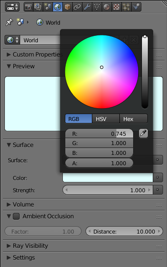
- On the top menu, click Render -> Render Image to preview the result
- After viewing the result, press Esc to close the render view
- Since we are working inside a house, we will not need the world environment.
In the World section of the Properties window, click the Unlink Datablock button
- On the top menu, click Render -> Render Image again to preview the result
- After viewing the result, press Esc to close the render view
Emitting a Light
An animated scene uses light to influence how the objects are viewed and how visible they are. Blender provides various options
for lights. To start, when you start a project, Blender adds a default light. You can keep it, change it, delete it, or replace it.
To get a custom light, create a shape such as a plane or else. Then apply a shader named Emission to it.
In this exercise, we will keep the existing lamp (we could have deleted it) and add two other customer lights to the scene.
 Practical Learning: Setting the Light
- On the menu bar of the 3D View, click Add -> Mesh -> UV Sphere
- In the section below the Tools window, change the following values:
Size:     .5
Location - Z: 5.5
- While the sphere is selected, position the mouse in the work area, press M and, in the Layers window, click the second box
- On the menu bar of the 3D View, in the Visible Layers section, click the second button
- Zoom in to see as much as possible of the sphere
- In the Numeric Pad of the keyboard, click 1 and click 5 to display the sphere in orthographic view
- Press Tab to display in Edit Mode
- Press Z to display in Wireframe mode
- Press A to deselect everything
- Press B to prepare to box-select
- Draw a rectangle that selects the top lines excluding the middle line and the line just above it:
- Press Delete
- In the menu that appears, click Faces:
- Zoom out to see less of the sphere
- Press Tab to display the Object Mode
- In the Numeric Pad, press 5 to return to the perspective view
- Press Z to return to the Solid view
- Press M and, in the Layers window, click the first button
- On the menu bar of the 3D View, in the Visible Layers section, click the first button
- In the Properties window, change the name to Ceiling Light and press Enter
- In the Tools window, click the Tools tab and click Smooth
- On the menu bar of the 3D View, click Add -> Mesh -> Cylinder
- On the section below the Tools window, change the following values:
Vertices: 5
Radius: .1
Depth:  6
X: 3
Y: 5.5
Z: 3
- Position the mouse in the work area and press N to display the Properties Region
- In the Properties Region, get to the 3D Cursor section and change the Location as follows:
X: 4
Y: 5.5
Z: 0.1
- Right-click the cube on the scene to select it
- In the Properties window, click the Object button
- In the Object section of the Properties window, change the Z location to 1.75
- In the Tools window, click the Create tab if necessary and click Plane
- In the Properties window, change the following values
Name:      Projected Light
Location - X:   6
           Y:   4
           Z:   10
Rotation - X: -20
           Y:  45
Scale    - X:   2.5
           Y:   3.5
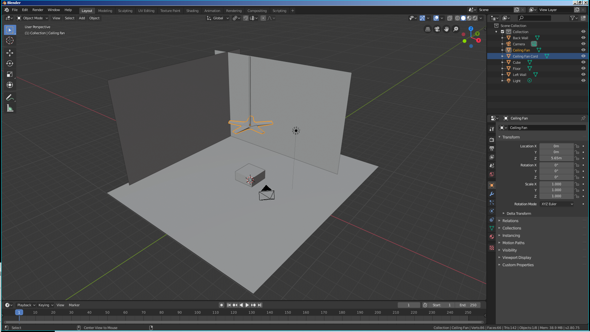
- Position the mouse in the work area and, to display the camera view, in the Numeric Pad, press 0
- Press N to display the Properties Region
- In the Properties Region, click the Lock Camera to View check box
- Use the mouse to position the view so you can see the whole area
- Press N to close the Properties Region
- To preview the result, on the top menu, click Render -> Render Image
- After viewing the result, press Esc to return to the 3D View
- In the Outliner, click Local Light to select it
- In the Properties window, click the Material button

- In the Material section of the Properties window, click New
- In the Surface text box, click Diffuse BSDF and, in the menu that appears, click Emission:
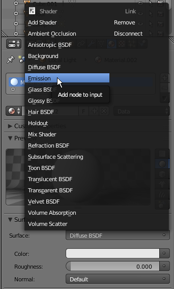
- Change the Strength value to 5 and press Enter
- Click the Color button and select a light-yellow color (I am using R = 0.800, G = 0.800, and B = 0.45):
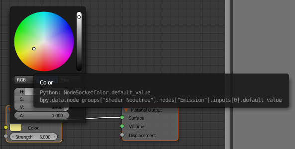
- Right-click the bottom border of the top menu bar and click Split Area:

- Position the mouse somewhere between the middle of the work area and the right border
- Click to confirm. If necessary, resize the windows
- In the bottom-left side of the new window, click the 3D Viewport button and select Node Editor
- Position the mouse inside the new window and press N to close its Properties Region
- Zoom in the Node Editor to get a larger view of its content
- In the Outliner, click Ceiling Light
- On the menu bar of the Node Editor, click New
- In the Properties window, click Diffuse BSDF and, in the menu that appears, click Emission
- In the Node Editor, in the Emission box, change the Strength to 8 and press Enter
- In the Outliner, click Projected Light
- In the Properties window, click the New Button
- In the Node Editor, click the body of Diffuse to select it:

- Press Delete
- On the menu bar of the Node Editor, click Add, position the mouse on Shader, and click Emission:
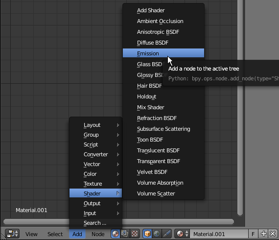
- Position the Emission window to the left of the Output window
- Drag the green button from the Emission window and drop it the green button of Surface in the Material Output window:

- In the Emission window, change the Strength to 10
- Position the mouse in the Node Editor and click (or click the right-pointing arrow)
- In the Properties window, click the Render button
- To preview the result, in the Render section, click the Render button
- After viewing the result, press Esc to close the render view
A Glossy Object
An object is referred to as glossy if it shines. To support this, Blender provides a material named Glossy BSDF.
The Glossy material is in fact two materials in one. That is, it can be used to create an object that shines or it can be used to create some type of a mirror.
Like the Diffuse material, the Glossy one is based on a color and a roughness. Unlike the roughness of the Diffuse material that specifies the amount of light or darkness that should be applied to an object, the roughness of the Glossy material specifies the amount of shininess that should be applied to the object.
To specify how the render engine should apply the shinyness of an object, the Glossy material adds some mathematical algorithms in a combo box.
Fundamentals of Materials
The most fundamental and most regularly used material is called Diffuse BSDF.
 Practical Learning: Introducing Glossiness
- Materials
- The Point structure provides other constructors you can use for the location of a control.
- Alternatively, expand the Size field, click Width and type a
value; click Height and type a value
btnSubmit.Size = new Size(80, 32);
Introduction
the delegate.
The Location of a Control
Introduction to the Location
Point
:
field:
Programmatically Locating a Control
You can programmatically specify the location of a control. To
support this, each control has a property named Location. To assist you
with specifying the location of a control, the Point class provides a
constructor as follows:
The Size of a Control
Introduction
The distance from the left border to the right border of a control is referred to as its
width property. In the same way, the distance from the top to the bottom borders of a control is its
height value. This can be illustrated as follows:
Programmatically Specifying the Size of a Control
To support the size of an object, the System.Drawing
namespace defines the Size structure.
There are four characteristics that define a Size value: its
location and its dimensions. A Size value must have a starting
point (X, Y) just as the Point object was illustrated earlier. The
width is the distance from the left to the right borders of a Size
object. The height represents the distance from the top to the bottom borders of
a Size value:

To assist you with sizes, the Size structure provides the following constructor:
public Size(int width, int height);
Using this constructor, to programmatically specify the size of a control,
assign a Size value to its Size property. Here is an example:
You can also define a Size object using a Point value. To
support this, the Size structure is equipped with the following constructor:
public Size(Point pt);
After declaring a variable with this constructor, you
can access its Width and Height properties to complete the
definition of the Size object. If you already have the size of an
object, you may only want to specify the dimensions of the variable.
Besides the Size, the System.Drawing
namespace also provides the SizeF
structure. It uses the same properties as Size except that its members float
types.
To retrieve the dimensions of a control, you can get
its Size property and assign it to a Size object.
The Rectangular Location and Size of a Control
The combination of the location and size of an object is
represented as a rectangle: a geometric figure with four
sides. To support this figure, the System.Drawing namespace
provides the Rectangle and the RectangleF structures. A rectangle can be represented as follows:

To completely represent it, a rectangle is defined by its
location and its dimensions. The location is defined by a point on the top-left
corner of the rectangle. The distance from the left border of the object that
owns the rectangle to the left border of the rectangle is represented by a
property called Left. The distance from the top border of the object that
owns the rectangle to the top border of the rectangle is represented by a
property called Top. The distance from
the left to the right borders of the rectangle is represented by a property
called Width.
The distance from
the left to the right borders of the rectangle is represented by a property
called Height. The distance from the left border of the object that owns
the rectangle to the right border of the rectangle is represented by a property
called Right. The distance from the top border of the object that owns
the rectangle to the bottom border of the rectangle is represented by a property
called Bottom. Based on this, a rectangle can be illustrated as follows:

To create a rectangle, you must provide at least its
location and dimensions. The location can be represented by a Point value and
the dimensions can be represented with a Size value. Based on this, you can use
the following constructor to declare a Rectangle variable:
This constructor requires that you define a Point and a Size
in order to use it. If instead you know the integer values of the location and
dimensions, you can use the following constructor to declare a Rectangle object:
At any time, you can access or retrieve the characteristics
of a Rectangle object as illustrated in the above picture from its properties.
You use the same names we used in the picture.
Besides the Rectangle structure, the System.Drawing
namespace provides the RectangleF structure that uses the same definition
as Rectangle, except that it is defined with float values instead of integers.
The be able to recognize the location and the size of
a control, the Control class is equipped with a property named Bounds.
This property is of type Rectangle represented by the property. Therefore,
at any time, to get the location and the size of
a control, you can call its Bounds property, which produces a Rectangle
value.
Techniques of Visually Resizing a Control
Introduction
|
Cursor |
Role |
 |
Moves the seized border in the North-West <-> South-East direction |
 |
Shrinks or heightens the control |
 |
Moves the seized border in the North-East <-> South-West direction |
 |
Narrows or enlarges the control |
Before resizing a control, as mentioned already, first select it. To
enlarge a control:
- Position the mouse on the right (or the left) handle. Then click and drag
in right (or left) direction. Once you get the desired width, release the
mouse
- Press and hold Shift. Then press the right arrow key as many times as you
want. Once you get the desired width, release Shift
To narrow a control:
- Position the mouse on its right (or its left) handle. Then click and drag
in the left (or the right) direction. Once you get the desired width, release the
mouse
- Press and hold Shift. Then press the left arrow key as many times as you
want. Once you get the desired width, release Shift
To heighten a control:
- Position the mouse on its top (or its bottom) handle. Then click and drag
in the top (or the bottom) direction. Once you get the desired width, release the
mouse
- Press and hold Shift. Then press the up arrow key as many times as you
want. Once you get the desired width, release Shift
To shrink a control:
- Position the mouse on its top (or its bottom) handle. Then click and drag
in the bottom (or the top) direction. Once you get the desired width, release the
mouse
- Press and hold Shift. Then press the down arrow key as many times as you
want. Once you get the desired width, release Shift
The Width and Height of a Control
Imagine you have added three controls to your form and,
after spending some time designing them, they appear as follows:

The dimensions of the controls are not set professionally.
As seen above, you can resize by dragging their borders but this might take a
while if you want them to have the same width, the same height, or both the same
height and width. The dimensions of a control or a group of controls are carried by a Size
value.
At design time, to change the dimensions of a control, first
click it. Then, in the Properties window, change the values of its Size
property.
To change the dimensions of a group of controls, first
select them. Then, in the Properties window, change the values of the Size
field. The new value would be applied to all selected controls. Alternatively,
the Form Designer provides tools to automatically do this for you.
| Button |
Name |
Format |
 |
Make Same Width |
Make Same Size -> Width |
Result: All controls,
except for the base control (the control that has the dark handles), will be
resized horizontally so they have the same width as the base control:
| The top control is used as
reference |
 |
=> |
 |
| The middle control is used
as reference |
 |
=> |
 |
| The bottom control is used
as reference |
 |
|
 |
| Button |
Name |
Format |
 |
Make Same Height |
Make Same Size -> Height |
Result: All controls,
except for the base control (the control that has the dark handles), will be
resized vertically so they have the same height as the base control:
| The top control is used as
reference |
 |
=> |
 |
| The middle control is used
as reference |
 |
=> |
 |
| The bottom control is used
as reference |
 |
=> |
 |
To set the same width and the same height to a group of
controls, first select them. Then, on the Layout toolbar or on the Format group
of the main menu, select:
| Button |
Name |
Format |
 |
Make Same Size |
Make Same Size -> Both |
Result: The Form Designer will calculate the sum of
the heights of all controls and find their average height (AvgHeight). It
will also calculate the sum of the widths of all controls and find their average
width (AvgWidth). These averages will be applied to the height and the
width respectively of each control:
 Practical Learning: Setting the Locations and Sizes of Controls
- Star Microsoft Visual C#
- To create a new application, on the main menu, click FILE -> New ->
Project...
- In the middle list,
click Windows Application
- In the Name box, replace the content with Rectangle2 and
press Enter
- From the Toolbox and from what we learned in the previous lesson, add four
labels, four text boxes, and two buttons to the form
- Based on what we have reviewed so far, design the form as follows:

- To test the application, on the Standard toolbar, click the Start button


- While the form is displaying, drag its right border to widen it. Also drag
its bottom border to heighten it

- Close the form and return to your programming environment
- Save all
Common Properties of Controls
The Content Alignment of a Control
When a control can be resized, or it has been configured to
be sizable, as it would be the case for a label or a button, you can specify in what part of
its confined borders the text should display. This characteristics is controlled
by the TextAlign property. To specify the alignment of text during
design, access the Properties window for a control and use the TextAlign
field:

The TextAlign property is of type ContentAlignment,
which is an enumeration. The members and result of this enumeration are:
To programmatically specify the text alignment of a control,
access its TextAlign property and assign it the desired member of the ContentAlignment
enumeration. Here is an example:
using System;
using System.Drawing;
using System.Windows.Forms;

public class Exercise : Form
{
    private Button btnSubmit;

    private void InitializeComponent()
    {
        btnSubmit = new Button();
        btnSubmit.Text = "Submit";
        btnSubmit.Location = new Point(20, 20);
        btnSubmit.Size = new Size(100, 60);
        btnSubmit.TextAlign = ContentAlignment.BottomRight;

        Controls.Add(btnSubmit);
    }

    public Exercise()
    {
        InitializeComponent();
    }
}

public class Program
{
    static int Main()
    {
        Application.Run(new Exercise());
        return 0;
    }
}
Anchoring a Control
If you position a (visual) control on a form and if the control
is positioned on the top left section of the form, when the user resizes the
form, the control’s position would appear static, it would not move. This could
be a concern if the control is positioned on the right, the bottom or the lower
right sections of the form. When the user resizes the form, the control’s position
would not be updated. Sometimes you will want the control to have the same location
and/or distance with regard to the bottom, the right, and/or the lower right
corners of the form.
The ability to manage a control or a group of
controls' location and size when the user resizes it is done using the Anchor property:

The Anchor property is created from the AnchorStyles
enumeration. By default, when you add a control to a form, its position is
relative to the
top left corner of its container. You can also set the control’s position with
regards to its container’s right and bottom borders. The Anchor property
can be used to "glue" one border of a control to its parent using one
of the following values:
Bottom: The control bottom border will be the same
even if the parent is heighten or shrunk
Left: The control left border will be the same even
if the parent is widened or narrowed
None: No anchoring is applied
Right: The control right border will be the same even
if the parent is widened or narrowed
Top: The control top border will be the same even if the parent is
heightened or shrunk
In the same way, you can combine AnchorStyles values to "glue" one or more
corners of a control to its parent when the parent is resized:
- To visually combine two or more AnchorStyles values, after
selecting the control(s) on the form, in the Properties window, click the
arrow of the Anchor field and click each desired Anchor button
- To programmatically combine two or more AnchorStyles values, you
use the OR bit operator, which is |
 Practical Learning: Anchoring the Controls
- On the form, select the buttons on the right side:

- In the Properties window, click Anchor and click the arrow of its combo
box
- Click the top vertical line and the right horizontal line. Click the left
horizontal line to clear it:

- On the form, select all text boxes
- In the Properties window, click Anchor and click the arrow of its combo
box. Click the right horizontal line and keep the others

- Execute the application
- Resize it horizontally and vertically to see the result

- Close the form and return to your programming environment
Control Docking
When a control is added to a host, depending on the control,
it may be automatically positioned where the mouse landed. In some cases, you
will want the control to be attached to a border or to a corner of its parent.
This can be done using the Dock property:
This property is managed through the DockStyle
enumeration. To use this property, click the control and, in the Properties
window, click the arrow of the Dock field. You can then select one of the
following values:
Bottom: The control will be attached to the bottom
border of its parent:
Fill: The control will use the whole client area of
its parent.
Left: The control will be attached to the left border
of its parent:
None: The control will be kept where it was
positioned on the parent:
Right: The control will be attached to the right
border of its parent:
Top: The control will be attached to the top border
of its parent:
To programmatically specify the docking option of a control,
access its Dock property and assign the desired member of the DockStyle
enumeration. Here is an example:
public class Exercise : Form
{
    private Button btnSubmit;

    private void InitializeComponent()
    {
        btnSubmit = new Button();
        btnSubmit.Text = "Submit";
        btnSubmit.Dock = DockStyle.Right;

        Controls.Add(btnSubmit);
    }
}
 Practical Learning: Docking a Control
- On the Toolbox, click Panel
- On the form, click and hold the mouse somewhere in the lower-left section.
Then drag right and slightly up to draw it as follows (no need for
precision):

- While the panel control is still selected, in the Properties window, click
Dock and click the arrow of its combo box
- Select the box above None (to select Bottom)

- Save all
Aesthetic Aspects of a Control
Background Color
Controls used on Microsoft Windows are painted using a color
known as Control. If you don't like the default color that paints the
background of a control, you can access the BackColor field of the
Properties window:
As you can see, the System and the Web tabs provide colors
by name. All regular names of colors of the English language are represented. If
you have done Windows programming before, you may recognize the names of colors
in the System tab because they are the same names you would see in Control
Panel, except that the names are in one word. If you have done web development
before, you may recognize the names because they are the same defined by
Netscape. The names in both the System and the Web tabs are defined in an
enumeration called Color.
If you are not familiar with the names of colors, you can
visually select a color in the Custom tab.
To programmatically specify the background color of a
control, access its BackColor property and assign it the desired member
of the Color enumeration. Here is an example:
public class Exercise : Form
{
    private Button btnSubmit;

    private void InitializeComponent()
    {
        btnSubmit = new Button();
        btnSubmit.Text = "Submit";
        btnSubmit.BackColor = Color.Aquamarine;

        Controls.Add(btnSubmit);
    }
}
 Practical Learning: Changing the Background Color of a Control
- Click the Custom tab and click the color at 3rd column - 2nd row:

Background Image
Instead of a color, you may want to fill the control with a
picture. To do this, you can access the control's BackgroundImage
property. This provides an ellipsis button you can use to locate and select the
desired picture.
Border Style
Some controls display a border when they are drawn and some
others don't. Consider the following:
Some of these controls allow you to specify a type of border
you want to show surrounding the controls. This characteristic is controlled by
the BorderStyle property, which is based on BorderStyle
enumerator. Its members are:
To programmatically specify the border style of a control,
access its BorderStyle property and assign it the desired BorderStyle
member. Here is an example:
using System;
using System.Drawing;
using System.Windows.Forms;

public class Exercise : Form
{
    private Panel pnlViewer;

    private void InitializeComponent()
    {
        pnlViewer = new Panel();
        pnlViewer.BorderStyle = BorderStyle.Fixed3D;
        pnlViewer.BackColor = Color.LightBlue;
        Controls.Add(pnlViewer);
    }

    public Exercise()
    {
        InitializeComponent();
    }
}

public class Program
{
    static int Main()
    {
        Application.Run(new Exercise());
        return 0;
    }
}
API Characteristics of Controls
Tab Ordering
A user can navigate through controls using the Tab key. When
that key has been pressed, the focus moves from one control to the next. By their
designs, not all controls can receive focus and not all controls can participate
in tab navigation. Even controls that can receive focus must be
primarily included in the tab sequence.
At design time, the participation to tab sequencing is controlled by the Boolean
TabStop property in the
Properties window. Every visual control that can receive focus is already configured to have this property set to
True. If you want to remove a control from this sequence, set its TabStop value to
False.
If a control has the TabStop property set to True, to arrange the navigation order of controls,
you have two main options. At design time, you can click a control on the form. Then, on the
Properties window, change the value of its TabIndex field. The value must be a positive short integer.
The best and easiest way to arrange the tab sequence of controls is to manage it
visually. To do this, first display the form. Then, on the main menu, click VIEW. This causes a number to be positioned on every control of the form. Here
is an example:
To arrange the sequence any way you like, click each control
once in the desired order. Normally, static controls (such as the label, the
picture box, the panel, etc) never receive focus when the application is
running; therefore, you can skip such controls.
Cubes Fundamentals
Control's Visibility
A control is referred to as visible if it can be visually located on the screen. A user can use a control only if he or she can see it. As a programmer, you have the role of deciding whether a control must be seen or not and when.
The visibility of an object is controlled by the its Visible
property. This is a Boolean property.
At design time, when you add a control to a parent, it is visible by default. This is because its
Visible property is set to True in the
Properties window. In the same way, if you programmatically create a control, by default, it is made visible once you
add it to its parent's Controls property.
If you don't want a control to primarily appear when the form comes up, you can either set its
Visible property to False or set its parent’s visible property to
False. Equivalently, at run time, to hide a control, assign a False value to either its
Visible property or its parent property. Keep
in mind that when a parent gets hidden, it also hides its children. On the other hand, a parent can be made visible but hide one or some of its children.
To programmatically check whether a control is visible at one time, apply a conditional statement


![]() Practical Learning: Starting the Project
Practical Learning: Starting the Project![]() Practical Learning:
Creating a Classic Cup
Practical Learning:
Creating a Classic Cup


![]() Practical Learning: Creating a Bottle of Red Wine
Practical Learning: Creating a Bottle of Red Wine


![]() Practical Learning: Creating an Empty Bottle
Practical Learning: Creating an Empty Bottle


![]() Practical Learning: Creating a Bottle of White Wine
Practical Learning: Creating a Bottle of White Wine


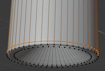
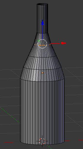


![]() Practical Learning: Creating the Red Wine
Practical Learning: Creating the Red Wine


![]() Practical Learning: Creating an Empty Wine Glass
Practical Learning: Creating an Empty Wine Glass


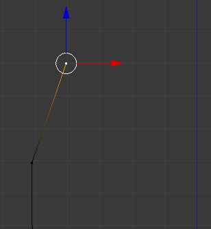
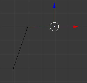


![]() Practical Learning: Creating an Ice Bucket
Practical Learning: Creating an Ice Bucket


![]() Practical Learning: Creating a Champaign Bucket
Practical Learning: Creating a Champaign Bucket


![]() Practical Learning: Creating a Picnic Table
Practical Learning: Creating a Picnic Table


![]() Practical Learning: Putting the Objects Together
Practical Learning: Putting the Objects Together


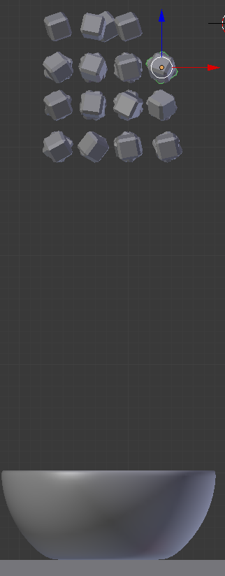
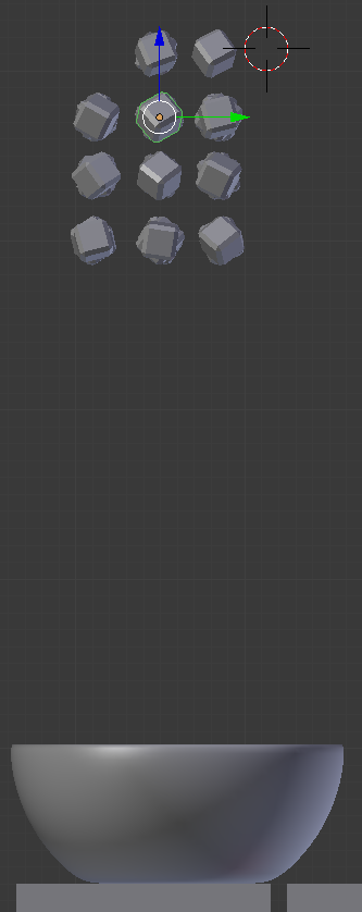
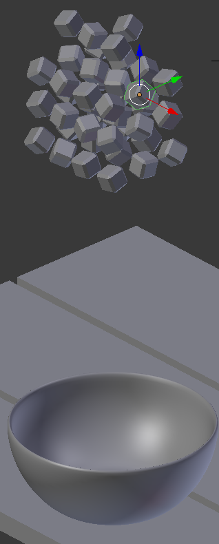
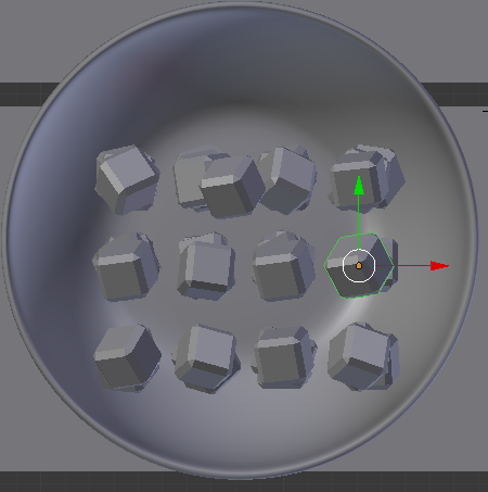


![]() Practical Learning: Creating a Glass
Practical Learning: Creating a Glass


![]() Practical Learning: Applying Roughness to a Glass
Practical Learning: Applying Roughness to a Glass


![]() Practical Learning: Introducing Glossiness
Practical Learning: Introducing Glossiness


 z
z


 z
z


![]() Practical Learning: Introducing the World
Practical Learning: Introducing the World![]() Practical Learning: Using Cycles Render
Practical Learning: Using Cycles Render


![]() Practical Learning: Setting the Locations and Sizes of Controls
Practical Learning: Setting the Locations and Sizes of Controls


![]() Practical Learning: Anchoring the Controls
Practical Learning: Anchoring the Controls


![]() Practical Learning: Docking a Control
Practical Learning: Docking a Control


![]() Practical Learning: Changing the Background Color of a Control
Practical Learning: Changing the Background Color of a Control


![]() Practical Learning: Setting the Tab Order of Controls
Practical Learning: Setting the Tab Order of Controls


![]() Practical Learning:
Ending the Lesson
Practical Learning:
Ending the Lesson![]() Practical Learning: Introducing the World
Practical Learning: Introducing the World
![]() Practical Learning: Setting the Light
Practical Learning: Setting the Light


![]() Practical Learning: Introducing Glossiness
Practical Learning: Introducing Glossiness


![]() Practical Learning: Setting the Locations and Sizes of Controls
Practical Learning: Setting the Locations and Sizes of Controls


![]() Practical Learning: Anchoring the Controls
Practical Learning: Anchoring the Controls


![]() Practical Learning: Docking a Control
Practical Learning: Docking a Control

![]() Practical Learning: Changing the Background Color of a Control
Practical Learning: Changing the Background Color of a Control