Introduction to Boolean Values
Introduction to Boolean Values
Fundamentals of Boolean Values
Introduction
A value is said to be Boolean if it is true or it is false. In fact, the two available Boolean values are true and false.
To let you declare a Boolean variable, the C# language provides a data type named bool. Here is an example of declaring a Boolean variable:
public class Exercise
{
    public static void Main()
    {
        bool drinkingUnderAge;
    }
}
To initialize a Boolean variable or to change its value, assign true or false to it. Here is an example:
public class Exercise
{
    public static void Main()
    {
        bool drinkingUnderAge = true;
    }
}
In this case, you can also declare the variable as var, object or dynamic. Make sure you initialize the variable when declaring it. Remember that, in any case, after declaring a (Boolean) variable, you can later change its value by assigning an updated value to it. Here is an example:
public class Exercise
{
    public static void Main()
    {
        var drinkingUnderAge = true;

        // Blah blah blah

        drinkingUnderAge = false;
    }
}
A Constant Boolean Variable
If you are planning to use a Boolean variable whose value will never change, you can declare it as a constant. To do this, apply the const keyword to the variable and initialize it. Here is an example:
public class PoliceReport
{
    public static void Main()
    {
        const bool driverIsSober = true;
    }
}
Introduction to the Windows Controls: The Check Box
Introduction
The Microsoft Windows operating system supports Boolean values in many ways, such as through Windows Controls. In the same way, the .NET Framework supports various ways to use Boolean values in your applications. One way this support is done by both Microsoft Windows and the .NET Framework is through a control named check box.
A check box is a control that displays a small square. That small square can display a check mark. The main purpose of a check box is to indicate that a value is true of it is false. Such a value must be associated to the check box. When the value is false, the small square of te check box is empty. When the value is true, the small square of the check box displays a check mark. In some cases, you may want the check box to indicate that the value is not known. In this case, the check box would display a gray check mark.
Creating a Check Box
To let you add a check box to an application, the .NET Framework prodives a class named CheckBox. To visually add a check box to your aplication, in the Toolbox, click CheckBox and click a form. To visually create the control, declare a variable of that class and initialize it appropriately.
Boolean Values and Classes
A Boolean Field
Like the other types of variables we used in previous lessons, a Boolean variable can be made a field of a class. To create a Boolean field, declare a variable of type bool in the body of a class. Here is an example:
public class Exercise
{
    bool drivingUnderInfluence;

    public static void Main()
    {

    }
}
Since the field is created in a class, you can apply any of the options we saw in previous lessons, such as an access level. Here are examples:
public class Future
{
    private bool ForÉyourEyesOnly;
    public readonly bool PastKnown;
    private static bool IsOriginal;
    static public bool UncertaintyReigns;
}
A Boolean Property
You can create a property of a Boolean type. To start, if you want to create a whole body for the property, first create a field that is of type bool. If necessary, add a constructor that uses a Boolean parameter. Of course, the property also must be a Boolean type. In the get accessor, return the Boolean field. In the set clause, assign the value contextual keyword to the Boolean field. Here is an example:
public class Member
{
    private bool isGood;

    public Member(bool status)
    {
        isGood = status;
    }

    public bool Accepted
    {
        get
        {
            return isGood;
        }
        set
        {
            isGood = value;
        }
    }
}
Once a Boolean read-write property exists, you can use it like any other. For example, you can assign a value to it or get the value it holds. Of course, the value you assign must be set as true or false. Here are examples:
public class Member
{
    private bool isGood;

    public bool Accepted
    {
        get
        {
            return isGood;
        }
        set
        {
            isGood = value;
        }
    }
}

public class Membership
{
    private void Main()
    {
        bool applicationValidated = true;

        Member applicant = new Member();

        // Setting a value to the Boolean property
        applicant.Accepted = applicationValidated;

        Membership mbr = new Membership(applicant.Accepted);

        applicant.Accepted = false;

        // Getting the value of the Boolean property
        applicationValidated = applicant.Accepted;

        mbr = new Membership(applicant.Accepted);
    }
}
Of course, a Boolean property can also be created as an automatic property. Here is an example:
public class Member
{
    public bool Accepted { get; set; }
}
Presenting a Boolean Value
To display the value of a Boolean variable to the console, pass the name of the variable to a Console.Write() or a Console.WriteLine() method. Here are examples:
using static System.Console;

public class Exercise
{
    public static void Main()
    {
        bool drinkingUnderAge = true;

        Write("The driver was operating under age: ");
        WriteLine(drinkingUnderAge);
        WriteLine("-----------------------------------------");

        drinkingUnderAge = false;

        Write("The person was driving under age: ");
        WriteLine(drinkingUnderAge);
        WriteLine("=========================================");
    }
}
To display the value of a Boolean variable in a Windows control, you must convert it to a string.
As reviewed for the other data types, you can request the value of a Boolean variable from your users. If you are working on a Windows Forms application, probably the best way to do this is to use a check box. If you equip a form with a check box, when the user clicks the check box, the Checked property of the check box becomes True. When a check box is not checked, the Checked property of the check box is False. Based on this, at any time, you can get the value of the Checked property of the check box to know its status and make a decision. We will various types of situations in future lessons.
Boolean Values and Methods
A Boolean Parameter
Like parameters of the other types, you can create a method that uses a parameter of bool type. Here is an example:
public class Contractor
{
    private void CalculatePayroll(bool fullTime)
    {

    }
}
In the body of the method, the parameter is treated as holding a true or false value. When calling the method, pass such a value or a variable that holds that value. Here is an example:
public class Contractor
{
    private void CalculatePayroll(bool fullTime)
    {

    }

    private void ValidateEmploymentStatus()
    {
        CalculatePayroll(false);
    }
}
Of course, a constructor can also use a Boolean parameter. Here is an example:
public class Contractor
{
    public Contractor(bool validated)
    {

    }

    private void CalculatePayroll(bool fullTime)
    {

    }

    private void ValidateEmploymentStatus()
    {
        CalculatePayroll(true);
    }
}

public class Accountability
{
    public Accountability()
    {
        Contractor empl = new Contractor(true);

        var staff = new Contractor(false);
    }
}
Returning a Boolean Value
You can create a function or a method that produces a Boolean value. To do that, when creating the function or method, on the left side of the name of the function or method, type bool. In the body of the function or method, perform the desired operation. Before the closing curly bracket, type return followed by a Boolean value or expression. Here is an example:
bool Validate()
{
    bool a = true;

    return a;
}
![]() Practical Learning: Introducting Boolean Properties
Practical Learning: Introducting Boolean Properties
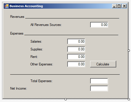
| Control | Text | TextAlign |
| Label | Revenues ____________ | |
| Label | All Revenues Sources: | |
| TextBox | 0.00 | Right |
| Label | Expenses ____________ | |
| Label | Salaries: | |
| TextBox | 0.00 | Right |
| Label | Supplies: | |
| TextBox | 0.00 | Right |
| Label | Rent: | |
| TextBox | 0.00 | Right |
| Label | Other Expenses: | |
| TextBox | 0.00 | Right |
| Button | Calculate | |
| Label | ______________________ | |
| Label | Total Expenses: | |
| TextBox | Right | Right |
| Label | Net Income | |
| TextBox | Right | Right |
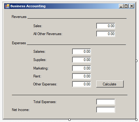
| Control | Text | TextAlign |
| Label | Revenues ____________ | |
| Label | Sales: | |
| TextBox | 0.00 | Right |
| Label | All Other Revenues: | |
| TextBox | 0.00 | Right |
| Label | Expenses ____________ | |
| Label | Salaries: | |
| TextBox | 0.00 | Right |
| Label | Supplies: | |
| TextBox | 0.00 | Right |
| Label | Marketing | |
| TextBox | 0.00 | |
| Label | Rent: | |
| TextBox | 0.00 | Right |
| Label | Other Expenses: | |
| TextBox | 0.00 | Right |
| Button | Calculate | |
| Label | ______________________ | |
| Label | Total Expenses: | |
| TextBox | 0.00 | |
| Label | Net Income: | |
| TextBox | Right |
Introduction to Built-In Boolean Properties
The Alignment of a Text Box
When you add a text box to a form, by default, the text in it is aligned to the left. Based on characteristics of writing numbers and text for various human languages, you can align the content to the left, the center, or the right. To support this, the class of the text box is equipped with a property named TextAlign. Therefore, to control the alignment of the content of a text box, after placing a text box on a form, use the TextAlign field in the Properties window to select an option.
Checking a Box
We saw that, to assist you with Boolean values, the .NET Framework (and Microsoft Windows for that matter) provides the check box control. To let you associate a Boolean value to a check box, the CheckBox class is equipped with a Boolean property named Checked. It is defined as follows:
public bool Checked { get; set; }
Imagine you declare and initialize a Boolean variable. You can then assign that variable to the Checked property of a check box. Here is an example of a form equipped with a check box named chkVerified:
using System.Windows.Forms;

namespace Verifications
{
    public partial class Verification : Form
    {
        public Verification()
        {
            bool verified = true;

            InitializeComponent();

            chkVerified.Checked = verified;
        }
    }
}
When the form comes up, the compiler will check the value of the variable and decide whether or not to display a check mark in the check box.
Tab Ordering
A user can navigate through controls using the Tab key of the keyboard. When that key has been pressed, the focus moves from one control to the next. By their designs, not all controls can receive focus and not all controls can participate in tab navigation. Even controls that can receive focus must be primarily included in the tab sequence.
To support the participation to tab sequencing, the class of every visual control is equipped with a Boolean property named TabStop. This property is represented in the Properties window. Every visual control that can receive focus is already configured to have this property set to True. If you want to remove a control from this sequence, set its TabStop value to False.
If a control has the TabStop property set to True, to arrange the navigation order of controls, you have two main options. At design time, you can click a control on the form. Then, on the Properties window, change the value of its TabIndex field. The value must be a positive short integer.
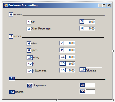
The best and easiest way to arrange the tab sequence of controls is to manage it visually. To do this, first display the form. Then, on the main menu, click View -> Tab Order. This causes a number to be positioned on every control of the form. Here is an example:
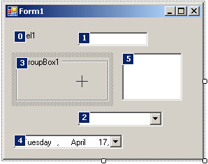
To arrange the sequence any way you like, click each control once in the desired order. Normally, static controls (such as the label, the picture box, the panel, etc) never receive focus when the application is running; therefore, you can skip such controls.
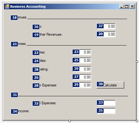
![]() Practical Learning: Controlling Tab Navigation
Practical Learning: Controlling Tab Navigation
Control's Visibility
A control is referred to as visible if it can be visually located on the screen. A user can use a control only if he or she can see it. As a programmer, you have the role of deciding whether a control must be seen or not and when. The visibility of an object is controlled by the a Boolean propertyVisible named.
At design time, when you add a control to a parent, it is visible by default. This is because its Visible property is set to True in the Properties window. In the same way, if you programmatically create a control, by default, it is made visible.
If you don't want a control to primarily appear when the form comes up, you can either set its Visible property to False or set its parent's Visible property to False. Equivalently, at run time, to hide a control, assign a False value to either its Visible property or its parent's Visible property. Keep in mind that when a parent gets hidden, it also hides its children. On the other hand, a parent can be made visible but hide one or some of its children.
To programmatically check whether a control is visible at one time, apply a conditional statement (next lessons) to its Visible property and check whether its value is true or false.
Control's Availability
For the user to use a control, the control must allow operations on it. For example, if a control is supposed to receive text, the user can enter characters in it only if this is made possible. To make a control available to the user, the object must be enabled. The availability of an object is controlled by a Boolean property named Enabled.
By default, after adding a control to a form, it is enabled and its Enabled property in the Properties window is set to True. An enabled control displays its text or other characteristics in their normal settings. If you want to disable a control, set its Enabled property to False. In the following picture, a text box and a button are disabled:
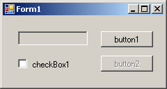
To programmatically find out whether a control is enabled or not, check its Enabled property.
Introduction to Labels
Description
A label is a control that serves as a guide to the user. It provides static text that the user cannot change. In previous lessons, we saw how to add a label to a form. To programmatically create a label, declare a variable of the Label class. Initialize it using its default constructor.
The Caption of a Label
The most important characteristic of a label control is the text it displays. That text is also referred to as its caption and this is what the user would read. The text of a label is its Text property and is its default. In previous lessons, we saw various examples of setting the captions of labels. Of course, you can also set a caption programmatically. Here is an example:
public class Exercise : System.Windows.Forms.Form
{
    Label lblMessage;

    public Exercise()
    {
        InitializeComponent();
    }

    private void InitializeComponent()
    {
        lblMessage = new Label();
        lblMessage.Text = DateTime.Now.ToString();
    }
}
Automatically Sizing a Label
After adding a label to a form, by default, it receives a fixed size. If you type its caption and press Enter, the text you provided would be confined to the allocated dimensions of the control. If the text is too long, part of it may disappear. You can then resize the label to provide more area. Another solution is to automatically resize the label to accommodate the length of the string you typed. This aspect is controlled by a Booleanproperty named AutoSize. Its default value is False. If you set this property to True, at design time, a rectangular border appears around it. If you type a string in the Text field and press Enter, the control would be resized to show the whole string but using only the necessary space.
If you programmatically create a label, it assumes a default size. If you assign it a string that is too long for that default size, part of the string may appear on a subsequent line. If you want the whole string to appear on the same line, you can set the AutoSize to true. Here is an example:
public class Exercise : System.Windows.Forms.Form
{
    Label lblMessage;

    public Exercise()
    {
        InitializeComponent();
    }

    private void InitializeComponent()
    {
        lblMessage = new Label();
        lblMessage.Text = DateTime.Now.ToString();
        lblMessage.AutoSize = true;
    }
}
Content Alignment
After typing the caption of a label whose AutoSize property is set to False, you can resize its allocated space to your liking. This is because a string occupies a rectangular area. Here is an example:

By default, the caption of a label is positioned starting on the middle-left side of its allocated rectangle. Alternatively, you can position it to one of the nine available positions. The position of the caption of a label is controlled by the TextAlign property which is based on the ContentAlignment enumeration. We have already reviewed this property.
Pictures on a Label
Other fancy characteristics you can apply to a label include its font and color. For example, a label is primarily meant to display a string. To make it fancier, you can display a (small) picture next to it. To do this, at design time, use the Image field of the Properties window to select a picture. You can also specify the picture at run time by assigning an Image value to the Label.Image property. After adding a picture that would accompany the label, you can specify what position the picture would hold with regards to the label. To do this, select the desired position of the ImageAlign field in the Properties window.
Instead of using a picture from the Image property, you can create a list of images using an ImageList control and assign it to the label. In fact, the advantage of an ImageList is that, unlike the Image property, it allows you to use more than one picture.
After assigning an ImageList to the label control using the Properties window or code, you can use the ImageIndex to specify what picture to display next to the label.
A Label's Mnemonic
A label provides another property called UseMnemonic. This property is valuable only when the label accompanies another control.
Radio Buttons
Introduction
A radio button, sometimes called an option button, is a circular control that comes in a group with other radio buttons. Each radio button is made of a small empty circle O. From the group, when the user clicks one of them, the radio button that was clicked becomes filled with a big dot 8. When one of the radio buttons in the group is selected and displays its dot, the others display empty circles. To guide the user as to what the radio buttons mean, each is accompanied by a label.
Here is an example of a form with three radio buttons: Small, Medium, and Large
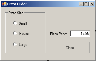
To create a radio button, on the Toolbox, you can click the RadioButton control. To programmatically create a radio button, declare a variable of type RadioButton, use the new operator to allocate memory for it. Because radio buttons always come as a group, you should include them in another control that visibly shows that the radio buttons belong together. The most common control used for this purpose is the group box created using the GroupBox control.
The Location of a Radio Button
Unlike most of other controls that can be positioned anywhere, a radio button should not be placed directly on a form. Instead, a radio button should be positioned in a container that belongs to a form. The typical container is the group box. When a radio button is added to a group box, the location of the radio button is relative to its parent. This location is easy to specify if you are visually designing the application. If you are programmatically creating it, make sure you specify the location based on the control that will hold the radio button.
The Caption of a Radio Button
To indicate what a radio button represents, it is accompanied by text, also referred to as its caption. To specify the caption of a radio button at a design time, type a string in the Text field of its Properties window. To programmatically specify the caption of a radio button, assign a string to its Text property.
Checking a Radio Button
If you add only one radio button to a container, when the application starts, the lone radio button would appear with an empty round circle. If the user clicks that lone radio button, the radio button's circle becomes filled with a dot and the user cannot remove or change this aspect. If you equip a container with more than one radio button, the user can click the desired one to select it and only one of the radio buttons can be selected at a given time. The radio button that is selected is referred to as checked. To support this description, the RadioButton class is equipped with a property named Checked.
At design time, to select a radio button, in the Properties window, set its Checked property to True. At run time, to programmatically select a radio button, assign a true value to its Checked property. To find out whether a particular radio button is selected, get the value of its Checked property. You can also programmatically check a radio button. Here is an example:
private void Form1_Load(object sender, System.EventArgs e)
{
    radioButton2.Checked = true;
}
If the user clicks a radio button, since this control is primarily a button, the radio button that was clicked in the group fires a Click event. This is the most regularly used event of a radio button. Normally, when the user clicks a button in the group, the round box of that button becomes filled and the Click event is fired. If the user clicks a button that is already checked, nothing changes in the round box of that button but the Click event fires again. In some cases, you may want to execute code only if the checked state of a button has actually changed rather than being interested in whether the button was clicked or not. Fortunately, if you are interested only when the checked stated of a button is changed, you can use the CheckedChanged event. This event is fired whenever the checked state of a button is modified. Here is an example of implementing it:
private void rdoSmall_CheckedChanged(object sender, System.EventArgs e)
{
        txtPizzaPrice.Text = "$8.75";
}
The Alignment of a Radio Button
By default, the round box of a radio button is positioned to the left side of its accompanying label but you have many options. Besides the left position, you can position the round box to the top, the right, or the bottom etc side of its label. The position of the round box with regards to its label is controlled by the CheckAlign property which is a value of type ContentAlignment. To specify it at design time, access the Properties window of the radio button and select the desired value from the CheckAlign field. You can also change this property programmatically.
Besides the alignment of the check box, you can also control the alignment of the text with regards to the bounding rectangle of the control. This characteristic is controlled by the TextAlign property of the RadioButton class. The TextAlign property also is of type ContentAlignment.
The Appearance of a Radio Button
By default, a radio button appears as a rounded box that gets filled with a big dot when the user selects it. Optionally, you can make a radio button appear as a toggle button. Normally, if you make one radio button appear as a button, you should apply the same characteristics on the other radio buttons of the same group. The button would appear as a rectangular object. When the user clicks such a button, it appears down:
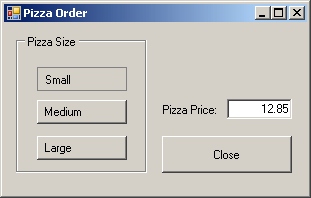
If the user clicks another button, this button becomes up:
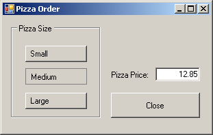
To change the appearance of a radio button, assign the Button or Normal value to its Appearance property. The Appearance property is based on the Appearance enumeration.
|
|
||
| Previous | Copyright © 2001-2021, FunctionX | Next |
|
|
||