The Starting Spot (Origin) of a Background
|
|
The starting spot of a background is where it should start
displaying. To let you control this, CSS provides the background-origin style.
Its value can be:
|
- border-box: This is the default value. It indicates that the
picture starts displaying on the border of the box or element
- padding-box: The picture starts displaying, and keeps displaying,
within the padding area of the box or element
- content-box: The picture starts displaying where the content of the
box or element starts
The Size of the Picture
Normally, when you choose or design the picture that will be
used for the background, the picture has a physical size. As done when using a
picture in HTML code, you can specify the size of the picture, but CSS allows
you to specify a different size for the picture. To support this, CSS provides
the background-size style. It can have a value as:
- auto: This is the defualt value. It lets the browser figure out the
size of the picture and apply it to display the background. Here is an example:

<!DOCTYPE html>

<html>

<head>
<title>Exercise</title>

<style type="text/css">
body {
    margin: 0;
    background-image: radial-gradient(at 65%, #0066CC, #99CCFF);
}
#central {
    margin:         auto;
    width:          470px;
    height:         270px;
    top:            1.50em;
    padding-left:   1.50em;
    padding-right:  0.50em;
    position:       relative;
    background-size: auto;
    border:            1pt solid White;
    background-image:  URL(images/bg8.png);
}

</style>
</head>
<body>
<div id="central"></div>
</body>
</html>
This would produce:
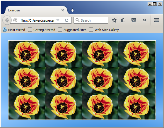
- A Constant Value: You can specify a single value for the width and the
height. If the original width and eight are not the same, the smaller side
would be shrunk. Here is an example:
#central {
    margin:         auto;
    width:          470px;
    height:         270px;
    top:            1.50em;
    padding-left:   1.50em;
    padding-right:  0.50em;
    position:       relative;
    background-size: 200px;
    border:            1pt solid White;
    background-image:  URL(images/bg8.png);
}
This would produce:
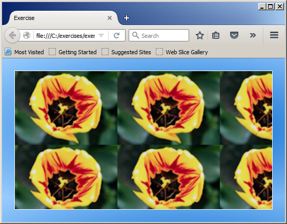
- A Fixed Size: You can specify the width and the height of the picture. Each
value is provided as an HTML-based number. The values are separated by a space
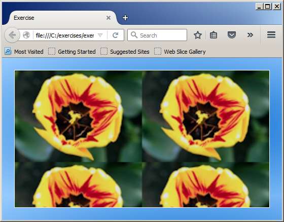
- A Relative Value: You can provide a percentage value by which to reduce or
increase both sides of the picture. The value is provided as a percentage.
Here is an example:
background-size: 50%;
This would produce:
- Relative Dimensions: You can provide a percentage value for the width
and the height in that order
- auto and a Value: You can indicate one of the value and let the
browser use the original value of the other. In this case, provide the value
that you want to use and auto
for the automatic one
Repeating a Background Picture
As you might have realized, if you indicate that a picturer
must be used to paint the background of a webpage or an element, the browser
will in fact create a pattern of displaying the picture at regular intervals based
on the width and the height of the picture. Here is an example:

<html>
<head>
<title>Exercise</title>
<style type="text/css">
body { background-image: URL(images/bg5.png);
</style>
</head>
<body>
<body>
</html>
This would produce:
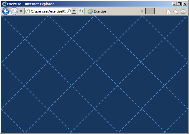
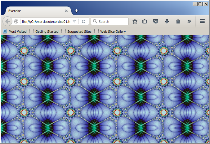
As you can see, the browser automatically repeats calling
the picture as many times as nececssary until the left and the right borders of
the webpage are reached. To let you indicate whether the browser should keep
displaying the picture or not, CSS provides a style named background-repeat.
This style can have one or two of the following values:
- repeat: This is the default value. It is the same as if you don't
specify a repeating option. Here is an example:
<html>
<head>
<title>Exercise</title>
<style type="text/css">
body {
    background-repeat: repeat;
    background-image:  URL(images/bg5.png);
}
</style>
</head>
<body>
<body>
</html>
You can also use repeat twice to get the same result
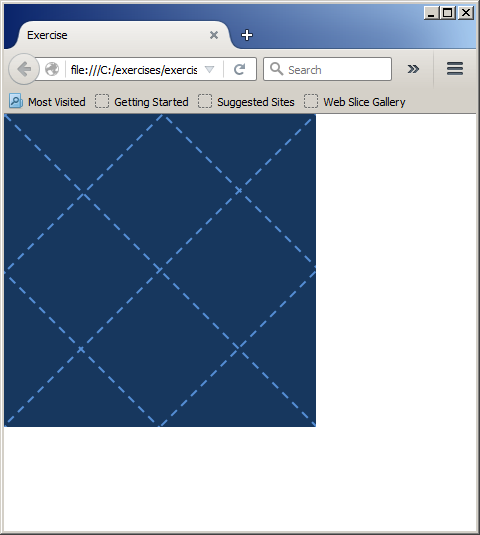
- no-repeat or no-repeat no-repeat: The picture must show only once, regrdless of the size
of the browser. Here is an example:
body {
    background-repeat: no-repeat;
    background-image:  URL(images/bg5.png);
}
This would produce:
- repeat-x: The picture will be repeated horizontally only. Here is an example:

<!DOCTYPE html>

<html>
<head>
<title>Exercise</title>
<style type="text/css">
body {
    margin: 0;
    background-repeat: repeat-x;
    background-image: URL(images/bg9.png);
}
</style>
</head>
<body>

</body>
</html>
This would produce:

- repeat-y: The picture will be repeated horizontally only. Here is an example:


- repeat repeat: To ask the browser to repeat the picture, you can
write repeat twice. This can be done as follows:
body {
    background-repeat: repeat repeat;
    background-image: URL(images/bg5.png);
}
As an alternative, you can combine both repeat-x and repeat-y followed
by a space. This can be done as follows:
body {
    background-repeat: repeat-x repeat-y;
    background-image: URL(images/bg5.png);
}
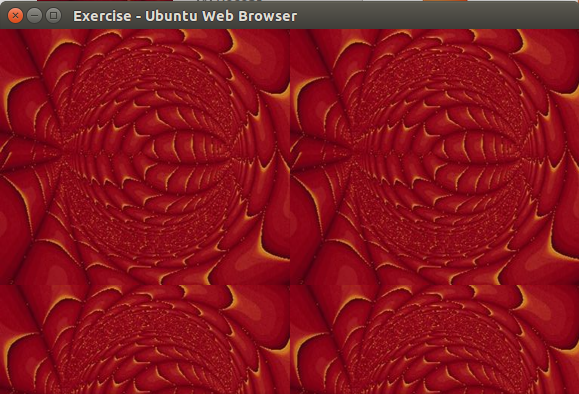
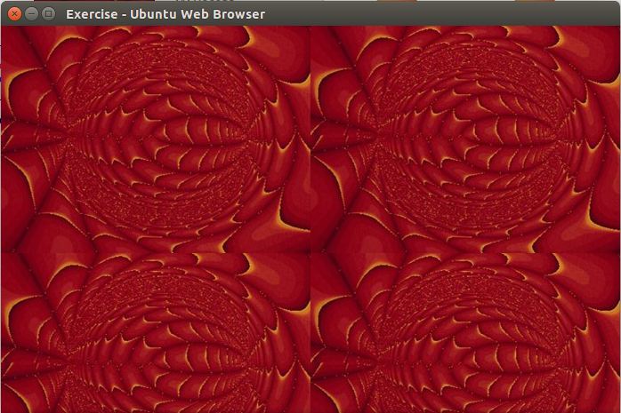
- round: If you apply one of the repeat options, the size of
the picture it respected. With the round or round round option, the
browser first calculates the number of pictures that can fit in the size
(width and height) of the browser without having to cut the last picture. If
the size of the browser is too narrow to show one more picture 9or too wide to
cut the last picture), the browser will enlarge (or shrink) the last picture
so that last picture can completely fit the browser. Here are examples:

body {
    background-repeat: round;
    background-image: URL(images/bg5.png);
}
This would produce:

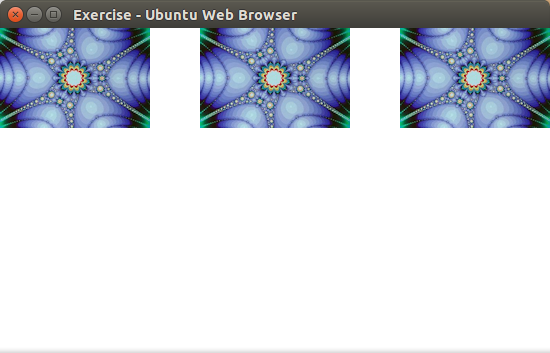
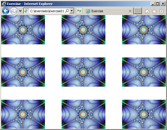
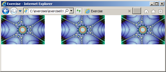
- space: The browser will repeat the picture both horixontally and
vertically but will use some type of algorythm to leave an empty space between
pictures. Here is an example:

body {
    background-repeat: space;
    background-image: URL(images/bg5.png);
}
You can also use space twice. Thie browser decides how many pictures to show and how much
space to use based on the size of the browser. Here are examples that use the
same code but different browser sizes:
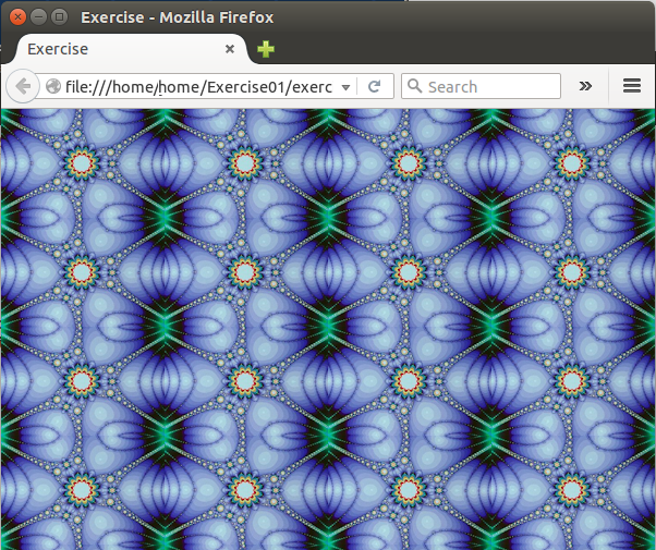
Internet Explorer:

Mozilla Firefox:
