Data Analysis With Charts

|
Data Analysis With Charts |
When creating a chart, first find out what the chart will be used for, this allows you to get necessary data available. Once the originating data is available on a worksheet, select Microsoft Excel can recognize data format and act appropriately. To create a chart, you will primarily use the Chart Wizard which will take you step by step in creating the object. To start, select data intended to be analyzed, then on the Formatting toolbar, click the Chart Wizard button, and proceed. Charts come in different types for various purposes.
|
|
|
Bar Charts |
|
Like the Column, the Bar chart is used to compare values of the same category on a common scale. This time, the chart is drawn horizontally. You create a Bar chart using the same process as the Column, except that you should select the Bar in step one. |
|
|
|
|
Line Charts |
|
A Line chart is used to analyze ups and downs of a tendency in a range of values. You can define it with one series of values where you will judge the evolution of an item over a period. When used with more than one series, this chart can be very helpful in comparing values of the same category over the same period. Fortunately, the Line chart can also be used to analyze values that don't share the same periodic variable. For example, you can use it to compare library attendance with regard to the real population number (which could be in hundreds of thousands or millions) with the number of people attending the library. In the latter situation, if the same axis are used to analyze, one category will almost disappear from the chart; the alternative is to separate their axis on the same chart. To create a Line chart, select the values in the category or categories that will be involved. After launching the Chart Wizard, select the Line and proceed. |
|
|
|
|
Pie and Doughnut Charts |
 |
The Pie chart is used to show percentage and/or fraction values. You should choose it whenever your analysis involves values that altogether evaluate to a 100%, a 1, a 10, a 100, or a 1000 scale. To create a Pie chart, select the heading variables such as the age categories of library members, then select the range of values that representation the proportions such as the percentage of those who visit the library based on the previously selected variables. |
|
An alternative to the Pie is the Doughnut chart. Sometimes this one can be used as a better alternative because it can include more than one series. |
|
|
|
|
The Cylinder, Cone, And Pyramid Charts |
|
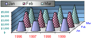
The Cone, Cylinder, and Pyramid charts can be used in the same scenario as the column and bar. Their 3-D visual effect can enhance the overall analysis of data. The Cylinder chart creates long circular boxes of the same base on both ends. It can be enhanced with good formatted Fill Effects. This chart is suitable for industry, manufacturing analysis, and predictions. |
 |
|
The cone is made of a circular base topped by a higher point. When used with various data, the higher values will have the complete cone while the lower values will share portion of the geometric figure. The cone chart should be used with values that can take advantage of its graphing dimensions. The Pyramid chart resembles the cone chart with a difference on their respective base. Both are constructed the same and can be used in similar scenarios. When analyzing data for geographical purposes, the Pyramid chart can render very dramatic effects. |
|
|
|
|
Chart Formatting |
|
Introduction |
 |
A chart created with all defaults settings usually accomplishes its purpose of helping to analyze data and figures, but the default features are set only as starting points. All the formatting and emphasis needs are left to you. Besides the values and numbers on it, a chart is a graphic object whose characteristics can be enhanced to accentuate special important points of the whole process. When you decide to create a chart, you should specify what kinds of numbers and values you are dealing with. |
|
These numbers ought to be formatted appropriately. Fortunately, even after creating the chart, you can reformat your numbers with new settings and the chart will be updated, provided the numbers are similarly recognizable. You can also change the type most of the time and get a new and/or better result. Almost any feature on the chart can be changed or reformatted at will. Charts share most the characteristics of the graphic items that you have become familiar with. This allows you to change a chart background, to reformat the fonts on its axes, to enhance the color of its columns, bar, cones, etc through the Fill Effects feature. Whenever a chart is selected on the worksheet, a Chart Menu Bar replaces the regular main menu. When a chart is selected, the Chart toolbar allows you to reformat various characteristics related to the chart. Just like any combination of a menu and toolbar, the Chart Menu Bar and the Chart toolbar work together to offer all formatted features of the chart. It is also very useful to always have the Drawing toolbar handy. You can improve a chart's look by adding any of the usual drawing from shapes to special characters.
|
|
Change of Chart Type |
|
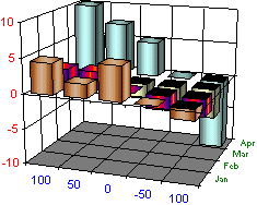
The Chart Wizard is equipped with various kinds of charts. In each category, different sub-types are used to accomplish a unique purpose. Although they share a lot of characteristics, some charts in the sub-type can tremendously change or alter the intended goal. You should know what options are available, and then act accordingly. Many charts can be changed from one kind to another, sometimes completely different. For example, you can change a chart from a flat column to a 3-D clustered. You can also change a chart from a bar to a cylinder, etc. To change a chart type, right-click on an empty area of the chart and click Chart Type from the menu. |
|
|
|
|
Source Data |
|
More often, you will test data when creating your charts. Your experience with trials and errors can help to enhance the effects of your analysis. Therefore, you should know how to change all or parts of your chart. The chart keeps live track of the data used on it, this means your data is always updated to the minute if you change or delete it. Also, you can completely change the values that are controlling the chart. To change the source of data on a chart, right-click on a white area of the chart and click Source Data… If you want to, you can type the new range of data, but the safest way is to reselect data using the mouse. The Source Data property sheet is a modeless dialog; this allows you to select data behind the scenes while the dialog is opened. Once you have set the new range, click OK. If you observe the Summary Sales chart, you find that one of the sales people, Alex, is not selling a lot, at least as compared to other employees; this could be due to anything. Let's assume that Alex is a manager and is not directly involves with sales, except that some time to time, he helps other employees, that's could be why his sales are low. If then he is not a sales person, we can just remove him from the chart and analyze the figures of those who have that profession. |
|
|
|
|
Map Charts |
|
Introduction |
|
The Microsoft Excel (or Microsoft Office) CD-ROM ships with Microsoft Map, a special software used to create maps that resemble particular charts. By default, this feature is not installed on a regular setup. To get Microsoft Map, first test whether it is installed, if it were, you might see its icon on the Standard toolbar and under the Insert menu. If it is not, include its icon manually on the Insert menu just under Chart… and/or on the Standard toolbar (or the Formatting toolbar, etc; it is up to you). You can do that using the Customize dialog gotten from the Tools menu. Once its button is on the menu and/or a toolbar, click it, then click somewhere on the worksheet and drag it as if you were drawing a rectangle. The dialog that follows will let you know whether Microsoft Map is installed on your computer. If a dialog box tells you that you can't draw a map, click OK, insert the Microsoft Excel (or Microsoft Office) CD-ROM or DVD in the appropriate drive, run Setup, select Add/Remove Features, click the + on Microsoft Excel, select Microsoft Map, and click Update Now. To use a chart map, first get some numbers that Microsoft Excel can recognize as belonging to a map; actually you can draw a map without numbers anywhere on your worksheet, but the computer will only let you draw a map of your choice without any special formatting. Once you have recognizable numbers, select them and any relevant data that obviously represents states, provinces, or countries. On the main menu, click Insert Ş Map… (or click the Insert Map button on the toolbar). Click one corner of the mapped drawing, drag to the other corner, if Microsoft Excel can recognize the values selected, for example US states, it will prompt you to a particular map or a group of maps. If you can't recognize the values, it will present you with a list of maps where you can make your choice. Once you have selected an appropriate map, click OK. All you have to do is configure and format the map to enhance its intended purpose. Be careful when working with Microsoft Map. As wonderful as it is, it almost never accepts any Undo action. |
|
|
|
|
Map Formatting |
|
A map in Microsoft is very valuable and can help to perform advanced data analysis; this is because the Microsoft Map software comes equipped with a lot of already formatted and recognizable features that you can simply decide to add to, or subtract from, the mapped area. When using the Microsoft Map on data related to United States, for example, the software is ready to recognize US major cities, airports, and highways, etc. These are items you can add when formatting and customizing the map. You can also change the font and graphic color used by different parts or sections. Further more, you can add other parts of the world as the map is expanding of your study is widening. |
|
|
||
| Previous | Copyright © 2000-2007 FunctionX, Inc. | Next |
|
|
||