Graphical User Interface Controls

There are words and expressions used on this web site that might not be familiar to you. To communicate with the computer, Graphical User Interface (GUI) systems, including Linux, Mac, Microsoft Windows, Unix, etc use a set of objects referred to as windows controls. To recognize them and to keep a harmonious naming in my tutorials, these controls are named after their programming identities.


A Button

A button in a small rectangular box that is used to answer a question or acknowledge something that the computer is displaying. You will usually be asked to click it or press a key on your keyboard to respond to a particular button.

The word or group of words displaying on top of a button is called a caption. A button is referred to by its caption. For example, the button on the left is called The OK Button, the other is called The Close Button, and the last is called The Cancel Button.


A Dialog or a Dialog Box

A dialog, or a dialog box, is a rectangular box that usually displays a message or a few other windows controls.

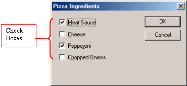
A dialog box usually displays a word or a group of words on its top section, its title bar. This word or group of words is called the caption. Unless specified otherwise, a dialog is referred to by its caption. In this case, this dialog would be called The Pizza Ingredients Dialog, or The Pizza Ingredients Dialog Box.

A dialog is almost the most common of the Windows Controls.


A Text Box

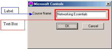
A text box is a placeholder for something you are supposed to read; otherwise it is a box where you are supposed to type something. Sometimes, you might be asked to highlight, select, or copy its content.

A text box is usually made of two parts. The writing on its left (sometimes it will be above it) is called a label. The text box itself is called by the name of its label. In this example, the text box would be called the Course Name Text Box.


A Combo Box

A combo box is a box that holds a list of items, one of which you might be asked to select. Just like a text box, a label accompanies a combo box. And like a text box, a combo box is named after its label. For example, in the picture, the left combo box would be called The Software Companies Combo Box and the other would be The Software Products Combo Box.

There are two kinds of combo boxes: dropdown and simple.

On a dropdown combo box (sometimes (in other books) called a dropdown box)), you make your selection by clicking the arrow on the right side of the box, a list drops down; from there, click your choice. On a simple combo box, you make your selection by clicking an in the box. In either case, only one item can be selected from the list.


A List Or A List Box

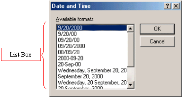
A list box displays a list of items you can choose from. The functionality of a list box depends on the programmer who implemented it. Some list boxes allow only one item selection, while some others would allow more. Eventually, when you are given instructions to use a list box or to make a selection from it, you will be direction on the item or items to be selected.


Property Sheets

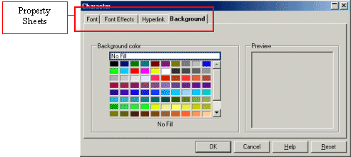
Property sheets, sometimes referred to as tabs (in other books), display paper sheet-like dialog boxes one in front of the other (s). You switch from one to another property sheet by clicking the appropriate tab, and then the new one comes in front. The number of property sheets on a property page differs from one implementation to another; in other words, it depends on the programmer.

The word or group of words on the tab is called a caption. Just like a dialog, each property sheet is referred to by its caption.


A Wizard

Like a property sheet, a wizard is made of various dialogs, this time, each dialog displays after other. A wizard is usually used to guide through a process of performing some actions.
Depending on the programmer, different wizards use a few or more buttons. But usually a wizard has buttons such as Back, Next, and Finish.


Check Boxes

A check box allows you to make one or more selections by clicking the check box(es). Programmatically, a check box evaluates something as being true or false.

A check box is referred to its caption (the whole line caption). For example, the first one of these check boxes is called The Meat Sauce Check Box. The 3rd one is called The Pepperoni Check Box.


Radio Buttons

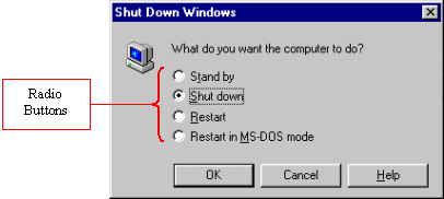
Radio buttons usually behave in a group of buttons. From the group, you usually can make only one selection. If you click one button, its radio button becomes selected; if you click another, the new one becomes selected and this deselects the last one.

A radio button is referred to by its label. From the sample dialog, the 2nd radio button would be called The Shut Down Radio Button. The 3rd one is called The Restart Radio Button.


Spin Buttons

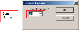
A spin button functions like a gauge counter. To use it, you increase or decrease its value using the up and down pointing arrows on its right. Depending on how it is set up, you usually can type the desired value.

A spin button is referred to by its label. The above spin button would be called The How Are You Spin Button.


Copyright © 2003 FunctionX