Windows Control: The Button
|
Windows Control: The Button |
|
Introduction to Command Buttons |
|
Description |
|
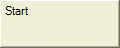
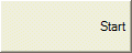
On a typical application, a button is an object that the user clicks to perform an action. To make this obvious, a button is a control surrounded by thick borders. Here is an example of a button on a form:
|
|
Although a control is usually positioned on a form, there various other control containers that can hold a button. These include the toolbar or the status bar, and the other containers we have used so far. To indicate what it is used for, a button displays some text as its caption. A button can also display a picture instead. Another button can display both a string and a picture. When you create a button, you will decide what it should display and how it should behave.
To support the buttons of an application, the .NET Framework provides an abstract class named ButtonBase. The regular button of Microsoft Windows is implemented by the Button class. At design time, to add a button to your project, from the Common Controls section of the Toolbox, you can click the Button and click the form or another container. To programmatically create a button, you can declare a variable of type Button and use the new operator to allocate memory for it. Here is an example: Imports System.Drawing
Imports System.Windows.Forms
Module Exercise
Public Class Starter
Inherits Form
Private btnResume As Button
Dim components As System.ComponentModel.Container
Public Sub New()
InitializeComponent()
End Sub
Public Sub InitializeComponent()
btnResume = New Button()
Controls.Add(btnResume)
End Sub
End Class
Function Main() As Integer
Dim frmStart As Starter = New Starter
Application.Run(frmStart)
Return 0
End Function
End Module
For a user, the most important aspects of a button are the message it displays and the action it performs. The text the button displays allows the user to know what the button is used for. This is represented by the Text property. The most popular strings that the buttons display are OK and Cancel. The OK caption is set for a form or a dialog box that informs the user of an error, an intermediary situation, or an acknowledgement of an action that was performed on the dialog that hosts the button. The Cancel caption is useful on a button whose main parent (the form or the dialog box) would ask a question or request a follow-up action from the user. Whenever a dialog box allows the user to dismiss it without continuing the action, you should provide a button with a Cancel caption. After adding a button to a form (by design or with code), you can change its caption with code by assigning the desired string to the Text property. For example, you can change the caption of a button as follows: button1.Text = "Let it Go!"; After specifying the Text of a button, by default, it's positioned in the middle center of the button:  The position of the text of a button is controlled through the TextAlign property which is a value of the ContentAlignment enumerator. The possible values are:
Here is an example: Public Sub InitializeComponent()
btnResume = New Button()
btnResume.Text = "Resume"
btnResume.Location = New Point(32, 20)
btnResume.Size = New System.Drawing.Size(120, 48)
btnResume.TextAlign = ContentAlignment.BottomCenter
Controls.Add(btnResume)
End Sub
Besides, or instead, of a caption, a button can display a picture on top. If you want a button to display a bitmap, you should first create, design, or have a picture. Then, in the Properties window, use the Image field to select a bitmap or an icon. You can also programmatically assign an Image object to the Image property. Here is an example: Public Sub InitializeComponent()
btnResume = New Button()
btnResume.Text = "Resume"
btnResume.Location = New Point(32, 20)
btnResume.Size = New System.Drawing.Size(120, 48)
btnResume.Image = Image.FromFile("E:\Programs\neutral.gif")
Controls.Add(btnResume)
End Sub
This would produce:  By default, both the caption and the image display ion the middle-center of the button. To make them distinct and allow the user to see both, you can design a bitmap that has both and assign that bitmap as the image of the button. Alternatively, you can use a separate string and a separate picture. Fortunately, each can have its own alignment. We already saw how to control the alignment of the caption. Besides displaying an image, the Button class is equipped with the ImageAlign property that allows you to specify the alignment of the image. The ImageAlign property is inherited from the ButtonBase class. The ButtonBase.ImageAlign property is based on the ContentAlignment enumeration that we are already familiar with. Here is an example: Public Sub InitializeComponent()
btnResume = New Button()
btnResume.Text = "Resume"
btnResume.Location = New Point(32, 20)
btnResume.Size = New System.Drawing.Size(120, 48)
btnResume.TextAlign = ContentAlignment.BottomCenter
btnResume.Image = Image.FromFile("E:\Programs\neutral.gif")
btnResume.ImageAlign = ContentAlignment.TopCenter
Controls.Add(btnResume)
End Sub
This would produce:  Instead of using the Image property, you can first create an image list and add some pictures to it. Then, using the ImageList property, assign it to the button. Use the ImageIndex property to specify what picture would be displayed on the button.
A regular button displays with raised borders as originally set by the operating system. To give your button a fancy look and behavior, you can use the FlatStyle property. The FlatStyle property is based on an enumeration of the same name. It provides 4 values that are:
Obviously the most important and the most intuitive event of a button occurs when clicked. This event is of type EventArgs, which indicates that it doesn't provide nor does it need any formal details about what is going on. To launch this event, you can double-click the button on the form. To create this event programmatically, first implement the method that would carry its assignment, then increment-add (with the += operator) it to the Click property of the button by assigning it the EventHandler constructor.
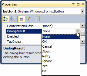
After the user has used a form or dialog box, to close it, the user would click a button. When the user does this, you must find out what button was clicked. Although there are various ways you can get this information, to assist you, the .NET Framework provides a convenient mechanism through an enumeration named DialogResult. When creating a form or a dialog box, after adding a button, in the Properties window, click DialogResult and select on the values:
Except for None, by default, it does not matter what value you select but, you should follow Windows standard to select the right value. After specifying the returned value of a button, access the properties of the form or dialog box:
After configuring the DialogResult of the button(s), when the user clicks one of the buttons to close the form or dialog box, you can get the value of the Form.ShowDialog() method which returns one of the values of the DialogResult enumeration. |
|
|
||
| Home | Copyright © 2008-2016, FunctionX, Inc. | |
|
|
||
