Accessories for Control Design: The Flow Layout Panel
|
Accessories for Control Design: The Flow Layout Panel |
|
Introduction |
|
To further assist you with application design, the .NET Framework provides the flow layout panel that you can use instead of manually positioning your controls horizontally or vertically. When used horizontally, the flow layout panel takes care of aligning controls so that all of them would have the same distance from the top border of their container. Of course, this has to do only with the controls that belong to the same group (the same container). |
|
The flow layout panel is represented in the .NET Framework by the FlowLayoutPanel class and in the Toolbox by the FlowLayoutPanel object. Therefore, to use it, click it from the Toolbox and add it to your form. The flow layout panel appears as a dotted rectangular object:
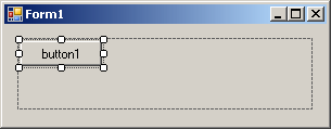
After placing it on a form, you can add controls to it. To do this, you would click a control from the Toolbox and click inside the flow layout panel. When you add the first control, it gets positioned in the top left side of the container and you cannot move it to a different position (if this were done it would deceive the purpose of the flow layout panel):
When you add a second control to the flow layout panel, it is positioned on the right side of the previously added control with the same horizontal alignment. You can continue adding other controls. If you want the controls to be aligned vertically, resize the flow layout panel accordingly:
Instead of aligning controls horizontally, you may want to position them vertically. To do this, you can narrow the flow layout panel but heighten it:
In the same way, if the flow layout panel is narrow and the controls are positioned vertically, if you enlarge it, its control would be positioned horizontally. As you can see, the flow layout panel provides a convenient way of aligning controls.
We mentioned that when you add the first control to a flow layout panel, the control is positioned in the top-left section of the container and the subsequently added controls would be positioned on the right side of, or below, the previous control. This is the default behavior and it is referred to as left-to-right. You can change this aspect. Depending on your design intentions, you may want the controls to be positioned from right to left. This characteristic is controlled by the FlowDirection property, which is an enumeration. The default value of this property is LeftToRight. If you set it to RightToLeft, the first control would be added to the top-right section of the container, the other controls would be incrementally positioned to the left of the previous one(s). As mentioned above, after adding a flow layout panel to a form, if you add a control to it, the control is positioned in the top-left section. If you add a second control, it is positioned on the right side of the previous control. This would be the same with the other subsequent controls. If you add a control but there is no room on the right side, the control would be positioned on the next row. If you resize the flow layout panel, the controls would be aligned vertically. This is the default behavior and it is referred to as wrapping. This means that the flow layout panel has the ability to wrap the controls inside its client area. This characteristics is partly controlled by a Boolean property named WrappingContents. Its default value is set to True. This property is controlled in connection with the FlowDirection. |
|
|
||
| Home | Copyright © 2008-2016, FunctionX, Inc. | |
|
|
||