Windows Control: The Label
|
Windows Control: The Label |
|
A label is a control that serves as a guide to the user. It provides static text that the user cannot change but can read to get information on a form. The programmer can also use it to display simple information to the user. Most controls on the form are not explicit at first glance and the user may not know what they are used for. Therefore, you can assign a label to a control as a help to the user. |
To add a label to a container, click the Label button
To programmatically create a label, declare a handle to Label, initialize it using its default constructor, and add it to the Controls property of the form. Here is an example: Imports System.Drawing
Imports System.Windows.Forms
Module Exercise
Public Class Starter
Inherits Form
Private lblMessage As Label
Dim components As System.ComponentModel.Container
Public Sub New()
InitializeComponent()
End Sub
Public Sub InitializeComponent()
lblMessage = New Label()
Controls.Add(lblMessage)
End Sub
End Class
Function Main() As Integer
Dim frmStart As Starter = New Starter
Application.Run(frmStart)
Return 0
End Function
End Module
The most important characteristic of a label control is the text it displays. That text is also referred to as its caption and this is what the user would read. The text of a label is its Text property and is its default. To set a label’s caption, after adding the control to a container, click Text in the Properties window and type the desired value. As we mentioned when studying controls characteristics, at design time, the text you type in the Text field is considered “as is”. If you want to create a more elaborate and formatted string, you would have to do it programmatically. Here is an example: Public Sub InitializeComponent()
lblMessage = New Label()
lblMessage.Text = Date.Today.ToLongDateString()
Controls.Add(lblMessage)
End Sub
Here is an example of what this would produce:
When it comes to its caption, one of the most valuable characteristics of the text of a label is the variance of the font. When designing a caption. you can change the default font to make it more attractive.
After adding a label to a form, by default, it receives a fixed size. If you type its caption and press Enter, the text you provided would be confined to the allocated dimensions of the control. If the text is too long, part of it may disappear. You can then resize the label to provide more area. Another solution is to automatically resize the label to accommodate the length of the string you typed. This is aspects is controlled by the Boolean AutoSize property. Its default value is False. If you set this property to True, at design time, a rectangular border appears around it. If you type a string in the Text field and press Enter, the control would be resized to show the whole string but using only the necessary space. If you programmatically create a label, it assumes a default size. If you assign it a string that is too long for that default size, part of the string may appear on a subsequent line. If you want the whole string to appear on the same line, you can set the AutoSize to true. Here is an example: Public Sub InitializeComponent()
lblMessage = New Label()
lblMessage.Text = Date.Today.ToLongDateString()
lblMessage.AutoSize = True
Controls.Add(lblMessage)
End Sub
Here is an example of what this would produce:
After typing the caption of a label whose AutoSize property is set to False, you can resize its allocated space to your liking. This is because a string occupies a rectangular area. Here is an example:  By default, the caption of a label is positioned starting on the middle-left side of its allocated rectangle. Alternatively, you can position it to one of the nine available positions. As we saw is Lesson 5, the position of the caption of a label is controlled by the TextAlign property which is based on the ContentAlignment enumerator: 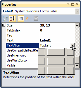 It can have the following values:
Other fancy characteristics you can apply to a label include its font and color. For example, a label is primarily meant to display a string. To make it fancier, you can display a (small) picture next to it. To do this, at design time, use the Image field of the Properties window to select a picture. You can also specify the picture at run time by assigning an Image value to the Label.Image property. After adding a picture that would accompany the label, you can specify what position the picture would hold with regards to the label. To do this, select the desired position of the ImageAlign field in the Properties window. Instead of using a picture from the Image property, you can create a list of images using an ImageList control and assign it to the label. In fact, the advantage of an ImageList is that, unlike the Image property, it allows you to use more than one picture. After assigning an ImageList to the label control using the Properties window or code, you can use the ImageIndex to specify what picture to display next to the label.
A label provides another property called UseMnemonic. This property is valuable only when the label accompanies another control.
|
|
|
||
| Home | Copyright © 2008-2016, FunctionX, Inc. | |
|
|
||
 from the Toolbox and click the object that would host it.
  Practical
Learning: Introducing Labels
Practical
Learning: Introducing Labels