Windows Control: The Progress Bar
|
Windows Control: The Progress Bar |
|
Introduction to Progress Bars |
|
Description |
|
A progress bar is a control that displays (small) rectangles that are each filled with a color. These (small) rectangles are separate but adjacent each other so that, as they display, they produce a bar. To have the effect of a progress bar, not all these rectangles display at the same time. Instead, a numeric value specifies how many of these (small) rectangles can display at one time. |
To support progress bars, the .NET Framework provides the ProgressBar class, which is derived from the Control class. In the Toolbox, the progress bar is represented by the ProgressBar control. At design time, to get a progress bar, from the Common Controls section of the Toolbox, you can click the ProgressBar control and click the form (or another container). To programmatically get a progress bar, declare a variable of type ProgressBar, use the New operator to allocate memory for it, and add it to the Controls property of its container. Here is an example: Imports System.Drawing
Imports System.Windows.Forms
Module Exercise
Public Class Starter
Inherits Form
Private Progress As ProgressBar
Dim components As System.ComponentModel.Container
Public Sub New()
InitializeComponent()
End Sub
Public Sub InitializeComponent()
Text = "Progressive Studies"
Size = New Size(242, 80)
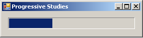
Progress = New ProgressBar
Controls.Add(Progress)
End Sub
End Class
Function Main() As Integer
Dim frmStart As Starter = New Starter
Application.Run(frmStart)
Return 0
End Function
End Module
This would produce:
The progress bar shares the various characteristics of other graphical controls (that is, the objects derived from the Control class). These include the location, the size, the back color, the size, the cursor, the ability to be anchored, the ability to the docked, the ability to be shown or hidden, and the ability to be enabled or disabled, etc. Here is an example: Public Sub InitializeComponent()
Text = "Progressive Studies"
Size = New Size(280, 80)
Progress = New ProgressBar
Progress.Location = New Point(12, 12)
Progress.Width = 252
Controls.Add(Progress)
End Sub
This would produce:
After adding it to an application, a progress bar assumes a horizontal position (the actual progress bar of Microsoft Windows, as implemented in Win32, can also have a vertical orientation; the .NET Framework's version has this and other limitations).
To show its effect, the progress bar draws its small rectangles as a bar. These small rectangles are from a starting position to an ending position. This means that the progress bar uses a range of values. This range is controlled by the Minimum and the Maximum properties whose default values are 0 and 100 respectively. At design time, you can set them using the limits of an integer. To programmatically set these values, assign the desired numbers to one or both. Here is an example: Public Sub InitializeComponent()
Text = "Progressive Studies"
Size = New Size(280, 80)
Progress = New ProgressBar
Progress.Location = New Point(12, 12)
Progress.Width = 252
Progress.Minimum = 0
Progress.Maximum = 255
Controls.Add(Progress)
End Sub
The small rectangles would be drawn from the left (the Minimum value) to the right (the Maximum value) sides of the control.
At one particular time, the most right rectangle of a progress bar is referred to as its position and it is represented by the Value property. At design time, to set a specific position for the control, change the value of the Value property whose default is 0. The position must always be between the Minimum and Maximum values. At design time, if you change the Minimum to a value higher than the Value property, the value of Value would be increased to the new value of Minimum. If you set the value of Value to a value lower than the Minimum, You would receive an error:  After clicking OK, the value of the Minimum would be reset to that of the Value property. In the same way, if you set the value of Value to a value higher than Maximum, you would receive an error. At run time, you can assign the desired value to the Value property. Once again, avoid specifying a value that is out of range. Here is an example: Public Sub InitializeComponent()
Text = "Progressive Studies"
Size = New Size(280, 80)
Progress = New ProgressBar
Progress.Location = New Point(12, 12)
Progress.Width = 252
Progress.Minimum = 0
Progress.Maximum = 255
Progress.Value = 88
Controls.Add(Progress)
End Sub
This would produce:
Because a progress bar is usually meant to indicate the progress of an activity, when drawing its small rectangles, it increases its current position in order to draw the next rectangle, except if the control is reset. The number of units that the object must increase its value to is controlled by the Step property. By default, it is set to 10. Otherwise, you can set it to a different value of your choice. Here is an example: Public Sub InitializeComponent()
Text = "Progressive Studies"
Size = New Size(280, 80)
Progress = New ProgressBar
Progress.Location = New Point(12, 12)
Progress.Width = 252
Progress.Minimum = 0
Progress.Maximum = 255
Progress.Step = 12
Controls.Add(Progress)
End Sub
When the control draws one of its rectangles based on the Step value, it calls the PerformStep(). Its syntax is: Public Sub PerformStep After a small rectangle has been drawn, the current value is incremented by the value of the Step property. If you want to increase the value of the control to a value other than that of the Step property, you can call the Increment() method. Its syntax is: Public Sub Increment(value As Integer) The amount by which to increment is passed to the method. Here is an example: Imports System.Drawing
Imports System.Windows.Forms
Module Exercise
Public Class Starter
Inherits Form
Private Progress As ProgressBar
Friend WithEvents btnIncrement As Button
Dim components As System.ComponentModel.Container
Public Sub New()
InitializeComponent()
End Sub
Public Sub InitializeComponent()
Text = "Progressive Studies"
Size = New Size(284, 115)
Progress = New ProgressBar
Progress.Location = New Point(12, 12)
Progress.Width = 252
Progress.Minimum = 0
Progress.Maximum = 255
Progress.Value = 88
Progress.Step = 12
btnIncrement = New Button
btnIncrement.Text = "Increment"
btnIncrement.Location = New Point(12, 52)
Controls.Add(Progress)
Controls.Add(btnIncrement)
End Sub
Private Sub IncrementedClicked(ByVal sender As Object, _
ByVal e As EventArgs) _
Handles btnIncrement.Click
Progress.Increment(8)
End Sub
End Class
Function Main() As Integer
Dim frmStart As Starter = New Starter
Application.Run(frmStart)
Return 0
End Function
End Module
So far, we have described a progress bar as drawing small rectangles to represent the control. These rectangles are visually distinct (don't touch each other) and adjacent. As an alternative, if you want the progress control to appear smooth, you can make the control draw each next rectangle exactly where the previous one stops. To support this characteristic, the ProgressBar class is equipped with the Style property. The ProgressBar.Style property is based on the ProgressBarStyle enumeration that has three members:
If you decide to use the Marquee style, the progress bar will continually show its animation of small rectangles moving at a speed set from the MarqueeAnimationSpeed integral property and you cannot get the value of the progress bar. |
|
|
||
| Home | Copyright © 2008-2016, FunctionX, Inc. | |
|
|
||