Windows Controls: The Radio Buttons
|
Windows Controls: The Radio Buttons |
|
Introduction to Radio Buttons |
|
Description |
|
A radio button, sometimes called an option button, is a circular control that comes in a group with other radio buttons. Each radio button is made of a small empty circle O. From the group, when the user clicks one of them, the radio button that was clicked becomes filled with a big dot 8. When one of the radio buttons in the group is selected and displays its dot, the others display empty circles. To guide the user as to what the radio buttons mean, each is accompanied by a label. |
|
Here is an example of a form with three radio buttons: Small, Medium, and Large
To create a radio button, on the Toolbox, you can click the
RadioButton control
Unlike most of other controls that can be positioned anywhere, a radio button should not be placed directly on a form. Instead, a radio button should be positioned in a container that belongs to a form. The typical container is the group box. When a radio button is added to a group box, the location of the radio button is relative to its parent. This location is easy to specify if you are visually designing the application. If you are programmatically creating it, make sure you specify the location based on the control that will hold the radio button. Here are examples: Imports System.Drawing
Imports System.Windows.Forms
Module Exercise
Public Class Starter
Inherits Form
Private radSmall As RadioButton
Private radMedium As RadioButton
Private radLarge As RadioButton
Private grpPizzaSize As GroupBox
Dim components As System.ComponentModel.Container
Public Sub New()
InitializeComponent()
End Sub
Public Sub InitializeComponent()
grpPizzaSize = New GroupBox()
grpPizzaSize.Size = New Size(160, 120)
grpPizzaSize.Location = New Point(20, 10)
radSmall = New RadioButton()
radSmall.Location = New Point(20, 20)
radMedium = New RadioButton()
radMedium.Location = New Point(20, 50)
radLarge = New RadioButton()
radLarge.Location = New Point(20, 80)
grpPizzaSize.Controls.Add(radSmall)
grpPizzaSize.Controls.Add(radMedium)
grpPizzaSize.Controls.Add(radLarge)
Controls.Add(grpPizzaSize)
End Sub
End Class
Function Main() As Integer
Dim frmStart As Starter = New Starter
Application.Run(frmStart)
Return 0
End Function
End Module
This would produce:
To indicate what a radio button represents, it is accompanied by text, also referred to as its caption. To specify the caption of a radio button at a design time, type a string in the Text field of its Properties window. To programmatically specify the caption of a radio button, assign a string to its Text property. Here are examples: Public Sub InitializeComponent()
grpPizzaSize = New GroupBox()
grpPizzaSize.Size = New Size(160, 120)
grpPizzaSize.Location = New Point(20, 10)
radSmall = New RadioButton()
radSmall.Text = "Small"
radSmall.Location = New Point(20, 20)
radMedium = New RadioButton()
radMedium.Text = "Medium"
radMedium.Location = New Point(20, 50)
radLarge = New RadioButton()
radLarge.Text = "Large"
radLarge.Location = New Point(20, 80)
grpPizzaSize.Controls.Add(radSmall)
grpPizzaSize.Controls.Add(radMedium)
grpPizzaSize.Controls.Add(radLarge)
Controls.Add(grpPizzaSize)
End Sub
This would produce:
If you add only one radio button to a container, when the application starts, the lone radio button would appear with an empty round circle. If the user clicks that lone radio button, the radio button's circle becomes filled with a dot and the user cannot remove or change this aspect. If you equip a container with more than one radio button, the user can click the desired one to select it and only one of the radio buttons can be selected at a given time. The radio button that is selected is referred to as checked. To support this description, the RadioButton class is equipped with a property named Checked. At design time, to select a radio button, in the Properties window, set its Checked property to True. At run time, to programmatically select a radio button, assign a true value to its Checked property. To find out whether a particular radio button is selected, get the value of its Checked property. You can also programmatically check a radio button. Here is an example: Public Sub InitializeComponent()
grpPizzaSize = New GroupBox()
grpPizzaSize.Size = New Size(160, 120)
grpPizzaSize.Location = New Point(20, 10)
radSmall = New RadioButton()
radSmall.Text = "Small"
radSmall.Location = New Point(20, 20)
radMedium = New RadioButton()
radMedium.Text = "Medium"
radMedium.Location = New Point(20, 50)
radLarge = New RadioButton()
radLarge.Text = "Large"
radLarge.Location = New Point(20, 80)
grpPizzaSize.Controls.Add(radSmall)
grpPizzaSize.Controls.Add(radMedium)
grpPizzaSize.Controls.Add(radLarge)
Controls.Add(grpPizzaSize)
radMedium.Checked = True
End Sub
If the user clicks a radio button, since this control is primarily a button, the radio button that was clicked in the group fires a Click event. This is the most regularly used event of a radio button. Normally, when the user clicks a button in the group, the round box of that button becomes filled and the Click event is fired. If the user clicks a button that is already checked, nothing changes in the round box of that button but the Click event fires again. In some cases, you may want to execute code only if the checked state of a button has actually changed rather than being interested in whether the button was clicked or not. Fortunately, if you are interested only when the checked stated of a button is changed, you can use the CheckedChanged event. This event is fired whenever the checked state of a button is modified.
By default, the round box of a radio button is positioned to the left side of its accompanying label but you have many options. Besides the left position, you can position the round box to the top, the right, or the bottom etc side of its label. The position of the round box with regards to its label is controlled by the CheckAlign property which is a value of type ContentAlignment. To specify it at design time, access the Properties window of the radio button and select the desired value from the CheckAlign field. You can also change this property programmatically. Here are examples: Public Sub InitializeComponent()
grpPizzaSize = New GroupBox()
grpPizzaSize.Size = New Size(160, 120)
grpPizzaSize.Location = New Point(20, 10)
radSmall = New RadioButton()
radSmall.Text = "Small"
radSmall.CheckAlign = ContentAlignment.TopCenter
radSmall.Location = New Point(20, 20)
radMedium = New RadioButton()
radMedium.Text = "Medium"
radMedium.CheckAlign = ContentAlignment.TopCenter
radMedium.Location = New Point(20, 50)
radLarge = New RadioButton()
radLarge.Text = "Large"
radLarge.CheckAlign = ContentAlignment.TopCenter
radLarge.Location = New Point(20, 80)
grpPizzaSize.Controls.Add(radSmall)
grpPizzaSize.Controls.Add(radMedium)
grpPizzaSize.Controls.Add(radLarge)
Controls.Add(grpPizzaSize)
End Sub
Besides the alignment of the check box, you can also control the alignment of the text with regards to the bounding rectangle of the control. This characteristic is controlled by the TextAlign property of the RadioButton class. The TextAlign property also is of type ContentAlignment.
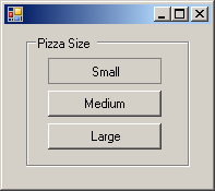
By default, a radio button appears as a rounded box that gets filled with a big dot when the user selects it. Optionally, you can make a radio button appear as a toggle button. Normally, if you make one radio button appear as a button, you should apply the same characteristics on the other radio buttons of the same group. The button would appear as a rectangular object. When the user clicks such a button, it appears down:  If the user clicks another button, this button becomes up:  To change the appearance of a radio button, assign the Button or Normal value to its Appearance property. The Appearance property is based on the Appearance enumeration. Here are examples: Public Sub InitializeComponent()
grpPizzaSize = New GroupBox()
grpPizzaSize.Text = "Pizza Size"
grpPizzaSize.Size = New Size(150, 120)
grpPizzaSize.Location = New Point(20, 10)
radSmall = New RadioButton()
radSmall.Appearance = Appearance.Button
radSmall.Location = New Point(20, 20)
radMedium = New RadioButton()
radMedium.Appearance = Appearance.Button
radMedium.Location = New Point(20, 50)
radLarge = New RadioButton()
radLarge.Appearance = Appearance.Button
radLarge.Location = New Point(20, 80)
grpPizzaSize.Controls.Add(radSmall)
grpPizzaSize.Controls.Add(radMedium)
grpPizzaSize.Controls.Add(radLarge)
Controls.Add(grpPizzaSize)
End Sub
This would produce:
As you can see, you can apply the Appearance property to a radio button that does not have a caption. You can also use a caption. If you do, make sure you align the caption to make is good to see. Here are examples: Public Sub InitializeComponent()
grpPizzaSize = New GroupBox()
grpPizzaSize.Text = "Pizza Size"
grpPizzaSize.Size = New Size(150, 120)
grpPizzaSize.Location = New Point(20, 10)
radSmall = New RadioButton()
radSmall.Text = "Small"
radSmall.Appearance = Appearance.Button
radSmall.TextAlign = ContentAlignment.MiddleCenter
radSmall.CheckAlign = ContentAlignment.MiddleCenter
radSmall.Location = New Point(20, 20)
radMedium = New RadioButton()
radMedium.Text = "Medium"
radMedium.Appearance = Appearance.Button
radMedium.TextAlign = ContentAlignment.MiddleCenter
radMedium.CheckAlign = ContentAlignment.MiddleCenter
radMedium.Location = New Point(20, 50)
radLarge = New RadioButton()
radLarge.Text = "Large"
radLarge.Appearance = Appearance.Button
radLarge.TextAlign = ContentAlignment.MiddleCenter
radLarge.CheckAlign = ContentAlignment.MiddleCenter
radLarge.Location = New Point(20, 80)
grpPizzaSize.Controls.Add(radSmall)
grpPizzaSize.Controls.Add(radMedium)
grpPizzaSize.Controls.Add(radLarge)
Controls.Add(grpPizzaSize)
End Sub
This would produce:
If you configure your application and give the user the ability to change the appearance of the radio button from a round circle to a rectangular object and vice-versa, and if the user decides to change this appearance, when this is done, the control whose appearance was changed fires an AppearanceChanged event. The AppearanceChanged event is of type EventArgs, meaning that it does not carry any significant information other than to let you know that the appearance of the button was changed. |
|
|
||
| Home | Copyright © 2008-2016, FunctionX, Inc. | |
|
|
||

 .
To programmatically create a radio button, declare a variable of type
RadioButton, use the new operator to allocation memory for it and add
it to the Controls collection of its parent. Because radio buttons always come
as a group, you should include them in another control that visibly shows that
the radio buttons belong together. The most common control used for this purpose
is the group box created using the GroupBox control.
.
To programmatically create a radio button, declare a variable of type
RadioButton, use the new operator to allocation memory for it and add
it to the Controls collection of its parent. Because radio buttons always come
as a group, you should include them in another control that visibly shows that
the radio buttons belong together. The most common control used for this purpose
is the group box created using the GroupBox control.