Windows Control: The Split Container
|
Windows Control: The Split Container |
|
Introduction |
|
A splitter is an object that divides a container in two vertical or two horizontal sections. It makes it possible for one section to be enlarged, narrowed, heightened, or shrunk while the other section is narrowed, enlarged, shrunk, or heightened. Based on this behavior, one section gets more room while the other gets smaller. You are probably familiar with this description if you have used Windows Explorer. In most cases, a splitter is made obvious by displaying a bar that divides the sections. |
|
Before using a splitter, the user can position the mouse of its bar. The cursor would change into a horizontal or a vertical double-arrow, depending on the orientation of the splitter. Here is an example:
To use the splitter, the user can click its bar and drag it left, right, up, or down, depending on the orientation of the splitter and what the user is trying to accomplish. After getting the desired position, the user can release the mouse.
To support splitters, the .NET Framework provides the split
container. It is represented in the library by the SplitContainer class
and in the Toolbox by the SplitContainer object. To add a split container to
your application, from the Containers section of the Toolbox, click the
SplitContainer object
A split container itself resembles a panel control. As described above, after you have added it, it automatically set its Dock property to Fill. This means that, after adding a split container, you would have difficulties adding an object to the form but outside the split container. Therefore, if you intend to have objects that do not belong to the split container, you must perform some prerequisite actions. Typically, you would first add a panel (or another container) to a form. For example, to have a group of control in the top section of the form, you can first add a panel to it and set its Dock property to Top:
Then, when you add a split container, it can use only the remaining area of the form:
In the same way, before adding a split container, you should prepare the form for objects you want to place on the form but that would not belong to the split container. Just you can have a split container made of two parts, you can have more than two resizable sections. To do this, after adding a split container, add another split container to one of the panels of an existing split container.
After adding a split container to a form, it may become difficult to select it from the form. To select, use the combo box above the Properties window. If you click an area of the split container, the corresponding panel becomes selected and you can change its characteristics using the Properties window but you can neither move nor delete a panel from the split container. As mentioned already, a split container is made of two panels separated by a bar. Each panel is equipped with the necessary characteristics that facilitate its role as its own container, including the background color, the background image, the ability to show the scroll bars, etc. As mentioned already, after adding a split container to a form, it sets its Dock property to Fill. This is the default behavior. If you do not want the container to fill the available area of the form, you can change the value of its Dock property.
Like a visual control, you can make a split container more appealing by painting its background with a picture. To support this, the SplitContainer class is equipped with a a property named BackgroundImage. This property expects a picture file or its location. The background image would appear on the splitter. When you set or change the background picture of the split container, it fires an BackgroundImageChanged event. This event is of type EventArgs. Because each panel has the ability to show a picture and to hold their controls, their backgrounds take priority over the background of the split container.
In our description, we saw that a split container was made of a dividing bar. This bar appears with a 4 pixel width. If you want, you can make it larger than. This characteristic is controlled by the SplitterWidth property. Its default value is 4 pixel. To change the with, assign the desired integer value to the SplitContainer.SplitterWidth property.
By default, when you add a new split container to a form, it divides itself with vertical bar. This makes it possible to change the width of panels. Alternatively, if you want the control to be divided horitally, you must change the orientation of the bar. To support this, the SplitContainer class is equipped with a property named Orientation. Default value of the SplitContainer.Orientation property is Vertical. To divide the container horizontally, set this property to Horizontal.
As mentioned in our description, to use a splitter, the user can position the mouse on the bar and drag in the desired direction. This is allowed by default and is controlled by the IsSplitterFixed Boolean property whose default value is False. While the user is moving the splitter, the split container fires a SplitterMoving event. This is event is handled by the SplitterCancelEventArgs class. This class holds the x and y coordinates of the split container as well the x and y coordinates of the mouse. After the user has moved the splitter, the split container fires a SplitterMoved event. This is event is handled by the SplitterEventArgs class that gives the x and y coordinates of the splitter. To prevent the user from dragging the bar, you can set the SplitContainer.IsSplitterFixed property to True. If you do this, when the user positions the mouse on the bar, the cursor would keep its pointing arrow shape.
If the IsSplitterFixed property is set to False, which is the default, the user can drag the bar to resize the panels. By default, when the user drags the bar, it moves by one pixel. You can make it move faster than that. This characteristic is controlled by the SplitterIncrement property whose default value is 1 (pixel). To make the bar move by more than one pixel, assign the desired value to the SplitterIncrement property.
After adding a split container and if the Dock property of the control is to a value other than None, when the user resizes the form, the border of the split container follows the movement of the mouse and the bar also moves by a certain rate to resize the opposite panel:
If you want, you can fix one panel so that, when the form is resized, that panel would keep its size by the bar not moving. To support this, the SplitContainer class is equipped with a property named FixedPanel. You can select one of the panels as the value of this property. |
|
|
||
| Home | Copyright © 2008-2016, FunctionX, Inc. | |
|
|
||

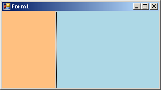
 and click a form of your application. Once you do this, an object called a split
container fills the form, divides itself in two, and gets equipped with two
objects named Panel1 and Panel2. In reality, a split container is an object made
of two panels separated by a bar. In each panel, you can then add the controls
as you see fit. A control added to one of the panels would become a child of
that panel.
and click a form of your application. Once you do this, an object called a split
container fills the form, divides itself in two, and gets equipped with two
objects named Panel1 and Panel2. In reality, a split container is an object made
of two panels separated by a bar. In each panel, you can then add the controls
as you see fit. A control added to one of the panels would become a child of
that panel.