Managing the Tabs
 |
Managing the Tabs |
|
The Navigation Arrows of a Tab Control |
|
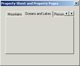
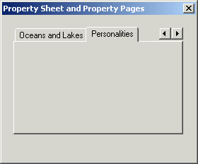
If you have many tab pages and the width of the tab control cannot show all tabs at the same time, the control would add two navigation arrows to its top right corner to let the user know that there are more property pages:   |
By default, the navigation buttons would come up because the control uses a property that controls their availability. If you do not want the navigation arrows, select the tab control and, in the Properties window, set the MultiLine property to True. This would create cascading tabs and the user can simply select the desired property page from its tab:
Of course, you can also do this programmatically by assigning the TabControl.MultiLine to true. After setting the MultiLine property to true, depending on the number of tab pages, the control may have 2, 3 or more rows. To find out the number of rows that the tab control contains, you can get the value of the RowCount property of the TabControl class. This property is of type int.
When you specify the caption of a property page, its is resized to accommodate the string. This means that the tab would get enlarged or narrowed, depending on the length of the caption. As an alternative, you can make all tabs use the same width. To support this, the TabControl class is equipped with a property named SizeMode. The SizeMode property is based on the TabSizeMode enumeration that has three members: Normal (the default), Fixed, and FillToRight. To control the size mode at design time, on the form, select the tab control. In the Properties window, click SizeMode and select the desired option: Normal: Each tab would be resized to fit its caption:
Fixed: The designer would find out what tab has the longest caption. It would then use that length as the common width of all the other tabs:
If the tab control's MultiLine property is set to true, the designer would get the length of the longest string of the first (top) row:
That length would be used as the common length to all the tabs on all rows:
FillToRight: This option is valid only if the MultiLine property is set to true. With this option, the tabs on each row would be resized so that the total length of the rows fit the width of the tab control:
Besides, or in addition to, the size mode, you can control the widths of the tab by specifying your own width. To do this, first set the SizeMode property to true. Then, use the ItemSize property of the tab control to specify how much width you want to apply to all tabs of the control.
As you are adding pages to a TabControl control, the tabs of the pages are positioned on the top border of the TabControl area. You can reposition them to the left, the right, or the bottom borders of the control. The placement of the tab is set using the Alignment property of the TabControl control. The possible values of this property are Top, Left, Right, and Bottom:
To support the alignment of the tabs of a property sheet, the TabControl class is equipped with a property named Alignment. This property is based on the TabAlignment enumeration and its members are Bottom, Left, Right, and Top. To programmatically control the alignment of the tabs, assign the desired value to the tab control. Here is an example: Imports System
Imports System.Drawing
Imports System.Windows.Forms
Module Exercise
Public Class WinControls
Inherits Form
Private lstImages As ImageList
Private pgeController As TabPage
Private pgeAccount As TabPage
Private pgeSummary As TabPage
Private tclPropertySheet As TabControl
Dim components As System.ComponentModel.Container
Public Sub New()
InitializeComponent()
End Sub
Public Sub InitializeComponent()
Size = New Size(345, 228)
StartPosition = FormStartPosition.CenterScreen
tclPropertySheet = New TabControl()
tclPropertySheet.Location = New Point(14, 16)
tclPropertySheet.Size = New Size(310, 170)
tclPropertySheet.HotTrack = True
tclPropertySheet.Alignment = TabAlignment.Left
lstImages = New ImageList()
lstImages.Images.Add(Image.FromFile("E:\Programs\image1.jpg"))
lstImages.Images.Add(Image.FromFile("E:\Programs\Image2.jpg"))
lstImages.Images.Add(Image.FromFile("E:\Programs\Image3.jpg"))
tclPropertySheet.ImageList = lstImages
pgeController = New TabPage()
pgeController.Text = "Controller"
pgeController.ImageIndex = 1
tclPropertySheet.Controls.Add(pgeController)
pgeAccount = New TabPage()
pgeAccount.Text = "Account"
pgeAccount.ImageIndex = 2
tclPropertySheet.TabPages.Add(pgeAccount)
pgeSummary = New TabPage()
pgeSummary.Text = "Summary"
pgeSummary.ImageIndex = 0
tclPropertySheet.TabPages.Add(pgeSummary)
Controls.Add(tclPropertySheet)
End Sub
Public Shared Function Main() As Integer
Application.Run(New WinControls())
Return 0
End Function
End Class
End Module
If you want to create a discrete property sheet and do not want to display the traditional tabs, you can replace the tabs with buttons. This is controlled by the Appearance property that presents three options: Normal (the default), Buttons, and FlatButtons. The Normal and the Buttons values can be used on all four views. The FlatButtons option is available only if the Alignment property is set to Top.
To support the option of showing tabs or buttons, the TabControl class is equipped with the Appearance property that is based on the TabAppearance enumeration. Therefore, to specify this option, assign the desired value to your TabControl object. Here is an example: Imports System
Imports System.Drawing
Imports System.Windows.Forms
Module Exercise
Public Class WinControls
Inherits Form
Private lstImages As ImageList
Private pgeController As TabPage
Private pgeAccount As TabPage
Private pgeSummary As TabPage
Private tclPropertySheet As TabControl
Dim components As System.ComponentModel.Container
Public Sub New()
InitializeComponent()
End Sub
Public Sub InitializeComponent()
Size = New Size(345, 228)
StartPosition = FormStartPosition.CenterScreen
tclPropertySheet = New TabControl()
tclPropertySheet.Location = New Point(14, 16)
tclPropertySheet.Size = New Size(310, 170)
tclPropertySheet.HotTrack = True
tclPropertySheet.Appearance = TabAppearance.FlatButtons
lstImages = New ImageList()
lstImages.Images.Add(Image.FromFile("E:\Programs\image1.jpg"))
lstImages.Images.Add(Image.FromFile("E:\Programs\Image2.jpg"))
lstImages.Images.Add(Image.FromFile("E:\Programs\Image3.jpg"))
tclPropertySheet.ImageList = lstImages
pgeController = New TabPage()
pgeController.Text = "Controller"
pgeController.ImageIndex = 1
tclPropertySheet.Controls.Add(pgeController)
pgeAccount = New TabPage()
pgeAccount.Text = "Account"
pgeAccount.ImageIndex = 2
tclPropertySheet.TabPages.Add(pgeAccount)
pgeSummary = New TabPage()
pgeSummary.Text = "Summary"
pgeSummary.ImageIndex = 0
tclPropertySheet.TabPages.Add(pgeSummary)
Controls.Add(tclPropertySheet)
End Sub
Public Shared Function Main() As Integer
Application.Run(New WinControls())
Return 0
End Function
End Class
End Module
|
|
|
||
| Previous | Copyright © 2008-2016, FunctionX, Inc. | Home |
|
|
||