A toolbar is a classic control container. It can host text, buttons, etc. It is up to you to decide whether your application needs a toolbar and what you want to position on it.
You can create a toolbar visually or programmatically. To support toolbars, the .NET Framework provides a class named ToolStrip. The ToolStrip class is derived from the ScrollableControl class and implements both the IComponent and the IDisposable interfaces.
Therefore, to start a toolbar, declare a variable of this class. Because a toolbar is hosted by a container, namely a form, if you want to display it, you should (must) add it to the Controls collection of its host. Here is an example: Imports System.Windows.Forms
Public Class Exercise
Inherits System.Windows.Forms.Form
Dim tbrStandard As ToolStrip
Public Sub New()
tbrStandard = New ToolStrip
Controls.Add(tbrStandard)
End Sub
<STAThread()>
Public Shared Function Main() As Integer
Application.Run(New Exercise)
Return 0
End Function
End Class
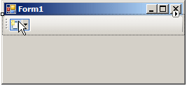
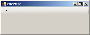
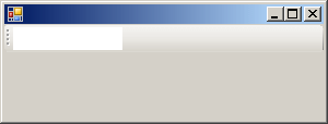
This would produce:
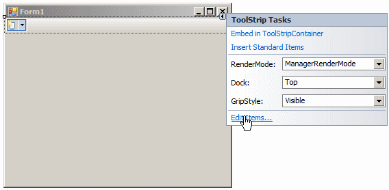
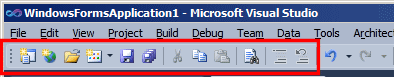
To help you visually create a toolbar, in its Container section, the Toolbox provides a ToolStrip button that you can click and click your form. Whether using code or visual design, you can create as many toolbars as you see fit.
A toolbar is primarily a container, which itself means nothing and doesn't even do anything. The controls you position on it give it meaning. Still, because of its position, it enjoys some visual characteristics but also imposes some restrictions to its objects. Although it is a container, a toolbar must be hosted by another container. For this reason, the dimensions, namely the width, of a toolbar are restricted to those of its host. When you add a toolbar to a form, it automatically positions itself in the top section of the form and uses the same width as the form. This means that the default Dock value of a toolbar is Top.
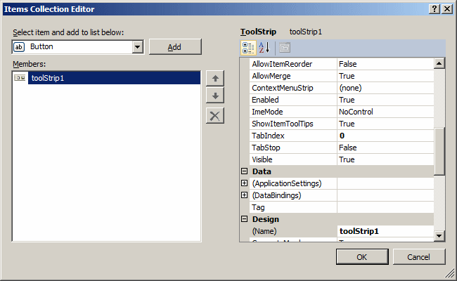
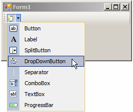
By default, just after you have added a toolbar to your form, it is empty, waiting for you to add objects to it. To hold its collection of objects, the ToolStrip class is equipped with a property named Items. The ToolStrip.Items property is an object of type ToolStripItemCollection, which itself is a collection class. Each member of the ToolStripItemCollection class is of type ToolStripItem. During desgin, to add the desired items, do one of the following things:
Any of these actions would open the Items Collection Editor where you can individually select items, click Add, and configure them:
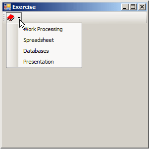
Instead of adding objects one by one, Microsoft Visual Studio provides a default or standard design for a toolbar. To use it, after visually adding the toolbar to a form:
Any of these actions would equip the toolbar with the most common buttons used on a standard toolbar.
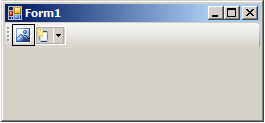
The most common object of a toolbar is a button. If you are working visually, to add a button to a toolbar, click the toolbar. An icon would display. Click that button:
A button of a toolbar is based on a class named ToolStripButton. The ToolStripButton clas is derived from the ToolStripItem class which, as mentioned before, is represented by the Items property that is a member of the ToolStrip class. To programmatically create a toolbar button, declare a variable of this class. The ToolStripButton class is equipped with 6 constructors. You can use the default constructor if you are not ready to provide the other pieces of information a button may need. After declaring the variable, add it to the Items property of its container. Here is an example: Imports System.Windows.Forms
Public Class Exercise
Inherits System.Windows.Forms.Form
Dim tbrStandard As ToolStrip
Dim btnCreate As ToolStripButton
Public Sub New()
tbrStandard = New ToolStrip
btnCreate = New ToolStripButton
tbrStandard.Items.Add(btnCreate)
Controls.Add(tbrStandard)
End Sub
<STAThread()>
Public Shared Function Main() As Integer
Application.Run(New Exercise)
Return 0
End Function
End Class
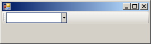
By default, a button of a toolbar displays an icon on top. If you click the toolstrip to create a button, the new button receives a default icon:
To specify or change the icon of a button, after clicking it, in the Properties window, click Image, then click its browse button. In the Select Resource dialog box, click Import, locate the desired icon, select it, and click OK. To programmatically specify the icon of a button, you have many options. The ToolStripButton class is equipped with a property named Image. Assign an icon to this property. Here is an example: Imports System.Drawing
Imports System.Windows.Forms
Public Class Exercise
Inherits System.Windows.Forms.Form
Dim tbrStandard As ToolStrip
Dim btnCreate As ToolStripButton
Public Sub New()
tbrStandard = New ToolStrip
btnCreate = New ToolStripButton
btnCreate.Image = Image.FromFile("C:\Icons Collection\create.ico")
tbrStandard.Items.Add(btnCreate)
Controls.Add(tbrStandard)
End Sub
<STAThread()>
Public Shared Function Main() As Integer
Application.Run(New Exercise)
Return 0
End Function
End Class
The ToolStripButton class provides another constructor whose syntax is: Public Sub New(image As Image) When creating a button, you can use this constructor to directly specify its icon. Here is an example: Imports System.Drawing
Imports System.Windows.Forms
Public Class Exercise
Inherits System.Windows.Forms.Form
Dim tbrStandard As ToolStrip
Dim btnCreate As ToolStripButton
Public Sub New()
tbrStandard = New ToolStrip
btnCreate = New ToolStripButton(Image.FromFile("C:\Icons Collection\create.ico"))
tbrStandard.Items.Add(btnCreate)
Controls.Add(tbrStandard)
End Sub
<STAThread()>
Public Shared Function Main() As Integer
Application.Run(New Exercise)
Return 0
End Function
End Class
If an icon is not explicit enough, you can make it display text or a combination of an icon and text. To support this, the ToolStripItem class provides a property named DisplayStyle. This property is of type ToolStripItemDisplayStyle, which is an enumeration. The members of the ToolStripItemDisplayStyle are:
To visually configure this behavior, access the Properties window for the button and, in the DisplayStyle field, select the desired member. To do this programmatically, access the DisplayStyle property and assign the desired value to it. If you want a button to display text, first select either Text or ImageAndText for the DisplayStyle property. To visually specify the text to display, type it in the Text property. To do it programmatically, you have various options. You can assign a string to the Text property of the button. Here is an example: Imports System.Drawing
Imports System.Windows.Forms
Public Class Exercise
Inherits System.Windows.Forms.Form
Dim tbrStandard As ToolStrip
Dim btnCreate As ToolStripButton
Public Sub New()
tbrStandard = New ToolStrip
btnCreate = New ToolStripButton
btnCreate.DisplayStyle = ToolStripItemDisplayStyle.Text
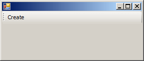
btnCreate.Text = "Create"
tbrStandard.Items.Add(btnCreate)
Controls.Add(tbrStandard)
End Sub
<STAThread()>
Public Shared Function Main() As Integer
Application.Run(New Exercise)
Return 0
End Function
End Class
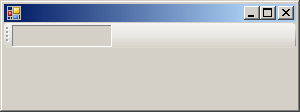
This would produce:
The ToolStripButton class is equipped with another constructor whose syntax is: Public Sub New(text As String) You can use this constructor to create a toolbar and specify its text. Of course, you must specify an appropriate value for the DisplayStyle property. Here is an example: Imports System.Drawing
Imports System.Windows.Forms
Public Class Exercise
Inherits System.Windows.Forms.Form
Dim tbrStandard As ToolStrip
Dim btnCreate As ToolStripButton
Public Sub New()
tbrStandard = New ToolStrip
btnCreate = New ToolStripButton("Create")
btnCreate.DisplayStyle = ToolStripItemDisplayStyle.Text
tbrStandard.Items.Add(btnCreate)
Controls.Add(tbrStandard)
End Sub
<STAThread()>
Public Shared Function Main() As Integer
Application.Run(New Exercise)
Return 0
End Function
End Class
To display both an icon and text, select the appropriate value of the DisplayStyle property. Then, in the Properties window of the button, specify the icon and enter the desired text. Otherwise, the ToolStripButton class provides another constructor whose syntax is: Public Sub New(text As String, image As Image) If you decide to use this version, pass the appropriate arguments. To use a button, the user can click it. Therefore, you should create an event handler for the button. You can use the Events section of the Properties window or programmatically write it. Here is an example: Imports System.Drawing
Imports System.Windows.Forms
Public Class Exercise
Inherits System.Windows.Forms.Form
Dim tbrStandard As ToolStrip
WithEvents btnCreate As ToolStripButton
Public Sub New()
tbrStandard = New ToolStrip
btnCreate = New ToolStripButton("Create")
btnCreate.DisplayStyle = ToolStripItemDisplayStyle.Text
tbrStandard.Items.Add(btnCreate)
Controls.Add(tbrStandard)
End Sub
Private Sub btnCreateClick(ByVal Sender As Object, ByVal e As EventArgs) _
Handles btnCreate.Click
MsgBox("The document will be created",
MsgBoxStyle.OkOnly Or MsgBoxStyle.Information,
"Exercise")
End Sub
<STAThread()>
Public Shared Function Main() As Integer
Application.Run(New Exercise)
Return 0
End Function
End Class
Otherwise, the ToolStripButton class supports all the normal events of a button.
|
|
|||||||||||||||||||||||||||||||||||||||||||||||||||||||||||||||||||||||||||||||||||||||||||||||||||||||||||||||||||||||||||||||||||||||||||||||||||||||
|
|
||||||||||||||||||||||||||||||||||||||||||||||||||||||||||||||||||||||||||||||||||||||||||||||||||||||||||||||||||||||||||||||||||||||||||||||||||||||||
 Practical Learning: Introducing MDI Applications
 and click the form
 and click the form
 and click the form