
The Windows Controls of a Form
 |
The Windows Controls of a Form |
|
Control Design |
|
Introduction |
|
A typical database is made of forms (and reports) and these objects are equipped with Windows controls that allow a user to interact with the computer. To create such a database, you add forms and reports to it. Then you populate them with the necessary objects. This is the essence of application design and you should know how to design the controls. Form and report design consists of populating them with the necessary controls that would allow a person to use your database. To perform this design, you first open the form or report in Design View. |
When designing a form, one of the most usual actions you will perform consists of adding the necessary controls to it. To do this, on the Toolbox, you can click the desired control and click a section of the form.
To perform your design, a form is equipped with two rulers, one horizontal on the top section of the form, and one vertical on the left section, to help you with more precise with dimensions. To assist with controls design, you can use a toolbox equipped with buttons, text boxes and other items to give a lot of flexibility to your application. Since the rulers are dimensionally configured, there are divisions inside of the rulers to help you be more precise. Between two numbered dimensions, there are 7 marks that create 8 divisions. The mark in the middle, a little taller than the others, represents the middle of two dimensions. In this site, the middle division will be referred to as ˝. The first division on the right side of a number represents 1/8 of a dimension, the 2nd represents 2/8 = Ľ of a dimension, the 3rd represents 3/8, and that is why the 4th represents 4/8 = ˝. This is how we will refer to these dimensions. |
|
Control Creation |
|
As mentioned already, to design a form (or report), to typically click the desired control in the Toolbox and click the form (or report). To programmatically create a control, you can call the CreateControl() method (of the Application object). Its syntax is: |
CreateControl(formname, controltype[, section[, parent[, columnname[, left[, top[, width[, height]]]]]]])
|
The first argument is the name of the form (or report) on which the control would be positioned. The second argument must correspond to one of the controls available in Microsoft Access but you must use one of the following constants to represent it:
The third argument specifies in what section of the form or report the new control would be positioned. The default val;ue of this argument is acDetail. This argument can have one of the following values:
The fourth argument to this method is the name of the control that would serve as the parent of the new control. If the control will not have a parent, then you can pass it as an empty string "". The fifth argument has to do with actual databases, which we haven't covered. The sixth and the seventh arguments specify the location of the control. The eighth and the ninth arguments specify the dimensions of the new control. Here is an example that first opens a form named Specials and then creates a text box control in the Detail section of the form: Private Sub cmdCreateControl_Click()
DoCmd.OpenForm "Specials", acDesign
CreateControl "Specials", acTextBox, acDetail, "", "", 220, 122, 1200, 400
End Sub
|
|
Common Properties of Controls |
|
Control Location |
|
While or after creating a control, you can either specify its location or change it. This is easily done when designing a form or report. To position a control, first select it. When the mouse moves over a selected control, its pointer displays a different cursor. Two of these cursors can be used to move a control:
You can use one of the cursor shapes to specify the desired location of the control. The distance from the left border of the container to the left border of a control is represented by its Left property. Based on this, to programmatically move a control horizontally, assign a numeric value to its Left property. Here is an example: Private Sub cmdMove_Click()
cmdRename.Left = 450
End Sub
In the same way, the distance from the top border of a host to the top border of a control is its Top property. |
|
Control Dimensions |
|
The dimensions of a control or a section of a container are the distance from its left to its right borders and from its top to its bottom borders. These dimensions are represented by the Height and the Width properties respectively. To manually change the dimensions of a control, first display it in Design View. To change the width of a form or a report, position the mouse on its right border until the cursor turns into a vertical beam with a double-horizontal arrow:
Then click and drag left or right until you are satisfied.
To change the width of the form or report and the height of the lowest section at the same time, you can position the mouse on the lower-right corner. The cursor would change into a small square with 4 arrows:
You can then click and drag left, right, up, down, or diagonally.
Although these pointers can be used to resize one control, they can also be applied to a group of controls. To programmatically change the height of a control, assign a numeric value to its Height property. In the same way, to heighten a control, assign the desired numeric value to its Width property. Here is an example: Private Sub cmdMove_Click()
cmdRename.Width = 2450
End Sub
|
|
Form and Report Design: Controls Deletion |
|
If you have added a control or it was created by the Form Wizard or the Report Wizard, you can delete it. You can also delete a group of controls in one step. |
|
Tab Order |
|
The controls on a form are aligned in the order you desire for their sequence. Unfortunately, when you add a control on the form that already has other controls, regardless of the section or area you place the new control, it is sequentially positioned at the end of the existing controls. If you don't fix it, the data entry personnel could have a hard time figuring out how the sequence should be followed. When writing Visual Basic code, you will also find out that the sequence of navigation of controls on a form is very important. The sequence of controls navigation is set using the Tab Order dialog box. The Tab Order dialog box is available when the form is opened in Design View. Once in Design View, either (1) on the menu bar, click View -> Tab Order; or (2) right-click on the form and click Tab Order. The simplest and quickest way to rearrange the order of items is to click the Auto Order button. Sometimes, you will not like the arrangement made by the Tab Order dialog box. To rearrange items manually, move a row or a group of rows using the same technique we used to move field names on a table's Design View. |
|
|
|
Tables Columns and Windows Controls |
|
Introduction |
|
The essence of a database relies on its table(s). Even if you consider that the forms present the friendlier link between the user and your application, most of the information in your database is stored in one or more tables, and table(s) is(are) made of columns. After creating a table and its columns, you can directly create the forms and/or other objects, such as reports or Access Data Pages, that are based on the table(s) and get their data from a table's column(s). Remember that, after creating a table, to generate a form based on it, you can first select that table in the Tables section of the Database window. Then, on the Database toolbar, click the arrow of the New Object button and click AutoForm. |
|
The Names of Columns and Controls |
|
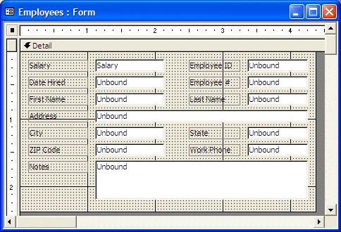
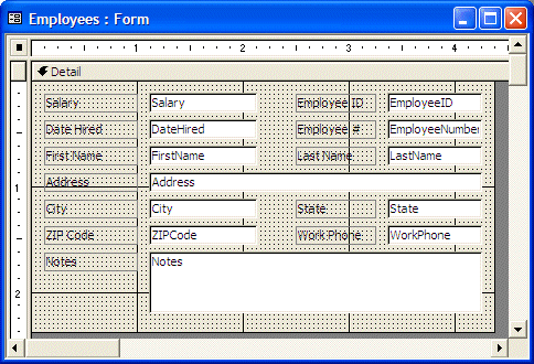
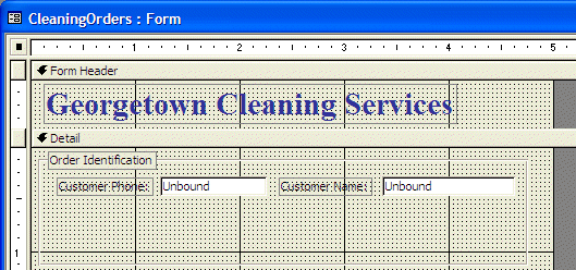
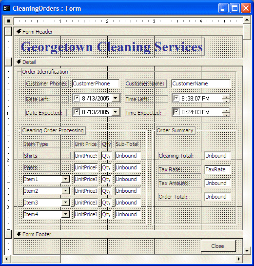
If you generate a form, a report, or a Data Access Page that is bound to a table, each control added to the container has a name that is the same as the column it is bound to. If you add an unbound text box or control to a form or report, it receives a default name that is cumulative. Whether a control of a form or a report is bound or not to a column of a table, the name of that control doesn't have anything to do with that of a column. This means that you can easily set or change the name of a control. We reviewed how to name a control and how to change it. You should refrain from programmatically changing the name of a control. If the form or report has already been created but its controls are not bound to the columns of a table, you should first specify the Record Source of the form or report. After doing this, to associate or link a control to a column of the Record Source, first select the column and, in the Properties window, set its Control Source to the name of the column. To do this programmatically, assign the name of the column to the name of the control. Here are two examples: Private Sub cmdRecordSource_Click()
Me.RecordSource = "CleaningOrders"
Me.txtPhoneNumber.ControlSource = "CustomerPhone"
Me.txtCustomerName.ControlSource = "CustomerName"
End Sub
In this case, the CustomerPhone column of a table named CleaningOrders would be bound to a text box named txtPhoneNumber of the current table. |
|
|
| Control | Control Source |
| txtSalary | Salary |
| txtEmployeeID | EmployeeID |
| txtDateHired | DateHired |
| txtEmployeeNumber | EmployeeNumber |
| txtFirstName | FirstName |
| txtLastName | LastName |
| txtAddress | Address |
| txtCity | City |
| txtState | State |
| txtZIPCode | ZIPCode |
| txtWorkPhone | WorkPhone |
| txtNotes | Notes |
| Field Name | Data Type |
| UnitPriceShirts | Currency |
| QtyShirts | Number |
| UnitPricePants | Currency |
| QtyPants | Number |
| Item1 | Text |
| UnitPriceItem1 | Currency |
| QtyItem1 | Number |
| Item2 | Text |
| UnitPriceItem2 | Currency |
| QtyItem2 | Number |
| Item3 | Text |
| UnitPriceItem3 | Currency |
| QtyItem3 | Number |
| Item4 | Text |
| UnitPriceItem4 | Currency |
| QtyItem4 | Number |
| TaxRate | Number |
|
The Names of Columns and Controls |
|
If you generate a form, a report, or a Data Access Page that is bound to a table, each control added to the container has a name that is the same as the column it is bound to. If you add an unbound text box or control to a form or report, it receives a default name that is cumulative. Whether a control of a form or a report is bound or not to a column of a table, the name of that control doesn't have anything to do with that of a column. This means that you can easily set or change the name of a control. In Lesson 10, we reviewed how to name a control and how to change it. You should refrain from programmatically changing the name of a control. If the form or report has already been created but its controls are not bound to the columns of a table, you should first specify the Record Source of the form or report. After doing this, to associate or link a control to a column of the Record Source, first select the column and, in the Properties window, set its Control Source to the name of the column. To do this programmatically, assign the name of the column to the name of the control. Here are two examples: Private Sub cmdRecordSource_Click()
Me.RecordSource = "CleaningOrders"
Me.txtPhoneNumber.ControlSource = "CustomerPhone"
Me.txtCustomerName.ControlSource = "CustomerName"
End Sub
In this case, the CustomerPhone column of a table named CleaningOrders would be bound to a text box named txtPhoneNumber of the current table. |
|
The Captions of Columns and Controls |
|
If you generate a form or report that is based on a table, its Windows controls would use default captions on their accompanying labels. If the originating column has a caption, that caption would be used. If the column doesn't have a caption, its name would be used as the caption of the accompanying label. |
|
Form and Report Design: Controls Selection |
|
To manipulate controls on the form, you will regularly need to select them. When one control is selected, you can change only its characteristics. When many controls are selected, you can make a change that would impact all of them. To select a control, you can just click it. A control that is selected displays 8 handles around it:
To select more than one control, at random, click one, then press and hold Shift. While holding Shift, click each of the desired controls. After selecting the controls, release Shift. To select controls aligned vertically, click inside of the horizontal ruler above the highest positioned control: everything that would be touched by the fake line will be selected. In the same way, you can select controls that are horizontally aligned by clicking inside the vertical ruler. To select many controls in the same area on the form, click next to one of them and draw a fake rectangle that covers each of the desired controls. All controls touched by the fake rectangle would be selected when you release the mouse. To select all controls on the form, press Ctrl + A. You can also click inside of one of the rulers on one end and drag to the other end. |
|
Common Methods of Windows Controls |
|
Setting Focus |
|
The focus is the visual aspect that indicates the control that would receive a change if the user types a new value. This also means that a control must receive focus before it can receive a value. A user usually gives focus to a control by clicking it or pressing Tab continuously until the control indicates that it has focus. To programmatically give focus to a control, you can call its SetFocus() method. Here is an example: |
Private Sub Form_Load() NavigationButtons = False [Company Name].SetFocus End Sub |
|
Common Events of Windows Controls |
|
Click |
|
An application is usually made of various and different objects. Still, just like properties, there are some events that many types of objects can fire. For example, may objects accept that you use the mouse with them. Some other objects allow the keyboard. To interact with the computer, one of the most usually performed actions is to click. The mouse is equipped with two buttons. The most clicked button is the left one. Because the action simply consists of clicking, when the user presses this button, a simple event, called Click is sent or fired. When the user presses the (left) button on the mouse, the mouse pointer is usually on a Windows control. Based on this, the control that is clicked "owns" the event and must manage it. Therefore, no detailed information is provided as part of the event. The operating system believes that the control that fired the event knows what to do and should take care of everything. For this reason, whenever you decide to code a Click event, you should make sure you know what control sent or fired the event. This is (one of) the most common events of Windows controls. |
|
Double-Click |
|
To make the mouse more useful and to verify its role, another action can be performed on it. This consists of pressing the left button very fast twice. This action initiates an event known as DblClick. By default, the DblClick event provides a simple structure to the programmer. You must know what control has been double-clicked and what you want to do. This means that the operating system relies on the control that "owns" the event. |
|
Focus Events |
|
Microsoft Windows operating systems allow the user of your database to work with more that one object in the database. In fact, they allow the user to work on as many objects as the computer can handle, but only one object can receive input at a given time. An object that can receive values or input at one particular moment is said to have focus. When an object has focus, Microsoft Visual Basic applies the GotFocus event to it. If the focus shifts to another object, the control that had focus fires a LostFocus event and sends it to the operating system. |
|
Keyboard Events |
|
Besides allowing the user to enter text into objects made for it, the keyboard is also used to perform various other actions such as accepting what a dialog box displays or dismissing it. When the user presses the keys on a keyboard, the object on which the characters are being typed sends one or more messages to the operating system. There are three main events that Microsoft Windows associates to the keyboard:
When programming your database, you will need to know what result you are expecting, then choose the right event. Some keys on the keyboard do not display anything on an object. Instead, they perform (only) an action. Examples of such keys are Enter, Tab, Esc. Therefore, if you mean to find out what key the user pressed, use the KeyDown event and not the KeyPress event, even though the user will have pressed a key. |
|
Mouse Events |
|
A mouse is equipped with buttons, usually two, that the user presses to request an action. Compared to the keyboard, the mouse claims many more events that are directly or indirectly related to pressing one of its buttons. When the user presses one of the buttons on the mouse, an event called MouseDown fires. This event carries enough information through three parameters. It appears as follows: |
Private Sub txtFirstName_MouseDown(Button As Integer, Shift As Integer,
      X As Single, Y As Single)

End Sub
|
When the user releases a button that was pressed on the mouse, the MouseUp event fires. It provides the same types of information as the MouseDown event: |
Private Sub txtFirstName_MouseUp(Button As Integer, Shift As Integer,
      X As Single, Y As Single)

End Sub
|
|
The MouseMove event fires while the user is moving the mouse on an object. It provides the same pieces of information as the MouseDown and the MouseUp events: |
Private Sub txtFirstName_MouseMove(Button As Integer, Shift As Integer,
      X As Single, Y As Single)

End Sub
|
|
Windows Controls: The Label |
|
Introduction |
|
A label is a static control that displays fixed text to the user. The user cannot change
the text of a label but can only read it. A label can be used by itself to
display text. In many other cases, a label is used to display text about another control
next to it. |
|
Properties of a Label |
|
Probably the most important and the most obvious characteristic of a label is the text it
displays. The text is the label's Caption. If you click the Label on the Toolbox and click on the form, you must first define its caption. If a label already has a caption, there are various ways you can edit it. For example, use the same techniques we reviewed for editing text-based properties. On the other hand, to edit the caption of a label, on the form, click inside the label. That would put it into edit mode and you can edit it as you wish. |
|
|
|
Windows Controls: The Group Box |
|
Introduction |
|
A group box is a rectangle that is used to group a set of control in a section.
There may not be any relationship among the controls. The main idea might simply
be to indicate that the controls go together, for any reason. As you may guess,
this is sometimes done for aesthetic reasons. |
|
Properties of the Group Box |
|
As far as Microsoft Windows is concerned, a group is a static control, like a label. This means that its appearance and the string it displays are its most important features. The group box is equipped with a rectangle that sets the area of its body. To enhance its appearance, you can set its Back Style, its Border Style, its Back Color, and its Border Color properties. Besides the rectangle around it, a group box is also equipped with a label. If you want to use the label, you can specify its Caption property as you see fit. If you don't want to use its label, you can either delete it or set its caption empty. |
|
|
|
|
Windows Controls: The Text Box |
|
Introduction |
|
A text box is a Windows control used to get or display text. At its most regular use, a text box serves as a place to fill out and provide information. You can also use it only to display
text without allowing the user to change its content. Unless you have a good alternate reason, most of your text boxes will be placed in the Detail section. Some text boxes used in expressions can be placed in another section. By default, placing a text box on the form also adds a corresponding label to its left. |
|
Properties of a Text Box |
|
Like every control on a form or a report, the dimensions of the text box are controlled by its
Width and Height properties. The position of a text box is controlled by its
Top and Left properties. |
|
|
|
Windows Controls: The Month Calendar |
|
Introduction |
|
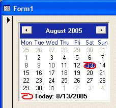
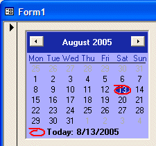
Microsoft Windows provides a control used to select dates on a colorful calendar:  The dates used and the way they display are based on the Regional Settings of the Control Panel. It may also depend on the operating system used. This convenient control is called Month Calendar. The title bar of the control displays two buttons and two labels. The left button allows the user to select the previous month by clicking the button. The left label displays the currently selected month. The right label displays the year of the displayed date. The right button is used to get to the next month. The calendar can be configured to display more than one month. Here is an example that displays two months:  If the control is displaying more than one month, the buttons would increment or decrement by the previous or next month in the list. For example, if the control is displaying April and May, if the user clicks the left button, the control would display March and April. If the control is displaying April and May and the user clicks the right button, the control would display May and June. To select any month of the current year, the user can click the name of the month, which displays the list of months and this allows the user to click the desired month:
To select a year, the user can click the year number. This changes the year label into a spin button:
To change the year, the user can click the up or down arrows of the spin button. As the spin button is displaying, the user can also use the arrow keys of the keyboard to increase or decrease the value. Under the title bar, the short names of week days display, using the format set in Control Panel. On the control, the currently selected date has a circle
around. To select a date on the control, the user can click the desired date,
which changes from the previous selection. By default, the calendar opens with today's day circled with a hand-drawn-look-alike ellipse. Using the buttons of the title bar, the month label, and/or the year, the user can change the date. If at one time the calendar is displaying a date other than today, and if the user wants to return to today's date, he or she can click the bottom label that displays Today (you as the programmer can hide the Today label if you want). To create a Month Calendar control, on the Toolbox, click More Controls. In the list of controls, you can click the Microsoft MonthView Control 6.0 (SP4). |
|
Properties of a Month Calendar Control |
|
The Month Calendar control is a rectangular object without a border. After placing it on a form or a report, it displays the current month and only one month. This is because, by default, its width and height are set enough to accommodate only one month. To display more than one month horizontally, change the MonthColumns property to 2 or more and increase its width. To display more than one month vertically, change the MonthRows property to 2 or more and increase its height. To make it a highly visual object, a Month Calendar control uses different colors to represent the background, week days, the background of the title bar, the text of the title bar, the text of the days of the previous month, and the text of the days of the next month. |
| As mentioned already, the top section of the Month Calendar
control displays buttons and labels. The background color of this section
is controlled by the TitleBackColor property.
By default, the labels on the title bar display in a black color defined by the ActiveCaptionText system color. The color used to paint the text of the labels of the title bar is controlled by the TitleForeColor property |
 |
|
As mentioned already, to change the month and subsequently the year of the calendar, the user can click the buttons continuously. By default, the user can navigate from 1/1/1753 to 12/31/9999. If you want to limit the allowable dates beyond which the user should not navigate, use the MinDate and the MaxDate properties. Under the title bar, the short names of weekdays display, using the format set in Control Panel. If you want to start with a different day, set the value using the StartOfWeek property. The names of weekdays use the same color as the TitleBackColor property. Under the names of the week, there is a horizontal line used as the separator. By default, this line separator is painted in black but it uses the same color as the numeric values of the days of the selected month. |
|
Under the line separator, the numeric days of the month are listed. By default, the numeric days of the control display above a white background which is the Window system color of Control Panel. This color is controlled by the overridden MonthBackColor property. The numbers of the days of the month display in two colors. The real days of the selected month display, by default, in a black color as the WindowText system color. The color of these days is controlled by the ForeColor property. |
 |
|
Besides the days of the current month, the other days on the calendar are those that don't belong to the currently selected month. These days display in a different color controlled by the TrailingForeColor property. Of course, you can change all mentioned colors. Although any color is allowed in any category, you should make sure that the calendar is still reasonably appealing and usable. The Month Calendar control is used to let the user know today's date in two ways. On the calendar, today's date is circled by an almost hand-drawn ellipse. In the bottom section of the calendar, today's date is also displayed as a sentence. If you want to display or hide the bottom label, set the ShowToday Boolean property accordingly. For example, to hide it, set this property to No. When a new Month Calendar control is added to an application, it assumes today's date. If you want to change this date, use the Value property. When the user clicks the Month Calendar control, one date is selected. To select more than one date, the user can click one date and drag left, right, up or down:
By default, the user can select only up to 7 days at a time. If you want the user to be able to select more or less days than that, change the value of the MaxSelCount property. After selecting the days, the starting date is stored in the SelectionStart property. The last date of the selection is stored in the SelectionEnd property. Both properties are of DateTime type. The range of the selected dates is stored in a SelectionRange value. SelectionRange is simply a class that can give you information about the beginning and the end of a selected range of dates. |
|
Windows Controls: The Date Picker |
|
Introduction |
|
The Date and Time Picker is a control that allows the user to select either a date or a time value. One of the advantages of the Date and Time Picker control is that it allows the user to select a time or a date value instead of typing it. This tremendously reduces the likelihood of mistakes. To create a Date or Time Picker control, in the Toolbox, click More Controls. In the list of controls, click Microsoft Date and Time Picker 6.0 (SP4), and click the form. After adding the DateTimePicker control to the form, to allow the user to set the dates and not the times on the control, set its Format property either to 0 - dtpLongDate or to 1 - dtpShortDate. |
|
Characteristics of the Date Picker |
|
After adding a Date Time Picker control and setting its Format to either 0 (the default) or 1, the control becomes a combo box (the default). If you don't like the combo box, you can display a spin button instead. This characteristic is controlled by the UpDown Boolean property. When its value is set to No (the default), the control appears as a combo box. It you set it to Yes, it appears as a spin button:
This calendar displays to the bottom-left or the bottom-right side of the combo box. In some cases, you may want to decide when to allow the user to select a date or when to disable it. There are two ways you can do this. You can use the Control's Enabled property that all other controls have. Another technique you can use is to display a check box on the left side of the text box section of the control. The presence or absence of the check box is controlled by the CheckBox Boolean property whose default value is No. If you set it to Yes, a check box appears:
When the check box is checked, the user can change the displayed date. When the check box is unchecked, the control is displayed and the user cannot change the date. The user must first put a check mark in the check box in order to be able to change the date. If the control displays a spin button, the object is divided in different sections that can each can be changed individually. To change either the day, the month, or the year, the user must click the desired section and use either the arrows of the button or the arrow keys on the keyboard to increase or decrease the selected value. If you want to control the range of dates the user can select, use the MinDate and the MaxDate properties as we mentioned them from the Month Calendar control. When you add the Date Time Picker control to your form or your report, it displays the date of the computer at the time the control was added. If you want the control to display a different date, set the desired value in the Value field of the Properties window. At any time, you can find out what value the Date Picker has by retrieving the value of the Value property. If you set the Format property to 0, the date displays using the Long Date format of Control Panel. If you set the Format to 1, the control uses the Short Date value of Control Panel. If you want to customize the way the date is displayed, set the Format property to 3 - dtdCustom. After setting the Format to 3, use the Custom property to create the desired format. The format is created by combining the following characters:
This means that you should be reluctant to let the users type whatever they want. The less they type, the less checking you need to do. |
|
|
Besides allowing to use a calendar, the Date and Time Picker control allows the user to select time value. As mentioned previously, to create a Date or Time Picker control, add a Microsoft Date Time Picker control to a form or report. After adding a Date Time Picker control to a container, to make it a Time Picker control, change its Format property to 2 - dtpTime. This makes it a true Time Picker control:
The Time Picker control is a spin button made of different sections: the hours value, the minutes value, the optional seconds value, and the optional AM/PM string. To change the time, the user clicks a section and uses either the mouse or the keyboard to increase or decrease that particular value. To change another value, the user must first click it and then use the spin button. By default, the time displays using the H:M:SS AM/PM format. This means that the time uses 1 digit for the hours from 0 to 9, 1 digit for the minutes from 0 to 9, 1 digit for the seconds from 0 to 9 and the AM or PM for morning or afternoon. To customize the way the time displays, first set the Format property to 3 - dtpCustom. Then, in the Custom property, use a combination of the following characters to create a custom format:
By default, after adding the control to the form or report, it assumes the time of the computer when the control was added. If you want to set a different time, apply a Format combination to the Value property. In the same way, at any time, you can retrieve the time value on the control by accessing the Value property. |
|
|
|
|
Windows Controls: The Command Button |
|
Introduction |
|
A command button is a rectangular object that allows the user to dismiss a dialog box or to initiate an action. This is done through a decision making process based on what a form or a dialog box is displaying. This could be an acknowledgement, such as a form displaying a simple message to the user. A user could also be asked to choose one button from a group of buttons on a form or a dialog box. Depending on how the button is implemented, it should be obvious to the user what to do with it. To indicate what a button is used for or what action it would lead to, a button can display a string on its top. This string is also referred to as the button's caption. The caption should be explicit enough to let the user know what the button is used for. A caption such as OK usually means the user accepts what message the form or dialog box is displaying. A caption like Cancel is usually accompanied by another OK button on the form. When a button has a Cancel button, the user would usually click it as if saying, "Never Mind" or "I change my mind", etc. To create a button, you can click the Command Button control
The button is an object of type CommandButton. |
|
Characteristics of Command Buttons |
|
Like all other “visual” controls, a command button has a Name property, a location (Left and Top), and dimensions (Width and Height). Because of their anticipated behavior, command buttons are the most commonly used objects to initiate an action. As such, they are used to open other forms, reports of the same database, or simply to display a message box. A command button in Microsoft Access can display either a string or a (small) picture on top. Microsoft Access ships with dozens of pictures you can use, specially made for buttons. If none of these pictures suits your need, you can design your own. To display a picture on a button, after selecting it in the Design View of the form or report, click the ellipsis button of the Picture field in the Format tab of the Properties window, locate the picture, and select it. When a dialog box is equipped with an OK and a Cancel button, it is suggested that the user be able to press Enter to perform the same action as if he or she had clicked OK. To apply this behavior, if you create a button and give it an OK Caption, you can set its Default property to Yes. It is also suggested that, if a button has a Cancel Caption, the user should be able to press Esc and produce the same behavior as if the Cancel button was clicked. To apply this feature, after creating the button with a Cancel caption, set its Cancel property to Yes. Never set the Default and the Cancel properties both to Yes for the same button. |
|
Windows Controls: Combo and List Boxes |
|
Introduction to Combo Boxes |
|
A combo box is a Windows control made of two parts: a text portion and a list. A text box is used to display a selection made from a list of items. On the right side of the text box, there is a down-pointing arrow that allows the user to know that the control holds a list. The user displays the list by clicking the arrow. To use a combo box, the most basic operation the user can perform is to click the arrow and select an item. Once an item is selected, the list retracts back.
The combo box is one of the highly praised features of Microsoft Access. As the application makes it particular easy to create, it performs all necessary basic behind-the-scene jobs.
Like every control, a combo box uses a name that allows you, the database application, or the operating system to identify it.
Most of the time, when a multi-column list displays, the user may not be able to identify the items under each column. In this case, you can display a column header on its column. This column header would display a label that categorizes the items under it. |
|
Properties of Combo and List Boxes |
|
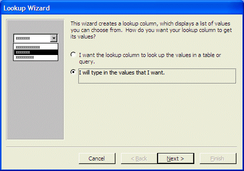
As mentioned already, the primary purpose for having a combo or a list box is to display a list of items. There are various ways you can specify this list. When adding a combo or a list box to a form or report, if you use the wizard, it would assist you with creating and even configuring the list of items. If you don't use the wizard, you will need to create and configure the list yourself. Before creating the list of items of a combo or a list box, you must first specify how the list would be created. The property that allows you to specify the type of list is called RowSourceType. As it happens, the combo and the list box of Microsoft Access provide three ways to specify the origin of the list. Two options require a table, a query, or a statement. When we study tables and queries, we will see how to use or apply them. If you want to create a list of strings to display in a combo box or list box, set the RowSourceType property to "Value List". This would be done as follows: Private Sub Form_Load()
cboFlavors.RowSourceType = "Value List"
End Sub
To actually specify the list of items of a combo or a list box, each of their object (ComboBox or ListBox) is equipped with a property named RowSource. |
|
|
 |
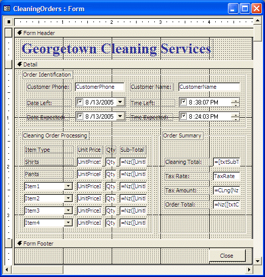
| Name | Control Source |
| txtSubTotalShirts | =Nz([UnitPriceShirts])*Nz([QtyShirts]) |
| txtSubTotalPants | =Nz([UnitPricePants])*Nz([QtyPants]) |
| txtSubTotalItem1 | =Nz([UnitPriceItem1])*Nz([QtyItem1]) |
| txtSubTotalItem2 | =Nz([UnitPriceItem2])*Nz([QtyItem2]) |
| txtSubTotalItem3 | =Nz([UnitPriceItem3])*Nz([QtyItem3]) |
| txtSubTotalItem4 | =Nz([UnitPriceItem4])*Nz([QtyItem4]) |
| txtCleaningTotal | =[txtSubTotalShirts]+[txtSubTotalPants]+[txtSubTotalItem1]+[txtSubTotalItem2]+[txtSubTotalItem3]+[txtSubTotalItem4] |
| txtTaxAmount | =CLng(Nz([txtCleaningTotal])*Nz([TaxRate])*100)/100 |
| txtOrderTotal | =Nz([txtCleaningTotal])+Nz([txtTaxAmount]) |
|
Windows Controls: Option Buttons |
|
Introduction |
|
A radio button is a Windows control made of a round box O. In practical usage, a radio button is usually (if not always) accompanied by other radio buttons. In other words, radio buttons come as a group. The user makes his or her decision by selecting or clicking one of the round boxes. Once clicked, the round box is partially filled with a dot. When one button in the group is selected, the other round boxes of the (same) group are empty
O. The user can select another button by clicking a different choice, which empties the previous selection. This technique of selecting is referred to as mutually-exclusive.
The Option Group control allows you to create a list of items that would become
radio buttons. Instead of using the Option Group control, you can create each
radio button separately. To do this, on the Toolbox, you can click the Option
Button |
|
Properties of Radio Buttons |
|
Because the round box of a radio button does not indicate what it is used for, it is usually (if not always) accompanied by a label. The label can be positioned anywhere (to the left, the top, the right, or the bottom sides) close to the round box but it is usually positioned to the left or the right side. To move or position the round box, click it to select it. Then position your mouse on it to get a pointing finger arrow and drag in the desired direction:
Like most (if not all) other controls, when you include a radio button, Microsoft Access adds a label to the control. If you don't like the string displayed by the label, you can click it twice to put it into edit mode and change the string. |
|
Check Boxes |
|
Introduction |
|
A check box is a control that allows the user to validate or invalidate an option. A check box appears as a little square box. The user makes his or her decision by clicking in the square, which toggles a check mark. Toggling means, that if the square box was empty, after clicking it, a check mark would appear in it:
Although it can appear by itself, a check box can come in a group with others, allowing the user to select as many choices as are available, as opposed to radio buttons where only one in the group can be selected
Check boxes provide a non-exclusive choice, which means that if they come as a group, each can behave independently with regards to the other check boxes of the same group. Therefore you can create check boxes anywhere on the form or report. It is recommended that, when they act as an ensemble, you should include check boxes in a group so their belonging to the same group would be obvious to the user. |
|
Toggle Buttons |
|
Introduction |
|
A toggle button is a type of control that behaves like a check box. The first difference is that it displays like a command button but behaves like a check box. The second difference is that, while a check box should be accompanied by a label that indicates what the check box is used for, a toggle button, like the command button, can display a string on its “face”. |
|
Properties of a Toggle Button |
|
Configuring the toggle button is particularly easy. Like the check box, the toggle button should be used for a Boolean field. |
|
|
||
| Previous | Copyright © 2005-2016, FunctionX | Next |
|
|
||