Application Design
|
Application Design |
|
Design Time Control Alignment |
|
Introduction |
|
During design, you may want to provide a good alignment of the controls to make the form appear more attractive and look professional. The Microsoft Visual Studio 2005 provides various tools to assist you with this. To start, you can first add one control on the form and position the control the way you want. Here is an example:
|
|
Once you have a control on your form, you can add another as we saw in the previous lesson. When adding another control, you can use the previous one as a reference to position the new one. To assist you with this, when moving the new control to position it, a guiding vertical would show you the alignment to follow with regards to an existing control. Here is an example:
Using this approach, once the control is aligned fine, you can release the mouse. There are various other techniques you can use to align the controls. After adding a control to a form, when it is selected, a control may be surrounded by 6 small squares:
As we saw in the previous lesson, you can also select more than one control. When many controls are selected, you can then align them. To do this, you can use the Layout toolbar.
If you have a certain control on the form and want to
position it exactly at equal distance between the left and the right borders of
the form, select the control, then click the Center Horizontally button on the
Layout toolbar
Horizontal alignment affects controls whose distance from the left border of the parent must be the same. To perform this type of alignment, the Layout toolbar provides the necessary buttons. The same actions can be performed using menu items of the Format group on the main menu. The options are as follows:
As seen above, the horizontal-oriented buttons allow moving controls left or right. Another option you have consists of moving controls up or down for better alignment. Once again you must first select the controls. Then on the Layout toolbar or the Format group of the main menu, use the following options:
Another valuable option you have consists of controlling the alignment of objects with regards to the extreme borders of controls of the selected group.
You can also position one or more controls in the middle of
the form. To do that, select the control, then click the Center Vertically
button on the Layout toolbar
Suppose you have a group of horizontally aligned controls as follows:  Obviously the buttons on this form are not enjoying the most professional look. For one thing, the distance between the Continue and the Submit buttons is longer than the distance between the Submit and the Deny buttons. The Layout toolbar and the Format group of the main menu allow you to specify a better horizontal alignment of controls with regards to each other. The options available are:
Result: The Forms Designer will calculate the horizontal distances that separate each combination of two controls and find their average. This average is applied to the horizontal distance of each combination of two controls:
Result: The Forms Designer will move each control horizontally, except the base control (the control that has white squares) by one unit away from the base control. This will be done every time you click the Increase Horizontal Spacing button or the Format -> Horizontal Spacing -> Increase menu item:
Result: The Forms Designer will move each control horizontally, except the base control (the control that has darker handles) by one unit towards the base control. This will be done every time you click the Decrease Horizontal Spacing button or the Format -> Horizontal Spacing -> Decrease menu item:
Result: The Forms Designer will move all controls (horizontally), except for the left control, to the left so that the left border of a control touches the right border of the next control:
Suppose you have a group of horizontally positioned controls as follows:  The text boxes on this form are not professionally positioned with regards to each other. Once again, the Layout toolbar and the Format group of the main menu allow you to specify a better vertical alignment of controls relative to each other. The options available are:
Result: The Forms Designer will calculate the total vertical distances that separate each combination of two controls and find their average. This average is applied to the vertical distance of each combination of two controls:
Result: The Forms Designer will move each control vertically, except the base control (the control that has darker handles) by one unit away from the base control. This will be done every time you click the Increase Horizontal Spacing button or the Format -> Horizontal Spacing -> Increase menu item:
Result: The Forms Designer will move each control, except the base control (the control that has darker handles) by one unit towards the base control. This will be done every time you click the Decrease Horizontal Spacing button or the Format -> Horizontal Spacing -> Decrease menu item:
Result: The Forms Designer will move all controls vertically, except for the top control, to the top so that the top border of a control touches the bottom border of the next control towards the top:
The distance from the left border to the right border of a control is referred to as its Width property. In the same way, the distance from the top to the bottom borders of a control is its Height value. This can be illustrated as follows: 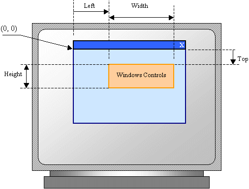 If you click a control’s button on the Toolbox and click its parent window, the control assumes some default dimensions in the body of the parent.
All graphical controls, including the form, can be resized using guiding mouse cursors. To resize a control, first select it. Except for the form, whenever a control is selected, there are eight handles around it. To resize the control, position your mouse on one of the handles. The mouse pointer will change, indicating in what direction you can move to resize the control.
To heighten or shrink a control by its lower border and one unit at a time, select the control, press and hold Shift. Then press the down arrow key as many times as necessary. Once satisfied, release the mouse and Shift. To heighten or shrink a control by its lower border by small units, select the control, press and hold Ctrl and Shift. Then press the down arrow key as many times as necessary. Once satisfied, release the mouse and Ctrl and Shift.
When a control has been added to a container, it occupies a Rectangle represented by the Bounds property. The syntax of this property is: public:
property Rectangle get_Bounds();
public:
property void set_Bounds(Rectangle);
At any time, to get the location and the dimensions of a control, you can call its Bounds property, which produces a Rectangle value.
Imagine you have added three controls to your form and, after spending some time designing them, they appear as follows:  The dimensions of the controls are not set professionally. As seen above, you can resize by dragging their borders but this might take a while if you want them to have the same width, the same height, or both the same height and width. The dimensions of a control or a group of controls are carried by a Size value. At design time, to change the dimensions of a control, first click it. Then, in the Properties window, change the values of its Size property. To change the dimensions of a group of controls, first select them. Then, in the Properties window, change the values of the Size field. The new value would be applied to all selected controls. Alternatively, the Form Designer provides tools to automatically do this for you. To synchronize the widths of a group of controls, first select them. Then, on the Layout toolbar or on the Format group of the main menu, select:
Result: All controls, except for the base control (the control that has the dark handles), will be resized horizontally so they have the same width as the base control:
To set the same height to a group of controls, first select them. Then, on the Layout toolbar or on the Format group of the main menu, select:
Result: All controls, except for the base control (the control that has the dark handles), will be resized vertically so they have the same height as the base control:
To set the same width and the same height to a group of controls, first select them. Then, on the Layout toolbar or on the Format group of the main menu, select:
Result: The Form Designer will calculate the sum of the heights of all controls and find their average height (AvgHeight). It will also calculate the sum of the widths of all controls and find their average width (AvgWidth). These averages will be applied to the height and the width respectively of each control:
If you position a (visual) control on a form, if the control is positioned on the top left section of the form, when the user resizes the form, the control’s position would appear static, it would not move. This could be a concern if the control is positioned on the right, the bottom or the lower right sections of the form. When the user resizes the form, the control’s position would not be updated. Sometimes you will want the control to have the same location and/or distance with regard to the bottom, the right, and/or the lower right corners of the form.
The ability to manage a control or a group of controls' location and size when the use resizes it is done using the Anchor property:  The Anchor property is created from the AnchorStyles enumerator. By default, when you add a control to a form, it is “glued” to the top left corner of its container. You can also set the control’s position with regards to its container’s right and bottom borders. The Anchor property can be used to "glue" one border of a control to its parent using one of the following values: Bottom: The control bottom border will be the same even if the parent is heighten or shrunk
Left: The control left border will be the same even if the parent is widened or narrowed
Right: The control right border will be the same even if the parent is widened or narrowed
In the same way, you can combine Anchor values to "glue" one or more corners of a control to its parent when the parent is resized.
When a control is added to a host, depending on the control, it may be automatically positioned where the mouse landed. In some cases, you will want the control to be attached to a border or to a corner of its parent. This can be done using the Dock property:  This property is managed through the DockStyle enumerator. To use this property, click the control and, in the Properties window, click the arrow of the Dock field. You can then select one of the following values: Bottom: The control will be attached to the bottom border of its parent:
Fill: The control will use the whole client area of its parent: Left: The control will be attached to the left border of its parent:
None: The control will be kept where it was positioned on the parent:
Right: The control will be attached to the right border of its parent:
Top: The control will be attached to the top border of its parent:
Controls used on Microsoft Windows are painted using a color known as Control. If you don't like the default color that paints the background of a control, you can access the BackColor field of the Properties window:  You can then select one of the preset colors from 3 windows represented with tabs.
Instead of a color, you may want to fill the control with a picture. To do this, you can access the control's BackgroundImage property. This provides an ellipsis button you can use to locate and select the desired picture.
Some controls display a border when they are drawn and some others don't. Consider the following:
Some of these controls allow you to specify a type of border you want to show surrounding the controls. This characteristic is controlled by the BorderStyle property, which is based on BorderStyle enumerator. Its members are:
A user can navigate through controls using the Tab key. When that key has been pressed, the focus moves from one control to the next. By their designs, not all controls can receive focus and not all controls can participate in tab navigation. Even controls that can receive focus must be primarily included in the tab sequence. At design time, the participation to tab sequencing is controlled by the Boolean TabStop property in the Properties window. Every visual control that can receive focus is already configured to have this property set to True. If you want to remove a control from this sequence, set its TabStop value to False. If a control has the TabStop property set to True, to arrange the navigation order of controls, you have two main options. At design time, you can click a control on the form. Then, on the Properties window, change the value of its TabIndex field. The value must be a positive short integer. The best and easiest way to arrange the tab sequence of controls is to manage it visually. To do this, first display the form. Then, on the main menu, click View. This causes a number to be positioned on every control of the form. Here is an example:
 To arrange the sequence any way you like, click each control once in the desired order. Normally, static controls (such as the label, the picture box, the panel, etc) never receive focus when the application is running; therefore, you can skip such controls.
Microsoft Windows XP added a new feature to the way some controls display or behave when the mouse passes over them, making the controls significantly attractive and enhanced. This feature is neither automatically applied on controls nor available on all controls. Therefore, before using it, you must first find out if the control you want to use it on support it. A control that supports this feature should have the FlatStyle property. This property provides the following values:
If the application will be run on Windows XP, you can use the System value of the FlatStyle property. To make this style work, call the Application.EnableVisualStyles() method in the Main() method as follows: int APIENTRY WinMain(HINSTANCE hInstance,
HINSTANCE hPrevInstance,
LPSTR lpCmdLine,
int nCmdShow)
{
System::Threading::Thread::CurrentThread->ApartmentState =
System::Threading::ApartmentState::STA;
Application::EnableVisualStyles();
Application::Run(new Form1());
return 0;
}
A control is referred to as visible if it can be visually located on the screen. A user can use a control only if he or she can see it. As a programmer, you have the role of deciding whether a control must be seen or not and when. The visibility of an object is controlled by the its Visible property. This is a Boolean property. At design time, when you add a control to a parent, it is visible by default. This is because its Visible property is set to True in the Properties window. In the same way, if you programmatically create a control, by default, it is made visible once you add it to its parent's Controls property. If you don't want a control to primarily appear when the form comes up, you can either set its Visible property to False or set its parent’s visible property to False. Equivalently, at run time, to hide a control, assign a False value to either its Visible property or its parent’s Visible property. Keep in mind that when a parent gets hidden, it also hides its children. On the other hand, a parent can be made visible but hide one or some of its children. To check whether a control is visible at one time, apply a conditional statement (if or while) to its Visible property and check whether its value is True or False. In the following example, when the user clicks a button named button1, a text box named textBox1 gets hidden.
For the user to use a control, it must allow operations on it. For example, if a control is supposed to receive text, the user can enter characters in it only if this is made possible. To make a control available to the user, the object must be enabled. The availability of an object is controlled by the Boolean Enabled property. By default, after adding a control to a form, it is enabled and its Enabled property in the Properties window is set to True. An enabled control displays its text or other characteristics in their normal settings. If you want to disable a control, set its Enabled property to False. In the following picture, a text box and a button are disabled:  To find out whether a control is enabled or not, check its Enabled property state. |
||||||||||||||||||||||||||||||||||||||||||||||||||||||||||||||||||||||||||||||||||||||||||||||||||||||||||||||||||||||||||||||||||||||||||||||||||||||||||||||||||||||||||||||||||||||||||||||||||||||||||||||||||||||||||||||||||||||||||||||||||||||||||||||||||||||||||||||||||||||||||||||||||
|
|
||
| Home | Copyright © 2007-2013, FunctionX | |
|
|
||


 :
:

 :
:


 Practical
Learning: Setting the Locations and Sizes of Controls
Practical
Learning: Setting the Locations and Sizes of Controls


