Applications Resources
 |
Applications Resources |
|
|
|
Coding a Main Menu Item |
|
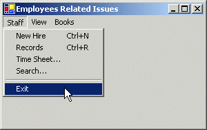
If you create a menu as we have just done, to write code for one of the menu items, you can double-click the menu item. This would open the Click event of the menu item in the Code Editor and you can start writing the desired code for that item. |
|
|
private void mnuFileExit_Click(object sender, System.EventArgs e)
		{
			Close();
		}
|

|
Popup or Context Menus |
|
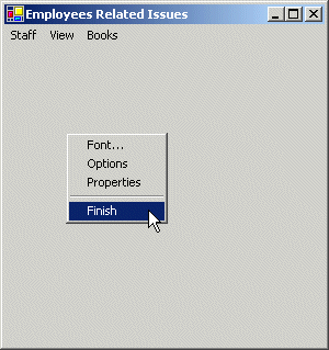
A menu is considered, or qualifies as, popup if, or because, it can appear anywhere on the form as the programmer wishes. Such a menu is also referred to as context-sensitive because its appearance and behavior depends on where it displays on the form or on a particular control. The first difference between a main menu and a popup menu is that a popup menu appears as one category or one list of items and not like a group of categories of menus like a main menu. Secondly, while a main menu by default is positioned on the top section of a form, a popup menu doesn't have a specific location on the form. To use a popup menu, usually the user can right-click the section of the form or the object on which the menu is configured to appear. A popup menu is based on the ContextMenu class. To visually create a popup menu, on the Toolbox, click the ContextMenu button and click on the form. Once you have a ContextMenu object, you can create its menu items. To do this, click the ContextMenu box to display the first Type Here line and configure the menu item as you would proceed with a menu item on the main menu. Unlike a main menu, a popup menu provides a single list of items. If you want different popup menus for your form, you have two options. You can create various popup menus or programmatically change your single popup menu in response to something or some action on your form. |
|
|
private void menuItem21_Click(object sender, System.EventArgs e)
		{
			mnuFileExit_Click(sender, e);
		}
|

|
Toolbars |
|
Introduction |
|
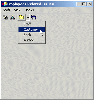
A toolbar is a Windows control that allows the user the perform some actions on a form by clicking a button instead of using a menu. What a toolbar provides is a convenient group of buttons that simplifies the user's job by bringing the most accessible actions as buttons so that, instead of performing various steps to access a menu, a button on a toolbar can bring such common actions closer to the user. Toolbars usually display under the main menu. They can be equipped with buttons but sometimes their buttons or some of their buttons have a caption. Toolbars can also be equipped with other types of controls. To create a toolbar, on the Toolbox, click the Toolbox button and the form. By default, a toolbar is positioned on the top section of the form. Like a form, a toolbar is only a container and does not provide much role by itself. To make a toolbar efficient, you should equip it with the necessary controls. To add controls to a toolbar, on the Properties window, click the ellipsis button of the Buttons field. This would open the ToolBarButton Collection Editor. To add a control to a toolbar, in the ToolBarButton Collection Editor, click the Add button. The most common control used on a toolbar is a button. The types of buttons used are set using the Style property. A regular button has the PushButton style. The new button would appear empty. A button on a toolbar is a rectangular object with a picture on top.
The picture on the button should suggest what the button is used for but this is not always possible. Providing a picture is more important. The easiest way to provide pictures for your toolbar is by creating an image list and associating it with the toolbar. If a toolbar is given an image list, whenever you
add a button, use the ImageIndex property to specify the image that
would display on the button. You can keep adding buttons in this fashion. As a toolbar can be equipped with various types of controls, there are various types of buttons you can place on a toolbar. The types of buttons can be configured using the Style property on the Object Inspector. |
|
|
private void menuItem15_Click(object sender, System.EventArgs e)
		{
			toolBar1.Visible = !toolBar1.Visible;
			menuItem15.Checked = !menuItem14.Checked;
		}
|

|
Toolbar Programming |
|
The controls on a toolbar are controls by their owner, the toolbar. In order to write code for a control, you must first locate it. The buttons are located in a collection called Buttons. Each button can be located by calling the IndexOf() methods. Once this gives you access to a button, you can write its code as you see fit. |
|
|
private void toolBar1_ButtonClick(object sender, System.Windows.Forms.ToolBarButtonClickEventArgs e)
{
	int IndexOfButtonSelected = toolBar1.Buttons.IndexOf(e.Button);

	if( IndexOfButtonSelected == 3 )
		Close();
}
|
|
The Multiple Document Interface (MDI) |
|
Introduction to MDI-Based Applications |
|
A multiple document interface, abbreviated MDI, is an application whose main form directly "owns" other forms. The main form is also considered the parent. The forms that the parent form owns can display only within the rectangular borders of the parent form. The main idea behind an MDI is to allow the user to open different documents and work on them without having to launch another instance of the application. As opposed to an MDI, a Single Document Interface (SDI) allow only one document at a time in the application. WordPad is an example of an SDI. The user can open only one document at a time. If he wants another WordPad document, he must open an additional instance of WordPad. Each form that is child of the main form in an MDI can be a fully functional form and most, if not all, child forms are of the same kind. There are two main ways a child document of an MDI displays. To provide information about its state, a child form is equipped with a title bar. The title bar of a child form displays an icon, the name of its document, and its own system buttons. Since it can be confined only within the parent form, it can be minimized, maximized, or restored within the parent form. When a child form is not maximized, it clearly displays within the parent form. If it gets closed and there is no other child form, the parent form would appear empty. If there are various child forms, they share the size of the client area of the parent form. If one of the child forms is maximized, it occupies the whole client area of the main form and it displays its name on the title bar of the main form. |
|
MDI Creation |
|
It is not particular difficult to create an MDI application. The challenge may come when you need to configure its functionality. To start, you must set a form to be the eventual parent of the application. This can be taken care of by setting its IsMDIContainer property to true. After doing this, the body of the form is painted in gray with a sunken client area that indicates that it can host other form. After creating the parent form of the MDI, you must provide a way to display a child form when needed. This is usually done with a menu, which we haven't covered yet. When displaying a child form of the MDI, access its MdiParent property and assign it the name of the parent form. Then display the child. |
|
|
private void Form1_Load(object sender, System.EventArgs e)
		{
			Form myBaby = new Baby();

			myBaby.MdiParent = this;
			myBaby.Show();
		}
|
|
|
||
| Previous | Copyright © 2004-2010 FunctionX, Inc. | |
|
|
||