.NET Controls: The Track Bar
 |
.NET Controls: The Track Bar |
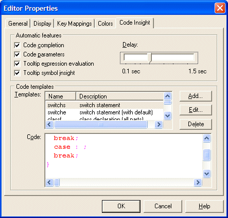
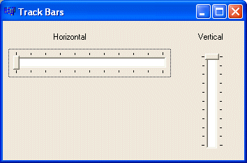
A track bar is a Windows control used to slide a small bar or pointer, also called a thumb, along a continuous line. In the following dialog box, observer the Delay track bar:  To use the track bar, the user can drag the thumb in one of two directions. This changes the position of the thumb. The user can also click a position along the control line to place the thumb at a desired location. Alternatively, when the trackbar has focus, the user can use the arrow keys to move the thumb. As far as appearances are concerned, there are two types of track bars, depending on the orientation: horizontal or vertical:  A track bar is configured with a set of values from a minimum to a maximum. Therefore, the user can make a selection included in that range. Optionally, a track bar can be equipped with small marks called ticks. These can visually guide the user for the available positions of the thumb. A track bar can be used as a progress control to help the user monitor an activity. A track bar also allows the user to specify a value that conforms to a range. When equipped with small indicators, also called ticks, a track bar can be used to control exact values that the user can select in a range, preventing the user from setting just any value.
To add a track bar to your application, from the Toolbox, double-click the TrackBar button
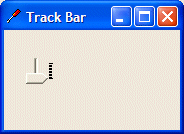
After placing a TrackBar control on a form or other container, by default, its assumes a horizontal position. The position of the track bar is controlled by Orientation property implemented through the Orientation enumerator that has two members. To change the direction of the control, on the Properties window, set the Orientation property to the desired value. For example, to make it vertical, change the field from Horizontal to Vertical. To change this property at runtime, assign the desired value to the property. Here is an example: public Form1()
{
trbSlider = new TrackBar();
trbSlider.Location = new Point(20, 20);
trbSlider.Orientation = Orientation.Vertical;
this.Controls.Add(trbSlider);
}
This would produce:  The dimensions of the track bars we have displayed so far don't appear practical. This is because we were using the default values. Like every control, the track bar has default dimensions and like many controls, these default values are usually not suitable. This means that every time you create a track bar, make sure you specify either its Size property or its Width and its Height properties. As mentioned already, to use the track bar, the user must change the position of the thumb. To change this position, the user can drag the thumb, click the slider line, press one of the arrow key, or press the Page Up or Page Down keys. When this is done, the control holds a new value known as the Value property. You also can assign a value to this property to change the position of the thumb. The value of the Value property must be an integer. After the user has changed it, to know the value of the track bar, you can access its Value property. However the user moves the thumb, it must assume a the limits allowed on the control. The Minimum property is the lowest value that the thumb can assume within the track. The Maximum value controls the opposite. The user is allowed to slide only between these two values. These two properties are set in the Properties window using their respective fields. By default, the minimum value is set to 0 and the maximum is 10. To change the minimum or maximum values programmatically, assign the desired value to the appropriate property. Here is an example: public Form1()
{
trbSlider = new TrackBar();
trbSlider.Location = new Point(20, 20);
trbSlider.Height = 264;
trbSlider.Width = 224;
trbSlider.Minimum = 12;
trbSlider.Maximum = 288;
this.Controls.Add(trbSlider);
}
You can also set the minimum and the maximum values by calling the TrackBar.SetRange() method. Its syntax is: public void SetRange(int minimum, int maximum); Always make sure that the minimum value is lower than the maximum. This safe measure will allow you to better control the current value of the control. At design time, if you set the Minimum property to a value higher than that of the Maximum, for example setting Minimum to 66 while Maximum=10, the value of the Maximum would be set to that of the Minimum; in this case, both properties would have the same value. This makes the control unusable: if the Minimum and the Maximum properties hold the same values, the user cannot move the thumb. In the same way, at run time, avoid assigning unpractical values to these properties. A trackbar is equipped with small bars “|” that serve as indicators of the position occupied by the thumb. These bars are called ticks. The tick are positioned at same distances from each other. The number of ticks available on a track bar, or the number of ticks you can see, depend on the difference between the Minimum and the Maximum values (Maximum-Minimum). The higher this value, the more ticks available. Consider the following example:  The lower this value, the fewer the ticks but this should not be the reason you use a lower Minimum or a higher Maximum. If the difference between these two properties causes the control to display too many ticks, you can reduce the number of ticks. This is done using the TickFrequency property. Here is an example:
The thumb’s visual display appears as a small standing pentagon with two straight borders. Its appearance is set using the TickStyle property which is based on the TickStyle enumerator. When you add a new TrackBar control to a form, it is horizontally oriented, the thumb points down, the tick marks are positioned under the sliding field. In this setting, the TickStyle property is set to BottomRight. To place the tick marks above the sliding field, change the value of the TickStyle property to TopLeft; this also has the effect of reversing the direction of the slider:
As a third option, you can have the tick marks on both sides of the slider. To get this, set the TickStyle property to Both. With this value, the thumb becomes a small rectangle (changing from its pentagon shape): 
When the user presses either the Page Up (PgUp) or the Page Down (PgDn) keys, the thumb moves by a value represented by the LargeChange property. If the default value of this property is not convenient for your application, you can change it to a new desired value or you can use a fraction of the difference between the Minimum and the Maximum properties then use it as the LargeChange.
|
|
|
|
||
| Home | Copyright © 2004-2010 FunctionX, Inc. | |
|
|
||