Based on their relationship with the parent control or owner, there are two types of scroll bars: those that are (automatically) associated with their parent or owner and scroll bar controls that are manually added by the programmer.
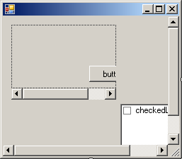
To effectively implement their functionality, some controls must be equipped with one or two scroll bars. When the list of items of a list-based control (list boxes, combo boxes, tree views, list views, etc) exceed the allocated client area of the control, the list should display a scroll bar to give access to the hidden part of their list. This type of automatically added scroll bars is usually positioned on the right side of the control for most Latin-based languages including US English. Here are examples:
These types of scroll bars are automatically added by the operating system to the control that needs it, unless the programmer explicitly prevented their showing.
Some controls are ready to display a scroll bar upon request, that is, if you want them to. Such controls are the form, the text box, the rich text box, and the panel. When designing one of these controls, you can ask it to display or hide either or both scroll bars as you see fit. Although they are the most used containers, by default, the form and the panel control don't display scroll bars, even if you add controls that exceed their allocated client area:  If you have controls that exceed the client area of a form or a panel and if you want them to display scroll bars so the user can navigate to the hidden parts of the container, change the value of the form or the panel's AutoScroll Boolean property. By default, this property is set to False. If you set its value to true, the control container would be equipped with one or both of the scroll bars as necessary:  The text box and the rich text box controls are equipped with a property called ScrollBars.
Because they are always likely to display a long text, the multi-line text box and the rich text box controls are natively ready to display either or both scroll bars. This is easily done using the ScrollBars property. It provides four options as follows:
Thanks to rapid application development (RAD) and object-oriented programming (OOP), you do not have to permanently set the scroll bar(s). You can act in response to the user doing something and decide when to display or hide either or both scroll bars.
Microsoft Windows provides two other types of scroll bars, considered complete controls in their own right. Like all other controls, these ones must be explicitly created; that is, they are not added automatically but they provide most of the same basic functionality as if the operating system's automatically added the scroll bars.
To create a scroll bar control, on the Toolbox, you can click either the VScrollBar or the HScrollBar button then click a container. The scroll bar is one of the earliest controls of the Microsoft Windows operating system. Each control is implemented through a class of the same name. The VScrollBar and the HScrollBar classes are based on the ScrollBar class that essentially provides all of their functionalities.
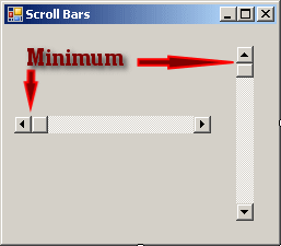
When using a scroll bar, the user can navigate from one end of the control to the other end. These are the control�s minimum and maximum values represented respectively by the Minimum and the Maximum properties. For a horizontal scrollbar, the minimum is the far left position that the bar can assume. For a vertical scrollbar, this would be the most top position:
The maximum would be the opposite. By default, a newly added scrollbar allows scrolling from 0 to 100. To change these values at design time, type a natural number for each field in the Properties window.
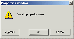
The primary technique the user applies to a scrollbar is to click one of the arrows at the ends of the control. As the bar slides inside of the control, it assumes an integer position from Minimum to Maximum. At one time, the position that the bar has is the Value property. At design time, you can use the Value property to set the position that the scrollbar would assume when the form opens. If you set the Value to a value less than the Minimum, you would receive an error of Invalid Property Value:  In the same way, if you set the value of Value to a value higher than the Maximum, you would receive an Invalid Property Value error. To programmatically set the position of the bar, assign the desired value, which must be between Minimum and Maximum, to the Value property. At run time, when the user scrolls the control, you can find the position of the bar by getting the value of the Value property.
When the user clicks an arrow of a scrollbar, the bar slides by one unit. This unit is represented by the SmallChange property and is set to 1 by default. If you want the bar to slide more than one unit, change the value of the SmallChange property to a natural number between Minimum and Maximum. The higher the value, the faster the sliding would occur because the bar would jump by SmallChange units.
There are two main ways the user can scroll faster using scrollbars: by pressing either page buttons or by clicking the scrolling region. The amount covered using this technique is controlled by the LargeChange property. Once again, the user can scroll only between Minimum and Maximum. To find the scrolling amount, the compiler would divide the actual scrolling range (the difference between Maximum and Minimum) by the LargeChange value. When the user clicks in the scrolling region or presses the Page Up or Page Down keys, the bar would jump by LargeChange up to the scrolling amount value. You can also change the LargeChange property programmatically.
|
|||||||||||||||||||||||||||||||||||||||||||||||||||||||||


