A status bar is a control container that is usually made of sections. The sections of status bar are called panels. The roles of the panels are left to the programmer.
You can create a status bar visually or programmatically. To support status bars, the .NET Framework provides a class named StatusStrip. The StatusStrip class is derived from the ToolStrip class, which it gets its primary functionality from that class.
To assist you with visually creating a status bar, the Toolbox provides a StatusStrip button in its Container section. You can click it and click a form. To programmatically create a status bar, declare a variable of type StatusStrip and add it to the Controls collection of the form. Here is an example: using System;
using System.Drawing;
using System.Windows.Forms;
public class Exercise : System.Windows.Forms.Form
{
StatusStrip statusbar;
public Exercise()
{
InitializeComponent();
}
void InitializeComponent()
{
statusbar = new StatusStrip();
Controls.Add(statusbar);
}
[STAThread]
static int Main()
{
System.Windows.Forms.Application.Run(new Exercise());
return 0;
}
}
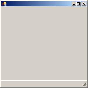
This would produce:
If you have a good reason to do so, you can add more than one status bar to a form.
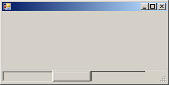
A status bar can be used for its aesthetic characteristics as it can be made to display sunken or raised bars to the bottom of a form:
Other than that, a status bar can be made to display other items.
Like a toolbar, a status bar is an intermediary container, meaning it must be positioned on another container, which is usually a form. The default Dock value of a status bar is Bottom.
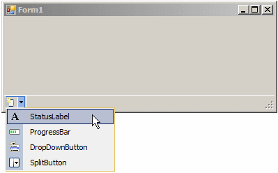
Like a toolbar, a status bar can host some items. A status bar is primarily used to display text. To get such text, you can create a label and add it to the status bar. A label on a status bar is an object of type ToolStripStatusLabel. The ToolStripStatusLabel class inherits from a class named ToolStripLabel. To visually add a label to a status bar:
To programmatically add a label to a status bar, declare a variable of type ToolStripStatusLabel, initialize it, and add it to the Items property of the StatusStrip variable. Here is an example: using System;
using System.Drawing;
using System.Windows.Forms;
public class Exercise : System.Windows.Forms.Form
{
StatusStrip statusbar;
ToolStripStatusLabel lblMessage;
public Exercise()
{
InitializeComponent();
}
void InitializeComponent()
{
statusbar = new StatusStrip();
lblMessage = new ToolStripStatusLabel();
statusbar.Items.Add(lblMessage);
Controls.Add(statusbar);
}
[STAThread]
static int Main()
{
System.Windows.Forms.Application.Run(new Exercise());
return 0;
}
}
Like the label of a toolbar, the label of a status bar can be made to display text, an icon, or both. This is handled by the DisplayStyle property that has the same options as the other. The label of a status bar is highly configurable. It has the ability to sink or raise its borders. If you want to control the borders of a label, first use its BorderSides property:
You can do this programmatically as follows: void InitializeComponent()
{
statusbar = new StatusStrip();
lblMessage = new ToolStripStatusLabel();
lblMessage.BorderSides = ToolStripStatusLabelBorderSides.All;
statusbar.Items.Add(lblMessage);
Controls.Add(statusbar);
}
After setting the BorderSides property, select the type of border you want in the BorderStyle property:
You can also specify the border style programmatically. Here is an example: void InitializeComponent()
{
statusbar = new StatusStrip();
lblMessage = new ToolStripStatusLabel();
lblMessage.AutoSize = false;
lblMessage.Width = 125;
lblMessage.BorderSides = ToolStripStatusLabelBorderSides.All;
lblMessage.BorderStyle = Border3DStyle.Sunken;
statusbar.Items.Add(lblMessage);
Controls.Add(statusbar);
}
This would produce:
Besides the label, a status bar can also contain a drop down button, a split button, and/or a progress bar.
|
|||||||||||||||||||||||||||||||||


