Windows Controls
|
Windows Controls |
|
Fundamentals of Windows Controls |
|
Introduction |
|
To make your interaction with the computer more useful, the Microsoft Windows operating systems provide various types of objects also called windows. Some of these windows are standard and can be seen in many applications. Some other windows can appear more complex as the companies that develop them are creative. Regardless, there are basic functionalities that most windows share. Therefore, before starting to get creative with the computer, you should be familiar with what is already available and get used to as many features as possible with the computer. The major categories of what you and I call windows come in four families: A dialog box, a Single Document Interface (SDI), a Multiple Document Interface (MDI), and the Windows Controls. To explore them, we will not necessarily proceed in that order. But we will eventually see all of them as we move along. |
The focus is a visual aspect that indicates that a control is ready to receive input from you. Various controls have different ways of expressing that they have received focus. Button-based controls indicate that they have focus by drawing a dotted rectangle around their text. In the following picture, the button on the right has focus:  A text-based control indicates that it has focus by displaying a blinking cursor. A list-based control indicates that it has focus when one of its items has a surrounding dotted rectangle: 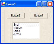 To give focus to a control, you can click it. Alternatively, if the focus is already on one of the controls, to give focus to a particular control, you can press Tab continuously until the control shows that it has focus. On a browser, if you press Tab continuously, the focus would move from one link or control to another. This means that a link on a web page can receive focus as if it were a control.
A Dialog Box is a square or rectangular window whose main role is to carry, hold, or host, other windows. By itself, a dialog box means nothing. The other objects displayed on it define its role. Like a dialog box, the types of objects whose role is to host other objects are called containers. Therefore, the primary role of a dialog box is as a container. Displaying a dialog box depends on the instructions you are given.
A dialog box is made of two main sections. On top, it displays a title bar. The left side of the title bar displays a sentence as the title of the dialog box. This group of words is also called the caption. Each dialog box is called by its title. Therefore, if the title displays Employees Registration, then the dialog box is called the Employees Registration Dialog Box. We will use the same naming convention in our lessons. On the right section
of the title bar, a normal dialog box would display only the system Close
button Sometimes, a dialog box will have a button with a question mark. This is called the Help button. A dialog box equipped with this button indicates that you can get quick help on the items displayed on the dialog box. While the behaviors of the system buttons seen in previous lessons are defined and controlled by the operating system, the person who creates a dialog box and equip it with the Help button also defines what happens if you click that Help button. The main section of a dialog box can be referred to as its body (programmers call it the Client Area). This is the area where the objects the dialog box is hosting are positioned. There is no predefined directive nor a restriction on what types of objects a dialog box can hold. It is left to the programmer to decide.
A command button, commonly called a button, is a rectangular object that displays a word or a group of words, expecting you to make a decision. You make your decision by clicking the button. The button is usually placed on a dialog box but it can also be placed on another type of container. As far as you (the user) are (is) concerned, the most important characteristic of a button is the word or sentence it displays. This is called the caption. The most basic common button you will encounter has a caption of OK. The buttons available on a dialog box, including their behaviors, once again, depend on the programmer. In many circumstances, the buttons come as a group. For example, you may have a dialog box with OK and Cancel buttons. Many dialog boxes have an OK and a Cancel buttons. Sometimes, they will have more than one button. Whenever a button has an OK and a Cancel buttons, clicking the OK button tells the computer that "I accept the changes I made" or "I agree with the changes made", or simply, "I agree". Clicking the Cancel button tells the computer that "Never mind", or "No, cancel your suggestion", or "Dismiss what I did". The documentation of the dialog box you are using should give you enough information about the buttons on the dialog box.
A text box is a window that is used to display text or to receive text from you. The type of text it displays or the type of text you are asked to provide depends on the application or the situation. Some text boxes are used only to display text. Either you cannot change the text or only an intermediary action can make it possible to change the text. Some other text boxes would require you to enter text. If you don't, something bad might happen. Some text boxes would display text already, giving you the chance to change the text or to accept the one suggested to you. In all or most circumstances, you will be informed about the text box and what you are supposed to do with it. |
|
|
|
|
The Scroll Bars |
|
A scroll bar is an object that is used to navigate from one end of a window content to another. There are two types of scroll bar: vertical and horizontal. |
 |
|
A vertical scroll bar allows you to navigate up and down to display a hidden section of a document. A horizontal scroll bar allows you to navigate left and right on the document. To scroll a bar, click the arrow of the section you want to display. |
|
List Boxes |
|
A list box is a rectangular control that displays a list of items. If you see the item that is convenient to the issue at hand, then you can click it. Once an item is clicked, it becomes highlighted, indicating that the item has been selected. If you want to change your choice, you can click another item. Clicking another item deselects the previous item and selects the new one. Depending on how a list box was configured, you may be able to select more than one item from the list. This is because, as set by the creator of the control, some list boxes allow only one selection while others could let you select as many objects as you want. To select one item from the list, click it. To select more than one item, click one of those you need. Press and hold Ctrl. Then click each of the desired items from the list. While making these selections, if you click an item by mistake, to deselect it, click it again and the item would appear "normal". After making the desired selection, release Ctrl. The selected items would be highlighted. To select items in a range, for example if a list has ten items and you want to select from the 3rd to the 7th item, click either the top item of your desired range, or click the last item of the range you want to select. Press and hold Shift. Then click the item at the other end of the range and release Shift. |
|
|
|
|
Combo Boxes |
 |
|
A combo box is a combination of a text box and a list box but is made of three sections. Based in its variations, there are three types of combo boxes: |
|
The Drop Down Combo Box |
|
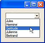
One of the types of combo boxes is referred to as Drop Down. This control is made of a text box on the left side and a down-pointing arrowed button on the right side. Depending on how the control was created, when it comes up, it may not display anything:  To use the combo box, you can click its down pointing arrow. If you click that arrow, a list would appear (or expand):  If you see an item that you want or an item that you are asked to select, you can click it. After an item has been clicked, two things happen: 1. the list retracts (or collapses) like a plastic; 2. the item that was clicked fills the text part and becomes the new selection:
On the other hand, after displaying the list, if you don't want to select anything from the list, you can click the arrow again or click anywhere away from the list. The list would collapse and the text part would get back to the previous text. One of the major characteristics of a drop down combo box, as compared to the type we will see next, is that, if you know for sure that the item you are looking for is in the list, you can first delete the text in the text part of the control, then start typing. For example, if the list contains a name such as Gertrude, you can delete the text part, and start typing g. If there is only one item that starts with g, you can then click the arrow twice and the item would be selected. Imagine the list contains such items as Jules and Julienne, if you type the first common letters of these item and double-click the arrow, the first item that has these letters would be selected. This means that, if you want to other item to be selected, you should type the letters beyond the common ones. In the case of Jules and Julienne, if you want Julienne to be selected from an incomplete string, you can type juli and click the arrowed button twice. So far, we have mentioned that, to display the list of a combo box, you could click its arrowed button. You can also display the list using the keyboard. To start, you must give focus to the control. When a drop down combo box has focus, to display its list, press Alt + down arrow key. To select an item from the list, you can press the down or up arrow key to move down or up. Once the desired item has been selected, you can press Enter. If you don't want to select an item while the list is displaying, press Esc. |
|
The Drop Down List Combo Box |
|
Another type of combo box is referred to as Drop Down List. This type also is made of a text box on the left and a down-pointing arrowed button on the right side. It also may appear empty when it comes up, depending on how it was created. The biggest difference between a drop down combo box and a drop down list combo box is that, with the drop down list, you can only select from the list: you cannot type anything in the text box part of the control. Once again, to use the control, you can click its arrow, which causes the list to display. You can also display the list using the keyboard by pressing Alt + down arrow key after giving focus to the control. Once the list displays, if you see the desired item, you can click it, which would cause the list to collapse and use the clicked item as the new selection. You can also press the up or down arrow key to select an item and press Enter when the desired item is highlighted. If you don't want to select anything from the list, you can click the arrow again, click anywhere away from the list, or press Esc. |
|
|
|
|
The Simple Combo Box |
|
The last type of combo box is called a simple combo box. This type of combo box is also made of two parts but they are distinct. The top section of the combo box displays a text box. Immediately under the text box, there is a list box: 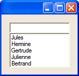 Notice that the control doesn't display an arrow since the list is available already. To use this combo box, you can examine the list part. If you see the desired item, you can click it. When an item is clicked, it becomes the string of the top text part. If you click a different item, it would become the new selection, replacing the one that was in the text part. Although this appears as a list box, you cannot select more than one item. |
|
|
|
A property sheet is a control that shows one or a group of tabs. The object that holds a tab is called a property page. Most other property sheets are equipped with buttons like a regular dialog box. As such, a property sheet is usually equipped with the OK and Cancel buttons. Sometimes it is additionally equipped with an Apply button. And sometimes it has a Help button.
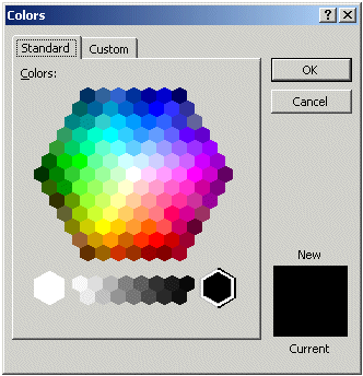
Normally, in the strict sense, the buttons that perform the exchange of information with other parts of the application are positioned on the property sheet and not on the property page(s). That is, the buttons are positioned outside of the property page. The buttons can be positioned on the right side of the property sheet. That is the case for the Colors dialog box of Microsoft Word:
Most of the time, the buttons are positioned on the bottom section of the property sheet.
Generally, the button labeled OK, if present, should have the Default property set to true. The Cancel button should have the Cancel property set to true. By convention, the OK button, if available should be either the top most or the left most. If the Apply button is used, it should be the right most, which should have the Cancel button between both.
Like any regular dialog box, the property page(s) of a property sheet is(are) equipped with Windows controls whose values the user may be asked to modify. When a property sheet is equipped with buttons, there are rules you should follow when implementing their behavior, to be in accordance with other Windows applications:

|
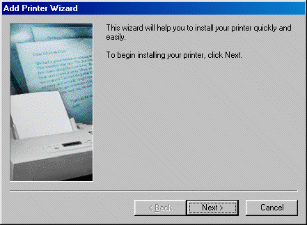
Wizards |
A wizard is a series of dialog boxes that assist you with performing a task that requires intermediary steps. To implement its functionality, a wizard displays some buttons in the lower section of the dialog box.
Depending on the programmer, different wizards use a few or more buttons. Usually a wizard has buttons such as Back, Next, and Cancel. Here is an example:
|
The .NET Framework provides a control used to select dates on a colorful calendar: 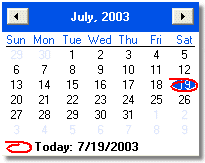 The dates used and the way they display are based on the Regional Settings of the Control Panel. It may also depend on the operating system. This convenient control is called Month Calendar. The title bar of the control displays two buttons and two labels. The left button allows you to select the previous month by clicking the button. The left label displays the currently selected month. The right label displays the year of the displayed date. The right button is used to get to the next month. The calendar can be configured to display more than one month. Here is an example that displays two months: 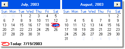 If the control is displaying more than one month, the buttons would increment or decrement by the previous or next month in the list. For example, if the control is displaying April and May, if you click the left button, the control would display March and April. If the control is displaying April and May and you click the right button, the control would display May and June. To select any month of the current year, you can click the name of the month, which displays the list of months and this allows you to click the desired month: 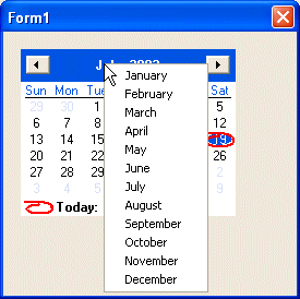 To select a year, you can click the year number. This changes the year label into a spin button: 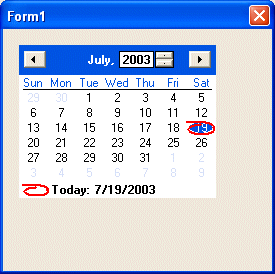 To change the year, you can click the up or down arrows of the spin button. As the spin button is displaying, you can also use the arrow keys of the keyboard to increase or decrease the value. Under the title bar, the short names of week days display, using the format set in Control Panel. In US English, the first day is usually Sunday. The first day can be changed by the programmer. On the control, the currently selected date has a circle around. To select a date on the control,
you click the desired date, which changes from the previous selection. |
|
Toolbars |
|
A toolbar provides a quick access to the most frequently used actions performed using the menu. A toolbar offers these items as buttons. For WordPad, the top toolbar is called the Standard toolbar: 
Each toolbar button is used to perform a different and particular action. When you position the mouse on top of a button, a tool tip appears, letting you know what the button is used for. WordPad is equipped with a second toolbar called the Formatting toolbar. Besides the usual buttons, a toolbar can offer many other windows controls, some of which we will explorer later. |
|
Status Bars |
|
The Status Bar helps as a guide to the users of an application. In a typical application, it displays small sentences that further explain the role of a particular button or an action that you are about to perform. The messages that appear on the Status Bar vary from one application to another and depend on the position of the mouse on an application. At this time, you should still have the Control Panel application running. |
|
The Single Document Interface |
|
WordPad is a Single Document Interface application, which means it allows you to work on only one opened document at a time. On top of most or all of Windows applications, there is the title bar: |
|
On the left side of the title bar, there is an icon that identifies the application you are using. This icon is called the system icon. Every application that looks like WordPad is equipped with this type of icon but the icons are different from one application to another. This is because the person who creates the application also designs the icon that goes with it. The system has its own menu called the system menu. To access this menu, simply click the system icon. On the right side of the icon, the name of the file is followed by the name of the application you are using, in this case WordPad. This sequence is not the same on all applications. Again, it depends on the application and how the programmer decided to make it appear. |
|
|
||
| Previous | Copyright © 2000-2008 FunctionX, Inc. | Next |
|
|
||

 or
or  . By convention, a dialog box cannot be minimized or
maximized. Therefore, it doesn't have those system buttons.
. By convention, a dialog box cannot be minimized or
maximized. Therefore, it doesn't have those system buttons. Practical Learning: Displaying a Dialog Box