Introduction to Visual Graphical Applications

Introduction to Visual Graphical Applications
Fundamentals of a Form-Based Application
Introduction to Visual/Graphical Applications
A graphical application is an application that displays various aesthetic objects on the computer screen. To get such a graphical application, you as the programmer must create it. You have many options to do this. One of the options you can use to create graphical applications is called Windows Forms or WinForms. An application created from Windows Forms App is primarily an object called a form:

Introduction to Integrated Development Environments
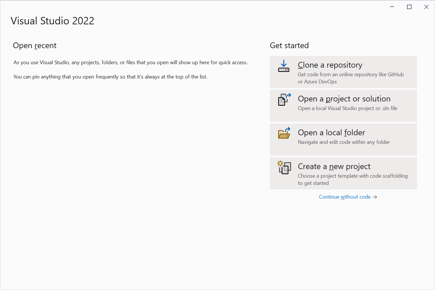
You can create a complete fully functional graphical application using a text editor such as Notepad and a compiler. A better option is to use a programming package referred to as an integrated development environment or IDE. One of the available programming environments you can use is Microsoft Visual Studio. You can download it free from the Microsoft website.
If you are using Microsoft Visual Studio, to create a graphical application, start a new project. In the Create a New Project dialog box, select one of the Windows Forms App options.
 Practical Learning: Introducing Graphical Applications

 |
Author NoteIf you want, using the form of the application you created, you can apply the descriptions in the following sections to experiment with, and get, the same results. |
Using a Computer Language
A computer application is a set of instructions that tell the computer how to do something. You as the computer must write those instructions and you must write those instructions in a specific language. For our lessons, we will use the C# language.
A Library for Graphical Applications
To help you create a graphical application, the .NET Framework includes all the classes you will need. The classes you will use (and their functionalities) are available in various libraries, called assemblies. Normally, if you create a Windows Forms App using Microsoft Visual Studio, the studio automatically includes all the fundamental assemblies your application will need (such as System.Windows.Forms.dll). Eventuall, if your application will need other assemblies, you can add them.
A Graphical Application with Windows Controls
Whether you start from an empty project or create a Windows Forms App, to make your application useful, you should add graphical objects to it. A Windows control is an object that allows a user to interact with the computer. The controls are part of the Microsoft Windows operating system available in the .NET Framework. Examples of controls are the button, the check box, the radio button, the list view, etc.
Visual Control Addition
The Client Area
A form appears as a rectangular object with four borders and a title bar:
The client area is the body of the form without the title bar, its borders and other sections such as the menu, scroll bars, etc:

Besides the form, every control also has a client area. The role of the client area is to specify the bounding section where the control can be accessed by other controls positioned on it. Based on this, a control can be visible only within the client area of its parent.
A Control's Parent
A control is referred to as parent if other controls can be positioned on its client area. The most fundamental parent in a graphical application is the form. There are many other controls that can play that role, but not all controls can be parent.
Design and Run Times
Application programming primarily consists of adding objects to your project. Some of these objects are what the users of your application use to interact with the computer. There are various ways you can get a control into your application. If you are using a text editor (such as Notepad or a code editor such as the one found in Visual Studio Code) to add the objects, you can write code. If you are using Microsoft Visual Studio, you can visually select an object and add it.
If a control is displaying on the screen and you are designing it, this is referred to as design time. This means that you have the ability to manipulate the control. You can visually set the control's appearance, its location, its size, and other necessary or available characteristics. The visual design is the technique that allows you to visually add a control and manipulate its display. This is the most common, the most regularly used, and the easiest technique.
The other technique you will use to control a window is with code. This is done by typing commands or instructions using the keyboard. This is considered, or referred to, as run time. This is the only way you can control an object's behavior while the user is interacting with the computer and your program.
A Control's Container
A control is usually an object with a body delimited by borders. Some controls can allow other controls to be positioned on their body. Some controls don't allow that. When a control can allow that other controls be positioned on its body, such a control is referred to as a container. The control that receives other controls is also referred to as a host, a containter, or a parent. A control that is positioned on the body of another control is referred to as a child or client. Some controls are mostly used only as containers (some of them are forms, tab pages, panels, picture boxes, etc). Some controls are mostly used only as clients (they cannot, or can hardly, host other controls; these include the label, the combo box, etc). Some controls can act as host or client.
The most fundamental container is the form. All the controls of an application are positioned directly or indirectly on a form.
Adding a Control to a Form
To add a control to your application, you can select it from the Toolbox and click the desired area on the form. Once added, the control is positioned where your mouse landed. In the same way, you can add other controls as you judge them necessary for your application. Here is an example of a few controls added to a form:

Alternatively, to add a control, you can also double-click it from the Toolbox and it would be added to the top-left section of the form.
If you want to add a certain control many times, before selecting it on the Toolbox, press and hold Ctrl. Then click it in the Toolbox. This permanently selects the control. Every time you click the form, the control would be added. Once you have added the desired number of this control, on the Toolbox, click the Pointer button to dismiss the control.
Introduction
A Windows control is a graphical object that allows a user to interact with the computer. The controls are as varied as the needs and goals are. Because there are many controls for various goals, their insertion to an application and their configuration are left to the computer programmer. To display the Toolbox if it is not visible:
The Toolbox is the accessory that provides most of the controls used in an application:

By default, the Toolbox is positioned on the left side of the Microsoft Visual Studio. To change that position, you can drag its title bar away and dock it to another side of the integrated development environment (IDE). The Toolbox also uses a default width to show the items on it. If the width is too narrow or too wide, you can change it. To do this, position the mouse to its right border and drag left or right.
|
Author NoteIf you want, using the form of the application you created, you can apply the descriptions in the following sections to experiment with, and get, the same results. |
The Toolbox and Additional Controls
When Microsoft Visual Studio is set up, it installs in the Toolbox the most regularly used controls. If you are working in an environment that creates only a particular group of applications and there are controls you hardly use, if you want, you can remove them from the list. To remove a control, right-click it and click Delete.
Besides the objects in the Common Controls section, other controls are left out but are still available. Some of the left out controls were created with the .NET Framework but are not installed by default because they are judged hardly used. To add one or more of these left out controls, right-click anywhere in the Toolbox and click Choose Items...


In the Choose Toolbox Items dialog box, click the .NET Framework Components tab (it should be automatically selected), then click the check box of the desired control:

After making the selections, click OK. In addition to .NET controls, some other objects called ActiveX controls were used in previous versions of Visual Basic or Visual Studio and are available. To take care of compatibility issues, most previous ActiveX controls were reconfigured and adapted to be used in .NET applications. To add some of these left out controls, right-click anywhere in the Toolbox and click Choose Items... In the Choose Toolbox Items dialog box, click the COM Components tab, select the desired control(s):

After making the selections, click OK.
The Sections of the Toolbox
When you start a Windows Forms App, it provides various controls on the Toolbox so you can choose which ones are appropriate for your particular application. Controls are set by categories based on their function or role. A container is a control whose main purpose is to host other controls. To design it, you pick up objects from the Toolbox and drop them where desired. The Toolbox organizes its items in categories and each category is represented by a triangular button:

If the available list of categories is not enough, you can add a new section of your choice. By default, Microsoft Visual Studio hides some categories because they are judged hardly used. To display these additional sections, you can right-click anywhere in the Toolbox and click Show All:

If you still want an additional section not included in the list, you can add one (or more). To do that, right-click anywhere in the Toolbox and click Add Tab. You would be prompted to provide a name. After typing the new name, press Enter.
To use an object of a particular category, you can first click its button. After selecting a category, it displays its items. In each category, a particular button called Pointer is selected by default. This simply indicates that no item in the group is currently selected.
By default, the items in each category are organized as horizontal wide buttons:

Alternatively, you can list the items of a category as buttons of a list view. To do that, you can right-click anywhere in the category and click List View to remove its check box:


The Arrangement of Items in the Toolbox
When Microsoft Visual Studio is installed, it adds the buttons in a somewhat random order. If you find it more convenient, you can arrange the list of controls in any order of your choice. You have two main options. To change the position of an item in the list, right-click it and click either Move Up or Move Down. Alternatively, you can arrange the items in alphabetic order. To do that, right-click anywhere in the Windows Forms section and click Sort Items Alphabetically.
Once you have rearranged items alphabetically, the Toolbox forgets the previous arrangement and you cannot restore it. Alternatively, you can right-click the button of a control and click either Move Up or Move Down.
Introduction
As you should know from the C# language, a property is a piece of information that characterizes or describes an object, such as a Windows control. A property can be related to a location or size of an object. It could be the color, the identification, or any visual aspect that gives it meaning. The properties of a Windows control can be changed either at design time or at run time. You can also manipulate these characteristics both at design and at run times. This means that you can set some properties at design time and some others at run time.
To manipulate the properties of a control at design time, first select it on the form. While a control is selected, use the Properties window to manipulate the properties of the control at design time. To access the Properties window if it is not visible:
The Title Bar of the Properties Window
To use the Properties window, you can position it on one side of the screen or to have it float on the screen as you wish.
The Properties window is divided in 5 sections:

The Properties window starts on top with a Title bar, which displays the name Properties. If the window is docked somewhere, its Title bar displays the Window Position, the Auto-Hide, and the Close buttons on its right side. If the window is floating, it would display the Window Position, the Maximize, and the Close buttons:

The Control Selector of the Properties Window
Below the Title bar, the Properties window displays a combo box. The content of the combo box is the name of the form plus the names of the controls currently on the form. To select a control, you can click the arrow of the Control Selector combo box and select a control from the list:

The Toolbar of the Properties Window
Below the Control Selector combo box, the Properties window displays a toolbar with 5 buttons.
Under the toolbar, the Properties window displays the list of properties of the selected control(s). On the right side, the list is equipped with a vertical scroll bar. The items in the Properties window display in a list set when installing Microsoft Visual Studio. In the beginning, you may be regularly lost when looking for a particular property because the list is not arranged in a strict order of rules. You can rearrange the list. For example, you can cause the items to display in alphabetic order. To do this, on the toolbar of the Properties window, click the Alphabetic button  . To restore the list, you can click the Categorized button
  .
.
Two lists share the main area of the Properties window. When the list of properties is displaying, the Properties button is clicked  . The second is the list of events. Therefore, to show the events, you can click the Events button
  . If the events section is displaying, to show the list of properties, you can click the Properties button .
Under the list of properties, there is a long bar that displays some messages. The area is actually a help section that displays a short description of the property that is selected in the main area of the Properties window.
Accessing the Properties of One or More Controls
Based on a previous description,
When a control is selected, the Properties window displays only its characteristics:
You can also change some characteristics of various controls at the same time. To do this, first select the controls on the form and access the Properties window:
When various controls have been selected:

Properties Categories
Introduction
Each field in the Properties window has two sections: the property's name and the property's value:

The name of a property is represented on the left column. This is the official name of the property. The names of properties are in one word. You can use this same name to access the property in code.
The box on the right side of each property name represents the value of the property that you can set for an object. There are various kinds of fields you will use to set the properties. To know what particular kind a field is, you can click its name. To set or change a property, you use the box on the right side of the property's name: the property's value, also referred to as the field's value.
Empty Fields
 |
By default, these fields have nothing in their value section. Most of these properties are dependent on other settings of your program. For example, you can set a menu property for a form only after you have created a menu. To set the property on such a field, you can type in it or select from a list. |
Text Fields
There are fields that expect you to type a value. Most of these fields have a default value. Here is an example:

To change the value of the property, click the name of the property, type the desired value, and press Enter. While some properties, such as the Text, would allow anything, some other fields expect a specific type of text, such as a numeric value.
Numeric Fields
Some fields expect a numeric value. In this case, you can click the name of the field and type the desired value. Here is an example:

If you type an invalid value, you would receive a message box notifying you of the error:

When this happens, click OK and type a valid value. If the value is supposed to be an integer, make sure you don't type it as a decimal number.
Expandable Fields
 |
Some fields have a + button. This indicates that the property has a set of sub-properties that actually belong to the same property and are defined together. To expand such a field:
After expanding the field, it would be equipped with a down-right pointing arrow: |
 |
To collapse the field, click the - button.
Some of the properties are numeric based, such as the Location or the Size. With such a property, you can click its name and type two numeric values separated by a comma. Some other properties are created from an enumeration or a class. If you expand such a field, it would display various options. Here is an example from the Font property:

With such a property, you should select from a list.
List-Based Fields
Some of the fields of the Properties window appear as combo boxes. Most (if all of) those properties use an enumerated property. When you click the arrow of the combo box, a list appears and displays the members of the enumeration:

To change the value of the field, that is, to visually specify the value of the property:
Area-Selection Fields
For some fields, if you click the arrow of the value, a window appears:

From that window, you can select the desired option.
Practical Learning: Ending the Lesson
|
|
|||
| Home | Copyright © 2001-2023, C# Key | Sunday 16 April 2023 | Next |
|
|
|||