Visual Characteristics of Menu Items
Visual Characteristics of Menu Items
Visual Assistance With Menu Items
Introduction
Here is an example of a starting menu:
using System.Drawing;
using System.Windows.Forms;

public class Exercise : System.Windows.Forms.Form
{
    MenuStrip mnuMain;

    ToolStripMenuItem mnuFile;
    ToolStripMenuItem mnuFileNew;

    public Exercise()
    {
        InitializeComponent();
    }

    void InitializeComponent()
    {
        mnuMain = new MenuStrip();
        Controls.Add(mnuMain);

        mnuFile = new ToolStripMenuItem("File");
        mnuFileNew = new ToolStripMenuItem("New");

        mnuFile.DropDownItems.Add(mnuFileNew);
        mnuMain.Items.Add(mnuFile);
    }
}

public class Program
{
    static int Main()
    {
        Application.EnableVisualStyles();
        Application.SetCompatibleTextRenderingDefault(false);
        System.Windows.Forms.Application.Run(new Exercise());
        return 0;
    }
}
This would produce:

After creating a menu (main menu and contextual menu), there are various actions you can perform to improve it and there are many ways you can enhance the user's experience with your application. Menus provide various features such as access keys and shortcuts. There are also other things you can do such as grouping menus. Although some of these actions are not required to make an application useful, they can be necessary to make it more professional.
![]() Practical Learning: Creating a Menu
Practical Learning: Creating a Menu
Access Keys
You may notice that some menu items have a letter underlined. Using this letter allows the user to access the menu using a keyboard. For example, if the letter F is underlined in a File menu as in File, the user can access the File menu by pressing the Alt, then the F keys. To create this functionality, choose a letter on the menu item and precede it with the & character. For example, &File would produce File. You can apply the same principle if you are programmatically creating the menu. Here are two examples:
void InitializeComponent()
{
    mnuMain = new MenuStrip();
    Controls.Add(mnuMain);

    mnuFile = new ToolStripMenuItem("&File");
    mnuFileNew = new ToolStripMenuItem("&New");

    mnuFile.DropDownItems.Add(mnuFileNew);
    mnuMain.Items.Add(mnuFile);
}
After creating the menu, to use it, the user can press Alt or F10:

![]() Practical Learning: Creating Access Keys
Practical Learning: Creating Access Keys
| (Name) | Text |
| miFile | &File |
| miEdit | &Edit |
| miHelp | &Help |
| (Name) | Text |
| miFileNewAutoPart | &New Auto-Part |
| miFileExit | E&xit |
| (Name) | Text |
| miEditUpdateAutoPart | &Update Auto Part |
| miEditDeleteAutoPart | &Delete Auto Part |
| (Name) | Text |
| miHelpAbout | &About CPAP |
Shortcuts
A shortcut is a key or a combination of keys that the user can press to perform an action that can also be performed using a menu item. When creating a menu, to specify a shortcut, use the ShortcutKeys property.
To visually specify a shortcut, in the menu designer, click the menu item. In the Properties window, click ShortcutKeys and click the arrow of the field, a window would come up:
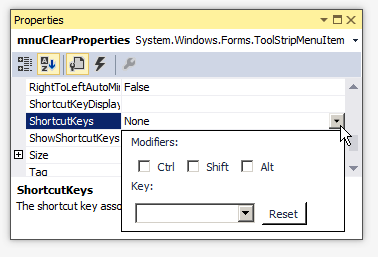
To specify just a letter for the shortcut, you can click the arrow of the combo box on the left side of the Reset button. A list would come up from which you can select the desired letter:

You are probably more familiar with shortcuts made of combinations of keys, such as Ctrl + N, Alt + F6, or Ctrl + Alt + Delete. To visually create such a shortcut, click the check box(es) and select the desired letter.
If you have used applications like Microsoft Word or Adobe Photoshop, you may know that they don't show all of their shortcuts on the menu. If you want to hide a shortcut, after specifying it, in the Properties window, set the ShowShortcutKeys property to False.
To programmatically specify a shortcut, assign a key or a combination of keys to the ShortcutKeys property of the ToolStripMenuItem class. The ShortcutKeys property is of type Keys, which is an enumeration of the various keys of a keyboard recognized by Microsoft Windows. Here is an example:
public class Exercise : System.Windows.Forms.Form
{
    MenuStrip mnuMain;

    ToolStripMenuItem mnuFile;
    ToolStripMenuItem mnuFileNew;
    ToolStripMenuItem mnuFileExit;
    ToolStripMenuItem mnuFormat;
    ToolStripMenuItem mnuFormatFont;

    public Exercise()
    {
        InitializeComponent();
    }

    void InitializeComponent()
    {
        mnuMain = new MenuStrip();
        Controls.Add(mnuMain);

        mnuFile = new ToolStripMenuItem("&File");
        mnuFileNew = new ToolStripMenuItem("&New");

        mnuFileExit = new ToolStripMenuItem("E&xit");

        mnuFormat = new ToolStripMenuItem("For&mat");
        mnuFormatFont = new ToolStripMenuItem("Fo&nt");

        mnuFormatFont.ShortcutKeys = Keys.F4;

        mnuFile.DropDownItems.Add(mnuFileNew);
        mnuFile.DropDownItems.Add(mnuFileExit);
        mnuMain.Items.Add(mnuFile);

        mnuFormat.DropDownItems.Add(mnuFormatFont);
        mnuMain.Items.Add(mnuFormat);
    }
}
This would produce:
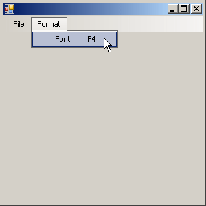
To create a shortcut that is a combination of keys, use the bit manipulation operator OR represented by |. Here is an example:
void InitializeComponent()
{
    mnuMain = new MenuStrip();
    Controls.Add(mnuMain);

    mnuFile = new ToolStripMenuItem("&File");
    mnuFileNew = new ToolStripMenuItem("&New");

    mnuFileNew.ShortcutKeys = Keys.Control | Keys.N;

    mnuFileExit = new ToolStripMenuItem("E&xit");

    mnuFormat = new ToolStripMenuItem("For&mat");
    mnuFormatFont = new ToolStripMenuItem("Fo&nt");
    mnuFormatFont.ShortcutKeys = Keys.F4;

    mnuFile.DropDownItems.Add(mnuFileNew);
    mnuFile.DropDownItems.Add(mnuFileExit);
    mnuMain.Items.Add(mnuFile);

    mnuFormat.DropDownItems.Add(mnuFormatFont);
    mnuMain.Items.Add(mnuFormat);
}
This would produce:
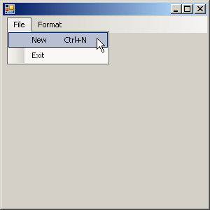
Normally, when you have associated a shortcut with a menu item, when the user displays the menu, the shortcut would appear. In some applications, you may want to hide the shortcut. To support this, the ToolStripMenuItem class is equipped with the Boolean ShowShortcutKeys property. The default value of this property is true. If you want to hide the shortcut, you can set this property to false.
![]() Practical Learning: Creating Shortcuts
Practical Learning: Creating Shortcuts
Three Periods
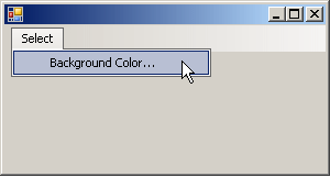
When a user has clicked a menu item, an action is supposed to occur. In some cases, an intermediary action is necessary before performing or completing the action. To indicate that an intermediary action is needed for the action related to the menu item, Microsoft standards suggest that the menu's text be followed by three periods. Here is an example that shows a menu item with three periods:
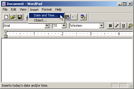
In this case, when you click the menu item, a dialog box would come up for you to select the desired value.
There is no programmatic relationship between the application and the menu item that displays three periods. It is only a suggestion to show them. Therefore, when creating a menu item, if you know that an intermediary action will be used to perform or complete the action, add three periods on the right side of its text. Here is an example:
public class Exercise : System.Windows.Forms.Form
{
    MenuStrip mnuMain;
    ToolStripMenuItem mnuSelect;
    ToolStripMenuItem mnuSelectColor;

    public Exercise()
    {
        InitializeComponent();
    }

    void InitializeComponent()
    {
        mnuMain = new MenuStrip();
        Controls.Add(mnuMain);

        mnuSelect = new ToolStripMenuItem("&Select");

        mnuSelectColor = new ToolStripMenuItem("Background Color...");

        mnuSelect.DropDownItems.Add(mnuSelectColor);
        mnuMain.Items.Add(mnuSelect);
    }
}
This would produce:
Because the three periods indicate to the user that an intermediary action will be performed, when implementing the code for the menu item, make sure you provide that intermediary action. Here is an example:
public class Exercise : System.Windows.Forms.Form
{
    MenuStrip mnuMain;
    ToolStripMenuItem mnuSelect;
    ToolStripMenuItem mnuSelectColor;

    public Exercise()
    {
        InitializeComponent();
    }

    void InitializeComponent()
    {
        mnuMain = new MenuStrip();
        Controls.Add(mnuMain);

        mnuSelect = new ToolStripMenuItem("&Select");
        mnuSelectColor = new ToolStripMenuItem("Background Color...");
        mnuSelectColor.Click +=
            new EventHandler(SelectBackgroundColor);

        mnuSelect.DropDownItems.Add(mnuSelectColor);
        mnuMain.Items.Add(mnuSelect);
    }

    void SelectBackgroundColor(object sender, EventArgs e)
    {
        ColorDialog dlgColor = new ColorDialog();

        if (dlgColor.ShowDialog() == DialogResult.OK)
            BackColor = dlgColor.Color;
    }
}
![]() Practical Learning: Adding Three Periods to a Menu Item
Practical Learning: Adding Three Periods to a Menu Item
Grouping Menu Items
Menu Separators
As we will see in later sections, there are various ways you can make a menu look good and you have many options to configure menu items. One of the ways you can manage menu items is to group them in small entities of your choice.
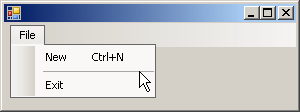
A menu separator is a horizontal line among some menu items to visually divide them. Here is an example:
There are two reasons you would use a separator. You can use a separator just for aesthetic reasons, to make your menu look good. Another, more valuable reason, is to create groups of menu items and show their belonging together by showing a line separating one group from another.
To visually specify a separator, when creating the menu item, set its string to a simple -.
To support menu separators, the .NET Framework provides the ToolStripSeparator class, which is derived from ToolStripItem. To programmatically create a separator, declare a variable of type ToolStripSeparator, initialize it using the new operator, add it to the Items property of the ToolStripItem menu category that will hold the separator. Here is an example:
public class Exercise : System.Windows.Forms.Form
{
    MenuStrip mnuMain;
    ToolStripMenuItem mnuFile;
    ToolStripMenuItem mnuFileNew;
    ToolStripSeparator mnuSeparator;
    ToolStripMenuItem mnuFileExit;

    public Exercise()
    {
        InitializeComponent();
    }

    void InitializeComponent()
    {
        mnuMain = new MenuStrip();
        Controls.Add(mnuMain);

        mnuFile = new ToolStripMenuItem("&File");
        mnuFileNew = new ToolStripMenuItem("&New");
        mnuFileNew.ShortcutKeys = Keys.Control | Keys.N;

        mnuSeparator = new ToolStripSeparator();

        mnuFileExit = new ToolStripMenuItem("E&xit");

        mnuFile.DropDownItems.Add(mnuFileNew);
        mnuFile.DropDownItems.Add(mnuSeparator);
        mnuFile.DropDownItems.Add(mnuFileExit);
        mnuMain.Items.Add(mnuFile);
    }
}
This would produce:
![]() Practical Learning: Creating a Menu Separator
Practical Learning: Creating a Menu Separator
Sub-Menus
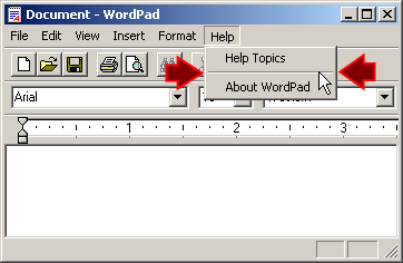
If you have menu items that perform similar tasks, you can put them in a group, which you can do using line separators. Another option is to create the menu items in their own group. The group of menu items that are created as children of a parent menu is referred to as a sub-menu. Here is an example of a sub-menu in Microsoft Paint:

To visually create a sub-menu, under the form, click the menu control that will hold the items. In the menu designer:
After selecting the eventual parent of the intended sub-menu, click the right Type Here box, type the desired caption and optionally give it a name.
To create another item for the sub-menu, you can click the Type Here box under the previous one. In the same way, you can add as many items as you judge necessary. Here is an example:

You can also create a sub-menu for a menu item that itself is a sub-menu. Here is an example:
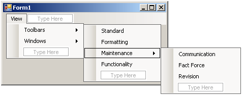
To create a sub-menu for an item A that itself is a sub-menu, click that menu item A, click the Type Here box on the right side, and type its caption.
As another technique, after selecting the menu item that will act as the parent of the sub-menu, in the Properties window, click the ellipsis button of the DropDownItems field to open the Items Collection Editor dialog box. To create an item for the sub-menu, in the top combo box, select MenuItem and click Add. Then configure the menu item as see fit (Text, (Name), etc).
Like any menu item, each sub-menu item is an object of type ToolStripMenuItem. Therefore, to programmatically create a sub-menu, create each ToolStripMenuItem item and add it to the ToolStripMenuItem menu item that will act as its parent.
Checked Box Menu Items
Introduction
Some applications are meant to display more than one form at the same time, or to optionally display and dismiss some forms some time to time. With this type of application, you may need a menu "witness" that can indicate whether the optional form is currently displaying or not. Some other applications may change their view some time to time. For these reasons and others, you can use the menu to assist the user with identifying an option that is currently available or not. You can do this through a check box on a menu item.
Implementing Check Boxes
To assist you with displaying a check box on a menu item, the ToolStripMenuItem class is equipped with a property named Checked. If you are visually creating a menu, to show a check mark on a menu item, access its Properties window and get to its Checked field. The default value of this property is false, which means the menu item is not meant to display a check box. To show a check box, you can set this property to true. When the user has clicked the menu item, you can then programmatically change its value from true to false and vice-versa.
When the application is running, to put a check mark on it, the user can click the menu item. If an item is displaying a check mark and the user clicks it, the check mark disappears. In reality, this is not an automatic functionality and it doesn't happen at random: you must configure it.
As mentioned already, to support check marks, the ToolStripMenuItem class is equipped with a Boolean property named Checked. If you want a menu item to exhibit the appropriate functionality of a check box, you must write code for it, which fortunately is particularly easy (at least easier than it is done in Win32).
The Status of Checked Menu Item
When a menu item is checked, it holds a status to indicate it. To assist you with getting this information, the ToolStripMenuItem class is equipped with a property named CheckState. This property allows you specify the type of check mark to put on a menu item or to find out the marked state of a menu item in terms of its check mark.
Pictures on Menu Items
Introduction
Because Microsoft Windows is a graphical operating system, you can enhance the appearance of your menu items by displaying indicative pictures close to menu items. Here is an example of three menu items that display pictures close to menu items.
When introducing menus, we saw that each menu was treated separately. This means that you choose what menu would display a picture and which one would not display any picture. The picture to display can be of almost any format and you can use a picture of any size. When you specify the picture, the studio may (or may not) resize it to fit the height (and width) reserved for it. This means that if the picture is too big, it may get shrunk, so much that you may not be able to recognize it anymore:
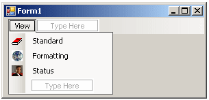
As mentioned already, the menu supports pictures of almost any type, which includes bitmaps, JPEGs, GIFs, and icons. Although you can use bitmaps, it may be better to use icons. The reason is that it is easier to control and even predict the background color of an icon and the operating system also is equipped to identify the background color of an icon. You can use icons that either you design or acquire one way or another.
Using Pictures on Menu Items
The .NET Framework provides a complete and high level of support for pictures on a menu. You can specify the picture on a menu item while or after designing the menu. If you are visually creating a menu:
The Open dialog box would come up for you to select the picture. Alternatively, on the menu strip, you can click the menu category that holds the menu item that will display the picture. In the Properties window, you can click the ellipsis button of the DropDownItems field. In the Items Collection Editor, under Members, click the item menu. In the right list, click Image and click its ellipsis button. Then use the Open dialog box to select the desired picture.
If you are programmatically creating a menu item, to specify only the picture that the menu item would display, you can initialize it with the following constructor of the ToolStripMenuItem class:
public ToolStripMenuItem(Image image);
Here is an example:
using System.Drawing;
using System.Windows.Forms;

public class Exercise : Form
{
    MenuStrip mnuMain;
    ToolStripMenuItem mnuFile;
    ToolStripMenuItem mnuFileNew;

    public Exercise()
    {
        InitializeComponent();
    }

    void InitializeComponent()
    {
        mnuMain = new MenuStrip();

        mnuFile = new ToolStripMenuItem("&File");
        mnuFileNew = new ToolStripMenuItem(Image.FromFile(@"C:\Programs\art\new.ico"));
        mnuFileNew.Text = "&New";

        mnuFile.DropDownItems.Add(mnuFileNew);
        mnuMain.Items.Add(mnuFile);

        Controls.Add(mnuMain);
    }
}

public class Program
{
    static int Main()
    {
        System.Windows.Forms.Application.Run(new Exercise());
        return 0;
    }
}
If you had created the menu item using either the default constructor or the constructor that takes only a string, to specify the picture of the menu, the ToolStripMenuItem is equipped with a property named Image that is of type Image. Here is an example:
public class Exercise : Form
{
    MenuStrip mnuMain;
    ToolStripMenuItem mnuFile;
    ToolStripMenuItem mnuFileNew;
    ToolStripMenuItem mnuFileOpen;

    public Exercise()
    {
        InitializeComponent();
    }

    void InitializeComponent()
    {
        mnuMain = new MenuStrip();

        mnuFile = new ToolStripMenuItem("&File");
        mnuFileNew = new ToolStripMenuItem(Image.FromFile(@"C:\Programs\art\new.ico"));
        mnuFileNew.Text = "&New";

        mnuFileOpen = new ToolStripMenuItem("Open");
        mnuFileOpen.Image = Image.FromFile(@"C:\Programs\art\open.ico");

        mnuFile.DropDownItems.Add(mnuFileNew);
        mnuFile.DropDownItems.Add(mnuFileOpen);
        mnuMain.Items.Add(mnuFile);

        Controls.Add(mnuMain);
    }
}
To specify both the caption and the picture of the menu, you can initialize it using the following constructor:
public ToolStripMenuItem(Stringtext, Imageimage);
Here is an example:
public class Exercise : Form
{
    MenuStrip mnuMain;
    ToolStripMenuItem mnuFile;
    ToolStripMenuItem mnuFileNew;
    ToolStripMenuItem mnuFileOpen;
    ToolStripMenuItem mnuFileSave;

    public Exercise()
    {
        InitializeComponent();
    }

    void InitializeComponent()
    {
        mnuMain = new MenuStrip();

        mnuFile = new ToolStripMenuItem("&File");
        mnuFileNew = new ToolStripMenuItem(Image.FromFile(@"C:\Programs\art\new.ico"));
        mnuFileNew.Text = "&New";

        mnuFileOpen = new ToolStripMenuItem("Open");
        mnuFileOpen.Image = Image.FromFile(@"C:\Programs\art\open.ico");

        mnuFileSave =
            new ToolStripMenuItem("Save", Image.FromFile(@"C:\Programs\art\save.ico"));

        mnuFile.DropDownItems.Add(mnuFileNew);
        mnuFile.DropDownItems.Add(mnuFileOpen);
        mnuFile.DropDownItems.Add(mnuFileSave);
        mnuMain.Items.Add(mnuFile);

        Controls.Add(mnuMain);
    }
}
Characteristics of Menu Images
After specifying the picture to display on a menu item, you can exercise a great deal of control on its appearance. By default, the picture is displayed on the left side of the menu item's caption. To support the alignment of the picure, the ToolStripItem class is equipped with a property named ImageAlign. The ImageAlign property is of type ContentAlignment, which is an enumeration. It uses the same values we saw for the content alignment of text on a control.
After specifying the picture to display on a menu item, if the picture is too big, it may get shrunk to fit 16 x 16. Still, if you want, you can keep the size. The ability to keep the 16 x 16 size or the original size is controlled by a property named ImageScaling. This property is of type ToolStripItemImageScaling, which is an enumeration and has only two members. The default value of this property is None, which means the picture would be resized for a 16 x 16 size. An alternative is to set the property to SizeToFit. If you do, the studio would use a type of algorithm to change the size of (all) the menu items: If you set only one menu item to SizeToFit, the studio would use its size of the new size of all the other menu items. Here is an example:
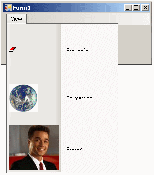
You can make the menu item display both the picture and the caption. This characteristic is controlled by the DisplayStyle property of the ToolStripItem class. This property is of type ToolStripItemDisplayStyle, which is an enumeration:
Menu Management
The Menu Outline
While you are visually creating a menu, Microsoft Visual Studio keeps track of its items. To see an outline of your menu, you can click a menu category or item and click Document Outline. A window titled Document Outline would appear (on the left of the screen by default).
Inserting Menu Items
After creating a few menu categories or a few menu items, you may find out that an item is missing in the sequence. You can then create a new menu before one of your choice:
There is no formal method to programmatically insert a new menu. The sequence of adding TooStripMenuItem objects to their parent specifies how they would appear.
Using a Menu Template
To assist you with easily creating a menu of the most common items found in regular applications, Microsoft Visual Studio comes with a menu template. To use it to create a main menu, from the Menus & Toolbars section of the Toolbox, click a MenuStrip and click the form. Right-click the menu strip and click Insert Standard Items. A complete menu made of File, Edit, Tools, and Help menu categories would be created on the form. Each menu category would also receive a few menu items:
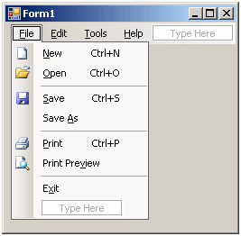
You can then customize the menu as you see fit.
Copying a Menu
You can visually copy a main menu or a contextual menu from one (Visual Studio) application to another. To do this, in the application that holds the desired menu, under the form, right-click the menu strip or the context menu strip and click Copy. In the other application, right-click the form and click Paste.
You can visually copy a menu category to duplicate it in your application. To do this, under the form, click the menu strip. In the menu designer, right-click the menu category and click Copy. Right-click another top-level item and click Paste. When you copy and paste a menu category, the new one would have the same menu items (captions) as the original, but with new names. You can keep the items of the new menu category or you can customize them as you see fit.
You can visually copy a menu item to duplicate it. To do this, in the menu designer:
After copying the menu item, right-click the item that will succeed it and click Paste.
To assist you with programmatically copying a menu category or a menu item, the ToolStripItemCollection class is equipped with a method named CopyTo. Its syntax is:
public void CopyTo(ToolStripItem[] array, int index);
This method takes a collection of menu items (as an array) and copies it to the index of your choice.
Moving a Menu
While designing your menu, you may find out that a menu category or a menu item is in the wrong position. You can then move the menu category or the menu item.
To visually move a menu category, on the menu designer, click and hold the mouse on the menu category. Drag left or right in the desired direction. While moving the mouse, the cursor would display a small rectangle. When the mouse gets to the item that will succeed the new one, it would be surrounded by a dotted rectangle:
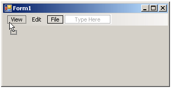
You can then release the mouse. When you move a menu category, it moves with all its menu items.
To move a menu item, in the menu designer, click and hold the mouse on the item. Drag up or down. While moving the mouse, the cursor would display a small rectangle. When the mouse gets to the item that will succeed the new one, it would be surrounded by a dotted rectangle:
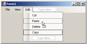
You can then release the mouse. When you move a menu item, if it has a sub-menu, it would move with that sub-menu.
If you are using the Items Collection Editor, to move a menu item, first select it in the Members list, then drag one of the arrow buttons that point up or down, depending on the direction you want to move it.
There is no formal process to programmatically move a menu. If you want, you can delete the menu from one ToolStripMenuItem object and add it to the desired ToolStripMenuItem object.
Enabling or Disabling a Menu Item
A menu item is said to be disabled if the user can see it but cannot use it. The caption of such a menu appears gray. Here are examples:
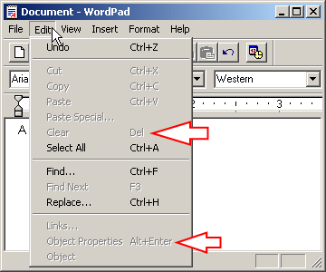
When a menu item is disabled, the user can position the mouse on it and click, but nothing would happen. This indicates that the action of that menu item is not available at that time. The reverse to a disabled menu item is that it is enabled. That's the case for the Under and the Select All items in the above application.
The user cannot directly enable or disable a menu. You as the application developer decides when (and why) the item would be enabled or disabled.
To support the ability to enable or to disable a menu item, the ToolStripMenuItem class is equipped with a Boolean property named Enabled. By default, a new menu item you have just created is enabled. This is because the default value of this property is true.
To visually enable or disable a menu item, in the menu designer or in the Items Collection Editor, click the menu item. In either the Properties window or on the right side of the Items Collection Editor, set the Enabled property to false. If it is currently set to false and you want to enable, set the property to true.
To programmatically enable or re-enable it, you can set the value to true. In the same way, to find out the enabled status of a menu item, you can check the value of its Enabled property.
![]() Practical Learning: Enabling or Disabling Menu Items
Practical Learning: Enabling or Disabling Menu Items
private void lvwAutoParts_ItemSelectionChanged(object sender, ListViewItemSelectionChangedEventArgs e)
{
    foreach (AutoPart part in Repository.AutoParts)
    {
        if (part.PartNumber == long.Parse(e.Item!.Text))
        {
            pbxAutoPart.Image = Image.FromFile(@"E:\College Park Auto-Parts\" + part.PartNumber + ".png");

            Width = pbxAutoPart.Left + pbxAutoPart.Image.Width + 40;
            Height = pbxAutoPart.Top + pbxAutoPart.Image.Height + 80;
        }
    }

    if (lvwAutoParts.SelectedItems.Count == 1)
        lviSelected = lvwAutoParts.SelectedItems[0];

    if (lvwAutoParts.SelectedItems.Count == 1)
    {
        miEditAutoPart.Enabled = true;
        miDeleteAutoPart.Enabled = true;
    }
    else
    {
        miEditAutoPart.Enabled = false;
        miDeleteAutoPart.Enabled = false;
    }
}
Hiding or Showing a Menu Item
A menu is said to be hidden if it is programmatically available behind the scenes but the user cannot see. Since the user cannot see it, he or she cannot use it. The reverse to a hidden menu item is that it is shown to the user. The user cannot directly hide or show a menu item. You as the application developer create a menu item and then decides when, how, and where (and why) the item would be hidden or shown.
To support the ability to show or to hide a menu item, the ToolStripMenuItem class inherits a Boolean property named Visible from the its parents (the ToolStripMenuItem class inherits it from the ToolStripDropDownItem class that inherits it from the ToolStripItem class).
After you have just created a new menu, by default, it is made visible to the user. This is because the default value of the Visible property is set to true. To hide a menu item, you can set its Visible property to false. To show or to reveal it, you can set the value to true. In the same way, to find out whether a menu item is currently displaying, you can check the status of its Visible property.
![]() Practical Learning: Hiding a Menu Item
Practical Learning: Hiding a Menu Item
Deleting a Menu Item
Instead of disabling or hiding a menu you don't want the user to use anymore, you can simply delete it. If you do this, you cannot programmatically refer to it anymore, unless you re-create it. From the previous to the current lesson, we saw different ways of creating menu categories and menu items.
To visually delete a menu category, under the form:
To visually delete a menu item, under the form, click either the menu strip or context menu strip:
In the same way, you can keep deleting one item at a time.
To visually delete the whole main menu or a contextual menu, under the form, click either the menu strip or the context menu strip, and press Delete. Be careful because you will not be warned before the menu is actually dismissed (you can still undo your action, provided it is still available).
To assist you with programmatically deleting a menu category or a menu item, the ToolStripItemCollection class is equipped with three methods. To delete a menu using its ToolStripItem object name, you can call the Remove() method. Its syntax is:
public void Remove(ToolStripItem value);
When calling this method, pass it the name of the menu category or the menu item you want to delete. If you want to delete a menu category or a menu item based on its index, you can call the following method:
public void RemoveAt(int index);
To delete a menu using its key, you can use the ToolStripItemCollection.RemoveByKey() method whose syntax is:
public virtual void RemoveByKey(string key);
In the same way, you can keep removing one item at a time. To help you delete all items, the ToolStripItemCollection class is equipped with a method named Clear. Its syntax is:
public virtual void Clear();
When called, this method will get rid of all the menu categories and items that belong to the object that called it.
![]() Practical Learning: Using the Application
Practical Learning: Using the Application
Part #:     148040
Year:       2010
Make:       Chrysler
Model:      Town & Country 3.8L
Category:   Alternators & Generators
Part Name:  Alternator
Unit Price: 118.37
| Part # | Year | Make | Model | Category | Part Name | Unit Price |
| 730283 | 2020 | Jeep | Wrangler Unlimited Sahara | Oil Filters | Hydraulic Cylinder Timing Belt Tensioner | 14.15 |
| 290741 | 2015 | Ford | F-150 Regular Cab | Shocks, Struts & Suspension | Strut and Coil Assembly | 295.88 |
| 740248 | 2013 | Chevrolet | Equinox | Bearings & Seals | Wheel hub bearing Assembly | 99.95 |
| 283759 | 2012 | Dodge | Charger 3.6L | Starters | DB Electrical SND0787 Starter | 212.58 |
| 503502 | 2008 | Jeep | Wrangler | Alternators | Alternator | 114.46 |
| 148073 | 2011 | Chrysler | s200 | Starters | DB Electrical SND0775 Starter | 94.48 |
| 308113 | 2017 | Buick | Enclave | Brake Kits | Autospecialty Front and Rear Replacement Brake Kit-OE Brake Rotors & Ceramic Brake Pads | 315.27 |
| 938475 | 2010 | Chrysler | Sebring | Starters | DB Electrical SMT0343 Starter | 82.66 |
Part #:   799428
Year:       2012
Make:       Cadillac
Model:      XTS
Category:   Bearings & Seals
Part Name:  Front/Rear Wheel Hub Bearing Assembly 5 Lugs w/ABS
Unit Price: 79.97
Model:      F-150 XL 3.5L V6 Flex Regular Cab 2 Full-Size Doors
Part Name:  Front Strut and Coil Spring Assembly - Set of 2
Unit Price: 245.68
Part #:     520384
Category:   Drum Brakes
Part Name:  Rear Dynamic Friction Company True-Arc Brake Shoes
Unit Price: 42.22
|
|
|||
| Previous | Copyright © 2004-2025, FunctionX | Saturday 20 May 2023, 08:02 | Next |
|
|
|||