Introduction to Applications Menus
Introduction to Applications Menus
The Main Menu
Introduction
A menu is a list of actions that can be performed on a program. To be aware of these actions, the list must be presented to the user upon request. On a typical DOS (Microsoft Windows) or Terminal (UNIX/Linux) application, a menu is presented with numerical or character options that the user can type and press Enter. An example would be:
Here are the various options:
1. Register a new student
2. Review a student's information
3. Enter student's grades
4. Close the application
The user would then enter the number (or character) that corresponds to the desired option and continue using the program. For a graphical application, a menu is presented as a list of words and, using a mouse or a keyboard, the user can select the desired item from the menu.
To enhance the functionality of a graphical application, also to take advantage of the mouse and the keyboard, there are various types of menus. A menu is considered a main menu when it carries most of the actions the user can perform on a particular application. Such a menu is positioned in the top section of the form in which it is used.
A main menu is divided in categories of items and each category is represented by a word. Here is an example of categories of menus as File, Edit, View, Insert, Format, and Help:
![]()
To use a menu, the user first clicks one of the words that displays on top. When clicked, the menu expands and displays a list of items that belong to that category. Here is an example:
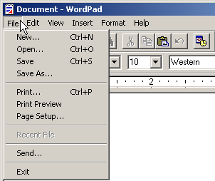
There is no strict rule on how a menu is organized. There are only suggestions. For example, actions that are related to file processing, such as creating a new file, opening an existing file, saving a file, printing the open file, or closing the file usually stay under a category called File. In the same way, actions related to viewing documents can be listed under a View menu category.
![]() Practical Learning: Creating a Menu
Practical Learning: Creating a Menu
namespace AutoPartsInventory3.Models
{
    internal record class AutoPart
    {
        public int     PartNumber { get; set; }
        public int     CarYear    { get; set; }
        public string? Make       { get; set; }
        public string? Model      { get; set; }
        public string? Category   { get; set; }
        public string? PartName   { get; set; }
        public double  UnitPrice  { get; set; }
    }
}namespace AutoPartsInventory3.Models
{
internal static class Repository
{
public static AutoPart[] AutoParts = new AutoPart[100];
static Repository()
{
for (int i = 0; i < AutoParts.Length; i++)
{
AutoParts[i] = new AutoPart()
{
PartNumber = 0,
CarYear = i,
Make = string.Empty,
Model = string.Empty,
Category = string.Empty,
PartName = string.Empty,
UnitPrice = 0d
};
}
}
private static int GetFirst0Index()
{
for (int i = 0; i < AutoParts.Length; i++)
{
if (AutoParts[i].PartNumber == 0)
{
return i;
}
}
return 0;
}
public static void Add(in AutoPart part)
{
int index = GetFirst0Index();
AutoParts[index].PartNumber = part.PartNumber;
AutoParts[index].CarYear = part.CarYear;
AutoParts[index].Make = part.Make;
AutoParts[index].Model = part.Model;
AutoParts[index].Category = part.Category;
AutoParts[index].PartName = part.PartName;
AutoParts[index].UnitPrice = part.UnitPrice;
}
}
}| Control | (Name) | Text | Modifiers | Other Properties | |
| Label | &Part #: | ||||
| TextBox | txtPartNumber | Public | |||
| PictureBox | pbxAutoPart | BorderStyle: FixedSingle SizeMode: AutoSize |
|||
| Label | &Year: | ||||
| ComboBox | cbxYears | Public | |||
| Label | &Make: | Public | |||
| ComboBox | cbxMakes | Public | |||
| Label | M&odel: | ||||
| TextBox | txtModel | Public | |||
| Label | Ca&tegory: | ||||
| ComboBox | cbxCategories | Public | |||
| Label | Part Na&me | ||||
| TextBox | txtPartName | Public | Mutiline: True ScrollBars: Vertical |
||
| Label | &Unit Price: | ||||
| TextBox | txtUnitPrice | Public | TextAlign: Right | ||
| Label | __________________________ | ||||
| Button | btnSaveAutoPart | Sa&ve Auto-Part | |||
| Button | btnClose | Close | |||
using AutoPartsInventory3.Models;

namespace AutoPartsInventory3
{
    public partial class AutoPartNew : Form
    {
        public AutoPartNew()
        {
            InitializeComponent();
        }

        public void InitializeStoreItem()
        {
            txtPartNumber.Text = string.Empty;
            cbxYears.Items.Clear();
            cbxMakes.Items.Clear();
            cbxCategories.Items.Clear();

            for (int year = DateTime.Today.Year + 1; year >= 2000; year--)
                cbxYears.Items.Add(year);

            cbxMakes.Items.Add("Kia");
            cbxMakes.Items.Add("GMC");
            cbxMakes.Items.Add("Ford");
            cbxMakes.Items.Add("Jeep");
            cbxMakes.Items.Add("Buick");
            cbxMakes.Items.Add("Dodge");
            cbxMakes.Items.Add("Honda");
            cbxMakes.Items.Add("Toyota");
            cbxMakes.Items.Add("Cadillac");
            cbxMakes.Items.Add("Chrysler");
            cbxMakes.Items.Add("Chevrolet");
            cbxMakes.Items.Add("Volkswagen");

            cbxCategories.Items.Add("Starters");
            cbxCategories.Items.Add("Brake Kits");
            cbxCategories.Items.Add("Air Filters");
            cbxCategories.Items.Add("Oil Filters");
            cbxCategories.Items.Add("Alternators");
            cbxCategories.Items.Add("Drum Brakes");
            cbxCategories.Items.Add("Bearings & Seals");
            cbxCategories.Items.Add("Alternators & Generators");
            cbxCategories.Items.Add("Shocks, Struts & Suspension");

            pbxAutoPart.Image = Image.FromFile(@"E:\College Park Auto-Parts\Generic.png");
        }

        private void AutoPartNew_Load(object sender, EventArgs e)
        {
            InitializeStoreItem();
        }

        private void txtPartNumber_Leave(object sender, EventArgs e)
        {
            if (!string.IsNullOrEmpty(txtPartNumber.Text))
            {
                pbxAutoPart.Image = Image.FromFile(@"E:\College Park Auto-Parts\" + txtPartNumber.Text + ".png");

                Width  = pbxAutoPart.Left + pbxAutoPart.Image.Width + 40;
                Height = pbxAutoPart.Top + pbxAutoPart.Image.Height + 80;
            }
        }

        private void btnSaveAutoPart_Click(object sender, EventArgs e)
        {
            AutoPart item = new AutoPart()
            {
                PartNumber = int.Parse(txtPartNumber.Text),
                CarYear    = int.Parse(cbxYears.Text),
                Make       = cbxMakes.Text,
                Model      = txtModel.Text,
                Category   = cbxCategories.Text,
                PartName   = txtPartName.Text,
                UnitPrice  = double.Parse(txtUnitPrice.Text),
            };

            Repository.Add(item);
            InitializeStoreItem();

            cbxYears.Text      = string.Empty;
            cbxMakes.Text      = string.Empty;
            txtModel.Text      = string.Empty;
            cbxCategories.Text = string.Empty;
            txtPartNumber.Text = string.Empty;
            txtPartName.Text   = string.Empty;
            txtUnitPrice.Text  = string.Empty;
        }

        private void btnClose_Click(object sender, EventArgs e)
        {
            Close();
        }
    }
}| Control | (Name) | Text | |
| Button | btnFindAutoPart | &Find Auto Part | |
| Button | btnUpdateAutoPart | &Update Auto-Part | |
using AutoPartsInventory3.Models;

namespace AutoPartsInventory3
{
    public partial class AutoPartEditor : Form
    {
        public AutoPartEditor()
        {
            InitializeComponent();
        }

        public void InitializeStoreItem()
        {
            txtPartNumber.Text = string.Empty;
            cbxYears.Items.Clear();
            cbxMakes.Items.Clear();
            txtModel.Text = string.Empty;
            cbxCategories.Items.Clear();
            txtPartName.Text = string.Empty;
            txtUnitPrice.Text = string.Empty;

            for (int year = DateTime.Today.Year + 1; year >= 2000; year--)
                cbxYears.Items.Add(year);

            cbxMakes.Items.Add("Kia");
            cbxMakes.Items.Add("GMC");
            cbxMakes.Items.Add("Ford");
            cbxMakes.Items.Add("Jeep");
            cbxMakes.Items.Add("Buick");
            cbxMakes.Items.Add("Dodge");
            cbxMakes.Items.Add("Honda");
            cbxMakes.Items.Add("Toyota");
            cbxMakes.Items.Add("Cadillac");
            cbxMakes.Items.Add("Chrysler");
            cbxMakes.Items.Add("Chevrolet");
            cbxMakes.Items.Add("Volkswagen");

            cbxCategories.Items.Add("Starters");
            cbxCategories.Items.Add("Brake Kits");
            cbxCategories.Items.Add("Air Filters");
            cbxCategories.Items.Add("Oil Filters");
            cbxCategories.Items.Add("Alternators");
            cbxCategories.Items.Add("Drum Brakes");
            cbxCategories.Items.Add("Bearings & Seals");
            cbxCategories.Items.Add("Alternators & Generators");
            cbxCategories.Items.Add("Shocks, Struts & Suspension");

            cbxYears.Text = string.Empty;
            cbxMakes.Text = string.Empty;
            cbxCategories.Text = string.Empty;
        }

        public void ResizeFormBasedOnPictureBox()
        {
            pbxAutoPart.Image = Image.FromFile(@"E:\College Park Auto-Parts\" + txtPartNumber.Text + ".png");

            Width  = pbxAutoPart.Left + pbxAutoPart.Image.Width + 40;
            Height = pbxAutoPart.Top + pbxAutoPart.Image.Height + 80;
        }

        private void btnFindAutoPart_Click(object sender, EventArgs e)
        {
            foreach (AutoPart part in Repository.AutoParts)
            {
                if (part.PartNumber == int.Parse(txtPartNumber.Text))
                {
                    cbxYears.Text      = part.CarYear.ToString();
                    cbxMakes.Text      = part.Make;
                    txtModel.Text      = part.Model;
                    cbxCategories.Text = part.Category;
                    txtPartName.Text   = part.PartName;
                    txtUnitPrice.Text  = part.UnitPrice.ToString();

                    pbxAutoPart.Image  = Image.FromFile(@"E:\College Park Auto-Parts\" + txtPartNumber.Text + ".png");

                    Width  = pbxAutoPart.Left + pbxAutoPart.Image.Width  + 40;
                    Height = pbxAutoPart.Top  + pbxAutoPart.Image.Height + 80;
                    break;
                }
            }
        }

        private void btnUpdateAutoPart_Click(object sender, EventArgs e)
        {
            foreach (AutoPart part in Repository.AutoParts)
            {
                if (part.PartNumber == int.Parse(txtPartNumber.Text))
                {
                    part.CarYear   = int.Parse(cbxYears.Text);
                    part.Make      = cbxMakes.Text;
                    part.Model     = txtModel.Text;
                    part.Category  = cbxCategories.Text;
                    part.PartName  = txtPartName.Text;
                    part.UnitPrice = double.Parse(txtUnitPrice.Text);
                    break;
                }
            }

            InitializeStoreItem();
        }

        private void btnClose_Click(object sender, EventArgs e)
        {
            Close();
        }
    }
}| Control | (Name) | Text | Modifiers | |
| TextBox | txtYear | Public | ||
| TextBox | txtMake | Public | ||
| TextBox | txtCategory | Public | ||
| Button | btnDeleteAutoPart | &Delete Auto-Part | ||
using AutoPartsInventory3.Models;

namespace AutoPartsInventory3
{
    public partial class AutoPartDelete : Form
    {
        public AutoPartDelete()
        {
            InitializeComponent();
        }

        public void InitializeStoreItem()
        {
            txtPartNumber.Text = string.Empty;
            txtYear.Text       = string.Empty;
            txtMake.Text       = string.Empty;
            txtModel.Text      = string.Empty;
            txtCategory.Text   = string.Empty;
            txtPartName.Text   = string.Empty;
            txtUnitPrice.Text  = string.Empty;
        }

        public void ResizeFormBasedOnPictureBox()
        {

            pbxAutoPart.Image = Image.FromFile(@"E:\College Park Auto-Parts\" + txtPartNumber.Text + ".png");

            Width  = pbxAutoPart.Left + pbxAutoPart.Image.Width  + 40;
            Height = pbxAutoPart.Top  + pbxAutoPart.Image.Height + 80;

        }

        private void btnFindAutoPart_Click(object sender, EventArgs e)
        {
            foreach (AutoPart part in Repository.AutoParts)
            {
                if (part.PartNumber == int.Parse(txtPartNumber.Text))
                {
                    txtYear.Text = part.CarYear.ToString();
                    txtMake.Text = part.Make;
                    txtModel.Text = part.Model;
                    txtCategory.Text = part.Category;
                    txtPartName.Text = part.PartName;
                    txtUnitPrice.Text = part.UnitPrice.ToString();

                    pbxAutoPart.Image = Image.FromFile(@"E:\College Park Auto-Parts\" + txtPartNumber.Text + ".png");

                    Width = pbxAutoPart.Left + pbxAutoPart.Image.Width + 40;
                    Height = pbxAutoPart.Top + pbxAutoPart.Image.Height + 80;
                    break;
                }
            }
        }

        private void btnDeleteAutoPart_Click(object sender, EventArgs e)
        {
            foreach (AutoPart part in Repository.AutoParts)
            {
                if (part.PartNumber == int.Parse(txtPartNumber.Text))
                {
                    part.PartNumber = 0;
                    part.CarYear    = 0;
                    part.Make       = string.Empty;
                    part.Model      = string.Empty;
                    part.Category   = string.Empty;
                    part.PartName   = string.Empty;
                    part.UnitPrice  = 0d;
                    break;
                }
            }

            InitializeStoreItem();
        }

        private void btnClose_Click(object sender, EventArgs e)
        {
            Close();
        }
    }
}Main Menu Creation
To support actions that are used to graphically enhance the functionality of an application, the .NET Framework provides a class named ToolStrip. To support menus for an application, the .NET Framework provides a class named MenuStrip (in Microsoft Visual Studio 2002 and 2003, the main menu was implemented through the MainMenu class, which is still available but lacks some features).
To graphically create a main menu, in the Menus & Toolbars section of the Toolbox, you can click the MenuStrip button ![]() and click the form that will use the menu. After clicking the form, an empty menu is initiated:
and click the form that will use the menu. After clicking the form, an empty menu is initiated:

Like every control, the main menu must have a name. After adding the menu strip to a form, you can accept the suggested name or, in the Properties window, click (Name) and type the desired name. You can then use the menu placeholder to add the necessary menu item(s).
To programmatically create a main menu, declare a variable of type MenuStrip and initialize it with its default constructor. Because the main menu is primarily a control, you must add it to the list of controls of the form. Here is an example:
using System.Windows.Forms;

public class Exercise : Form
{
    MenuStrip mnuMain;

    public Exercise()
    {
        InitializeComponent();
    }

    void InitializeComponent()
    {
        mnuMain = new MenuStrip();
        Controls.Add(mnuMain);
    }

    static int Main()
    {
        Application.EnableVisualStyles();
        Application.SetCompatibleTextRenderingDefault(false);
        System.Windows.Forms.Application.Run(new Exercise());
        return 0;
    }
}
Menu Categories
In our introduction, we saw that a main menu was made of categories represented in the top section. After adding a MenuStrip, you can start creating the desired menu categories. To graphically create a menu category:
To create the next menu category, click Type Here on the right side of the previous menu category. In the same way, you can continue creating the desired menu categories. Here is an example:

Besides clicking Type Here and typing a string, an alternative is to get assisted by a dialog box. To open it:
A dialog box, titled Items Collection Editor, would come up:

To create a menu category, in the Select Item And Add To List Below combo box, select MenuItem and click the Add button. In the right list, configure the menu item. At a minimum, you should specify its caption in the Text field. Like every control, each menu item has a name. To make sure you can easily recognize it in your code, when creating a menu item, you should give it a name unless you are satisfied with the suggested one. After creating the menu categories, you can click OK and keep the dialog box opened for more options.
To support menu items, the .NET Framework provides a class named ToolStripMenuItem. Using it, to create a menu category, declare a handle to this class and initialize it using one of its constructors. The default constructor is used to create a menu item without specifying any of its options. Here is an example:
ppublic class Exercise : System.Windows.Forms.Form
{
    MenuStrip mnuMain;
    ToolStripMenuItem mnuFile;

    public Exercise()
    {
        InitializeComponent();
    }

    void InitializeComponent()
    {
        mnuMain = new MenuStrip();
        mnuFile = new ToolStripMenuItem();

        Controls.Add(mnuMain);
    }
}
To specify the caption that will be displayed on a menu category, you can use the following constructor of the ToolStripMenuItem class:
public ToolStripMenuItem(string text);
Here is an example:
public class Exercise : System.Windows.Forms.Form
{
    MenuStrip mnuMain;
    ToolStripMenuItem mnuFile;

    public Exercise()
    {
        InitializeComponent();
    }

    void InitializeComponent()
    {
        mnuMain = new MenuStrip();
        mnuFile = new ToolStripMenuItem("File");

        Controls.Add(mnuMain);
    }
}
If you had instantiated the class using its default constructor, to specify its caption, the ToolStripMenuItem class is equipped with a property named Text. Therefore, assign a string to this property. Here is an example:
public class Exercise : System.Windows.Forms.Form
{
    MenuStrip mnuMain;
    ToolStripMenuItem mnuFile;
    ToolStripMenuItem mnuEdit;

    public Exercise()
    {
        InitializeComponent();
    }

    void InitializeComponent()
    {
        mnuMain = new MenuStrip();
        mnuFile = new ToolStripMenuItem("File");
        mnuEdit = new ToolStripMenuItem();
        mnuEdit.Text = "Edit";

        Controls.Add(mnuMain);
    }
}
In the same way, you can create as many menu categories as you judge necessary for your application.
Introduction to Menu Items
In our introduction, we saw that if you click a menu category, a list comes up. Here is an example:

The objects under a menu category are referred to as menu items. To graphically create a menu item, first access the menu strip, which you can do by clicking it under the form. On the form, click a menu category. Once you do this, a placeholder would be displayed under it:
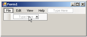
To create a menu item:
In the same way, to create the next menu item, under the same category, click the next Type Here and type the desired caption or change the Text value in the Properties window.
An alternative is to use a dialog box. To access it, in the menu designer:
The Items Collection Editor dialog box would come up:

To create a menu item, in the Select Item And Add To List Below combo box, select MenuItem and click Add. On the right side, configure the menu item as you see fit. At a minimum, you should specify its caption in the Text field.
Both the menu category and the menu item are created using the ToolStripMenuItem class. Here are examples:
public class Exercise : System.Windows.Forms.Form
{
    MenuStrip mnuMain;

    ToolStripMenuItem mnuFile;
    ToolStripMenuItem mnuNew;
    ToolStripMenuItem mnuExit;
    ToolStripMenuItem mnuEdit;
    ToolStripMenuItem mnuCopy;

    public Exercise()
    {
        InitializeComponent();
    }

    void InitializeComponent()
    {
        mnuMain = new MenuStrip();

        mnuFile = new ToolStripMenuItem("File");
        mnuNew  = new ToolStripMenuItem("New");
        mnuExit = new ToolStripMenuItem("Exit");
        mnuEdit = new ToolStripMenuItem("Edit");
        mnuCopy = new ToolStripMenuItem("Copy");

        Controls.Add(mnuMain);
    }
}
Associating Menu Items to Menu Categories
If you visually create your main menu, the form designer takes care of most details behind the scenes. For example, each menu item is automatically added to its parent menu category. If you programmatically create your main menu, you must associate each menu item to its parent menu category.
To support menu categories, ToolStripMenuItem, the class used to create menu categories, is derived from a class named ToolStripDropDownItem. The ToolStripDropDownItem class is abstract, which means you cannot instantiate it. Instead, it provides functionality to other classes derived from it. The ToolStripDropDownItem class is based on the ToolStripItem class.
To support menu items, the ToolStripDropDownItem class is equipped with a property named DropDownItems. This property is of type ToolStripItemCollection.
To specify that a menu item will be part of a menu category, call the Add() method of the ToolStripItemCollection class. This method is overloaded with various versions. One of the versions uses the following syntax:
public int Add(ToolStripItem value);
This version allows you to pass a ToolStripItem-type of item class, such as a ToolStripMenuItem object. Here is an example:
public class Exercise : System.Windows.Forms.Form
{
    MenuStrip mnuMain;

    ToolStripMenuItem mnuEdit;
    ToolStripMenuItem mnuCopy;

    public Exercise()
    {
        InitializeComponent();
    }

    void InitializeComponent()
    {
        mnuMain = new MenuStrip();

        mnuEdit = new ToolStripMenuItem("Edit");
        mnuCopy = new ToolStripMenuItem("Copy");
        mnuEdit.DropDownItems.Add(mnuCopy);

        Controls.Add(mnuMain);
    }
}
The ToolStripItemCollection class also allows you to create a menu item without going through a ToolStripItem-type of object. To support this, it provides the following version of its Add() method:
public ToolStripItem Add(string text);
This method takes as argument the text that the menu item would display and it returns the ToolStripItem item that was created. Here is an example:
public class Exercise : System.Windows.Forms.Form
{
    MenuStrip mnuMain;

    ToolStripMenuItem mnuEdit;
    ToolStripMenuItem mnuCopy;
    ToolStripMenuItem mnuPaste;

    public Exercise()
    {
        InitializeComponent();
    }

    void InitializeComponent()
    {
        mnuMain = new MenuStrip();

        mnuEdit = new ToolStripMenuItem("Edit");
        mnuCopy	= new ToolStripMenuItem("Copy");
        mnuEdit.DropDownItems.Add(mnuCopy);
        mnuPaste = (ToolStripMenuItem)mnuEdit.DropDownItems.Add("Paste");

        Controls.Add(mnuMain);
    }
}
Instead of adding one menu item at a time, you can create an array of menu items and then add it to a category in one row. To support this, the ToolStripItemCollection class is equipped with a method named AddRange method. This method is overloaded with two versions. One of the versions uses the following syntax:
public void AddRange(ToolStripItem[] toolStripItems);
When calling this method, you must pass it an array of ToolStripItem-type of objects. Here are two examples:
public class Exercise : System.Windows.Forms.Form
{
    MenuStrip mnuMain;

    ToolStripMenuItem mnuFile;
    ToolStripMenuItem mnuNew;
    ToolStripMenuItem mnuOpen;
    ToolStripMenuItem mnuExit;
    ToolStripMenuItem mnuEdit;
    ToolStripMenuItem mnuCopy;
    ToolStripMenuItem mnuPaste;
    ToolStripMenuItem mnuHelp;

    public Exercise()
    {
        InitializeComponent();
    }

    void InitializeComponent()
    {
        mnuMain = new MenuStrip();

        mnuFile = new ToolStripMenuItem("File");
        mnuNew = new ToolStripMenuItem("New");
        mnuOpen = new ToolStripMenuItem("Open");
        mnuExit = new ToolStripMenuItem("Exit");
        ToolStripMenuItem[] mnuFileItems = { mnuNew, mnuOpen, mnuExit };
        mnuFile.DropDownItems.AddRange(mnuFileItems);

        mnuEdit = new ToolStripMenuItem("Edit");
        mnuCopy = new ToolStripMenuItem("Copy");
        mnuEdit.DropDownItems.Add(mnuCopy);
        mnuPaste = (ToolStripMenuItem)mnuEdit.DropDownItems.Add("Paste");

        mnuHelp = new ToolStripMenuItem("Help");
        ToolStripMenuItem[] mnuHelpItems =
        {
            new ToolStripMenuItem("Search"),
            new ToolStripMenuItem("Contents"),
            new ToolStripMenuItem("Index"),
            new ToolStripMenuItem("Support Web Site"),
            new ToolStripMenuItem("About this application")
        };
        mnuHelp.DropDownItems.AddRange(mnuHelpItems);

        Controls.Add(mnuMain);
    }
}
Associating Menu Categories to the Main Menu
If you visually create your main menu, each menu category is automatically assigned to the menu strip. If you programmatically create your main menu, you must take care of this in order to show the whole menu.
After creating the menu categories, you can add them to the main menu. To support this, the ToolStrip class is equipped with a property named Items and it makes this property available to the MenuStrip class. The Items property is of type ToolStripItemCollection. To add a menu category to a MenuStrip object, you can call the Add() method of the ToolStripItemCollection class. This method is overloaded with various versions and one of them uses the following version:
public int Add(ToolStripItem value);
You can call this version and pass it a ToolStripItem-type of object, such as a ToolStripMenuItem value. Here is an example:
public class Exercise : System.Windows.Forms.Form
{
    MenuStrip mnuMain;

    ToolStripMenuItem mnuFile;
    ToolStripMenuItem mnuNew;
    ToolStripMenuItem mnuOpen;
    ToolStripMenuItem mnuExit;
    ToolStripMenuItem mnuEdit;
    ToolStripMenuItem mnuCopy;
    ToolStripMenuItem mnuPaste;
    ToolStripMenuItem mnuHelp;

    public Exercise()
    {
        InitializeComponent();
    }

    void InitializeComponent()
    {
        mnuMain = new MenuStrip();

        mnuFile = new ToolStripMenuItem("File");
        mnuNew = new ToolStripMenuItem("New");
        mnuOpen = new ToolStripMenuItem("Open");
        mnuExit = new ToolStripMenuItem("Exit");
        ToolStripMenuItem[] mnuFileItems = { mnuNew, mnuOpen, mnuExit };
        mnuFile.DropDownItems.AddRange(mnuFileItems);

        mnuEdit = new ToolStripMenuItem("Edit");
        mnuCopy = new ToolStripMenuItem("Copy");
        mnuEdit.DropDownItems.Add(mnuCopy);
        mnuPaste = (ToolStripMenuItem)mnuEdit.DropDownItems.Add("Paste");

        mnuHelp = new ToolStripMenuItem("Help");
        ToolStripMenuItem[] mnuHelpItems =
        {
            new ToolStripMenuItem("Search"),
            new ToolStripMenuItem("Contents"),
            new ToolStripMenuItem("Index"),
            new ToolStripMenuItem("Support Web Site"),
            new ToolStripMenuItem("About this application")
        };
        mnuHelp.DropDownItems.AddRange(mnuHelpItems);

        mnuMain.Items.Add(mnuFile);
        Controls.Add(mnuMain);
    }
}
In the same way, you can add the other items. Alternatively, you can create an array of menu categories and add them in a row. To support this, the ToolStripItemCollection is equipped with the AddRange() method that is overloaded with two versions. One of the versions uses the following syntax:
public void AddRange(ToolStripItem[] toolStripItems);
When calling this method, pass it an array of ToolStripItem types of values. Here is an example:
public class Exercise : System.Windows.Forms.Form
{
    MenuStrip mnuMain;

    ToolStripMenuItem mnuFile;
    ToolStripMenuItem mnuNew;
    ToolStripMenuItem mnuOpen;
    ToolStripMenuItem mnuExit;
    ToolStripMenuItem mnuEdit;
    ToolStripMenuItem mnuCopy;
    ToolStripMenuItem mnuPaste;

    ToolStripMenuItem mnuView;

    ToolStripMenuItem mnuHelp;

    public Exercise()
    {
        InitializeComponent();
    }

    void InitializeComponent()
    {
        mnuMain = new MenuStrip();

        mnuFile = new ToolStripMenuItem("File");
        mnuNew = new ToolStripMenuItem("New");
        mnuOpen = new ToolStripMenuItem("Open");
        mnuExit = new ToolStripMenuItem("Exit");
        ToolStripMenuItem[] mnuFileItems = { mnuNew, mnuOpen, mnuExit };
        mnuFile.DropDownItems.AddRange(mnuFileItems);

        mnuEdit = new ToolStripMenuItem("Edit");
        mnuCopy = new ToolStripMenuItem("Copy");
        mnuEdit.DropDownItems.Add(mnuCopy);
        mnuPaste = (ToolStripMenuItem)mnuEdit.DropDownItems.Add("Paste");

        mnuView = new ToolStripMenuItem("View");
        ToolStripMenuItem[] mnuViewItems =
        {
	    new ToolStripMenuItem("Standard Toolbar"),
	    new ToolStripMenuItem("Formatting Toolbar"),
	    new ToolStripMenuItem("Status Bar")
        };
        mnuView.DropDownItems.AddRange(mnuViewItems);

        mnuHelp = new ToolStripMenuItem("Help");
        ToolStripMenuItem[] mnuHelpItems =
        {
            new ToolStripMenuItem("Search"),
            new ToolStripMenuItem("Contents"),
            new ToolStripMenuItem("Index"),
            new ToolStripMenuItem("Support Web Site"),
            new ToolStripMenuItem("About this application")
        };
        mnuHelp.DropDownItems.AddRange(mnuHelpItems);

        ToolStripMenuItem[] mnuAccessories = { mnuView, mnuHelp };
        mnuMain.Items.Add(mnuFile);
        mnuMain.Items.AddRange(mnuAccessories);

        Controls.Add(mnuMain);
    }
}
This would produce:

![]() Practical Learning: Creating Menu Items
Practical Learning: Creating Menu Items
| Text | (Name) |
| File | miFile |
| Edit | miEdit |
| Help | miHelp |
| Text | (Name) |
| New Auto-Part | miFileNewAutoPart |
| Exit | miFileExit |
| Text | (Name) |
| Update Auto Part | miEditUpdateAutoPart |
| Delete Auto Part | miEditDeleteAutoPart |
| Text | (Name) |
| About CPAP | miHelpAbout |
| Control | (Name) | Text | Other Properties | |
| Label | College Park Auto-Parts | Font: Times New Roman, 36pt, style=Bold ForeColor: Blue |
||
| Label | BackColor: Maroon AutoSize: False |
|||
| Label | Part Identification _______ | |||
| TreeView | tvwAutoParts | ImageList: imgAutoParts | ||
| ListView | lvwAutoParts | FullRowSelect: True GridLines: True View: Details |
||
| PictureBox | pbxAutoPart | BorderStyle: FixedSingle SizeMode: AutoSize |
||
| (Name) | Text | TextAlign | Width |
| colPartNumber | Part # | 100 | |
| colPartName | Part Name/Description | 700 | |
| colUnitPrice | Unit Price | Right | 100 |
Writing Code for a Menu Item
If you create one or more menu items as we have just done, to write code for one of the menu items, you can double-click the menu item. This would open the Click event of the menu item in the Code Editor and you can start writing the desired code for that item.
Contextual Menus
Introduction
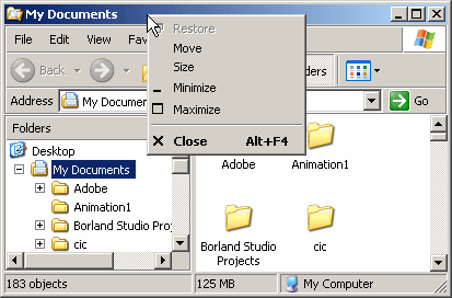
In our introduction to the main menu, we saw that, to access it, the user can click one of its categories. A contextual menu is one that appears when the user right-clicks an area of an application or form. In most applications, when the user right-clicks a title bar, the operating system is configured to display a system menu. Here is an example:
A menu is considered, or qualifies as, popup if, or because, it can appear anywhere on the form as the programmer wishes. Such a menu is also referred to as context-sensitive or contextual because its appearance and behavior depend on where it displays on the form or on a particular control. The person who creates the application decides if or where the contextual menu would appear. Because this characteristic is up to the programmer, the same application can display different types of popup menus depending on where the user right-clicks. Here are examples:
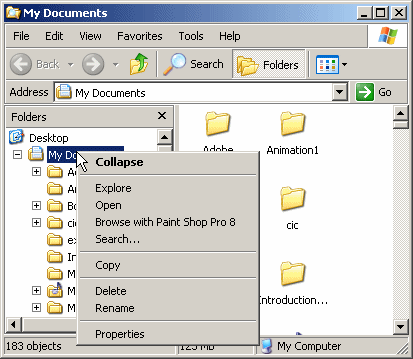
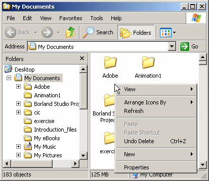
The first difference between a main menu and a popup menu is that a popup menu appears as one category or one list of items and not like a group of categories of menus like a main menu. Secondly, while a main menu by default is positioned on the top section of a form, a popup menu doesn't have a specific location on the form.
Creating a Contextual Menu
To support the creation and management of contextual menus, the .NET Framework provides a class named ContextMenuStrip. This class is derived from ToolStripDropDownMenu, which itself is based on the ToolStripDropDown class. The ToolStripDropDown class is derived from ToolStrip.
To visually create a contextual menu, in the Menus & Toolbars section of the Toolbox, click the ContextMenuStrip button ![]() and click the form. Once you have a ContextMenuStrip object, you can create its menu items. To do this, as mentioned for the MenuStrip, you can click the first Type Here line, type a string, press Enter, and continue creating the other menu items in the same way.
and click the form. Once you have a ContextMenuStrip object, you can create its menu items. To do this, as mentioned for the MenuStrip, you can click the first Type Here line, type a string, press Enter, and continue creating the other menu items in the same way.
Unlike a main menu, a popup menu provides a single list of items. If you want different popup menus for your form, you have two options. You can create various popup menus or programmatically change your single popup menu in response to something or some action on your form.
To programmatically create a contextual menu, start by declaring a variable of type ContextMenuStrip. Here is an example:
using System.Windows.Forms;

public class Exercise : Form
{
    public Exercise()
    {
        InitializeComponent();
    }

    void InitializeComponent()
    {
        System.Windows.Forms.ContextMenuStrip context =
		new System.Windows.Forms.ContextMenuStrip();
    }

    static int Main()
    {
        System.Windows.Forms.Application.Run(new Exercise());
        return 0;
    }
}
To assist you with each item of a contextual menu, ToolStrip, the ancestor to the ContextMenuStrip class, is equipped with a property named Items. This property is of type ToolStripItemCollection.
To create one or more menu items, you can use the various techniques we reviewed for the main menu. Here are examples:
void InitializeComponent()
{
    System.Windows.Forms.ContextMenuStrip context =
	new System.Windows.Forms.ContextMenuStrip();

    ToolStripMenuItem mnuCut = new ToolStripMenuItem("Cut");

    ToolStripMenuItem[] mnuEdit =
    {
	    new ToolStripMenuItem("Copy"),
	    new ToolStripMenuItem("Paste")
    };
}
After creating a menu item, to add it to the contextual menu, you can call the ToolStripItemCollection.Add() method. To add an array of items, you can call the ToolStripItemCollection.AddRange() method. Here are examples:
void InitializeComponent()
{
    System.Windows.Forms.ContextMenuStrip context =
	new System.Windows.Forms.ContextMenuStrip();

    ToolStripMenuItem mnuCut = new ToolStripMenuItem("Cut");
    ToolStripMenuItem[] mnuEdit =
    {
		new ToolStripMenuItem("Copy"),
        new ToolStripMenuItem("Paste")
    };

    context.Items.Add(mnuCut);
    context.Items.AddRange(mnuEdit);
}
Using a Contextual Menu
By default, a newly created contextual menu is attached neither to the form nor to any control on it. In order to display a context menu, you must assign its name to the control. To support this, Control, the ancestor to all visual controls of the .NET Framework, is equipped, and provides to its children, with a property named ContextMenuStrip, which is of type ContextMenuStrip.
To visually assign a contextual menu to a control during design, click the control. In the Properties window, click the ContextMenuStrip field, then click the arrow of its combo box, and select the menu. If you had created more than one contextual menu, the combo box would show all of them and you can choose the one you want to use as default.
To programmatically specify the contextual menu of a control, assign a ContextMenuStrip object to its ContextMenuStrip property. Here is an example:
void InitializeComponent()
{
    System.Windows.Forms.ContextMenuStrip context =	new System.Windows.Forms.ContextMenuStrip();

    ToolStripMenuItem mnuCut = new ToolStripMenuItem("Cut");
    ToolStripMenuItem[] mnuEdit =
    {
		new ToolStripMenuItem("Copy"),
	        new ToolStripMenuItem("Paste")
    };

    context.Items.Add(mnuCut);
    context.Items.AddRange(mnuEdit);

    ContextMenuStrip = context;
}
After assigning a ContextMenuStrip object to a control, when you right-click (actually when the user right-clicks) the control, the contextual menu would display. The above code would produce:

In your application, you can create as many contextual menus as you want. If you have different controls, each can have its own contextual menu or many can share a contextual menu. Also, you can use different contextual menus for a control and decide what menu to display when/why.
![]() Practical Learning: Creating Contextual Menu
Practical Learning: Creating Contextual Menu
| Text | (Name) |
| New Auto-Part | miNewAutoPart |
| Edit Store Item | miEditAutoPart |
| Delete Inventory Item | miDeleteAutoPart |
| Text | (Name) |
| New Auto-Part | miNewStoreItem |
| Edit Store Item | miEditStoreItem |
| Delete Inventory Item | miDeleteStoreItem |
Writing Code for a Contextual Menu
There is nothing particularly specific with writing code for a popup menu item. You approach it exactly as if you were dealing with a menu item of a main menu. You can write code for an item of a popup menu independent of any other item of a main menu. If you want an item of a popup menu to respond to the same request as an item of a main menu, you can write code for one of the menu items (either the item on the main menu or the item on the popup menu) and simply call its Click event in the event of the other menu item.
![]() Practical Learning: Preparing Code for Menu Items
Practical Learning: Preparing Code for Menu Items
using AutoPartsInventory3.Models;

namespace AutoPartsInventory3
{
    public partial class CollegeParkAutoParts : Form
    {
        int level = 0;
        int yearSelected = -1;
        string makeSelected = string.Empty;
        string modelSelected = string.Empty;
        string categorySelected = string.Empty;
        ListViewItem lviSelected = new();

        public CollegeParkAutoParts()
        {
            InitializeComponent();
        }

        private static int GetFirst0Index(string[] objects)
        {
            for (int i = 0; i < objects.Length; i++)
            {
                if (string.IsNullOrEmpty(objects[i]))
                {
                    return i;
                }
            }

            return 0;
        }

        private void InitializeAutoParts()
        {
            tvwAutoParts.Nodes.Clear();

            TreeNode nodRoot = tvwAutoParts.Nodes.Add("College Park Auto-Parts",
                                                      "College Park Auto-Parts", 0, 1);

            nodRoot.Nodes.Add("2024", "2024", 2, 3);
            nodRoot.Nodes.Add("2023", "2023", 2, 3);
            nodRoot.Nodes.Add("2022", "2022", 2, 3);
            nodRoot.Nodes.Add("2021", "2021", 2, 3);
            nodRoot.Nodes.Add("2020", "2020", 2, 3);
            nodRoot.Nodes.Add("2019", "2019", 2, 3);
            nodRoot.Nodes.Add("2018", "2018", 2, 3);
            nodRoot.Nodes.Add("2017", "2017", 2, 3);
            nodRoot.Nodes.Add("2016", "2016", 2, 3);
            nodRoot.Nodes.Add("2015", "2015", 2, 3);
            nodRoot.Nodes.Add("2014", "2014", 2, 3);
            nodRoot.Nodes.Add("2013", "2013", 2, 3);
            nodRoot.Nodes.Add("2012", "2012", 2, 3);
            nodRoot.Nodes.Add("2011", "2011", 2, 3);
            nodRoot.Nodes.Add("2010", "2010", 2, 3);
            nodRoot.Nodes.Add("2009", "2009", 2, 3);
            nodRoot.Nodes.Add("2008", "2008", 2, 3);
            nodRoot.Nodes.Add("2007", "2007", 2, 3);
            nodRoot.Nodes.Add("2006", "2006", 2, 3);
            nodRoot.Nodes.Add("2005", "2005", 2, 3);
            nodRoot.Nodes.Add("2004", "2004", 2, 3);
            nodRoot.Nodes.Add("2003", "2003", 2, 3);
            nodRoot.Nodes.Add("2002", "2002", 2, 3);
            nodRoot.Nodes.Add("2001", "2001", 2, 3);
            nodRoot.Nodes.Add("2000", "2000", 2, 3);

            // Select the root node
            tvwAutoParts.SelectedNode = nodRoot;
            // Expand the root node
            tvwAutoParts.ExpandAll();

            // Check every node year in the tree view
            foreach (TreeNode nodYear in nodRoot.Nodes)
            {
                ComboBox cbxMakes = new();

                foreach (AutoPart part in Repository.AutoParts)
                {
                    if (nodYear.Text == part.CarYear.ToString())
                    {
                        if (!cbxMakes.Items.Contains(part.Make))
                            cbxMakes.Items.Add(part.Make!);
                    }
                }

                foreach (string strMake in cbxMakes.Items)
                    nodYear.Nodes.Add(strMake, strMake, 4, 5);
            }

            foreach (TreeNode nodYear in nodRoot.Nodes)
            {
                foreach (TreeNode nodMake in nodYear.Nodes)
                {
                    ComboBox cbxModels = new();

                    foreach (AutoPart part in Repository.AutoParts)
                    {
                        if ((nodYear.Text == part.CarYear.ToString()) &&
                            (nodMake.Text == part.Make))
                        {
                            if (!cbxModels.Items.Contains(part.Model!))
                                cbxModels.Items.Add(part.Model!);
                        }
                    }

                    foreach (string strModel in cbxModels.Items)
                        nodMake.Nodes.Add(strModel, strModel, 6, 7);
                }
            }

            foreach (TreeNode nodYear in nodRoot.Nodes)
            {
                foreach (TreeNode nodMake in nodYear.Nodes)
                {
                    foreach (TreeNode nodModel in nodMake.Nodes)
                    {
                        var cbxCategories = new ComboBox();

                        foreach (AutoPart part in Repository.AutoParts)
                        {
                            if ((nodYear.Text == part.CarYear.ToString()) &&
                                (nodMake.Text == part.Make) &&
                                (nodModel.Text == part.Model))
                            {
                                if (!cbxCategories.Items.Contains(part.Category!))
                                    cbxCategories.Items.Add(part.Category!);
                            }
                        }

                        foreach (string strCategory in cbxCategories.Items)
                            nodModel.Nodes.Add(strCategory, strCategory, 8, 9);
                    }
                }
            }

            pbxAutoPart.Image = Image.FromFile(@"E:\College Park Auto-Parts\Generic.png");

            lvwAutoParts.Items.Clear();
        }

        private void CollegeParkAutoParts_Load(object sender, EventArgs e)
        {
            InitializeAutoParts();
        }

        private void tvwAutoParts_NodeMouseClick(object sender, TreeNodeMouseClickEventArgs e)
        {
            TreeNode nodClicked = e.Node;

            level = nodClicked.Level;

            tvwAutoParts.SelectedNode = e.Node;

            if (e.Node.Level == 1)
            {
                yearSelected = Convert.ToInt32(e.Node.Text);
                makeSelected = string.Empty;
                modelSelected = string.Empty;
                categorySelected = string.Empty;
            }
            else if (e.Node.Level == 2)
            {
                makeSelected = e.Node.Text;
                yearSelected = Convert.ToInt32(e.Node.Parent.Text);
                modelSelected = string.Empty;
                categorySelected = string.Empty;
            }
            else if (e.Node.Level == 3)
            {
                modelSelected = e.Node.Text;
                makeSelected = e.Node.Parent.Text;
                yearSelected = Convert.ToInt32(e.Node.Parent.Parent.Text);
                categorySelected = string.Empty;
            }
            else if (e.Node.Level == 4)
            {
                categorySelected = e.Node.Text;
                modelSelected = e.Node.Parent.Text;
                makeSelected = e.Node.Parent.Parent.Text;
                yearSelected = Convert.ToInt32(e.Node.Parent.Parent.Parent.Text);

                lvwAutoParts.Items.Clear();
            }

            try
            {
                foreach (AutoPart part in Repository.AutoParts)
                {
                    if ((part.Category == nodClicked.Text) &&
                        (part.Model == nodClicked.Parent.Text) &&
                        (part.Make == nodClicked.Parent.Parent.Text) &&
                        (part.CarYear.ToString() == nodClicked.Parent.Parent.Parent.Text))
                    {
                        ListViewItem lviAutoPart = new ListViewItem(part.PartNumber.ToString());

                        lviAutoPart.SubItems.Add(part.PartName);
                        lviAutoPart.SubItems.Add(part.UnitPrice.ToString("F"));
                        lvwAutoParts.Items.Add(lviAutoPart);
                    }
                }
            }
            catch (NullReferenceException)
            {
            }
        }

        private void lvwAutoParts_ItemSelectionChanged(object sender, ListViewItemSelectionChangedEventArgs e)
        {
            foreach (AutoPart part in Repository.AutoParts)
            {
                if (part.PartNumber == long.Parse(e.Item!.Text))
                {
                    pbxAutoPart.Image = Image.FromFile(@"E:\College Park Auto-Parts\" + part.PartNumber + ".png");

                    Width = pbxAutoPart.Left + pbxAutoPart.Image.Width + 40;
                    Height = pbxAutoPart.Top + pbxAutoPart.Image.Height + 80;
                }
            }

            if (lvwAutoParts.SelectedItems.Count == 1)
                lviSelected = lvwAutoParts.SelectedItems[0];
        }

        private void miFileNewAutoPart_Click(object sender, EventArgs e)
        {
            AutoPartNew sin = new AutoPartNew();

            sin.ShowDialog();

            InitializeAutoParts();
        }

        private void miEditUpdateAutoPart_Click(object sender, EventArgs e)
        {
            AutoPartEditor editor = new AutoPartEditor();

            editor.ShowDialog();

            InitializeAutoParts();
        }

        private void miEditDeleteAutoPart_Click(object sender, EventArgs e)
        {
            AutoPartDelete apd = new AutoPartDelete();

            apd.ShowDialog();
            InitializeAutoParts();
        }

        private void miNewAutoPart_Click(object sender, EventArgs e)
        {
            AutoPartNew sin = new();

            sin.InitializeStoreItem();
            sin.ShowDialog();

            InitializeAutoParts();
        }

        private void miNewStoreItem_Click(object sender, EventArgs e)
        {
            AutoPartNew sin = new();

            sin.cbxYears.Text = yearSelected.ToString();
            sin.cbxMakes.Text = makeSelected;
            sin.txtModel.Text = modelSelected;
            sin.cbxCategories.Text = categorySelected;

            sin.InitializeStoreItem();

            sin.ShowDialog();

            InitializeAutoParts();
        }

        private void miEditStoreItem_Click(object sender, EventArgs e)
        {
            AutoPartDelete apd = new AutoPartDelete();

            apd.ShowDialog();
            InitializeAutoParts();
        }

        private void miDeleteStoreItem_Click(object sender, EventArgs e)
        {
            AutoPartDelete apd = new AutoPartDelete();

            foreach (AutoPart part in Repository.AutoParts)
            {
                if (part.PartNumber == int.Parse(lviSelected.Text))
                {
                    apd.txtPartNumber.Text = part.PartNumber.ToString();
                    apd.txtYear.Text = part.CarYear.ToString();
                    apd.txtMake.Text = part.Make;
                    apd.txtModel.Text = part.Model;
                    apd.txtCategory.Text = part.Category;
                    apd.txtPartName.Text = part.PartName;
                    apd.txtUnitPrice.Text = part.UnitPrice.ToString();
                    break;
                }
            }

            apd.ResizeFormBasedOnPictureBox();
            apd.ShowDialog();

            InitializeAutoParts();
        }

        private void miHelpAbout_Click(object sender, EventArgs e)
        {
            AboutCPAP about = new AboutCPAP();
            about.ShowDialog();
        }

        private void miFileExit_Click(object sender, EventArgs e)
        {
            Close();
        }
    }
}|
|
|||
| Previous | Copyright © 2004-2025, FunctionX | Sunday 07 May 2023, 23:08 | Next |
|
|
|||