
Form Design
 |
Form Design |
Forms Properties
Introduction
A form appears to be the most regularly used object of a Microsoft Access database. Although there are various means of quickly creating a form, as we saw with the Form Wizard or AutoForm and their variations, at times you will need to further customize the appearance of a form to the user as this can affect the overall understanding of your product.
A form by itself is presented as a rectangular object that shares many of the characteristics of a regular container: a system icon, a title bar, one or more system buttons, borders, corners, and a body. Depending on the role of your form, you may want to design forms that present differing characteristics, even if these forms belong to the same database. For example, while one form presents a normal title bar, you may want another form not to present a title bar at all. While you may allow the user to be able to minimize or maximize a form, you may want to present one or both of these actions for the user. As an application design environment, Microsoft Access provides most of the features you will need for a regular and even advanced database product.
![]() Practical Learning: Introducing Details of Form Design
Practical Learning: Introducing Details of Form Design
Form Automatic Centering
If you either create a new form or modify the design of an existing form, when you save it, Microsoft Access saves the position of the form then would remember and restore that position the next time you reopen the form. Alternatively, you can ask Microsoft Access to position the form in the center of the screen the next time you open the form, even if it was on one corner of the screen when you saved.
To center the form by default whenever it comes, set its Auto Center Boolean property to Yes.
As we have seen so far, the top section of a form is its title bar. It displays an icon on the left side. The system icon is fixed and you should not spend time trying to change it. As mentioned already, the system icon holds a menu that allows the user to perform the regular operations of a Windows container, including minimizing, maximizing, restoring or closing the window. To display this menu, the user can click the form’s system icon:

The presence of the form’s system icon is partly controlled by the Control Box property of a form. In most cases, you should make this system icon and its menu available to the user. If for some strange reason you do not want to provide this functionality, set the Control Box property to No. The form would appear as follows:
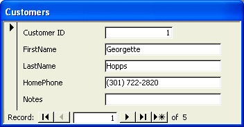
If you decide to do this, make sure you provide the user with the ability to close the form and this type of title bar makes it impossible. Of course, a user may know that the form can be closed by clicking the Close menu item under the File group of the main menu or by pressing Ctrl+F4.
The Title Bar
The middle section of the title bar is actually referred to as the title bar. It can be used to change the view of the form after right-clicking it. The title bar uses a color set in the Advanced Appearance of Control Panel as Active Title Bar:
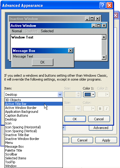
Since you cannot control and cannot predict how your users will modify their system colors (because most users are free to set their system colors as they wish, even when they work corporate), you should refrain from changing this color when designing your forms, especially if you plan to distribute your product. Otherwise, the result you see on your form may be different from your users computers (and this can invite trouble with users telephone calls asking you why Leonie's form appears with a different color than mine; what did I do to deserve this? Why does everybody hate me?).
| When designing your forms, try to keep colors to their default and to their minimum. In this lesson, we are showing most options simply to let you know that they exist, not because you should or must use them. |
![]() Practical Learning: Using the Form’s Title Bar
Practical Learning: Using the Form’s Title Bar
The System Buttons
The right side of the form’s title bar displays three system buttons
![]() ,
, ![]() or
or ![]() ,
, ![]() . The group of these buttons is called the
Control Box. If you do not want these system buttons at all, access the Properties window of the form and set the
Control Box Boolean property to No from its Yes default value. In this case, the form would appear
with neither the system icon nor the system buttons as seen above. Once again, if you do this, make sure the user has a way to close the form.
. The group of these buttons is called the
Control Box. If you do not want these system buttons at all, access the Properties window of the form and set the
Control Box Boolean property to No from its Yes default value. In this case, the form would appear
with neither the system icon nor the system buttons as seen above. Once again, if you do this, make sure the user has a way to close the form.
Instead of completely hiding all system buttons of a form, you can specify which ones to display and thus control the ability to close, minimize, or maximize the form. The presence and/or the role of the system buttons is (partly) controlled by the
Control Box and the Min Max Buttons properties. When the Control Box property is set to
No, regardless of the value of the Min Max Buttons property, there would be no system buttons on the title
bar (this is also something you learn if you do Windows GUI programming,
like Win32). Therefore, in order to control the appearance and behavior of the system buttons, the
Control Box property must be set to Yes. The values of the Min Max Buttons produce the
following results:
| Min Max Buttons | Result | System Buttons | Consequence | ||
| Minimize | Maximize | Close | |||
| None | Hidden | Hidden | Available | The form can only be closed | |
| Min Enabled | Enabled | Disabled | Available | The form can be minimized or closed but not maximized | |
| Max Enabled | Disabled | Enabled | Available | The form cannot be minimized but can be maximized | |
| Both Enabled | Enabled | Enabled | Available | All operations (minimize, maximize, restore, and close) are allowed | |
Depending on the role and probably the number of Windows controls on a form, you will decide what button to allow or not.
![]() Practical Learning: Configuring the Form’s System Buttons
Practical Learning: Configuring the Form’s System Buttons
The Form’s Borders
Whether you allow the system icon and system buttons or not, the user needs to be able to know where a form starts and where it ends. This is seen by the borders of the form. In most cases, you will not be concerned with this aspect. Otherwise, you can control the borders of a form.
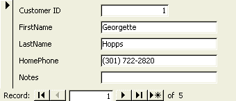
The borders of a form are controlled using the Border Style property. If you set it to None, the form would appear without borders:
The Form's Width
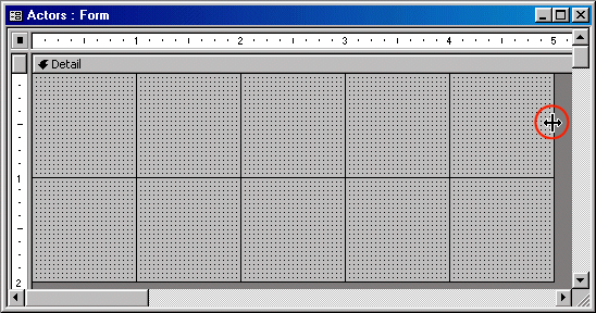
A form displays on the screen using its dimensions. These are the width and height. The form itself controls only the width. The height is controlled by its sections. To change the width of a form, in the Properties window, type the desired decimal value in the Width field of the Format property page. You can also change the form's width by dragging the right border of one of its sections.
![]() Practical Learning: Setting the Form’s Width
Practical Learning: Setting the Form’s Width
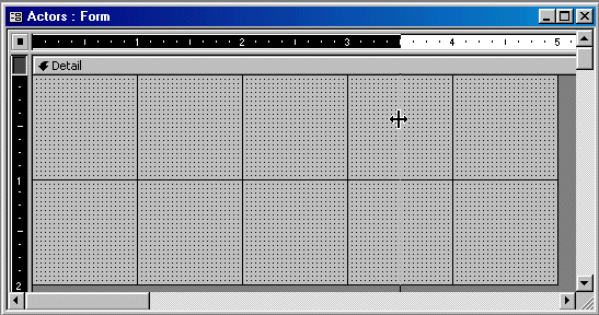
The Detail Section
The most obvious part of a form is an area called Detail. This section starts on a bar labeled Detail and ends at the bottom unless a new section starts. The Detail section serves as the main host of other controls. It can also serve to display messages of various kinds. The Detail section can be enhanced by manipulating its properties. These properties are not necessarily related to the parent form but can be used conjointly with it.
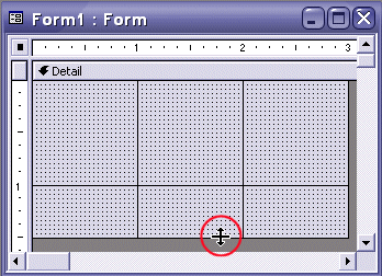
During our first design experience of forms, we learned that the form itself controls its width. The vertical dimension of a form is controlled by its sections. This means that a section, such as the Detail section, can "decide" how much height it needs to accommodate its content. The vertical measurement of the Detail section is controlled by the
Height property. There are two main ways you can change the Detail section's height at design time:
![]() Practical Learning: Using the Detail Section of a Form
Practical Learning: Using the Detail Section of a Form
The Header and Footer Sections
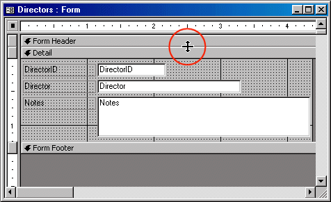
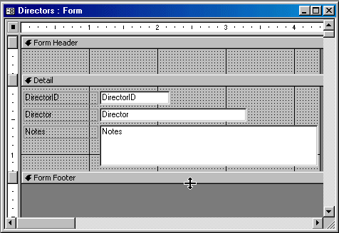
Besides the Detail section, a form can be enhanced with one or two more sections: Header and Footer. By default, the Header and Footer sections are created on a form if you use the Form Wizard.
To add the Header and Footer sections on a form that doesn't have them, you can use the menu bar where you would click View -> Form Header/Footer. Probably the fastest way to add these sections is by right-clicking anywhere on the form and clicking Form Header/Footer. If the form already has these sections but they don't contain anything, they would be removed. If the form already has these sections and they contain anything, you would receive a warning:
 |
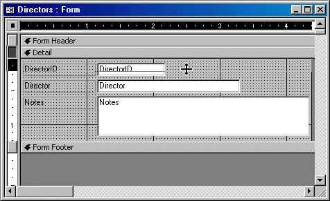
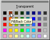
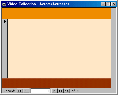
If you still want to delete the Header and Footer sections, you can click Yes; this would un-recoverably delete their content. Like the Detail section, the Header and Footer sections control their own height, which you can change the same way we described above for the Detail section. This also applies for the Back Color property. The Special Effect property allows you to raise or sink a section.
![]() Practical Learning: Designing the Header and Footer Sections
Practical Learning: Designing the Header and Footer Sections

 |
 |
Record Selectors
|
|
The Record Selector is a vertical bar on the left side of a form. It allows the user to select all of the fields’ contents of one or more records and copy them to the clipboard. Such a selection can then be pasted to another record, other records, or to a text or another type of file (for example you can paste the record in Notepad, Microsoft Word, Microsoft Excel, or any text file). There are two reasons you would use record selectors on a form. If you want the user to be able to access all fields of a record as a whole, make sure that the form is equipped with record selectors. In the same way, you can hide the scroll bar if the user would not need them. Another reason you would use a record selector is for aesthetic reasons. Most of the time, if designing a form for data entry, you would mostly allow the presence of record selectors. If you are designing a dialog box that would display the same content all the time, you should not allow the record selectors. The presence or absence of record selectors is controlled by the Boolean Record Selectors property field. If you set the field value to Yes, the form would display the record selector. Setting the field value to No would hide the record selectors. |
![]() Practical Learning: Toggling the Record Selectors
Practical Learning: Toggling the Record Selectors
The Form's Scroll Bars
As much as you can, you should design your (non-Datasheet) form to display all of the fields of a record whenever the/a record comes up. Sometimes this will not be possible. If a form possesses too many fields for each record, Microsoft Access would equip the form with one or two scroll bars. A scroll bar allows the user to scroll from one side of the form to another. The vertical scroll bar is used to scroll up and down while the horizontal scroll allows scrolling left and right.
By default, scroll bars come up if the form "judges" that some fields are hidden. The presence of scroll bars allows the user to be aware of hidden fields. Depending on your design, you can control the appearance or disappearance of the scroll bars. To do this, change the
value of the Scroll Bars field in the Format property page of the
Properties window. There are four possible values. To display only the vertical scroll bar, set the value to
Vertical Only. In the same way, you can display only the vertical scroll bar by selecting
Horizontal Only. On the other hand, you can display both scroll bars by setting the value to
Both. If for some reason you don't want any scroll bar, set the Scroll Bars property value to Neither.
![]() Practical Learning: Configuring a Form’s Scroll Bars
Practical Learning: Configuring a Form’s Scroll Bars
|
Navigation Buttons |
|
When studying tables and during form's data entry, we found out that a form (also a table, a query, or a report) is equipped with some buttons on its lower section. These buttons allow the user to navigate back and forth between records. These buttons are very useful during data entry and data analysis. If you are creating a form that would display the same content all the time, such as a form that does not actually display records, you can hide the form navigation buttons. |
![]() Practical Learning: Hiding the Navigation Buttons
Practical Learning: Hiding the Navigation Buttons
|
|
Dividing Lines |
|
A form is equipped with special horizontal lines used to visually separate sections of a form. They do not perform any other
special function. They can be useful on a continuous form. |
![]() Practical Learning: Using Dividing Lines
Practical Learning: Using Dividing Lines
Dialog Boxes |
|
|
Introduction |
|
A dialog box is a rectangular object that is used to host or carry other controls without itselft being hosted by another object:
A dialog box is primarily characterized by two main features: its title bar and its body. The title bar, on top of the dialog box, has a title and the system close button (only, mostly). Although this is the classic appearance of a dialog box, it is not strictly exclusive. Some dialog boxes display the system icon. On the right side of the title bar, a classic dialog box displays only the system Close button made of X. Again, this is not exclusive. It is not unusual for a dialog box to display the minimize and the maximize/restore buttons but, according to Microsoft standards, a dialog box should appear as the one above: no system icon, only the system Close button, and a type of border referred to as Dialog Frame.
To use a dialog box, the user must open it one way or another. Your job is to decide how and when the user will be able to open a dialog box. |
![]() Practical Learning: Creating a Modal Dialog Box
Practical Learning: Creating a Modal Dialog Box
|
|
Modal Dialog Boxes |
|
A dialog box is characterized as modal if the user must close it before continuing with another task on the same application. |
|
The Date and Time dialog box of WordPad is an example of a modal dialog box: if opened, the user must close it in order to continue using WordPad. |

|
|
neither a Record Selectors bar nor the record navigation buttons. Therefore, you should decide how the dialog box would be used. If you want a regular dialog box as defined by the Microsoft standards, you should set the Record Selectors, the Navigation Buttons and the Dividing Lines properties to No each. |
![]() Practical Learning: Creating a Modal Dialog Box
Practical Learning: Creating a Modal Dialog Box
|
|
Modeless Dialog Boxes |
|
A dialog box is referred to as modeless if the user doesn't have to close it in order to continue using the application that owns the dialog box: |
|
|
The Find dialog box of WordPad (also the Find dialog box of most applications) is an example of a modeless dialog box. If it is opened, the user doesn't have to close in order to use the application or the document in the background. |
|
dialog box, or to convert a form into a modeless dialog box, when in Design View, set the Popup property to Yes. This makes sure that the user can work on another form and the modeless dialog box or form would remain on top of any other form of the database. |
![]() Practical Learning: Creating a Modeless Dialog Box
Practical Learning: Creating a Modeless Dialog Box
|
|
MOUS Topics |
| S29 | Use form sections (headers, footers, and detail) |
|
Exercises |
Watts A loan
|
Yugo National Bank
|
|
|
||
| Previous | Copyright © 2002-2019, FunctionX | Next |
|
|
||