Overview of Windows Controls
 |
Overview of Windows Controls |
Text-Based Controls: The Label
Introduction
A label is a control that serves as a guide to the user. It provides a static text that the user cannot change but can read to get information about another control on the form. You can also use it to display simple information to the user. Most controls on the form are not explicit at first glance and the user would not know what they are. Therefore, you can assign a label to the control as a help to the user.
To add a label to a form, on the Toolbox, click Label and click on the form or report. Type the text that the label will display and press Enter (as we will see, most controls add their own label to the form).
Properties of a Label
Probably the most important and the most obvious characteristic of a label is the text it is displaying. The text is the label's Caption. If you click the Label on the Toolbox and click on the form, you must first define its caption. If a label already has a caption, there are various ways you can edit it. For example, use the same techniques we reviewed for editing text-based properties. On the other hand, to edit the caption of a label, on the form, click inside the label. That would put it into edit mode and you can edit it as you wish.
The appearance of a label is visibly controlled by its font characteristics. The Font name, also called its face, is the name of the font as defined by the operating system. We saw that there are various ways you can define the font characteristics of a control like the label. The Formatting toolbar is equipped with appropriate combo boxes and buttons. These characteristics can also be modified using their corresponding properties from the Properties window.
The dimensions of a label control its Width and Height. Although the dimensions are closely related to the font characteristics, they can be independently defined. There are two main ways you can resize a label, which is equivalent to changing its dimensions. To set your own dimensions, in the Format tab of the Properties window of the label, change the values of the Width and Height properties. Unless you plan to show the background color of a label, probably the best way to resize a label is to make it adjust to the dimensions depending on the font size and the total characters width. To do this, position the mouse on one of the label's handle and double-click. The label's width and height would be set to accommodate its caption.
The position of a label is controlled by its Top and Left properties. The Top property defines the measure from the top left corner of the section where the label is positioned, to the top left corner of the label itself. There are two main ways you can set the position of a label. On the Properties window, you can change the values of the Top and Left properties. On the other hand, you can place your mouse on the top left corner of the label until the mouse pointer turns into a pointing finger. Then click and drag in the desired direction.
![]() Practical Learning: Designing Labels
Practical Learning: Designing Labels

Text-Based Controls: The Text Box
Introduction
A text box is a Windows control used to get or display text for the userÆs interaction. At its most regular use, a text box serves as a place to fill out and provide information. You can also use it only to display a text without allowing the user to change its content.
Like most other controls, the role of an edit box is not obvious at first glance; that is why it should be accompanied by a label that defines its purpose. From the userÆs standpoint, a text box is named after the label closer to it. Such a label is usually on the left or the top side of the corresponding edit box.
There are two main ways you can add a text box to a form:
Properties of a Text Box
Like every control on a form, the dimensions of the text box are controlled by its Width and Height properties. The position of a text box is controlled by its Top and Left properties.
To make a text box read-only, that is, if you don't want the user to enter text in an edit box, there are various alternatives. If you change the Enabled property from Yes to No, the text box would have a gray background and cannot receive focus. If you set the Locked property from No to Yes, the control would appear with a normal (white) background.
The Special Effects of the text box are expanded as compared to those available on a label. Besides the ability to raise or sink a text box, you can give it a thick, etched, or shadow border.
After adding a text box on a form, you can configure it to receive its data from an existing table. This can be done after the Record Source of a form has been defined. To link a text box to the object that is the Record Source of a form, click the arrow of its Record Source combo box and select the desired field.
![]() Practical Learning: Designing Text Boxes
Practical Learning: Designing Text Boxes
The Command Buttons
Introduction
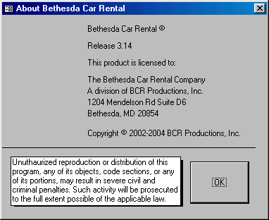
A command button is a rectangular object that allows the user to dismiss a dialog box or to initiate an action. This is done through a decision making process based on what a form or a dialog box is displaying. This could be an acknowledgement, such as a form displaying a simple message to the user. A user could also be asked to choose one button from a group of buttons on a form or a dialog box. To use a button, the user position his mouse pointer on the desired button and presses the left button. This action is referred to as clicking.
Depending on how the button is implemented, it should be obvious to the user what to do with it. To indicate what a button is used for or what action it would lead to, a button can display a string on its top. This string is also referred to as the button's caption. The caption should be explicit enough to let the user know what the button is used for. A caption like OK usually means the user accepts what message the form or dialog box is displaying. A caption like Cancel is usually accompanied by another OK button on the form. When a button has a Cancel button, the user would usually click it as if saying, "Never Mind" or "I change my mind", etc.
To create a button, you can click the Command Button control on the Toolbox and click on the desired section of the form. On the Toolbox, if the Control Wizard button was down or clicked, the Command Button Wizard would start to help you create a fully functional button. If you do not want to use the wizard, you can click Cancel on the first page of the Command Button Wizard. Also, if you do not want to use the wizard, on the Toolbox, you can click the Control Wizards button to have it up.
![]() Practical Learning: Creating Command Buttons
Practical Learning: Creating Command Buttons

 |
Characteristics of Command Buttons
Like all other ôvisualö controls, a command button has a Name property, a location (Left and Top), and dimensions (Width and Height). Because of their anticipated behavior, command buttons are the most commonly used object to initiate an action. As such, they are used to open other forms, reports of the same database, or simply to display a message box.
As we saw in the second page of the wizard, a command button in Microsoft Access can display either a string or a (small) picture on top. Microsoft Access ships with dozens of pictures you can use, especially made for buttons. If none of these pictures suits your need, you can design your own. To display a picture on a button, after selecting in Design View, click the ellipsis button of the Picture field in the Format tab of the Properties window, locate the picture, and select it.
When a dialog box is equipped with an OK and a Cancel button, it is suggested that the user be able to press Enter to perform the same action as if he had clicked OK. To apply this behavior, if you create a button and give it an OK Caption, you can set its Default property to Yes. It is also suggested that, if a button has a Cancel Caption, the user should be able to press Esc and produce the same behavior as if the Cancel button was clicked. To apply this feature, after creating the button with a Cancel caption, set its Cancel property to Yes. Never set the Default and the Cancel properties both to Yes for the same button.
![]() Practical Learning: Configuring Command Buttons
Practical Learning: Configuring Command Buttons
Combo and List Boxes
Introduction to Combo Boxes
A combo box is a Windows control made of two parts: a text portion and a list. A text box is used to display a selection made from a list of items. On the right side of the text box, there is a down-pointing arrow that allows the user to know that the control holds a list. The user displays the list by clicking the arrow. To use a combo box, the most basic operation the user can perform is to click the arrow and select an item. Once an item is selected, the list retracts back like a plastic.
There are various ways you can add a combo box to a form (or report). This is done the same way we did with the table: using the Lookup Wizard.
![]() Practical Learning: Creating a Combo Box
Practical Learning: Creating a Combo Box
 |
 |
Introduction to List Boxes
|
A list box presents a list of items to the user. The list appears as a taller text box. The items in the list appear each on its own line. The user makes her selection by clicking in the list. Once an item is clicked, it becomes highlighted indicating that it is the current choice:
Probably the easiest way to create a list is by using the List Box Wizard. This allows you to select the source of data, which would be a table or a query. Then you can select the column that would be displayed as the value of the list box, exactly as done for the combo box. |
![]() Practical Learning: Creating a List Box
Practical Learning: Creating a List Box
Properties of Combo and List Boxes |
|
|
The combo box is one of the highly praised features of Microsoft Access. As the application makes it particular easy to create, it performs all necessary basic behind-the-scene jobs. The Combo Box Wizard, used to create a bound combo box, is able to reconcile a relationship between the primary key of the parent table that holds the actual data to display, and the selected foreign key that exists on the table that host the foreign key. After creating the combo box, especially if you used to wizard to configure it, you can check and adjust the characteristics as you see fit.
Most of the time, when a multi-column list displays, the user may not be able to identify the items under each column. In this case, you can display a column header on its column. This column header would display a label that categorizes the items under it. |
![]() Practical Learning: Configuring a Combo Box
Practical Learning: Configuring a Combo Box
|
|
Radio Buttons |
|
Introduction |
|
A radio button is a Windows control made of a round box O. In practical usage, a radio button is usually (if not always) accompanied by other radio buttons. In other words, radio buttons come as a group. The user makes his or her decision by selecting or clicking one of the round boxes. Once clicked, the round box is partially filled with a dot. When one button in the group is selected, the other round boxes of the (same) group are empty
O. The user can select another button by clicking a different choice, which empties the previous selection. This technique of selecting is referred to as mutually-exclusive. |
![]() Practical Learning: Adding Radio Buttons
Practical Learning: Adding Radio Buttons
Properties of Radio Buttons |
|||||
|
Because the round box of a radio button does not indicate what it is used for, it is usually (if not always) accompanied by a label. The label can be positioned anywhere (to the left, the top, the right, the bottom side) close to the round box but it is usually positioned to the left or the right side. To move or position the round box, click it to select it. Then position your mouse on it to get a pointing finger arrow and drag in the desired direction:
Like most (if not all) other controls, when you include a radio button, Microsoft Access adds a label to the control. If you do not like the string displayed by the label, you can click it twice to put it into edit mode and change the string. |
![]() Practical Learning: Configuring Radio Buttons
Practical Learning: Configuring Radio Buttons
|
|
Check Boxes |
|
Introduction |
|
A check box is a control that allows the user to validate or invalidate an option. A check box appears as a little square box ú. The user makes his or her decision by clicking in the square, which toggles a check mark R. Toggling means, that if the square box were empty ú, after clicking it, a check mark would appear in it R:
Although it can appear by itself, a check box can come in a group with others, allowing the user to select as many choices as are available, as opposed to radio buttons where only one in the group can be selected
Check boxes provide a non-exclusive choice, which means that if they come as a group, each can behave independently with regards to the other check boxes of the same group. Therefore you can create check boxes anywhere on the form. It is recommended that, when they act as an ensemble, you should include check boxes in a group so their belonging to the same group would be obvious to the user. |
![]() Practical Learning: Adding a Check Box
Practical Learning: Adding a Check Box
|
|
Toggle Buttons |
|
Introduction |
|
A toggle button is a type of button that behaves like a check box. The first difference is that it displays like a command button but behaves like a check box. The second difference is that, while a check box should be accompanied by a label that indicates what the check box is used for, a toggle button, like the command button, can display a string on its ôfaceö. |
|
Properties of a Toggle Button |
|
Configuring the toggle button is particularly easy. Like the check box, the toggle button should be used for a Boolean field. Therefore, after adding it to a form, in the Control Source of the toggle button, select the field that would carry or show its value. |
|
MOUS Topics |
| S17 | Use the Control Toolbox to add controls |
| S18 | Modify Format Properties (font, style, font size, color, caption, etc.) of controls |
|
Exercises |
Yugo National Bank
|
Watts A Loan
|
|
|
||
| Previous | Copyright ® 2002-2005 FunctionX, Inc. | Next |
|
|
||