
Buttons and List-Based Controls
 |
Buttons and List-Based Controls |
|
The Command Buttons |
|
Introduction |
|
A command button is an object that allows a person to use a dialog box or to initiate an action. This is done through a decision making process based on what a form is displaying. This could be an acknowledgement, such as a form displaying a simple message to the user. A user could also be asked to choose one button from a group of buttons on a form. To use a button, the user positions the mouse on the desired button and presses the left button. This action is referred to as clicking. |
Depending on how the button is implemented, it should be obvious to the user what to do with it. To indicate what a button is used for or what action it would lead to, a button can display a string on its top. This string is also referred to as the button's caption. The caption should be explicit enough to let the user know what the button is used for. A caption like OK usually means the user accepts what message the form is displaying. A caption like Cancel is usually accompanied by an OK button. When a button has a Cancel button, the user would usually click it as if saying, "Never Mind" or "I change my mind", etc.
To create a button, you can click the Button
![]() in the Controls section of the Design tab of the Ribbon and click the
desired section of the form. If the Use Control Wizard option is on
in the Controls section of the Design tab of the Ribbon and click the
desired section of the form. If the Use Control Wizard option is on
![]() ,
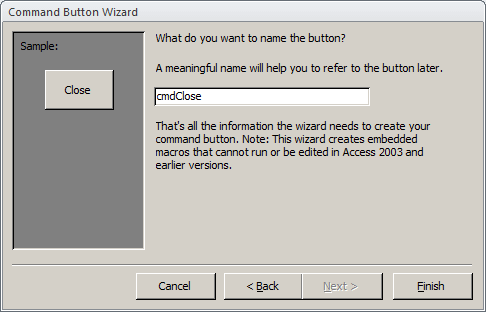
the Command Button Wizard would start to help you create a fully
functional button. If you don't want to use the wizard, you can click
Cancel on the first page of the Command Button Wizard. Also, if you don't
want to use the wizard, in the Controls section of the Design tab of the
Ribbon, click the More button and click the Use Control Wizards option to
dimisss it
,
the Command Button Wizard would start to help you create a fully
functional button. If you don't want to use the wizard, you can click
Cancel on the first page of the Command Button Wizard. Also, if you don't
want to use the wizard, in the Controls section of the Design tab of the
Ribbon, click the More button and click the Use Control Wizards option to
dimisss it
![]() .
.
![]() Practical
Learning: Creating Command Buttons
Practical
Learning: Creating Command Buttons


|
Characteristics of Command Buttons |
Like all other "visual" controls, a button has a Name property, a location (Left and Top properties), and size (Width and Height properties). Because of their anticipated behavior, buttons are the most commonly used objects to initiate an action. As such, they are used to open forms or reports or to display message boxes.
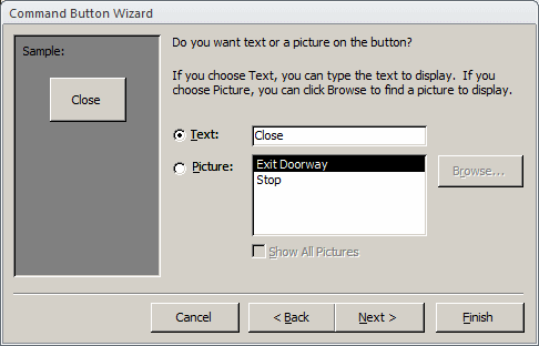
As we saw in the second page of the wizard, a command button in Microsoft Access can display either a string or a (small) picture on top. Microsoft Access ships with dozens of pictures you can use, especially made for buttons. If none of these pictures suits your need, you can design your own. To display a picture on a button, after selecting it in Design View, click the ellipsis button of the Picture field in the Format tab of the Properties window, locate the picture, and select it.
When a dialog box is equipped with an OK and a Cancel button, it is suggested that the user be able to press Enter to perform the same action as if he had clicked OK. To apply this behavior, if you create a button and give it an OK caption, you can set its Default property to Yes. It is also suggested that, if a button has a Cancel Caption, the user should be able to press Esc and produce the same behavior as if the Cancel button was clicked. To apply this feature, after creating the button with a Cancel caption, set its Cancel property to Yes. Never set the Default and the Cancel properties both to Yes for the same button.
Microsoft Office Access 2010 brought new features to the design and appearance of a button. Once of the aspects you can control on the appearance of a button is its shape. To set it, while the form or report is in Design View and the button(s) is(are) selected, on the Ribbon, click Format. In the Control Formatting section, click Change Shape:

From there, click the desired shape.
Another aspect you can control on a button is its style. To use it, while the form or report is in Design View and the button(s) is(are) selected, on the Ribbon, click Format. In the Control Formatting section, click Quick Style:

From there, click the desired shape.
Combo and List Boxes
|
Combo Boxes |
A combo box is a Windows control made of two parts: a text portion and a list. The text box portion is used to display a selection made from a list of items. On the right side of the text box, there is a down-pointing arrow that allows the user to know that the control holds a list. The user displays the list by clicking the arrow:
To use a combo box, the most basic operation the user can perform is to click the arrow and select an item. Once an item is selected, the list retracts back like a plastic.
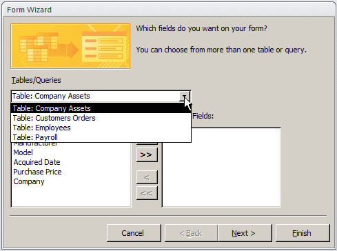
There are various ways you can add a combo box to a form or report: using the Lookup Wizard or using the Combo Box Wizard:
The combo box is one of the highly praised features of Microsoft Access. As the application makes it particular easy to create, it performs all necessary basic tasks behind-the-scene jobs. The Combo Box Wizard, used to create a bound combo box, is able to reconcile a relationship between two tables. After creating the combo box, especially if you used the wizard to configure it, you can check and adjust the characteristics as you see fit.
Like every control, a combo box uses a name that allows the database application or the operating system to identify it. If you create a combo box by dragging an item from the Field List, a field whose lookup features have already been configured, the control would receive the same name as the table's column. If you create a combo box using the Combo Box Wizard, the control would receive a name that starts with Combo. An example would be Combo21. If you don't intend to refer to the combo box in an expression, you would not need to pay attention to the name of the control. Otherwise, if you create various controls using wizards, the names might become confusing. In this case it would be a good idea to change the name of the combo box. Like all others, to change the name of a control, access its Properties window and, from the Other or the All table, change the value of the Name property.
|
List Boxes |
A list box presents a list of items to the user. The list appears as a taller text box. The items in the list appear each on its own line. The user makes a selection by clicking in the list. Once an item is clicked, it becomes highlighted indicating that it is the current choice:

Probably the easiest way to create a list is by using the List Box Wizard. This allows you to select the source of data, which would be a table or a query. Then you can select the column that would be displayed as the value of the list box, exactly as done for the combo box.
When we think of a list box, we usually assume that it is made of one column of items. A list box can be made of various columns. In this case, it is sometimes called a list view. Most of the time, when a multi-column list displays, the user may not be able to identify the items under each column. In this case, you can display a column header on its column. This column header would display a label that categorizes the items under it.
One of the main reasons for using a combo or a list box is to provide a list of items to the user. Sometimes the list would be very large. If the list is long, the control would provide a vertical scroll bar that allows the user to navigate up and down to access all items of the list. The database developer decides how many items to display in the list.
![]() Practical
Learning: Configuring a Combo Box
Practical
Learning: Configuring a Combo Box



|
Radio Buttons |
|
Introduction |
A radio button is a Windows control made of a round box O. In practical usage, a radio button is usually (if not always) accompanied by other radio buttons. In other words, radio buttons come as a group. The user makes a decision by selecting or clicking one of the round boxes. Once clicked, the round box is partially filled with a dot. When one button in the group is selected, the other round boxes of the (same) group are empty O. The user can select another button by clicking a different choice, which empties the previous selection. This technique of selecting is referred to as mutually-exclusive.
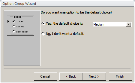
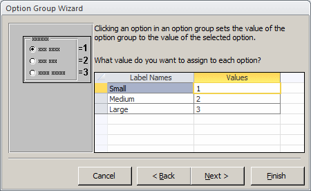
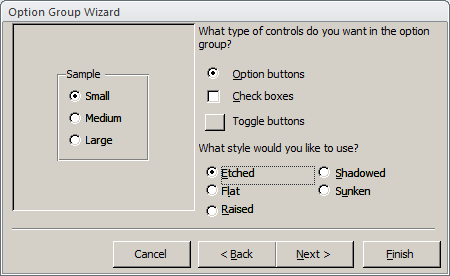
There are two main ways you add a radio button to your form or report. While in Design View, if you add an Option Group control to a window while the Control Wizard button is down, the Option Group Wizard would start, allowing you to create a list of items where each item would be later converted into a radio button. If the radio button must be linked to a column of the data source, you will need to specify it. Such a column should have a natural number as data type (Byte, Integer, Long Integer).
![]() Practical
Learning: Adding Radio Buttons
Practical
Learning: Adding Radio Buttons



|
Properties of Radio Buttons |
Because the round box of a radio button does not indicate what it is used for, it is usually (if not always) accompanied by a label. The label can be positioned anywhere (to the left, the top, the right, or the bottom side) close to the round box but it is usually positioned to the left or the right side. To move or position the round box, click it to select it. Then position your mouse on it to get a 4-arrow cross and drag in the desired direction:
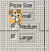
Like most (if not all) other controls, when you include a radio button, Microsoft Access adds a label to the control. If you do not like the string displayed by the label, you can click it twice to put it into edit mode and change the string.
![]() Practical
Learning: Configuring Radio Buttons
Practical
Learning: Configuring Radio Buttons

Check Boxes
|
Introduction |
A check box is a control that allows the user to validate or invalidate an option. A check box appears as a little square box. The user makes a decision by clicking in the square, which puts a check mark in the square. Toggling means, that if the square box were empty, after clicking it, a check mark would appear in it.
Although it can appear by itself, a check box can come in a group with others, allowing the user to select as many choices as are available, as opposed to radio buttons where only one in the group can be selected

Check boxes provide a non-exclusive choice, which means that if they come as a group, each behaves independently with regards to the other check boxes of the same group. Therefore you can create check boxes anywhere on the form or report. It is recommended that, when they act as an ensemble, you should include check boxes in a group so their belonging to the same group would be obvious to the user.
To add a check box to a form or report, in the Controls
section of the Ribbon, click the Check Box
![]() and click the form or report where you want to position the control.
and click the form or report where you want to position the control.
![]() Practical
Learning: Adding a Check Box
Practical
Learning: Adding a Check Box
|
Characteristics of Check Boxes |
As mentioned already, when you add a check box to a form or report, it is accompanied by a label positioned to its right. The label is used to indicate what the check box is used for, but the label can be moved or even removed from the host. That is, the label can be treated independently.
If you click the check box itself, it becomes surrounded by an orange box. Although you can resize that orange box, you cannot resize the actual check box: it is managed by the operating system.
A check box is used to express a Yes/No value (also called a Boolean value) as true or false. Sometimes, the decision cannot be made as a definite true or a definite false. To support this eventuality, a check box can assume an intermediate (or indeterminate) value. To provide this functionality, the check is equipped with a property named Triple State. This property is Boolean. If it is set to Yes, the check box can be true (checked), undetermined (dimmed), or false (unchecked):


![]() Practical
Learning: Using Check Boxes
Practical
Learning: Using Check Boxes


Toggle Buttons
|
Introduction |
A toggle button is a type of button that behaves like a check box. It displays like a command button but behaves like a check box. Also, while a check box should be accompanied by a label that indicates what the check box is used for, a toggle button, like the command button, can display a string on its "face".
To create a toggle button, you can click the Toggle
Button control
![]() in the Controls section of the Ribbon and click the form. Like the check box
and the radio buttons, there is no wizard to follow.
in the Controls section of the Ribbon and click the form. Like the check box
and the radio buttons, there is no wizard to follow.
|
Properties of a Toggle Button |
Configuring the toggle button is particularly easy. Like the check box, the toggle button should be used for a Boolean field. Therefore, after adding it to a form, in the Control Source of the toggle button, select the field that would carry or show its value.