VCL Controls: Date Time Picker

|
VCL Controls: Date Time Picker |
The Date and Time Picker is a control that allows the user to select either a date or a time value. This control provides two objects in one:
|
One of the advantages of the Date and Time Picker control is that it allows the user to select a time or a date value instead of typing it. This tremendously reduces the likelihood of mistakes.
|
|
||||||||
|
The Time Picker |
|
After adding a DateTimePicker control to a container, to make it a Timer Picker control, change its Kind property to a dtkTime value. This changes the control into a spin control:
The Time Picker control is a spin button made of different sections: the hours value, the minutes value, the optional seconds value, and the optional AM/PM string. To change the time, the user clicks a section and uses either the mouse or the keyboard to increase or decrease that particular value. To change another value, the user must first click it and then use the spin button.
You can set the format at design time using the Format field on the Object Inspector. To set the format at run time, assign the desired format to the
TDateTimePicker::Format property.
After adding the DateTimePicker control to the form, to allow the user to set the dates and not the times on the control, set its Kind property to dtkDate. This would change the control into a combo box. If you do not like the combo box, you can display a spin button instead. This ability is controlled by the DateMode property. The dmComboBox value is used to display a combo box while the dmUpDown value displays a spin button. If the control displays a combo box, if the user clicks the arrow on the Date control, a calendar object similar to the MonthCalendar control we saw earlier displays:  This calendar displays to the bottom-left or the bottom-right side of the combo box. To control this alignment, change the value of the CalAlignment property.
To change either the day, the month, or the year, the user must click the desired section and use either the arrows of the button or the arrow keys on the keyboard to increase or decrease the selected value.
The user may want to edit the date value of the control, including typing the month, day, year, the name of the month or the name of the weekday. The Date Picker object is equipped to control the types of values that can be entered. For example, the user cannot type the name of a month, only a number and the control would display the corresponding name of the month. This is the default scenario where you let this object help you control the values that the user can type. If you want to take matters into your own hands, that is, if you want to allow the user to type the value of the date or time of the control, set the ParseInput Boolean property to true. If you allow the user to manually enter the date value, if the value is incorrect, when the control looses focus, the compiler would make an attempt to convert the date entered into a valid and true date. If the user enters an invalid value, the compiler would throw an EconvertError error:  This means that you should be reluctant to let the users type whatever they want. The less they type, the less checking you need to do. |
|
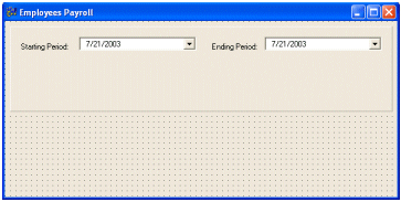
Practical Learning: Adding Date Picker Controls |

//---------------------------------------------------------------------------
void __fastcall TfrmMain::FormCreate(TObject *Sender)
{
	dteStartPeriod->CalColors->BackColor = TColor(RGB(230, 245, 255));
	dteStartPeriod->CalColors->MonthBackColor =
		 TColor(RGB(212, 235, 255));
	dteStartPeriod->CalColors->TextColor = clBlue;
	dteStartPeriod->CalColors->TitleBackColor = TColor(RGB(0, 0, 160));
	dteStartPeriod->CalColors->TitleTextColor = clWhite;
	dteStartPeriod->CalColors->TrailingTextColor =
		 TColor(RGB(190, 125, 255));

	dteStartPeriod->Format = "ddd d MMM yyyy";

	dteEndPeriod->CalColors->BackColor = TColor(RGB(255, 236, 218));
	dteEndPeriod->CalColors->MonthBackColor = TColor(RGB(255, 235, 214));
	dteEndPeriod->CalColors->TextColor = TColor(RGB(102, 52, 0));
	dteEndPeriod->CalColors->TitleBackColor = TColor(RGB(176, 88, 0));
	dteEndPeriod->CalColors->TitleTextColor = TColor(RGB(255, 238, 220));
	dteEndPeriod->CalColors->TrailingTextColor =
		TColor(RGB(230, 115, 0));

	dteEndPeriod->Format = "ddd d MMM yyyy";
}
//---------------------------------------------------------------------------
|
|
Date Time Picker Events |
|
The Date Time Picker control enjoys some events that the Calendar object does not have. Whenever the user changes the date or time value of the control, an
OnChange event fires. You can use this event to take some action such as indicating to the user that the new date is invalid. void __fastcall DateTimePickerUserInput(TObject *Sender, const AnsiString UserString, TDateTime &DateAndTime, bool &AllowChange) The UserString argument is the value that the user is typing. It could be a digit or a letter. The control returns the DateAndTime as the value of the control. If, during your checking, you find out that the user typed a wrong value, you can allow or disallow by setting the value of the AllowChange argument accordingly. Here is an example: //---------------------------------------------------------------------------
void __fastcall TForm1::DateTimePicker1UserInput(TObject *Sender,
const AnsiString UserString, TDateTime &DateAndTime,
bool &AllowChange)
{
if( TDateTime(UserString) < Date() )
{
ShowMessage("The cleaning date you entered, " +
UserString + ", is not valid!");
AllowChange = False;
}
else
{
Edit1->Text = DateAndTime;
AllowChange = True;
}
}
//---------------------------------------------------------------------------
If the Kind property of the control is set to dtkDate and if the DateMode value is dmComboBox, when the user clicks the arrow of the combo box to display the MonthCalendar, the OnDropDown() event fires. On the other hand, if the user clicks the arrow to retract the Calendar, an OnCloseUp() event fires. Both event are TNotifyEvent type. |
|
Practical Learning: Using Date Time Picker Events |
//---------------------------------------------------------------------------
void __fastcall TfrmMain::dteStartPeriodCloseUp(TObject *Sender)
{
	// Add two weeks to the date selected by the user
	dteEndPeriod->Date = dteStartPeriod->Date + 13;
}
//---------------------------------------------------------------------------
|
|
|
||
| Home | Copyright © 2004-2007 FunctionX, Inc. | |
|
|
||