|
After adding the control to a container, you may want
to ōglueö it to one border or corner of its host, as you would do with
the Anchors property. Unlike anchoring a control, the Align
property allows you to fix a control to one border of its host:
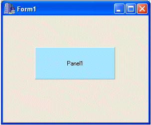
| By default, the Align property is set to alNone.
In this case, the control can assume any position with regard to
its host control |
 |
 |
When the Align property is set to alLeft,
the control will be fixed to the left border of its host. |
| A control whose Align property is set to alTop
can serve as a toolbar or a floatable window on the top section of
its host. |
 |
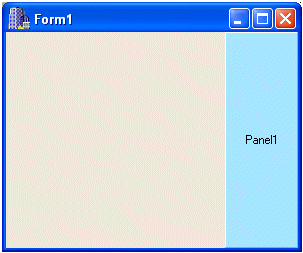 |
If the control has the Align property set to alRight,
the control would be anchored to the right border of its
container. |
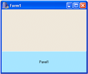
| A control can be used as a status bar that always
displays on the bottom section of the form. In this case, its Align
property would be set to alBottom. |
 |
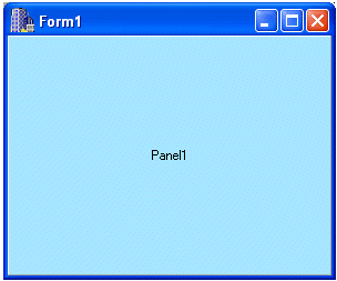 |
If a controlÆs Align property is set to alClient,
it would occupy the client area of the container. If another
control on the same container already has one of the previous
alignments, except alNone, the control whose Align
property is set to alClient would occupy only the remaining
unoccupied area. |
Most controls that use a caption allow you to control how such text would
be aligned as a paragraph. The Alignment property is a TAlignment
enumerator that lets you align text to the left (default), the center, or
the right. If the control, such as a panel would not display a caption,
you can leave this property ōas isö. To change the Alignment
property, click it on the Object Inspector to reveal its combo box. Click
the arrow and select the desired value: taLeft, taCenter, or
taRight.
Three specific bevel properties allow you to customize the appearance of a
panel. A panel object is drawn with two borders: an inner and an outer
borders. You can decide which one or both would use the bvNone, bvLowered,
bvRaised, or bvSpace. Using a combination of these values on
the BevelInner and BevelOuter fields, you can create special
effects for the appearance of a panel. The other property to take into
consideration is the BevelWidth value. This is an integer that
controls the border value of a panel. Playing with these three values can
tremendously transform the appearance of a panel.
Another property that acts on a panelÆs display is the BorderStyle;
this controls the line used to draw the contour of the panel.
A panel can be used as a button, in which case the user would click it to
initiate an action. A panel can also simply display a message to the user.
In any case, if you want to display a word or a group of words, you can
use the Caption property to show it.
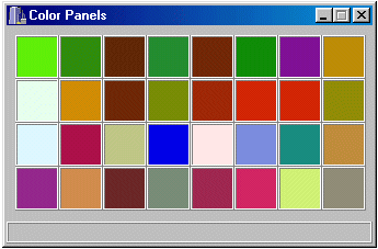
A property that is highly used on panels (and forms) is the Color.
If you change the Color property, the new color would cover the
face of the panel:
One of the most useful actions performed on a panel consists of involving
it in drag and drop operations. A panel can serve as the source or the
destination on such an operation.
The DockSite property uses
a Boolean value to indicate that the control, in this case the panel, can
serve as the host for a dragÆnÆdrop operation. The DragKind
property specifies how the control participates in the dragÆnÆdrop
operation. If the control serves as a docking host, set its DragKind
property to dkDock. On the other hand, if the control will itself
be used when dragging, set its DragKind property to dkDrag.
If a control is ōdraggableö, use the DragMode property to
specify how the dragging operation on the control would be initiated. If
you want the dragging operation to be possible when the user clicks the
control, set its DragMode property to dmAutomatic.
Otherwise, some controls, depending on the result you are trying to
achieve, should be available for dragging only depending on an
intermediary action. In such a case, you can write your program so that
the dragging operation on a control would be available only after the
application or another event or control has called the TControl::BeginDrag()
method. In this case, set the DragMode property to dmManual.
|
|

