|
To change the properties of a control at design time, you
will use the Object Inspector:
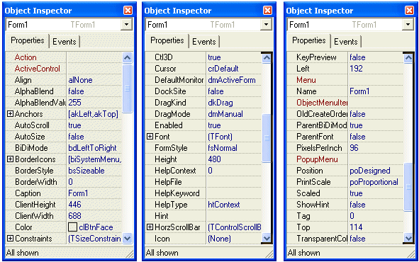
Each field on the Object Inspector has two sections: the
property’s name and the property's value:
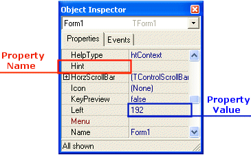
The box on the right side of each name represents the value
of the property that you can set for an object. There are various kinds of
fields you will use to set the properties. To know what particular kind a field
is, click its name. But to set or change a property, you use the box on the
right side of the name: the property's value also referred to as the field's
value.
Empty fields:  By default, these fields have nothing in their properties. Most of these
properties are dependent on other settings of your program. For example, you can
set a menu property for a form only after you have created a menu.
To set the property on such a field, you can type in it or
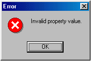
select from a list. If you type an invalid value and press Enter, you would
receive an "Invalid Property Value" error :
Text Fields:  There are fields that expect you to type a value. Most of these fields have a
default value. To change the value of the property, click the name of the
property and press Enter. While some properties would allow anything, such as
the Caption, come other fields expect a specific type of text, such as a
numeric value. If you type an invalid value, you would receive an error.
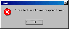
You can click OK to dismiss the error dialog and type a new
valid value.
Expandable Fields:
 Some fields have a + sign. This indicates that the property has a set of
sub-properties that actually belong to the same property and are set together.
To expand such a field, click its + sign and a – sign will appear:

To collapse the field, click the – sign. Some of the set
properties are created from an enumerator. Since the field was created as a
Pascal-style set, this allows the property to have more than one
value. For example, the BorderIcons property can have the minimize and
the maximum buttons. Some other fields that have a plus sign are actually
complete classes or a combination of classes.
Boolean Fields:
 Some fields can have only a true or false value. To change their
setting, you can either select from the combo box or double-click the property
to toggle to the other value.
Action Fields: Some fields would require a list of items and need to be
controlled by an intermediary action. Such fields display an ellipsis button  . When you click the button, a dialog box would come up and you can set the
value for the field. You can also double-click the field value to call the
dialog.
Selection Fields:
 To change the value of some of the fields, you would use their combo box to
display the available values. After clicking the arrow, a list would display.
There are various types of selection fields. Some of them display just two
items. To change their value, you can just double-click the field. Some other
fields have more than two values in the field. To change them, you can click
their arrow and select from the list. You can also double-click a few times
until the desired value is selected. On some other properties, you can
double-click the field and a dialog box would come up.
|
Characteristics of a Form
|
|
A form starts on top with a title bar:
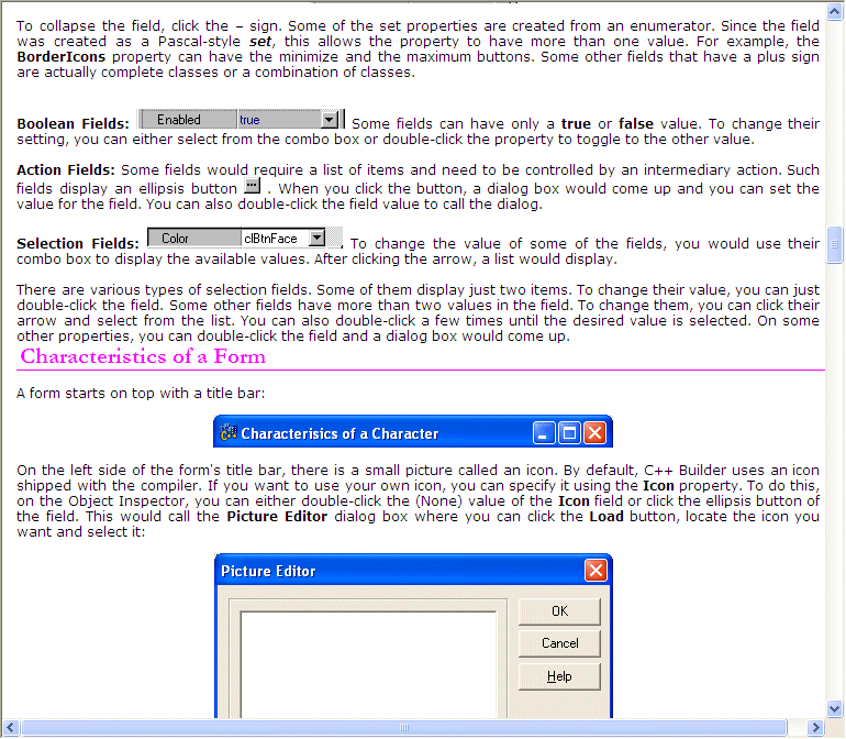
On the left side of the form's title bar,
there is a small picture called an icon. By default, C++ Builder uses an icon
shipped with the compiler. If you want to use your own icon, you can specify it
using the Icon property. To do this, on the Object Inspector, you can
either double-click the (None) value of the Icon field or click the
ellipsis button of the field. This would call the Picture Editor dialog
box where you can click the Load button, locate the icon you want and
select it:
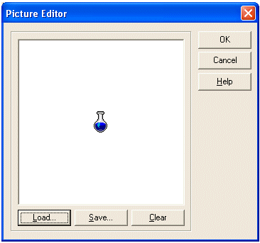
After clicking OK, the new icon would be used as the system
icon of the form

The icon used on the title bar possesses a menu called the
system menu. This menu displays if you click the icon:
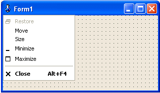
The system menu of the icon's title bar allows you to
perform the common actions of a regular Windows form. If you do not want to
display the icon and its menu, refer to the section on the BorderIcons
below.
On the right side of the system icon, there is long bar that
is actually usually referred to as the title bar. This section displays a word
or a group of words known as the caption of the form. By default, the title bar
displays the name of the form. To customize the text displayed on the title bar,
on the Object Inspector, change the text of the Caption property.
At design time, you can only set the caption as text. The
caption can be any type of string. At run time, you can control and
programmatically display anything on the caption of the form. It can consist of
an expression or the result of a calculation. To change the caption at run time,
you can use a function, a method, or an event. Just type “Caption = “
and the sentence you want. For example, you can display today’s date on the
caption as follows:
//---------------------------------------------------------------------------
void __fastcall TForm1::ChangingFormCaption()
{
    Caption = "Today is " + Date();
}
//---------------------------------------------------------------------------
|
You can also indirectly control the caption. For example,
after the user has typed his or her name in an edit box, you can display it in
the form’s caption as follows:
//---------------------------------------------------------------------------
void __fastcall TForm1::ChangingFormCaption()
{
    Caption = Edit1->Text;
}
//---------------------------------------------------------------------------
|
On the right side caption, there
are three system buttons that allow minimizing ( , , ,
or ,
or  ),
maximizing ( ),
maximizing ( , ,
 ,
or ,
or  )
restoring ( )
restoring ( , ,
 , or , or
 )
or closing ( )
or closing ( , ,
 , or , or
 )
the form as a window. The presence, absence, or appearance of the system buttons
is controlled by the BorderIcons property. To control this property, you
can click its + sign to expand it to display its four possible values: biSystemMenu,
biMinimize, biMaximimize, and biHelp )
the form as a window. The presence, absence, or appearance of the system buttons
is controlled by the BorderIcons property. To control this property, you
can click its + sign to expand it to display its four possible values: biSystemMenu,
biMinimize, biMaximimize, and biHelp
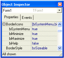
The BorderIcons property is a (Pascal-style) set,
which means it can use one or more values in any allowed combination. Each
member of the set can have a true or false value. If you set the biSystemMenu
property to true, regardless of the values of the other fields of the BorderIcons
property, the form would have neither the system icon (which also makes the
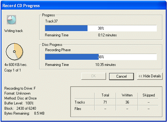
system menu unavailable) nor the system buttons. If a form does not have a
system close button, you should make sure the user has a way to close the form:
| This dialog box does not present system buttons. The user
would not have any inherent way to close it unless the programmer
explicitly presents a button to close it, which was taken care of by the
presence of the OK and Cancel buttons. |
 |
Using a combination of the biSystemMenu, the biMinimize
and the biMaximimize properties, you can control the availability of the
system buttons:
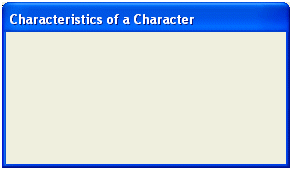 |
biSystemMenu = false
Notice that there is no system button
|
|
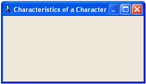
biSystemMenu = true biMinimize = false biMaximize
= true
Notice that the Minimize button is disabled
|
 |
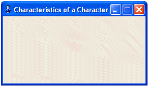 |
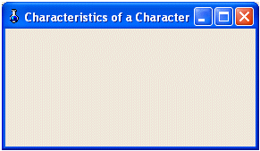
biSystemMenu = true biMinimize = true biMaximize
= false
Notice that the Maximize button is disabled
|
|
biSystemMenu = true biMinimize = true biMaximize
= true
Both the Minimize and Maximize buttons are enabled
|
 |
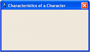 |
biSystemMenu = true biMinimize = false biMaximize
= false
Notice that only the Close button is available
|
 |
The biHelp property works only if
the form is a dialog box. It does not bear any role on the title bar of
a regular form |
You can also control the system
buttons with code. Since the BorderIcons property is a set, you must use
the overloaded extractor operators. To remove or set a property to false, use
the >> operator. To include or set a property to true, use the <<
operator. For example, to set the biSystemMenu property to false, you can
use code such as:
|
biSystemMenu = false
is equivalent to:
|
//---------------------------------------------------------------------------
__fastcall TForm1::TForm1(TComponent* Owner)
    : TForm(Owner)
{
    BorderIcons = TBorderIcons() >> biSystemMenu;
}
//---------------------------------------------------------------------------
|
|
biSystemMenu = true
biMinimize = false
biMaximize = true
is equivalent to:
|
//---------------------------------------------------------------------------
__fastcall TForm1::TForm1(TComponent* Owner)
    : TForm(Owner)
{
    BorderIcons = TBorderIcons() << biSystemMenu >> biMinimize << biMaximize;
}
//---------------------------------------------------------------------------
|
|
biSystemMenu = true
biMinimize = true
biMaximize = false
is equivalent to:
|
//---------------------------------------------------------------------------
__fastcall TForm1::TForm1(TComponent* Owner)
    : TForm(Owner)
{
    BorderIcons = TBorderIcons() << biSystemMenu << biMinimize >> biMaximize;
}
//---------------------------------------------------------------------------
|
|
biSystemMenu = true
biMinimize = false
biMaximize = false
is equivalent to:
|
//---------------------------------------------------------------------------
__fastcall TForm1::TForm1(TComponent* Owner)
    : TForm(Owner)
{
    BorderIcons = TBorderIcons() << biSystemMenu >> biMinimize >> biMaximize;
}
//---------------------------------------------------------------------------
|
If you do not explicitly define the values of the BorderIcons,
by default, the form would be equipped with all system buttons.
One of the most visual effects of
an object's appearance is its borders. A border is a line that sets the visual
limits of an object. most objects, including a form, have four borders: left,
top, right, and bottom. In VCL applications, the borders of a form are
controlled by a property called BorderStyle.
To control the appearance of the borders of your form, on
the Object Inspector, if you click BorderStyle, you would see that it is
a combo box property. The BorderStyle property is an enumerator and you
can choose one of its value needed for your form.
|
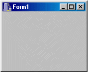
By default, a form is designed to be resizable using
the bsSizeable value. In this case the user can change its width
and its height by dragging one of its borders or corners.
|
 |
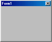 |
If you set the BorderStyle property to bsDialog,
the user will not be able to resize the dialog. This is the default and
the mostly used characteristics for a dialog window. You should always
use it if you want the window to be a dialog box.
|
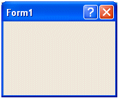 |
If you set the BorderStyle property to bsDialog
and have a Help file you want to use on the dialog box, you can set the biHelp
of the BorderIcons property to true. This would display a Whats
This button on the title bar. |
|
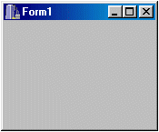
A BorderStyle set with bsSingle looks
like one set with the bsSizeable. The difference is that the user
cannot resize it.
|
 |
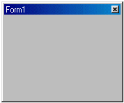 |
A floating window is a form used to let the user
move it around while she is working on the main form or dialog. This
form is usually modeless, which means the user does not have to close it
to continue working. If you want to create a floating modeless window,
you should set the form’s BorderStyle to bsSizeToolWin.
The window has a short title bar and it can be resized.
|
|
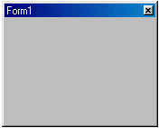
Like the sizable tool window, a form with bsToolWindow
has a short title bar and is also a prime candidate for a floating
window. Unlike the form with bsSizeToolWin, the user cannot
resize a bsToolWindow form.
|
 |
 |
A Form whose BorderStyle is set to bsNone
has neither a title bar nor borders.
|
To change a property programmatically, assign one of the
above values to the BorderStyle variable. Here is an example:
//---------------------------------------------------------------------------
__fastcall TForm1::TForm1(TComponent* Owner)
    : TForm(Owner)
{
    BorderStyle = bsDialog;
}
//---------------------------------------------------------------------------
|
A form is a rectangular object. As a
geometric figure, a form is characterized by a length and a height. In VCL, the
length of an object is known as its Height and its horizontal measurement
is its Width. Therefore, the Width and the Height
properties control the external dimensions of a form:
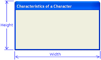
C++ Builder uses some default dimensions to display a form
when you create it. To change the dimensions of a form, on the Object Inspector,
set an integer value to the Height and/or the Width fields. The
value must be a reasonable short integer. If the value is not a number, you
would receive an error.
To change the dimensions programmatically, simply assign the
desired value to the Height and/or Width property of your choice.
Here is an example that changes the width of the form:
//---------------------------------------------------------------------------
void __fastcall TForm1::ChangingFormWidth()
{
    Width = 248;
}
//---------------------------------------------------------------------------
|
If the value you give to a property is not allowed, the
program would throw an error.
Between the left, right, bottom
borders and under the title bar of the form, there is an area that can be
referred to as the body of the form. It has a size that directly influences the
overall size of the form. The area delimited by the body of the form is called
the Client Area. This is the area that is used as the host for other objects, as
we will see in future lessons.
The size of the body of the form, of course, is less than
the actual size of the form because the true size of the form includes its title
bar and its borders. The length of the body of the form has a dimension called
and represented as ClientWidth. The height of the body of the form has a
dimension referred to as ClientHeight:
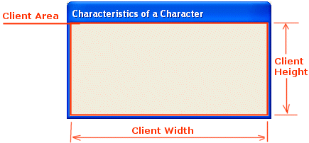
Overall, you will hardly be concerned with the dimensions of
the client area, unless you want to draw or render a image. If you do not have a
particular reason, let C++ Builder take care of the client area.
As a spatial object, a form has a
location with regard to the monitor that displays it. This means that a form is
housed by the screen of your monitor. The measurement of the form's position
starts on the top-left corner of the screen host where the origin is set to
(0,0) coordinate. The Left property represents the length from the left
border of the screen to the left border of the form. In the same way, the Top
property measures the length from the top border of the screen to the top border
of the form:
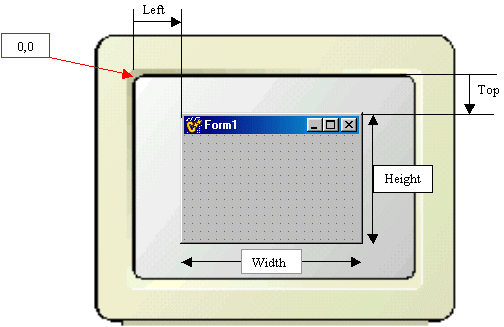
At design time, if you drag the title bar of the form and
start moving it, you can see the Left and Top properties in the
Object Inspector vary accordingly, live: this is RAD in its truest form. Once
you position your form, the compiler would remember to display the form where it
was last positioned at design time. In the same way, you can change the location
of the form at run time by assigning a short integer to either the Top,
the Left, or both properties. Make sure you use valid integer values,
otherwise you would receive an error when you compile the project.
The location of a form is respected
at design time because the VCL provides another property that follows the
directives of the design. At design time, you can position the form anywhere on
your screen and when you run the application, the form would appear following
that position. This is based on the fact that the position of the form is
controlled by the TPosition enumerator. The default position of the form
is recognized as the way it was designed if you do not change the Position
property. The default value of the Position property is poDesigned.
In the same way, when a form
appears as it was designed,, it is said to be "normal". C++ Builder
allows you to have the form minimized or maximized when it appears for the first
time. This ability is controlled by the WindowState property. The default
value of this property is wsNormal which means the form would appear in a
normal fashion. If you want the form to be minimized or maximized at startup, in
the Object Inspector, select the desired value for the WindowState
property.
Besides the Top, Left, and
Position properties, you can also controlled the position of a form using
the Align property. The Align property controls how an object is
positioned with regard to the object that is hosting it. In case of a (regular)
form, the Align property controls how the form is positioned with respect
to the monitor's screen. When it comes to a form, the Align property
should be used only if you have a good reason. For example, to maximize a form
at startup, you can set its Align property to alClient, which you
can also accomplish using the WindowSate property. The default value of
the Align property is alNone, which means the appearance of the
form is left to other properties. We will explore the Align property when
we get to the controls but remember that it is also available to the form.
The user of your application will
have the ability to resize the form when using your application. If the form is
not a classic dialog box, by default, the user can resize it to any dimensions
allowed by the screen resolution; the minimum is to have the system buttons and
just a tiny part of the caption. You can set the minimum height, the maximum
height, the minimum width, and the maximum width allowed on the form when the
user decides to resize it. This property is controlled by the Constraints
property. The Constraints property is a TSizeConstraints class,
which is inherited from the TPersistent class. Although it is a class,
you should never declare it. The control that uses a Constraints property
will create and initialize an instance of the class. The MinWidth, MinHeight,
MaxWidth, and MaxHeight are integer values you can set using the
keyboard. To set the constraints of a control that has this property, click the
+ sign of the Constraints name in the Object Inspector, click the field
desired and type an integer value. To programmatically control the constraints
of a control, call the TSizeConstraints::Property and type the
desired value. In the following example, when the user tries to resize the Form1
form, the minimum and maximum dimensions of the form are already set and would
not change:
//---------------------------------------------------------------------------
void __fastcall TForm1::FormResize(TObject *Sender)
{
    Form1->Constraints->MinHeight = 300;
    Form1->Constraints->MinWidth = 500;
    Form1->Constraints->MaxHeight = 400;
    Form1->Constraints->MaxWidth = 565;
}
//---------------------------------------------------------------------------
|
An object is referred to as transparent when you can see
through it. If you are working for or under Windows 2000 or later running on a
Pentium or equivalent, you can make your form transparent. To create a
transparent form, set the AlphaBlend Boolean property to true from
its false default value. Once this property is set to true, you can use
the AlphaBlendValue property to set the degree of transparency. The value
must be an integer value between 0 and 255. At 0, you would not see the form at
all. The only presence of the form would be on the taskbar. At 255, the form
would appear as if the property was not applied.
|

