
API Properties of Windows Controls
|
|
API Properties of Windows Controls |
|
Introduction to Interface Design |
|
Selecting a Control |
|
While you are designing an application, it is important to always know what particular control is selected. Whenever you make changes, they are applied to the control that has focus.
There are various techniques used to give focus to a control: |
|
here are various techniques used to give focus to a control:
|
To select a form, click an unoccupied area on the form. If the form is hidden, you can press F12 to toggle between the form and the code. If your application has more than one form, to display one of them, on the main menu, you can click View -> Forms and select the desired form from the list.
Any control on a form can be moved to a desired location either to accommodate other controls or based on new demands:
There are two valuable dialog boxes available to move controls. To solve alignment issues, access the Align dialog box:
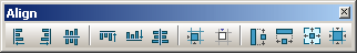
To better control the relative alignment of controls, you can use the Alignment toolbar. To access it, on the main menu, you can click View -> Toolbars -> Align:
Because it may be equipped with buttons you are not familiar with, to know what a button is for, you can position the mouse on it and wait for the tool tip. When dealing with relative dimensions, call the Size dialog box. To get it:
Most controls, including the form, can be resized using guiding mouse cursors. To resize a control, first select it. Except for the form, whenever a control is selected, there are eight handles around it. To resize the control, position your mouse on one of the handles. The mouse pointer will change, indicating in what direction you can move to resize the control
The TComponent class provides a valuable property named Tag: __property int Tag = {read=FTag,write=FTag};
The role of the TComponent::Tag is not defined by anything other than its being available. This means that you can use the Tag property anyway you want. The only thing you have to know is that it can be assigned an integer value that you can then use however you see fit.
Because a control�s location can be identified with two values, it can also be illustrated as a geometric point on the coordinate system of the screen. A point is a pixel on the monitor screen, on a form, or on any object of your application. A point is represented by its coordinates with regard to the object that "owns" the point:
As seen so far, a control is a rectangular object that can be located, and whose dimensions are visible, on the screen. We saw already that each object of your application, including a form, is visually defined by its location and its dimensions on the screen for a form or on the object that owns it. These two aspects are controlled by a geometric rectangle that defines the location and the dimensions of the object. In the Win32, to get the location and dimension of a control, you can call the GetWindowRect() function from Microsoft Windows (Win32). Its syntax is: BOOL GetWindowRect(HWND hWnd, LPRECT lpRect); This function returns a rectangle that holds the location and the dimensions of the control as, lpRect. In the VCL, a control is included in a rectangle known as the BoundsRect property. BoundsRect is a property of the TControl class and is declared as follows: __property Types::TRect BoundsRect = {read=GetBoundsRect,write=SetBoundsRect};
Therefore, at any time, to get the location and the dimensions of a control, call its BoundsRect property, which produces a TRect value.
A control is referred to as visible if it can be visually located on the screen. A user can use a control only if he or she can see it. As a programmer, you have the role of deciding whether a control must be seen or not and when. At design time, when you add a control to a parent, it is visible by default. In Microsoft Windows, the visibility of a control is specified by a style named WS_VISIBLE. If you are creating a control using either the CreateWindow() or the CreateWindowEx() functions, to indicate that it must be visible, add the WS_VISIBLE style to its dwStyle argument. Here is an example: //---------------------------------------------------------------------------
void __fastcall TExercise::ExerciseCreate(TObject *Sender)
{
HWND hWndButton = CreateWindow("Button", "Submit",
WS_CHILD | WS_VISIBLE,
10, 10, 124, 25,
Handle,
NULL,
HInstance,
NULL);
}
//---------------------------------------------------------------------------
After the control has been created, if it is hidden and you want to show it, you can call the ShowWindow() function. Here is an example: //---------------------------------------------------------------------------
void __fastcall TExercise::SomethingClick(TObject *Sender)
{
ShowWindow(SomeControl->Handle, SW_NORMAL);
}
//---------------------------------------------------------------------------
In the VCL, for controls to support the visibility, the TControl class is equipped with a Boolean property named Visible: __property bool Visible = {read=FVisible,write=SetVisible};
If you are visually creating a control, in the Object Inspector, access its Visible field and set the desired value. In the same way, if you programmatically create a control, by default, it is made visible once you specify its owner and parent as the (main) form. Besides setting the Visible property to True to show a control, the TControl class is equipped with a method named Show() that supports this operation. Its syntax is: void __fastcall Show(); When calling this method, if the control is visible, nothing would happen. If it were hidden, then it would be revealed. Here is an example: //---------------------------------------------------------------------------
void __fastcall TExercise::SomethingClick(TObject *Sender)
{
SomeControl->Show();
}
//---------------------------------------------------------------------------
The Show() method internally sets the Visible property to true. At run time, to hide a control, assign a False value to either its Visible property or its parent�s Visible property. Remember that, as stated already, when a parent gets hidden, it also hides its children. On the other hand, a parent can be made visible but hide one or some of its children. Besides the Visible property used to hide a control, the TControl class is equipped with a method named Hide that performes the same operation. Its syntax is: void __fastcall Hide(); If you do not want a control to primarily appear when the form comes up, you can either set its Visible property to False or set its parent�s visible property to False.
//---------------------------------------------------------------------------
void __fastcall TExercise::ToggleControlAppearance()
{
	SomeControl->Visible = !SomeControl->Visible;
}
//---------------------------------------------------------------------------
Another property that supports the visibility of a control is named Showing but it is defined in the TWinControl class: __property bool Showing = {read=FShowing};
While the Visible property can be read or changed, Showing is a read-only property. This means that you can assign a true or false value to Visible but you can only check the state of Showing; you cannot change it. As an example, the following code will not compile because Showing is used as read-write property: //---------------------------------------------------------------------------
void __fastcall TExercise::SomethingClick(TObject *Sender)
{
// This will not work because you cannot change Showing
if( SomeControl->Showing )
SomeControl->Showing = False;
}
//---------------------------------------------------------------------------
Keep in mind that hiding a control does not close or destroy it.
When designing an application, you are allowed to position controls on top of others. When a control that has a strong (non-transparent) background is positioned on top of an existing control, the control at the botton gets hidden, either partially or completely. Here is an example:
If you have a controlled that is behind a control that is not its parent, you can bring it to the front, either visually or programmatically. To visually control the coordinate arrangement of a control, on the form, right-click it, position the mouse on Control, and click Bring to Front:
To support this operation, the TControl class is equiped with a property named BringToFront. Its syntax is: void __fastcall BringToFront(void); Call this method on the control you want to bring to the top of all the other controls.
As opposed to a control being positioned behind the others, you may have a control above the others and you rather have it behind the other controls. To visually send it, right-click the control, position the mouse on Control and click Send to Back. To programmatically support this operation, the TControl class is equipped with the SendToBack() method. Its syntax is: void __fastcall SendToBack(void); Call this method to change order of controls on the Z coordinates of the axes. |
|
|
||
| Previous | Copyright © 2004-2010 FunctionX | Next |
|
|
||


 Practical
Learning: Selecting Controls
Practical
Learning: Selecting Controls


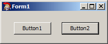


 and click the form
 and click the form to add a button control to the form


