|
Characteristics of Progress Bars
|
|
|
The Orientation of a Progress Bar
|
|
By default, a newly added progress bar assumes a
horizontal position. This aspect is controlled by the Orientation
property which is a TProgressBarOrientation enumeration defined as
follows:
enum TProgressBarOrientation { pbHorizontal, pbVertical };
The default value of the Orientation property is
pbHorizontal. This is equivalent to not specifying an orientation
when programmatically creating the control using either the VCL or the Win32
libraries. If you want the progress bar to appear vertical, at design time,
set the Orientation value to pbVertical. If you are creating the
progress bar using the Win32 library, you must OR the PBS_VERTICAL
style. Here is an example:
//---------------------------------------------------------------------------
void __fastcall TForm1::FormCreate(TObject *Sender)
{
	CreateWindowEx(0, PROGRESS_CLASS, NULL,
		       WS_CHILD | WS_VISIBLE | PBS_VERTICAL,
		       20, 20, 18, 170,
		       Handle, NULL, HInstance, NULL);
}
//---------------------------------------------------------------------------
|
The Smoothness of a Progress Bar
|
|
As mentioned already, a progress bar appears as a series
of small adjacent rectangles. By default, these rectangles display
distinctively. If on the other hand you want to "glue" them and produce a
smooth bar, use the Smooth Boolean property:
__property bool Smooth = {read=FSmooth,write=SetSmooth};
Its default value is false, making the small rectangles
separate. If you set this property to true, the bar would appear continuous.
If creating the control using the CreateWindow() or
CreateWindowEx() Win32 function, you can OR the PBS_SMOOTH style.
To display its small rectangles or the smooth bar, the
progress bar uses a preset color, which is usually blue. If you prefer to
use a different color, call the SendMessage() function with the
PBM_SETBARCOLOR message. The syntax you would is:
SendMessage(HWND hWnd,
	    PBM_SETBARCOLOR,
	    wParam = 0,
	    lParam = (LPARAM)(COLORREF)clrBar;
As you can see from this syntax, the wParam
argument is not used and must be passed as 0. The desired color for the bar
is specified using the lParam argument. Here is an example:
//---------------------------------------------------------------------------
void __fastcall TForm1::FormCreate(TObject *Sender)
{
	SendMessage(ProgressBar1->Handle, PBM_SETBARCOLOR, 0, clRed);
}
//---------------------------------------------------------------------------
|
 Practical
Learning: Smoothing a Progress Bar Practical
Learning: Smoothing a Progress Bar
|
|
- On the form, click one of the progress bars
- In the Object Inspector, click the Smooth check box to make it True
- Do the same for the other two progress bars
|
The Values of a Progress Bar
|
|
To show its effect, the progress bar draws its small
rectangles on a bar. These small shapes are from a starting position to an
end. This means that the progress bar uses a range of values. This range is
controlled by the Min and the Max
properties:
__property int Min = {read=GetMin,write=SetMin};
__property int Max = {read=GetMax,write=SetMax};
Their default values are 0 and 100 respectively. At
design time, you can set them using the limits of an unsigned short integer,
that is, from 0 to 65,535. In Win32, the range of values of a progress bar
is set using the PBM_SETRANGE message using the following syntax:
SendMessage(HWND hWnd,
	    PBM_SETRANGE,
	    wParam = 0,
	    lParam = MAKELPARAM(nMinRange, nMaxRange);
Alternative, you can send the PBM_SETRANGE32
message to set the range of the progress bar. This time, the syntax used
would be:
SendMessage(HWND hWnd,
	    PBM_SETRANGE32,
	    wParam = (WPARAM)(int) iLowLim,
	    lParam = (LPARAM)(int) iHighLim);
For a horizontal progress bar, the small rectangles are
drawn from left to right. For a vertical progress bar, the small rectangles
are drawn from bottom to top. At one particular time, the most top or the
most right rectangle of a progress bar is referred to as its position. At
design time, to set a specific position for the control, change the value of
the Position property whose default is 0. The position must always be
between the Min and Max values. If you set it to a value lower
than the Min, the Object Inspector would reset it to Min. In
the same way, if it is set to a value higher than Max, it would be reset to
the Max value. At run time, you can assign the desired value to the Position
property. Once again, avoid specifying a value that is out of range.
|
Practical
Learning: Setting the Maximum Value of a Progress Bar
|
|
- On the form, click the top progress bar (corresponding to the hours)
- In the Object Inspector, click Max, type 23 and
press Enter
- On the form, click the middle progress bar (corresponding to the
minutes)
- Press and hold Shift
- Click the bottom progress bar
- Release Shift
- In the Object Inspector, click Max, type 59 and
press Enter
|
The Step of a Progress Bar
|
|
Because a progress bar is usually meant to indicate the
progress of an activity, when drawing its small rectangles, it increases its
current position in order to draw the next rectangle, except if the control
is reset. The number of units that the control must increase value is
controlled by the Step property:
__property int Step = {read=FStep,write=SetStep};
By default, it is set to 1. Otherwise, you can set it to
a different value of your choice.
|
Practical
Learning: Setting the Step of a Progress Bar
|
|
- On the form, click the top progress bar (corresponding to the hours)
- Press and hold Shift
- On the form, click the middle progress bar (corresponding to the
minutes)
- Click the bottom progress bar
- Release Shift
- In the Object Inspector, click Step, type 1 and
press Enter
|
The Position of a Progress Bar
|
|
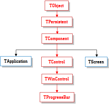
The ProgressBar control
 is based on the TProgressBar class. Like every VCL class, it is
equipped with a constructor that can be used to dynamically create the
control.
is based on the TProgressBar class. Like every VCL class, it is
equipped with a constructor that can be used to dynamically create the
control.
We have seen that a progress bar implements its behavior
by drawing small adjacent rectangles. This control does not know and does
not decide when to draw these indicators. Therefore, after creating a
progress bar, you must provide a means of changing its value, that is, a way
to increment its position. Although it is usually used to show the evolution
of a task, it does not actually have an internal mechanism to monitor such
an activity. Another control is usually used to trigger this. Nevertheless,
when the value of a progress bar changes, the control refers to the Step
property to increment its Position. Based on this Step value,
when it is time to increment, the progress bar calls its StepIt()
method. Its syntax is:
void __fastcall StepIt(void);
If you want to increase the progress bar’s position by a
value other than Step, you can call the StepBy() method. Its syntax
is:
void __fastcall StepBy(int Delta);
Pass the desired incremental value as the Delta
argument.
|
Practical
Learning: Implementing Progress Bars
|
|
- On the form, double-click the TTimer1 timer to access its OnTimer
event
- Implement it as follows:
//---------------------------------------------------------------------------
void __fastcall TfrmProgress::Timer1Timer(TObject *Sender)
{
	// Get the current time
	TDateTime CurTime = TDateTime::CurrentTime();
	unsigned short Hours, Minutes, Seconds, Milliseconds;

	// Retrieve the hour, minute, and second values of the current time
	CurTime.DecodeTime(&Hours, &Minutes, &Seconds, &Milliseconds);

	// Draw the progress boxes based on the values of the time
	pgrHours->Position = Hours;
	pgrMinutes->Position = Minutes;
	pgrSeconds->Position = Seconds;

	// Display the values in the corresponding labels
	lblHours->Caption   = UnicodeString(Hours);
	lblMinutes->Caption = UnicodeString(Minutes);
	lblSeconds->Caption = UnicodeString(Seconds);

}
//---------------------------------------------------------------------------
- To execute the application, on the main menu, click Run -> Run

- After using the form, close it and return to your programming
environment
|
|

