|
Characteristics of a Scroll Box
|
|
The scroll box is a classic implementor of a scrolling
window. In fact, all the functionalities of a scroll box come from its
ancestors, first from the TWinControl class, and especially from
TScrollingWinControl. Because the scroll box is primarily a visual
Windows control, it has characteristics that allow it to have presence. For
example, you should make sure you control the size of the scroll box using
its Width and Height properties.
As a child of the TScrollingWinControl class, a
scroll box can be equipped with one or both scroll bars. As described for a
scroll bar, a scroll box relies on the operating system to decide whether a
scroll bar is needed on the container, based on the controls it is hosting.
Your role is to add the objects to the scroll box and give them the sizes
you feel necessary for the functionality of your application.
|
 Practical
Learning: Creating a Scroll Box Practical
Learning: Creating a Scroll Box
|
|
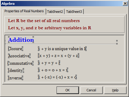
- In the body of the scroll box, add the following controls:
 |
| Control |
Caption |
Font |
Shape |
| Font |
Size |
Font Style |
Color |
|
| TLabel |
 |
Addition |
Georgia |
14 |
Bold |
Blue |
|
| TBevel |
 |
|
|
|
|
|
bsBottomLine |
| TLabel |
 |
Closure: |
Georgia |
10 |
|
|
|
| TLabel |
 |
x + y is a unique value in R |
Georgia |
10 |
|
|
|
| TLabel |
 |
Associative: |
Georgia |
10 |
|
|
|
| TLabel |
 |
(x + y) + z = x + (y + z) |
Georgia |
10 |
|
|
|
| TLabel |
 |
Commutative: |
Georgia |
10 |
|
|
|
| TLabel |
 |
x + y = y + z |
Georgia |
10 |
|
|
|
| TLabel |
 |
Identity: |
Georgia |
10 |
|
|
|
| TLabel |
 |
x + 0 = 0 + x = x |
Georgia |
10 |
|
|
|
| TLabel |
 |
Inverse |
Georgia |
10 |
|
|
|
| TLabel |
 |
x + (-x) = (-x) + x = 0 |
Georgia |
10 |
|
|
|
|
- Click the Addition label
- Press and hold Shift
- Click the bevel and click each of the labels under it
- Release Shift

- On the main menu, click Edit -> Copy
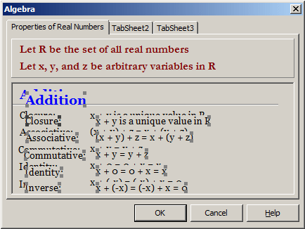
- Click an empty area in the scroll box to make sure nothing is
selected
- On the main menu, click Edit -> Paste
- While the controls are selected (there is a mixture of selected and
unselected controls:

so you must make sure you can carefully identify a control that is
selected), click one of them and hold the mouse down
- Drag down to position the selection under the existing controls. You
can first dra half-way, release the mouse, scroll down using the right
scroll bar of the scroll box, and drag the selection down again
- Click an unoccupied are on the form to make sure nothing is selected
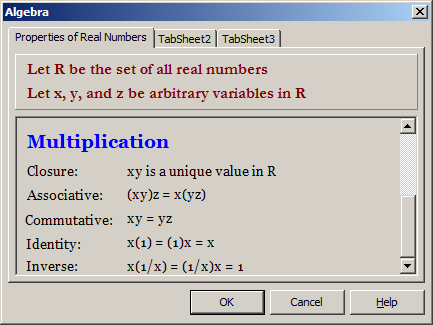
- Change the captions of the labels as follows:
 |
| Control |
Caption |
| TLabel |
 |
Multiplication |
| TBevel |
 |
|
| TLabel |
 |
Closure: |
| TLabel |
 |
xy is a unique value in R |
| TLabel |
 |
Associative: |
| TLabel |
 |
(xy)z = x(yz) |
| TLabel |
 |
Commutative: |
| TLabel |
 |
xy = yz |
| TLabel |
 |
Identity: |
| TLabel |
 |
x(1) = (1)x = x |
| TLabel |
 |
Inverse |
| TLabel |
 |
x(1/x) = (1/x)x = 1 |
|
- Double-click the Cancel button and implement its event as follows:
//---------------------------------------------------------------------
void __fastcall TdlgAlgebra::CancelBtnClick(TObject *Sender)
{
	Close();
}
//---------------------------------------------------------------------------
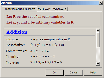
- Press F9 to test the application


- Close the form and return to your programming environment
The only characteristic that the VCL's scroll box has on
its own is the ability to show or hide its borders. This is handled by the
BorderStyle property of the TScrollBox
class:
__property Forms::TFormBorderStyle BorderStyle = {read=FBorderStyle,write=SetBorderStyle};
The border style is a derivative of the TFormBorderStyle
enumerator:
typedef Forms::TFormBorderStyle TBorderStyle;
This property has only two values:
- bsSingle: With this value, the scroll box gets
equipped with 3-D border
- bsNone: The scroll box does not show borders
|
|