IDE Objects: The Tool Palette
 |
IDE Objects: The Tool Palette |
|
Introduction |
|
When creating an application, you will be adding Windows controls, also called controls, to it. Most of the controls you will use reside on a window named Tool Palette. To access the Tool Palette:
|
|
The Sections of the Tool Palette |
|
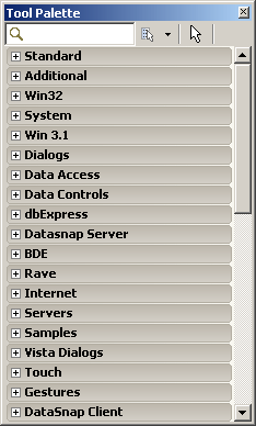
The Tool Palette is made of various sections. When the Tool Palette is floating, its top section displays the title Tool Palette on the left side of the Close button on the right side. Under the title bar, the window displays a toolbar made of three buttons:
|
|
On the Tool Palette, the controls are organized in categories based on various criteria, such as the type of control or the Microsoft release date of a series of controls. A container is a control whose main purpose is to host other controls. To design it, you pick up objects from the Tool Palette and drop them where desired. The Tool Palette organizes its items in categories and each category is represented by a + button and a string as its name:  If the available list of categories is not enough, you can add a new category of your choice. To do this, right-click anywhere in the Tool Palette and click Add New Category:
You would be prompted to provide a name. After typing the new name, press Enter. |
To use an object of a particular category:
After selecting a category, it displays its items. By default, the items in each category are organized as horizontal wide buttons:  Alternatively, you can list the items of a category as buttons of a list view. To do that, you must use the Properties of the Tool Palette. To display the Properties of the Tool Palette:
In the right section, you can remove the check mark on the Show Button Captions check box:
Each control would then be represented by a button and no name:
By default, the items in the Tool Palette appear as smal icons. RAD Studio gives an option among three sizes. To specify the size, display the Options dialog box. In the left list, click Tool Palette. In the Appearance section, click
When C++Builder is installed, it adds the buttons in a certain order. If you find it more convenient, you can arrange the list of controls in an order of your choice. To change the position of an item in the list, click it and drag it either up or down. After rearranging the items, if you want to put them back in the original arrangement, you can right-click the Tool Palette and click Reset Palette. To prevent the re-ordering of items, you can right-click the Tool Palette and click Lock Reordering. As mentioned already, the Tool Palette is usually positioned to the lower-right section of the screen. If you don't like that position, you can change it. To do this, you can grab and drag its title bar.
In the Tool Palette, the controls are represented each by a specific button. Some of the buttons display an appearance that easily suggests their role. Some others may not be obviously identified. In any case, to find out what control a button represents, you can position your mouse on it. A small yellow box called a tool tip or a hint would display. In the tool tip, you will see Name followed by a name:
Rapid Application Development (RAD) consists of selecting the controls that are necessary for your application and use them as you see fit. There are various techniques you can use to add a control to your application. |
|
|||||||||||||||||||||||||
|
|
|
|
||
| Home | Copyright © 2010-2016, FunctionX | |
|
|
||