|
Accessories for Control Design: The Flow Layout
Panel
|
|
To further assist you with application design, the .NET
Framework provides the flow layout panel that you can use instead of
manually positioning your controls horizontally or vertically. When used
horizontally, the flow layout panel takes care of aligning controls so that
all of them would have the same distance from the top border of their
container. Of course, this has to do only with the controls that belong to
the same group (the same container).
The flow layout panel is represented in the .NET
Framework by the FlowLayoutPanel class and in the Toolbox by
the FlowLayoutPanel object. Therefore, to use it, click it from the Toolbox
and add it to your form. The flow layout panel appears as a dotted
rectangular object:

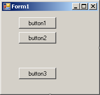
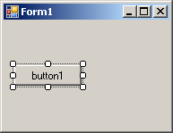
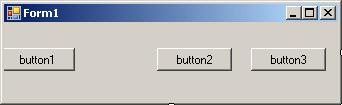
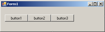
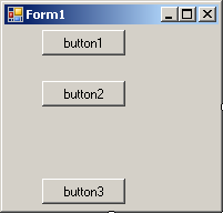
After placing it on a form, you can add controls to it.
To do this, you would click a control from the Toolbox and click inside the
flow layout panel. When you add the first control, it gets positioned in the
top left side of the container and you cannot move it to a different
position (if this were done it would deceive the purpose of the flow layout
panel):
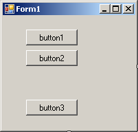
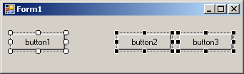
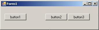
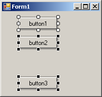
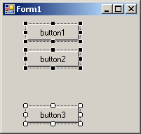
When you add a second control to the flow layout panel,
it is positioned on the right side of the previously added control with the
same horizontal alignment. You can continue adding other controls. If you
want the controls to be aligned vertically, resize the flow layout panel
accordingly:

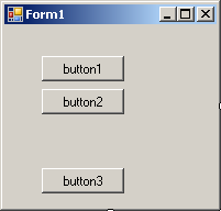
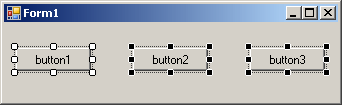
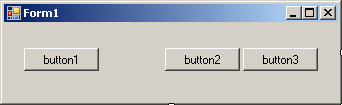
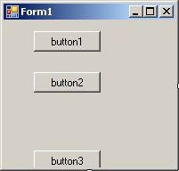
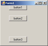
Instead of aligning controls horizontally, you may want
to position them vertically. To do this, you can narrow the flow layout
panel but heighten it:

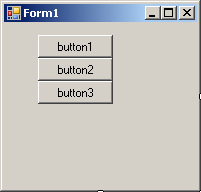
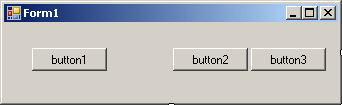
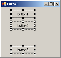
In the same way, if the flow layout panel is narrow and
the controls are positioned vertically, if you enlarge it, its control would
be positioned horizontally. As you can see, the flow layout panel provides a
convenient way of aligning controls.
|
Characteristics of the Flow Layout Panel
|
|
We mentioned that when you add the first control to a
flow layout panel, the control is positioned in the top-left section of the
container and the subsequently added controls would be positioned on the
right side of, or below, the previous control. This is the default behavior
and it is referred to as left-to-right. You can change this aspect.
Depending on your design intentions, you may want the controls to be
positioned from right to left. This characteristic is controlled by the
FlowDirection property, which is an enumeration. The default value of
this property is LeftToRight. If you set it to RightToLeft,
the first control would be added to the top-right section of the container,
the other controls would be incrementally positioned to the left of the
previous one(s).
As mentioned above, after adding a flow layout panel to
a form, if you add a control to it, the control is positioned in the
top-left section. If you add a second control, it is positioned on the right
side of the previous control. This would be the same with the other
subsequent controls. If you add a control but there is no room on the right
side, the control would be positioned on the next row. If you resize the
flow layout panel, the controls would be aligned vertically. This is the
default behavior and it is referred to as wrapping. This means that the flow
layout panel has the ability to wrap the controls inside its client area.
This characteristics is partly controlled by a Boolean property named
WrappingContents. Its default value is set to True. This property is
controlled in connection with the FlowDirection.
|
Accessories for
Control Design: The Table Layout Panel
|
|
During your application design, if you have a group of
controls that you want to align either horizontally or vertically, you can
use the flow layout panel. You can use different rows and columns of flow
layout panels to align the controls. If you do this, you would then have to
align the flow layout panels also to make sure their controls are aligned.
In reality, the flow layout panel is a valuable accessory for control design
but it may not effectively align different types of controls. To assist with
another type of problem, you can use the table layout panel.
The table layout panel is represented in the .NET
Framework by the TableLayoutPanel class and in the Toolbox by the
TableLayoutPanel control. To use it at design time, from the Toolbox, click
the TableLayoutPanel button and click the form. When it has been added, it
presents a dotted table made of four cells:

To use the table layout panel as a design object, you
can click a control from the Toolbox and click a cell in the table. The
control would be added to that cell. To add another control to the
application, you can click it from the Toolbox and click another cell:

|
Characteristics of a Table Layout
|
|
You cannot add a control to a cell if that cell contains
a control already. If you want to add more controls than the cells in the
table layout panel, you can add new cells. To do this, first select the
table layout panel from the form:
- To add a new column, under the Properties window, you can click Add
Column
- To add a row, under the Properties window, you can click Add Row
- To add more than one column or more than one row, in the Properties
window, click Columns or Rows and click its ellipsis button. This would
open the Column and Row Style dialog box
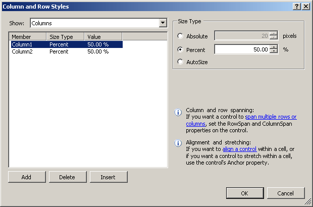
To add a column, in the Show combo box, select Columns and click
Add. To add a row, in the Show combo box, select Rows and click Add.
After using the dialog box, you can click OK
Besides the ability to align the controls, the table
layout panel provides various aesthetic characteristics, such as the
background color of the table, various styles for the dividing lines of the
cells, etc.
Most of the controls you will use to create your
applications are defined in the .NET Framework and each is based on a
particular class. To provide them with basic and common characteristics, all
visual Windows controls of the .NET Framework are based on a class called
Control which is available in the System.Windows.Forms namespace
of the System.Windows.Forms.dll assembly. Based on this, the
characteristics common to .NET Framework graphical controls are accessed and
managed from one point, then inherited by those controls.
As you should know from your learning C#, in order to
use a variable in your application, you must declare a variable for it and,
when declaring a variable, you must give it a name. This rule also applies
to Windows controls you will use in your application. Based on this, and as
seen in the previous lesson, you can programmatically create a control by
declaring a variable for and give that variable a name.
|
 Practical
Learning: Introducing Characteristics of Controls Practical
Learning: Introducing Characteristics of Controls
|
|
- Start Microsoft Visual Studio or Visual Basic
- Create a Windows Application named Rectangle1
- On the Toolbox, click the Auto Hide button

- On the Toolbox, click Label and click the form (no need for
precision)
- On the Toolbox again, click Label and click an empty area of the
form (no need for precision)
- Once again, on the Toolbox, click Label and click an unoccupied area
of the form (no need for precision)
- One more time, on the Toolbox, click Label and click an unoccupied
area of the form (no need for precision)
To create a control, the primary piece of information
you must provide is its name. This allows you and the compiler to know what
control you are referring to when the program is running. Specifying the
name of a control may depend on the technique you decide to use to create
the control.
After adding a control to a form, it automatically
receives a name. In the Properties window, the control's name displays in
the (Name) field.
 |
The Name property is in parentheses so that,
since it is the most regularly used property, if you alphabetically
arrange the names of properties in the Properties window, the (Name)
property will be on top. This would help you to easily find it. |
The default name of a newly added control reflects the
name of its control. To differentiate newly added controls of the same
class, the Properties window adds an incremental number. For example, if you
click the TextBox button on the Toolbox and click the form, the
control would be named TextBox1. If you add a second TextBox control,
it would be named TextBox2. This causes the default names to be incremental.
Since a program usually consists of many controls, it is usually a good idea
to rename your controls and give them meaningful and friendlier names. The
name should help you identify what the button is used for.
To change the name of a control, on the Properties
window, click the (Name) field, type the desired name and press
Enter.
When you add a control to a form, the Forms Designer
declares a variable for it. To hold the names of controls on a form,
Microsoft Visual Studio 2005 creates and associates an additional file to
the form. This file is called Form_Name.Designer.vb and you can open
it from the Solution Explorer. When you change the name of a control in the
Properties window, the studio also changes that name in the designer file.
After creating a control in the Forms Designer, you can
change its name programmatically but you should avoid doing that unless you
have a good reason to. To change the name of a control, use the Properties
window where you would click the (Name) field and type the desired name. If
you change the name of a control in the Properties window, the studio
automatically makes the necessary changes in the designer file but, if you
had used the previous name in your code, you must manually update your code:
the studio would not do it for you.
If you are creating a control with code, after declaring
its variable and allocating memory for it, you can access its Name
property and assign it a string as the name. The name must follow the rules
of C# names. Here is an example:
public class Exercise Inherits Form
    private Dim BtnSubmit as Button

    private void InitializeComponent()
        BtnSubmit = new Button()
        BtnSubmit.Name = "Submit";

        Controls.Add(BtnSubmit)
    End
End
To programmatically change the name of a control, access
its Name property and assign a string, using the C# rules of variable
names. To retrieve the name of a control, access its Name property.
|
Practical
Learning: Naming Controls
|
|
- Press and hold Ctrl
- On the Toolbox, click TextBox
- Click the right section of the form four times
- On the Toolbox, click Pointer
- On the form, click textBox1
- In the Properties window, click (Name) and type TxtLength
- In the top combo box of the Properties window, select textBox2
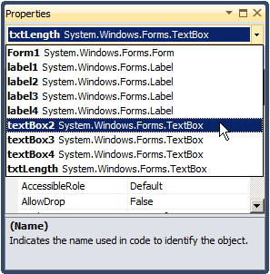
- In the Properties window, click (Name) and type TxtHeight
- In the same way, select textBox3 and change its Name to
TxtPerimeter
- Select textBox4 and change its Name to TxtArea
- Change the Text of each text box to 0.00
- Save all
Up to 2002, Microsoft Windows programmers relied on a
library called Win32 to create applications for the operating system. The
Win32 library was the only resource of classes (in fact structures),
functions, etc, that gave functional instructions to the operating system.
The other languages such as Pascal, Visual Basic, etc, used directly or
indirectly these resources in their own "dialect" to communicate with
Microsoft Windows. The Win32 library is still around (it can never disappear
unless the operating system changes completely) and serves as the platform
for Microsoft Windows programming. To harmonize programming for this
platform, Microsoft created the .NET Framework as a substitute library. This
is the library used in Microsoft Visual Studio .NET programming environment.
Most of the functionality of Win32 has been redefined in the .NET Framework.
The operations were implemented in various libraries or assemblies. Some
other operations, such as those related to the Registry, were kept in the
Microsoft.Win32 namespace.
The Win32 library uses a concept called handle to
represent each object of an application. A handle in Win32 is simply an
unsigned integer used in place of a control. The new .NET Framework also
uses handles to internally represent controls but defines a handle as a
pointer to an integer. Based on this, every control has a handle. You have a
choice of using it or not but it exists. The handle is created by the
operating system when the application comes up. This means that you don't
need to create it but you can access it to retrieve its value.
To access the handle to a control, you can call its
Handle property. In the .NET Framework, the Handle property is
defined as an IntPtr value. To retrieve the handle of a control, you
can access its Handle property.
|
The Textual Characteristics of a Control
|
|
Some controls are text-based, meaning they are meant to
display or sometimes request text from the user. For such controls, this
text is referred to as caption while it is simply called text for some other
controls. This property is not available for all controls.
If a control displays text, then it has a property
called Text. After adding such a control to a form, in some cases,
its Text field in the Properties window would hold the same text as
its name. In some other cases, the Text property would be empty.
At design time, to change the text of the control, in
its Properties window, click its Text field and type the desired
value. For most controls, there are no strict rules to follow for this text.
Therefore, it is your responsibility to type the right value.
The text provided in a Text field of a text-based
control can only be set "as is" at design time. To programmatically specify
or change the text of a control, assign a value to its Text property.
If you want the text to change while the application is
running, you can format it. For example, such a control can display the
current time or the name of the user who is logged in. These format
attributes cannot be set at design time. To change the text of a text-based
control at run time, either assign a simple string or provide a formatted
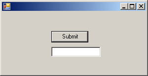
string to the Text property. Here is an example:
Imports System
Imports System.Windows.Forms

Module Exercise

    Public Class WinControls
        Inherits Form

        Private BtnSubmit As Button

        Dim components As System.ComponentModel.Container

        Public Sub New()
            InitializeComponent()
        End Sub

        Public Sub InitializeComponent()
            BtnSubmit = New Button()

            BtnSubmit.Text = "Submit"

            Controls.Add(BtnSubmit)
        End Sub

        Public Shared Function Main() As Integer

            Application.Run(New WinControls())
            Return 0

        End Function

    End Class

End Module
|
Practical
Learning: Setting Controls Text
|
|
- On the form, click Label1
- In the Properties window, click Text and type Length:
- On the form, click Label2 and type Height:
- On the form, click Label3 and type Perim:
- On the form, click Label4 and type Area:
- On the form, click Perim:
- In the Properties window, in the Text field, click between m and :
then type eter to produce Perimeter:
In the previous lesson, we saw how you could visually
change the size of a control. In reality, many pre-requisites must be met
and many options are available. After adding a control to a form, we saw
that it would be surrounded by 8 small squares In reality, this is not true
for all controls.
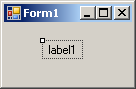
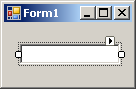
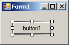
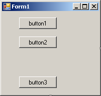
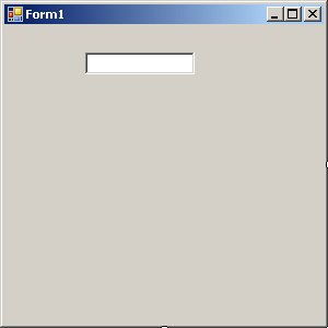
Notice that some controls, such as the label, display
one square handle. Some other controls, such as the text box, display 2
square handles. And then some controls display 8 square handles:
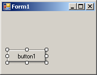
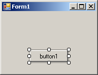
- The presence of the single square button indicates that the control
can only be moved: it cannot be resized (at that time)
- Besides the possibility of moving it, the presence of only two
square handles indicates that the control can only be enlarged or
narrowed: it cannot be heightened or shrunk
- The presence of the 8 square handles means that the control's size
can be changed in all 8 directions
Many controls (not all), such as the Label
 ,
are configured to resize themselves as you provide a string to their Text
field in the Properties window. If you type a long string, the control would
be made large enough to show the whole text. Some other controls, such as
the Button ,
are configured to resize themselves as you provide a string to their Text
field in the Properties window. If you type a long string, the control would
be made large enough to show the whole text. Some other controls, such as
the Button
 ,
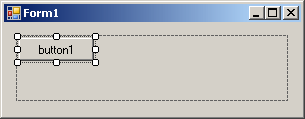
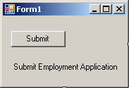
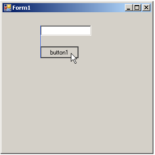
will not resize themselves if their text is too long. On the following form,
both the button and the label received the same text but, while the label
shows the whole string, the button can only show the length that its width
can afford: ,
will not resize themselves if their text is too long. On the following form,
both the button and the label received the same text but, while the label
shows the whole string, the button can only show the length that its width
can afford:
The ability of a control to enlarge itself to
accommodate its long is controlled by a Boolean property named AutoSize.
For some controls, the default value of this property is False. For
some other controls, this property is defaulted to True. Therefore,
use this property to control whether a control on the form can be resized or
not.
To programmatically specify the auto-sizing option of a
control, access its AutoSize property and assign it the desired
Boolean value. Here is an example:
Public Sub InitializeComponent()
    BtnSubmit = New Button()
    BtnSubmit.Text = "Submit"

    BtnSubmit.AutoSize = True

    Controls.Add(BtnSubmit)
End Sub
|
The Location of a Control
|
|
A control can be visually represented on the screen by a
geometric point on a coordinate system. A point is a pixel on the monitor
screen, on a form, or on any object of your application. A point is
represented by its coordinates with regard to the object that "owns" the
point:
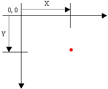
To identify the concept of a point, the
System.Drawing namespace provides the Point structure. One of the
properties of the Point structure is X, which represents the
horizontal distance of the point from the top-left corner of the object that
owns the point. Another property, Y, represents the vertical measurement of
the point with regards to the top-left corner of the object that owns the
point.
|
Introduction to the Location
|
|
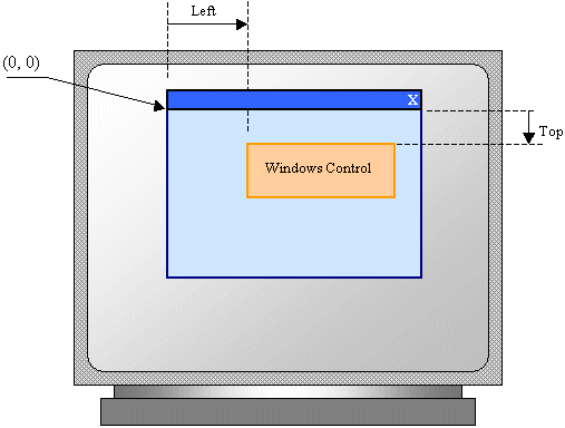
The controls added to a parent window are confined to
the area of the body offered by that window. After adding it to a window,
the control is positioned in the body of the parent using a Cartesian
coordinate system whose origin is located on the top-left corner of the
parent window. If the parent is a form, the origin is located just under the
title bar to the left. The horizontal measurements move from the origin to
the right. The vertical measurements move from the origin to the bottom.
In the previous lesson, we saw how to position a control
on a form. The position of a control on a form (or a container) is referred
to as its location. The location is defined by two values:
- The horizontal value of a location is the distance from the left
border of a form (or container) to the left border of a control
- The vertical value of a location is the distance from the top border
of a form (or container) to the top border of a control
The location of a Windows control can be illustrated as
follows:
The location of a control is programmatically specified
using a structure called Point. To identify the concept of a point,
the System.Drawing namespace provides the Point structure. The
Point structure is defined in the System.Drawing.dll. Therefore, if
you want to use a Point object in your application, include that
assembly in your application:

After adding the reference, you can access the Point
object. One of the properties of the Point structure is X, which
represents the horizontal distance of the point from the top-left corner of
the object that owns the point. Another property, Y, represents the vertical
measurement of the point with regards to the top-left corner of the object
that owns the point. Based on this, a Point object can be represented on the
Windows coordinate system as follows:
To visually specify the location of a control, access
its Properties window, and use the Location field:
- You can enter two numbers separated by a comma
- You can expand the Location field, click X and type a value; click Y
and type a value
|
Programmatically Locating a Control
|
|
You can programmatically specify the location of a
control. To support this, each control has a property named Location.
To assist you with specifying the location of a control, the Point class
provides a constructor as follows:
Public Sub New(x As Integer, y As Integer)
This constructor takes a left and a top arguments. Here
is an example of programmatically setting the location of a control:
Imports System
Imports System.Drawing
Imports System.Windows.Forms

Module Exercise

    Public Class WinControls
        Inherits Form

        Private BtnSubmit As Button

        Dim components As System.ComponentModel.Container

        Public Sub New()
            InitializeComponent()
        End Sub

        Public Sub InitializeComponent()
            BtnSubmit = New Button()
            BtnSubmit.Text = "Submit"

            BtnSubmit.Location = New Point(100, 40)

            Controls.Add(BtnSubmit)
        End Sub

        Public Shared Function Main() As Integer

            Application.Run(New WinControls())
            Return 0

        End Function

    End Class

End Module
You can also use an existing Point object and
assign it to the Location property of the control. Here is an
example:
Public Sub InitializeComponent()
            BtnSubmit = New Button()
            BtnSubmit.Text = "Submit"

            Dim pt As Point = New Point()
            pt.X = 100
            pt.Y = 40
            BtnSubmit.Location = pt

            Controls.Add(BtnSubmit)
End Sub
You can also retrieve the location of a control and
store it in a Point object. To do this, you can simply assign the
Location property of a control to a Point object.
Public Sub InitializeComponent()
            BtnSubmit = New Button()
            BtnSubmit.Text = "Submit"

            BtnSubmit.Location = New Point(100, 40)

            Dim pt As Point = BtnSubmit.Location

            Controls.Add(BtnSubmit)
End Sub
When studying control alignment, we saw that you could
use the location of one control as a reference to position another control.
You can also do this programmatically by retrieving the location of one
control and changing either its X or its Y values to position the new
control. Here is an example:
Imports System
Imports System.Drawing
Imports System.Windows.Forms

Module Exercise

    Public Class WinControls
        Inherits Form

        Private BtnSubmit As Button
        Dim TxtEmployeeName As TextBox

        Dim components As System.ComponentModel.Container

        Public Sub New()
            InitializeComponent()
        End Sub

        Public Sub InitializeComponent()
            Dim pt As Point

            BtnSubmit = New Button()
            BtnSubmit.Text = "Submit"
            BtnSubmit.Location = New Point(100, 40)

            TxtEmployeeName = New TextBox()

            pt = BtnSubmit.Location
            TxtEmployeeName.Location = New Point(pt.X, pt.Y + 32)

            Controls.Add(BtnSubmit)
            Controls.Add(TxtEmployeeName)
        End Sub

        Public Shared Function Main() As Integer

            Application.Run(New WinControls())
            Return 0

        End Function

    End Class

End Module
This would produce:
The Point structure provides other constructors
you can use for the location of a control.
|


 :
:
 :
:


