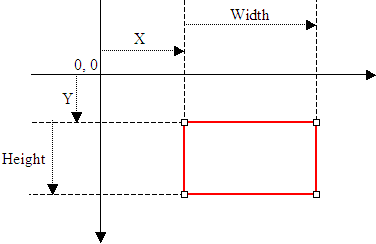
 Based on this, to create a Size object, if you know only its location (X and Y), you can use the following constructor: Public Sub New (pt As Point) After declaring a variable with this constructor, you can access its Width and Height properties to complete the definition of the Size object. If you already have the location of a Size object by other means, you may not be interested in (re)defining its location. In this case, you may only want to specify the dimensions of the variable. To do this, you can use the following constructor: Public Sub New(width As Integer, height As Integer) Besides Size, the System.Drawing namespace also provides the SizeF structure. It uses the same properties as Size except that its members float values. A rectangle is a geometric figure that has four sides. To support this figure, the System.Drawing namespace provides the Rectangle and the RectangleF structures. A rectangle can be represented as follows: 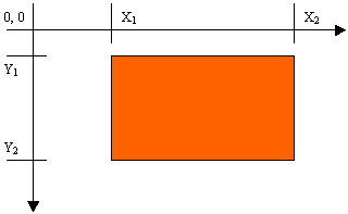 Like every geometric representation in your program, a rectangular figure is based on a coordinate system whose origin is located on a top-left corner. The object that "owns" or defines the rectangle also owns this origin. For example, if the rectangle belongs to a control that is positioned on a form, then the origin is on the top-left corner just under the title bar of the form, provided the form has a title bar. To completely represent it, a rectangle is defined by its location and its dimensions. The location is defined by a point on the top-left corner of the rectangle. The distance from the left border of the object that owns the rectangle to the left border of the rectangle is represented by a property called Left. The distance from the top border of the object that owns the rectangle to the top border of the rectangle is represented by a property called Top. The distance from the left to the right borders of the rectangle is represented by a property called Width. The distance from the left to the right borders of the rectangle is represented by a property called Height. The distance from the left border of the object that owns the rectangle to the right border of the rectangle is represented by a property called Right. The distance from the top border of the object that owns the rectangle to the bottom border of the rectangle is represented by a property called Bottom. Based on this, a rectangle can be illustrated as follows: 
To create a rectangle, you must provide at least its location and dimensions. The location can be represented by a Point value and the dimensions can be represented with a Size value. Based on this, you can use the following constructor to declare a Rectangle variable: Public Sub New(location As Point, size As Size) This constructor requires that you define a Point and a Size in order to use it. If instead you know the integer values of the location and dimensions, you can use the following constructor to declare a Rectangle object: Public Sub New(x As Integer, y As Integer, width As Integer, height As Integer) At any time, you can access or retrieve the characteristics of a Rectangle object as illustrated in the above picture from its properties. You use the same names we used in the picture. Besides the Rectangle structure, the System::Drawing namespace provides the RectangleF structure that uses the same definition as Rectangle, except that it is defined with float values instead of integers.
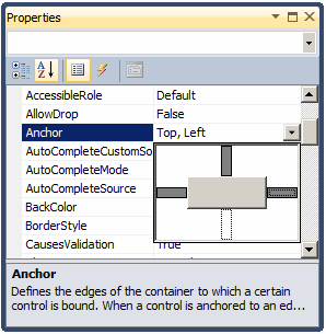
The distance from the left border to the right border of a control is referred to as its width property. In the same way, the distance from the top to the bottom borders of a control is its height value. This can be illustrated as follows: 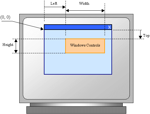 The combination of the width and the height of a control is referred to as its size. If you add a control to a form, it assumes a default size. To specify the size of a control during design, access its Properties window:
To support the size of an object, the System.Drawing namespace defines the Size structure. There are four characteristics that define a Size value: its location and its dimensions. A Size value must have a starting point (X, Y) just as the Point object was illustrated earlier. The width is the distance from the left to the right borders of a Size object. The height represents the distance from the top to the bottom borders of a Size value: To assist you with sizes, the Size structure provides the following constructor: Public Sub New(width As Integer, height As Integer) Using this constructor, to programmatically specify the size of a control, assign a Size value to its Size property. Here is an example: Imports System
Imports System.Drawing
Imports System.Windows.Forms
Module Exercise
Public Class WinControls
Inherits Form
Private BtnSubmit As Button
Dim components As System.ComponentModel.Container
Public Sub New()
InitializeComponent()
End Sub
Public Sub InitializeComponent()
Dim pt As Point
BtnSubmit = New Button()
BtnSubmit.Text = "Submit"
BtnSubmit.Location = New Point(100, 40)
BtnSubmit.Size = New Size(80, 32)
Controls.Add(BtnSubmit)
End Sub
Public Shared Function Main() As Integer
Application.Run(New WinControls())
Return 0
End Function
End Class
End Module
You can also define a Size object using a Point value. To support this, the Size structure is equipped with the following constructor: Public Sub New(pt As Point) After declaring a variable with this constructor, you can access its Width and Height properties to complete the definition of the Size object. If you already have the size of an object, you may only want to specify the dimensions of the variable. To do this, you can use the Besides the Size, the System.Drawing namespace also provides the SizeF structure. It uses the same properties as Size except that its members float types. To retrieve the dimensions of a control, you can get its Size property and assign it to a Size object.
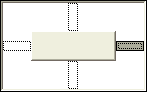
The combination of the location and size of an object is represented as a rectangle: a geometric figure with four sides. To support this figure, the System.Drawing namespace provides the Rectangle and the RectangleF structures. A rectangle can be represented as follows: Like every geometric representation in your program, a rectangular figure is based on a coordinate system whose origin is located on a top-left corner. The object that "owns" or defines the rectangle also owns this origin. For example, if the rectangle belongs to a control that is positioned on a form, then the origin is on the top-left corner just under the title bar of the form, provided the form has a title bar. To completely represent it, a rectangle is defined by its location and its dimensions. The location is defined by a point on the top-left corner of the rectangle. The distance from the left border of the object that owns the rectangle to the left border of the rectangle is represented by a property called Left. The distance from the top border of the object that owns the rectangle to the top border of the rectangle is represented by a property called Top. The distance from the left to the right borders of the rectangle is represented by a property called Width. The distance from the left to the right borders of the rectangle is represented by a property called Height. The distance from the left border of the object that owns the rectangle to the right border of the rectangle is represented by a property called Right. The distance from the top border of the object that owns the rectangle to the bottom border of the rectangle is represented by a property called Bottom. Based on this, a rectangle can be illustrated as follows:
To create a rectangle, you must provide at least its location and dimensions. The location can be represented by a Point value and the dimensions can be represented with a Size value. Based on this, you can use the following constructor to declare a Rectangle variable: Public Sub New(location As Point, size As Size) This constructor requires that you define a Point and a Size in order to use it. If instead you know the integer values of the location and dimensions, you can use the following constructor to declare a Rectangle object: Public Sub New(x As Integer, y As Integer, width As Integer, height As Integer) At any time, you can access or retrieve the characteristics of a Rectangle object as illustrated in the above picture from its properties. You use the same names we used in the picture. Besides the Rectangle structure, the System.Drawing namespace provides the RectangleF structure that uses the same definition as Rectangle, except that it is defined with float values instead of integers. The be able to recognize the location and the size of a control, the Control class is equipped with a property named Bounds. This property is of type Rectangle represented by the property. Therefore, at any time, to get the location and the size of a control, you can call its Bounds property, which produces a Rectangle value.
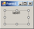
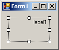
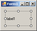
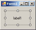
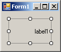
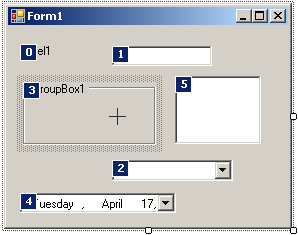
All graphical controls, including the form, can be resized using guiding mouse cursors or the keyboard. To resize a control, first select it. Except for the form, whenever a control is selected, there are eight handles around it. To resize the control, position your mouse on one of the handles. The mouse pointer will change, indicating in what direction you can move to resize the control.
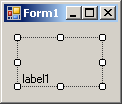
To narrow a control:
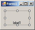
To heighten a control:
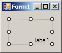
To shrink a control:
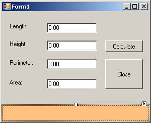
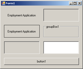
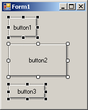
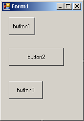
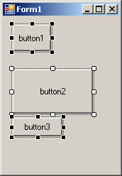
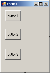
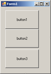
Imagine you have added three controls to your form and, after spending some time designing them, they appear as follows: 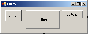 The dimensions of the controls are not set professionally. As seen above, you can resize by dragging their borders but this might take a while if you want them to have the same width, the same height, or both the same height and width. The dimensions of a control or a group of controls are carried by a Size value. At design time, to change the dimensions of a control, first click it. Then, in the Properties window, change the values of its Size property. To change the dimensions of a group of controls, first select them. Then, in the Properties window, change the values of the Size field. The new value would be applied to all selected controls. Alternatively, the Form Designer provides tools to automatically do this for you. To synchronize the widths of a group of controls, first select them. Then, on the Layout toolbar or on the Format group of the main menu, select:
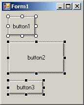
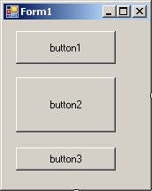
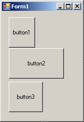
Result: All controls, except for the base control (the control that has the dark handles), will be resized horizontally so they have the same width as the base control:
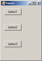
To set the same height to a group of controls, first select them. Then, on the Layout toolbar or on the Format group of the main menu, select:
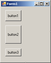
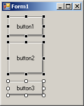
Result: All controls, except for the base control (the control that has the dark handles), will be resized vertically so they have the same height as the base control:
To set the same width and the same height to a group of controls, first select them. Then, on the Layout toolbar or on the Format group of the main menu, select:
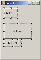
Result: The Form Designer will calculate the sum of the heights of all controls and find their average height (AvgHeight). It will also calculate the sum of the widths of all controls and find their average width (AvgWidth). These averages will be applied to the height and the width respectively of each control:
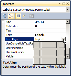
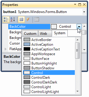
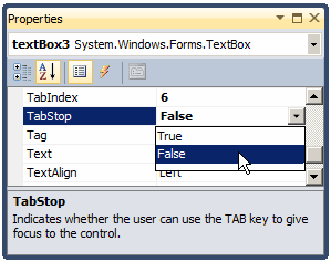
When a control can be resized, or it has been configured to be sizable, as it would be the case for a label or a button, you can specify in what part of its confined borders the text should display. This characteristics is controlled by the TextAlign property. To specify the alignment of text during design, access the Properties window for a control and use the TextAlign field:
The TextAlign property is of type ContentAlignment, which is an enumeration. The members and result of this enumeration are:
To programmatically specify the text alignment of a control, access its TextAlign property and assign it the desired member of the ContentAlignment enumeration. Here is an example: Imports System
Imports System.Drawing
Imports System.Windows.Forms
Module Exercise
Public Class WinControls
Inherits Form
Private BtnSubmit As Button
Dim components As System.ComponentModel.Container
Public Sub New()
InitializeComponent()
End Sub
Public Sub InitializeComponent()
BtnSubmit = New Button()
BtnSubmit.Text = "Submit"
BtnSubmit.Location = New Point(20, 20)
BtnSubmit.Size = New Size(100, 60)
BtnSubmit.TextAlign = ContentAlignment.BottomRight
Controls.Add(BtnSubmit)
End Sub
Public Shared Function Main() As Integer
Application.Run(New WinControls())
Return 0
End Function
End Class
End Module
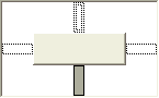
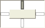
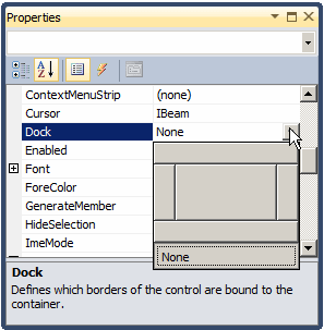
If you position a (visual) control on a form and if the control is positioned on the top left section of the form, when the user resizes the form, the control's position would appear static, it would not move. This could be a concern if the control is positioned on the right, the bottom or the lower right sections of the form. When the user resizes the form, the control's position would not be updated. Sometimes you will want the control to have the same location and/or distance with regard to the bottom, the right, and/or the lower right corners of the form. The ability to manage a control or a group of controls' location and size when the user resizes it is done using the Anchor property: 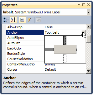 The Anchor property is created from the AnchorStyles enumeration. By default, when you add a control to a form, its position is relative to the top left corner of its container. You can also set the control's position with regards to its container's right and bottom borders. The Anchor property can be used to "glue" one border of a control to its parent using one of the following values: Bottom: The control bottom border will be the same even if the parent is heighten or shrunk
Left: The control left border will be the same even if the parent is widened or narrowed
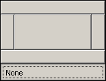
None: No anchoring is applied
Right: The control right border will be the same even if the parent is widened or narrowed
In the same way, you can combine AnchorStyles values to "glue" one or more corners of a control to its parent when the parent is resized:
|
|
|||||||||||||||||||||||||||||||||||||||||||||||||||||||||||||||||||||||||||||||||||||||||||||||||||||||||||||||||||||||||||||||||||||||||||
|
|
||||||||||||||||||||||||||||||||||||||||||||||||||||||||||||||||||||||||||||||||||||||||||||||||||||||||||||||||||||||||||||||||||||||||||||


 Practical
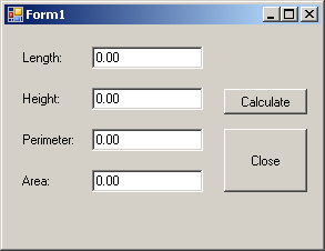
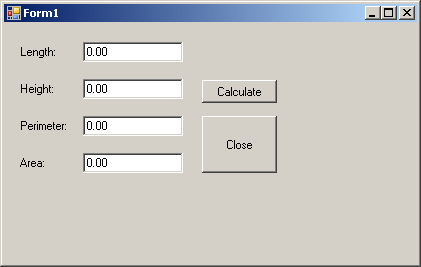
Learning: Setting the Locations and Sizes of Controls
Practical
Learning: Setting the Locations and Sizes of Controls