
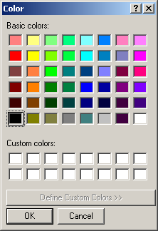
This displays a constant list of colors to the user. If none of the available colors is appropriate for the task at hand, the user can click the Define Custom Colors
>> button to expand the dialog box:

The expanded Color dialog box allows the user either to select one of the preset colors or to custom create a color by specifying its red, green, and blue values.
The user can change the color in four different areas. The top left section displays a list of 48 predefined colors. If the desired color is not in that section, the user can click and drag the mouse in the multi-colored palette. The user can also drag the right bar that displays a range based on the color of the palette; the user can scroll up and down by dragging the arrow. For more precision, the user can type the Red, Green and Blue values.
Each uses an integral value that ranges from 1 to 255.
|
Making a Color Dialog Box Available |
|
To provide the Color dialog box to your application, on the Toolbox, you can click the ColorDialog button and click anywhere on the form.
The Color dialog box is implemented through the ColorDialog class, which
is based on the CommonDialog class that is the ancestor to all Windows
common dialog boxes of the .NET Framework. To display the dialog box to the
user, call the CommonDialog::ShowDialog() method. Here is an example:
System::Void button1_Click(System::Object ^  sender,
			   System::EventArgs ^  e)
{
    this->colorDialog1->ShowDialog();
}
|
The Characteristics of the Color Dialog Box |
|
The most important and most obvious property of the Color dialog box is the selected color once the user has made a choice.
This selected color is represented by the ColorDialog::Color property.
When you are setting up a ColorDialog control for your application, if you want
to specify the default color, in the Properties windows,
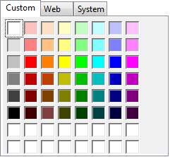
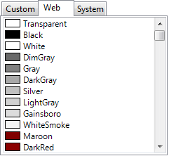
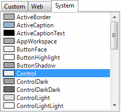
you can click the arrow of the Color property. This would give you the
option to select a color from three available tabs:
At run time, you can set the color programmatically by
assigning it a valid known name of a color:
System::Void Form1_Load(System::Object ^  sender,
			System::EventArgs ^  e)
{
    this->colorDialog1->Color = Color::Green;
}
When the user has finished using the Color dialog box and
clicks OK, you can find out what color was selected by retrieving the value of
the ColorDialog::Color property.
By default, the Color dialog box comes up in its regular
(small) size. This allows the user to select one of the preset colors. If the
desired color is not available, as mentioned already, the user can click the
Define Custom Colors >> button. If you want to control the user's ability
to expand the dialog box, use the Boolean AllowFullOpen property.
When this property is set to True, which is its default value, the dialog box
appears in its regular size but with the Define Custom Colors >> button
enabled. If you want the user to be able to select only one of the preset colors
and not have the ability to expand the dialog box, set the AllowFullOpen
property to False. With this value, when the Color dialog box comes up, it is in
its regular size but the Define Custom Colors >> button is disabled:
As mentioned already, by default, the Color dialog box
displays in its regular size. You can control the regular or full size of the dialog using the
Boolean FullOpen property. When its value is False, which is the default,
the dialog appears regularly. If you want it to appear in its full size, set
this property to True.
|