|
Introduction to Radio Buttons |
|
|
|
A radio button, sometimes called an option button, is a
circular control that comes in a group with other radio buttons. Each radio
button is made of a small empty circle O. From the group, when the user
clicks one of them, the radio button that was clicked becomes filled with a
big dot 8. When one of the radio buttons in
the group is selected and displays its dot, the others display empty
circles. To guide the user as to what the radio buttons mean, each is
accompanied by a label.
|
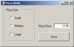
Here is an example of a form with three radio buttons:
Small, Medium, and Large:
To create a radio button, on the Toolbox, you can
click the RadioButton control
 .
To programmatically create a radio button, declare a variable of type
RadioButton, use the gcnew operator to allocation memory for it
and add it to the Controls collection of its parent. Because radio buttons
always come as a group, you should include them in another control that
visibly shows that the radio buttons belong together. The most common
control used for this purpose is the group box created using the GroupBox
control.
|
Characteristics of Radio Buttons
|
|
|
The Location of a Radio Button
|
|
Unlike most of other controls that can be positioned
anywhere, a radio button should not be placed directly on a form. Instead,
a radio button should be positioned in a container that belongs to a form.
The typical container is the group box. When a radio button is added to a
group box, the location of the radio button is relative to its parent.
This location is easy to specify if you are visually designing the
application. If you are programmatically creating it, make sure you
specify the location based on the control that will hold the radio button.
Here are examples:
#include <windows.h>

#using <System.dll>
#using <System.Drawing.dll>
#using <System.Windows.Forms.dll>

using namespace System;
using namespace System::Drawing;
using namespace System::Windows::Forms;

public ref class CExercise : public Form
{
private:
    RadioButton ^ radSmall;
    RadioButton ^ radMedium;
    RadioButton ^ radLarge;
    GroupBox    ^ grpPizzaSize;

public:
    CExercise()
    {
	InitializeComponent();
    }

private:
    void InitializeComponent()
    {
        grpPizzaSize = gcnew GroupBox;
        grpPizzaSize->Size = System::Drawing::Size(160, 120);
        grpPizzaSize->Location = Point(20, 10);

        radSmall = gcnew RadioButton;
        radSmall->Location = Point(20, 20);

        radMedium = gcnew RadioButton;
        radMedium->Location = Point(20, 50);

        radLarge = gcnew RadioButton;
        radLarge->Location = Point(20, 80);

        grpPizzaSize->Controls->Add(radSmall);
        grpPizzaSize->Controls->Add(radMedium);
        grpPizzaSize->Controls->Add(radLarge);

        Controls->Add(grpPizzaSize);
    }
};

[STAThread]
int APIENTRY WinMain(HINSTANCE hInstance,
		     HINSTANCE hPrevInstance,
		     LPSTR lpCmdLine,
		     int nCmdShow)
{
    Application::Run(gcnew CExercise);

    return 0;
}
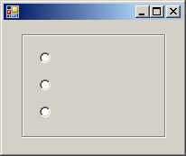
This would produce:
|
The Caption of a Radio Button
|
|
To indicate what a radio button represents, it is
accompanied by text, also referred to as its caption. To specify the
caption of a radio button at a design time, type a string in the Text
field of its Properties window. To programmatically specify the caption of
a radio button, assign a string to its Text property. Here are
examples:
void InitializeComponent()
{
        grpPizzaSize = gcnew GroupBox;
        grpPizzaSize->Text = "Pizza Size";
        grpPizzaSize->Size = System::Drawing::Size(160, 120);
        grpPizzaSize->Location = Point(20, 10);

        radSmall = gcnew RadioButton;
        radSmall->Text = "Small";
        radSmall->Location = Point(20, 20);

        radMedium = gcnew RadioButton;
        radMedium->Text = "Medium";
        radMedium->Location = Point(20, 50);

        radLarge = gcnew RadioButton;
        radLarge->Text = "Large";
        radLarge->Location = Point(20, 80);

        grpPizzaSize->Controls->Add(radSmall);
        grpPizzaSize->Controls->Add(radMedium);
        grpPizzaSize->Controls->Add(radLarge);

        Controls->Add(grpPizzaSize);
    }
}
This would produce:

|
 Practical Learning: Introducing Radio Buttons Practical Learning: Introducing Radio Buttons
|
|
The application we are going to create is used to
calculate the amount owed on a loan using the following formula:
 |
P = Principal |
| r = Annual (Interest) Rate |
| m = Number of Compounding Periods per Year |
| n = Total Number of Compounding Periods |
| A = Amount Earned After n periods |
- Start Microsoft Visual Studio
- To create a new application, on the main menu, click File -> New
Project
- In the middle list, click Windows Forms Application
- Change the Name to CompoundInterest1
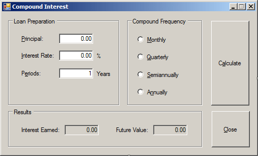
- Design the form as followed:
 |
| Control |
Name |
Text |
Additional Properties |
| GroupBox |
 |
|
Loan Setup |
|
| Label |
 |
|
Principal: |
|
| TextBox |
 |
txtPrincipal |
0.00 |
TextAlign: Right |
| Label |
 |
|
Interest Rate: |
|
| TextBox |
 |
txtInterestRate |
8.25 |
TextAlign: Right |
| Label |
 |
|
% |
|
| Label |
 |
|
Number of Periods: |
|
| TextBox |
 |
txtPeriods |
1 |
TextAlign: Text |
| Label |
 |
|
years |
|
| GroupBox |
 |
|
Compound Frequency |
|
| RadioButton |
 |
rdoMonthly |
Monthly |
|
| RadioButton |
 |
rdoQuarterly |
Quarterly |
|
| RadioButton |
 |
rdoSemiannually |
Semiannually |
|
| RadioButton |
 |
rdoAnnually |
Annually |
|
| GroupBox |
 |
|
Results |
|
| Label |
 |
|
Interest Earned: |
|
| TextBox |
 |
txtInterestEarned |
0.00 |
TextAlign: Right
ReadOnly: True |
| Label |
 |
|
Future Value: |
|
| TextBox |
 |
txtFutureValue |
0.00 |
TextAlign: Right
ReadOnly: True |
| Button |
 |
btnCalculate |
Calculate |
|
| Button |
 |
btnClose |
Close |
|
|
- On the form, double-click the Close button and implement its
OnClick() event as follows:
System::Void btnClose_Click(System::Object^  sender, System::EventArgs^  e)
{
	Close();
}
- To test the application, press F5
- Close the form and return to your programming environment
If you add only one radio button to a container, when
the application starts, the lone radio button would appear with an empty
round circle. If the user clicks that lone radio button, the radio
button's circle becomes filled with a dot and the user cannot remove or
change this aspect. If you equip a container with more than one radio
button, the user can click the desired one to select it and only one of
the radio buttons can be selected at a given time. The radio button that
is selected is referred to as checked. To support this description, the
RadioButton class is equipped with a property named Checked.
At design time, to select a radio button, in the
Properties window, set its Checked property to True. At run time, to
programmatically select a radio button, assign a true value to its
Checked property. To find out whether a particular radio button is
selected, get the value of its Checked property. You can also
programmatically check a radio button. Here is an example:
void InitializeComponent()
{
        grpPizzaSize = gcnew GroupBox;
        grpPizzaSize->Text = "Pizza Size";
        grpPizzaSize->Size = System::Drawing::Size(160, 120);
        grpPizzaSize->Location = Point(20, 10);

        radSmall = gcnew RadioButton;
        radSmall->Text = "Small";
        radSmall->Location = Point(20, 20);

        radMedium = gcnew RadioButton;
        radMedium->Text = "Medium";
        radMedium->Location = Point(20, 50);

        radLarge = gcnew RadioButton;
        radLarge->Text = "Large";
        radLarge->Location = Point(20, 80);

        grpPizzaSize->Controls->Add(radSmall);
        grpPizzaSize->Controls->Add(radMedium);
        grpPizzaSize->Controls->Add(radLarge);

        Controls->Add(grpPizzaSize);

	radMedium->Checked = true;
}
If the user clicks a radio button, since this control
is primarily a button, the radio button that was clicked in the group
fires a Click event. This is the most regularly used event of a
radio button. Normally, when the user clicks a button in the group, the
round box of that button becomes filled and the Click event is fired. If
the user clicks a button that is already checked, nothing changes in the
round box of that button but the Click event fires again. In some
cases, you may want to execute code only if the checked state of a button
has actually changed rather than being interested in whether the button
was clicked or not. Fortunately, if you are interested only when the
checked stated of a button is changed, you can use the CheckedChanged
event. This event is fired whenever the checked state of a button is
modified. Here is an example of implementing it:
System::Void rdoSmall_CheckedChanged(Object ^ sender, EventArgs ^ e)
{
        txtPizzaPrice->Text = "$8.75";
}
|
 Practical Learning: Using Radio Buttons Practical Learning: Using Radio Buttons
|
|
- Return to the form.
On the form, click Monthly
- In the Properties window, double-click Checked to set its value to
True
- On the form, double-click the Calculate button and implement its
Click() event as follows:
System::Void btnCalculate_Click(Object ^ sender, EventArgs ^ e)
{
    double principal = 0.00,
           interestRate = 0.00,
           interestEarned = 0.00;
    double futureValue = 0.00,
           ratePerPeriod = 0.00,
           periods = 0;
    int compoundType = 0;

    // Retrieve the value of the principal
    principal = double::Parse(txtPrincipal->Text);

    // Retrieve the interest rate
    interestRate = double::Parse(txtInterestRate->Text) / 100;

    // Find out what radio button was clicked
    // to apply the compound frequency
    if( rdoMonthly->Checked )
        compoundType = 12;
    else if( rdoQuarterly->Checked )
        compoundType = 4;
    else if( rdoSemiannually->Checked )
        compoundType = 2;
    else
        compoundType = 1;

    // Get the number of periods
    periods = double::Parse(txtPeriods->Text);

    // These values will make the calculation easier to read
    double i = interestRate / compoundType;
    double n = compoundType * periods;

    // Perform the necessary calculations
    ratePerPeriod = interestRate / periods;
    futureValue = principal * Math::Pow(1 + i, n);
    interestEarned = futureValue - principal;

    // Display the values in the appropriate text boxes
    txtInterestEarned->Text = interestEarned.ToString("C");
    txtFutureValue->Text = futureValue.ToString("C");
}
- Test the application
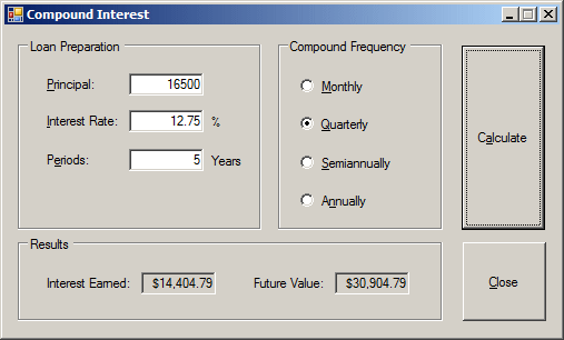
- After using it, close the form and return to your programming
environment
|
The Alignment of a Radio Button
|
|
By default, the round box of a radio button is
positioned to the left side of its accompanying label but you have many
options. Besides the left position, you can position the round box to the
top, the right, or the bottom etc side of its label. The position of the
round box with regards to its label is controlled by the CheckAlign
property which is a value of type ContentAlignment. To specify it
at design time, access the Properties window of the radio button and
select the desired value from the CheckAlign field. You can also change
this property programmatically. Here are examples:
void InitializeComponent()
{
        grpPizzaSize = gcnew GroupBox;
        grpPizzaSize->Text = "Pizza Size";
        grpPizzaSize->Size = System::Drawing::Size(160, 120);
        grpPizzaSize->Location = Point(20, 10);

        radSmall = gcnew RadioButton;
        radSmall->Text = "Small";
        radSmall->CheckAlign = ContentAlignment::TopCenter;
        radSmall->Location = Point(20, 20);

        radMedium = gcnew RadioButton;
        radMedium->Text = "Medium";
        radMedium->CheckAlign = ContentAlignment::TopCenter;
        radMedium->Location = Point(20, 50);

        radLarge = gcnew RadioButton;
        radLarge->Text = "Large";
        radLarge->CheckAlign = ContentAlignment::TopCenter;
        radLarge->Location = Point(20, 80);

        grpPizzaSize->Controls->Add(radSmall);
        grpPizzaSize->Controls->Add(radMedium);
        grpPizzaSize->Controls->Add(radLarge);

        Controls->Add(grpPizzaSize);
}
Besides the alignment of the check box, you can also
control the alignment of the text with regards to the bounding rectangle
of the control. This characteristic is controlled by the TextAlign
property of the RadioButton class. The TextAlign property
also is of type ContentAlignment.
|
The Appearance of a Radio Button
|
|
By default, a radio button appears as a rounded box
that gets filled with a big dot when the user selects it. Optionally, you
can make a radio button appear as a toggle button. Normally, if you make
one radio button appear as a button, you should apply the same
characteristics on the other radio buttons of the same group. The button
would appear as a rectangular object. When the user clicks such a button,
it appears down:
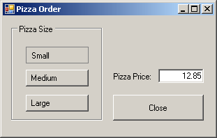
If the user clicks another button, this button becomes
up:
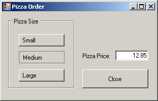
To change the appearance of a radio button, assign the
Button or Normal value to its Appearance property.
The Appearance property is based on the Appearance
enumeration. Here are examples:
void InitializeComponent()
{
        grpPizzaSize = gcnew GroupBox;
        grpPizzaSize->Text = "Pizza Size";
        grpPizzaSize->Size = System::Drawing::Size(150, 120);
        grpPizzaSize->Location = Point(20, 10);

        radSmall = gcnew RadioButton;
        radSmall->Appearance = Appearance::Button;
        radSmall->Location = Point(20, 20);

        radMedium = gcnew RadioButton;
        radMedium->Appearance = Appearance::Button;
        radMedium->Location = Point(20, 50);

        radLarge = gcnew RadioButton;
        radLarge->Appearance = Appearance::Button;
        radLarge->Location = Point(20, 80);

        grpPizzaSize->Controls->Add(radSmall);
        grpPizzaSize->Controls->Add(radMedium);
        grpPizzaSize->Controls->Add(radLarge);

        Controls->Add(grpPizzaSize);
}
This would produce:

As you can see, you can apply the Appearance property
to a radio button that does not have a caption. You can also use a
caption. If you do, make sure you align the caption to make is good to
see. Here are examples:
void InitializeComponent()
{
        grpPizzaSize = gcnew GroupBox;
        grpPizzaSize->Text = "Pizza Size";
        grpPizzaSize->Size = System::Drawing::Size(150, 120);
        grpPizzaSize->Location = Point(20, 10);

        radSmall = gcnew RadioButton;
        radSmall->Text = "Small";
        radSmall->Appearance = Appearance::Button;
        radSmall->TextAlign = ContentAlignment::MiddleCenter;
        radSmall->CheckAlign = ContentAlignment::MiddleCenter;
        radSmall->Location = Point(20, 20);

        radMedium = gcnew RadioButton;
        radMedium->Text = "Medium";
        radMedium->Appearance = Appearance::Button;
        radMedium->TextAlign = ContentAlignment::MiddleCenter;
        radMedium->CheckAlign = ContentAlignment::MiddleCenter;
        radMedium->Location = Point(20, 50);

        radLarge = gcnew RadioButton;
        radLarge->Text = "Large";
        radLarge->Appearance = Appearance::Button;
        radLarge->TextAlign = ContentAlignment::MiddleCenter;
        radLarge->CheckAlign = ContentAlignment::MiddleCenter;
        radLarge->Location = Point(20, 80);

        grpPizzaSize->Controls->Add(radSmall);
        grpPizzaSize->Controls->Add(radMedium);
        grpPizzaSize->Controls->Add(radLarge);

        Controls->Add(grpPizzaSize);
}
This would produce:
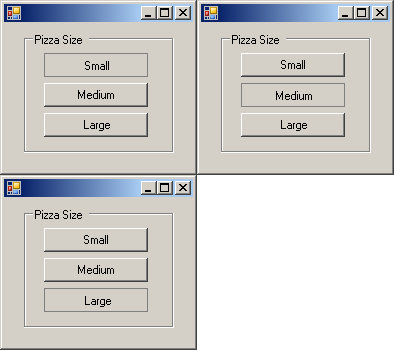
If you configure your application and give the user
the ability to change the appearance of the radio button from a round
circle to a rectangular object and vice-versa, and if the user decides to
change this appearance, when this is done, the control whose appearance
was changed fires an AppearanceChanged event. The
AppearanceChanged event is of type EventArgs, meaning that it
does not carry any significant information other than to let you know that
the appearance of the button was changed.