|
Microsoft Windows provides two other types of scroll
bars, considered complete controls in their own right. Like all other
controls, these ones must be explicitly created; that is, they are not added
automatically but they provide most of the same basic functionality as if
the operating system's automatically added the scroll bars.
|
Creating a Scroll Bar Control
|
|
To create a scroll bar control, on the Toolbox, you can
click either the VScrollBar or the HScrollBar button then click a container.
The scroll bar is one of the earliest controls of the Microsoft Windows
operating system. Each control is implemented through a class of the same
name. The VScrollBar and the HScrollBar classes are based on
the ScrollBar class that essentially provides all of their
functionalities.
|
 Practical Learning: Introducing Scroll Bar Controls Practical Learning: Introducing Scroll Bar Controls
|
|
- Start a new Windows Application named HTMLBodyTag1
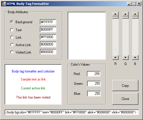
- Design the form as follows:
 |
| Control |
Name |
Text |
Other Properties |
| GroupBox |
 |
|
Body Attributes |
|
| RadioButton |
 |
rdoBackground |
Background |
Checked: True |
| TextBox |
 |
txtBackground |
#000000 |
|
| RadioButton |
 |
rdoText |
Text |
|
| TextBox |
 |
txtText |
#0000FF |
|
| RadioButton |
 |
rdoLink |
Link |
|
| TextBox |
 |
txtLink |
#FF0000 |
|
| RadioButton |
 |
rdoActiveLink |
Active Link |
|
| TextBox |
 |
txtActiveLink |
#008000 |
|
| RadioButton |
 |
rdoVisitedLink |
Visited Link |
|
| TextBox |
 |
txtVisitedLink |
#800000 |
|
| Panel |
 |
pnlPreview |
|
BackColor: White
BorderStyle: Fixed3D |
| VScrollBar |
 |
scrRed |
|
|
| VScrollBar |
 |
scrGreen |
|
|
| VScrollBar |
 |
scrBlue |
|
|
| Label |
 |
|
R |
|
| Label |
 |
|
G |
|
| Label |
 |
|
B |
|
| Panel |
 |
pnlBody |
|
BackColor: White
BorderStyle: Fixed3D |
| TextBox |
 |
txtTextPreview |
Body tag formatter and colorizer |
BorderStyle: None
ForeColor: Blue
TextAlign:
Center |
| TextBox |
 |
txtLinkPreview |
Sample text as link |
BorderStyle: None
ForeColor: Red
TextAlign:
Center |
| TextBox |
 |
txtALinkPreview |
Current active link |
BorderStyle: None
ForeColor: Green
TextAlign:
Center |
| TextBox |
 |
txtVLinkPreview |
This link has been visited |
BorderStyle: None
ForeColor: Maroon
TextAlign:
Center |
| GroupBox |
 |
|
Color's Values |
|
| Label |
 |
|
Red: |
|
| TextBox |
 |
txtRed |
0 |
|
| Label |
 |
|
Green: |
|
| TextBox |
 |
txtGreen |
0 |
|
| Label |
 |
|
Blue: |
|
| TextBox |
 |
txtBlue |
0 |
|
| Button |
 |
btnCopy |
Copy |
|
| Button |
 |
btnClose |
Close |
|
| TextBox |
 |
txtResult |
<body bgcolor="#FFFFFF"
text="#0000FF" link="#FF0000" alink="#008000"
vlink="#800000"> |
|
|
Characteristics of a Scroll Bar
|
|
|
The Minimum and Maximum Positions
|
|
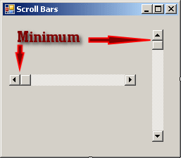
When using a scroll bar, the user can navigate from one
end of the control to the other end. These are the control’s minimum and
maximum values represented respectively by the Minimum and the
Maximum properties. For a horizontal scrollbar, the minimum is the far
left position that the bar can assume. For a vertical scrollbar, this would
be the most top position:

 |
As you can see from this illustration, the minimum value of a
vertical scroll bar is on top. This is the way the vertical scroll
bar control of the .NET Framework is configured. On a regular
application, the minimum of a vertical scroll is in the bottom
section of the control.
|
The maximum would be the opposite. By default, a newly
added scrollbar allows scrolling from 0 to 100. To change these values at
design time, type a natural number for each field in the Properties window.
|
 Practical Learning: Specifying the Minimum and Maximum Practical Learning: Specifying the Minimum and Maximum
|
|
- On the form, click one of the scroll bars
- Press and hold Ctrl
- Click the other two scroll bars and release Ctrl
- In the Properties window, click Maximum, type 255, and press
Enter
- Click an unoccupied area of the form to make sure no control is
selected
|
The Value of a Scroll Bar
|
|
The primary technique the user applies to a scrollbar is
to click one of the arrows at the ends of the control. As the bar slides
inside of the control, it assumes an integer position from Minimum to
Maximum. At one time, the position that the bar has is the Value
property. At design time, you can use the Value property to set the
position that the scrollbar would assume when the form opens. If you set the
Value to a value less than the Minimum, you would receive an
error of Invalid Property Value:

In the same way, if you set the value of Value to
a value higher than the Maximum, you would receive an Invalid Property Value
error. To programmatically set the position of the bar, assign the desired
value, which must be between Minimum and Maximum, to the
Value property.
At run time, when the user scrolls the control, you can
find the position of the bar by getting the value of the Value
property.
When the user clicks an arrow of a scrollbar, the bar
slides by one unit. This unit is represented by the SmallChange
property and is set to 1 by default. If you want the bar to slide more than
one unit, change the value of the SmallChange property to a natural
number between Minimum and Maximum. The higher the value, the
faster the sliding would occur because the bar would jump by SmallChange
units.
There are two main ways the user can scroll faster using
scrollbars: by pressing either page buttons or by clicking the scrolling
region. The amount covered using this technique is controlled by the
LargeChange property. Once again, the user can scroll only between
Minimum and Maximum. To find the scrolling amount, the compiler
would divide the actual scrolling range (the difference between Maximum
and Minimum) by the LargeChange value. When the user clicks in
the scrolling region or presses the Page Up or Page Down keys, the bar would
jump by LargeChange up to the scrolling amount value. You can also
change the LargeChange property programmatically.
|
 Practical Learning: Creating Scroll Bar Controls Practical Learning: Creating Scroll Bar Controls
|
|
- On the form, click one of the scroll bars
- Press and hold Ctrl
- Click the other two scroll bars and release Ctrl
- In the Properties window, click LargeChange, type 1, and
press Enter

- Right-click the form and click View Code
- Create a function as follows:
void ApplyColor()
{
    // Retrieve the current hexadecimal colors from their Edit controls
    HexBG = txtBackground->Text;
    HexText = txtText->Text;
    HexLink = txtLink->Text;
    HexALink = txtActiveLink->Text;
    HexVLink = txtVisitedLink->Text;

    // Get the integral position of each ScrollBar control
    String ^ strRed = Convert::ToString(255 - scrRed->Value);
    String ^ strGreen = Convert::ToString(255 - scrGreen->Value);
    String ^ strBlue = Convert::ToString(255 - scrBlue->Value);

    // Display the position of each ScrollBar
    // in its corresponding Edit control
    txtRed->Text = strRed;
    txtGreen->Text = strGreen;
    txtBlue->Text = strBlue;

    // Change the color of the Preview panel
    // according to the values of the ScrollBar positions
    pnlPreview->BackColor = Color::FromArgb(255 - scrRed->Value,
                                            255 - scrGreen->Value,
                                            255 - scrBlue->Value);

    String ^ FmtRed = (255 - scrRed->Value).ToString("X");
            if( FmtRed->Length == 1)
                FmtRed = String::Concat("0", FmtRed);

            String ^ FmtGreen = (255 - scrGreen->Value).ToString("X");
            if( FmtGreen->Length == 1)
                FmtGreen = String::Concat("0", FmtGreen);

            String ^ FmtBlue = (255 - scrBlue->Value).ToString("X");
            if( FmtBlue->Length == 1)
                FmtBlue = String::Concat("0", FmtBlue);

            // Get the position of each ScrollBar control
            // Create a hexadecimal color starting with #
            // And display the color in the appropriate Edit control
            if( rdoBackground->Checked == true)
            {
                String ^ BG = "#";
                BG = String::Concat(BG, FmtRed);
                BG = String::Concat(BG, FmtGreen);
                BG = String::Concat(BG, FmtBlue);

                txtBackground->Text = BG;
                pnlBody->BackColor = pnlPreview->BackColor;
                txtTextPreview->BackColor = pnlPreview->BackColor;
                txtLinkPreview->BackColor = pnlPreview->BackColor;
                txtALinkPreview->BackColor = pnlPreview->BackColor;
                txtVLinkPreview->BackColor = pnlPreview->BackColor;

                HexBG = txtBackground->Text;
            }
            else if( rdoText->Checked == true)
            {
                String ^ Txt = "#";
                Txt = String::Concat(Txt, FmtRed);
                Txt = String::Concat(Txt, FmtGreen);
                Txt = String::Concat(Txt, FmtBlue);

                txtText->Text = Txt;
                txtTextPreview->ForeColor = Color::FromArgb(255 - scrRed->Value,
                                                          255 - scrGreen->Value,
                                                          255 - scrBlue->Value);
                HexText = txtText->Text;
            }
            else if( rdoLink->Checked == true)
            {
                String ^ TL = "#";
                TL = String::Concat(TL, FmtRed);
                TL = String::Concat(TL, FmtGreen);
                TL = String::Concat(TL, FmtBlue);

                txtLink->Text = TL;
                txtLinkPreview->ForeColor = Color::FromArgb(255 - scrRed->Value,
                                                          255 - scrGreen->Value,
                                                          255 - scrBlue->Value);

                HexLink = txtLink->Text;
            }
            else if( rdoActiveLink->Checked == true)
            {
                String ^ AL = "#";
                AL = String::Concat(AL, FmtRed);
                AL = String::Concat(AL, FmtGreen);
                AL = String::Concat(AL, FmtBlue);

                txtActiveLink->Text = AL;
                txtALinkPreview->ForeColor = Color::FromArgb(255 - scrRed->Value,
                                                           255 - scrGreen->Value,
                                                           255 - scrBlue->Value);

                HexALink = txtActiveLink->Text;
            }
            else if( rdoVisitedLink->Checked == true)
            {
                String ^ VL = "#";
                VL = String::Concat(VL, FmtRed);
                VL = String::Concat(VL, FmtGreen);
                VL = String::Concat(VL, FmtBlue);

                txtVisitedLink->Text = VL;
                txtVLinkPreview->ForeColor = Color::FromArgb(255 - scrRed->Value,
                                                           255 - scrGreen->Value,
                                                           255 - scrBlue->Value);

                HexVLink = txtVisitedLink->Text;
    }

    // Update the contents of the bottom text box
    String ^ BD = "<body bgcolor=\"";
    BD = String::Concat(BD, HexBG);
    BD = String::Concat(BD, "\" text=\"");
    BD = String::Concat(BD, HexText);
    BD = String::Concat(BD, "\" link=\"");
    BD = String::Concat(BD, HexLink);
    BD = String::Concat(BD, "\" alink=\"");
    BD = String::Concat(BD, HexALink);
    BD = String::Concat(BD, "\" vlink=\"");
    BD = String::Concat(BD, HexVLink);
    BD = String::Concat(BD, "\">");

    txtResult->Text = BD;
}
- Return to the form and double-click the left scroll bar
- Implement its event as follows:
System::Void scrRed_Scroll(System::Object^  sender,
		System::Windows::Forms::ScrollEventArgs^  e)
{
    ApplyColor();
}
- Return to the form and double-click the middle scroll bar
- Implement its event as follows:
System::Void scrGreen_Scroll(System::Object^  sender,
			 System::Windows::Forms::ScrollEventArgs^  e)
{
      ApplyColor();
}
- Return to the form and double-click the right scroll bar
- Implement its event as follows:
System::Void scrBlue_Scroll(System::Object^  sender,
			    System::Windows::Forms::ScrollEventArgs^  e)
{
        ApplyColor();
}
- Execute the application to test the form
- Close the form and return to your programming environment
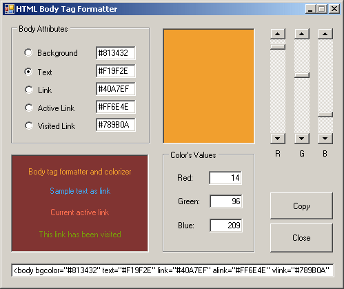
- When the user clicks a radio button from the Body Attributes group
box, we need to display its color on the Preview panel. When a
particular button is clicked, we will retrieve the color of its font
from the Body text box, translate that color into red, green, and blue
values, and then use those values to automatically update the scroll
bars and the edit boxes. While we are at it, we also need to update the
corresponding text box in the Body Attributes group box. Since this
functionality will be used by all radio buttons in the group, we will
use a global function to which we can pass two variables.
When the
user clicks a particular radio button, that button is represented by a
text box in the lower-left Body section. We need to get the color of
that edit box and pass it to our function. Since the clicked radio
button has a corresponding text box in the Body Attributes group box, we
need to change/update that value with the hexadecimal value of the first
argument. Therefore, we will pass a string argument to our function.
In the Code Editor, just after the closing curly bracket of the
scrBlue_Scroll event, create the following member function:
void ClickOption(System::Drawing::Color Clr, String ^ Result)
{
	// These variables will hold the red, green, and blue
	// values of the passed color
	int red, green, blue;

	// Colorize the Preview panel with the passed color
	pnlPreview->BackColor = Clr;

	// Get the red value of the color of the Preview panel
	red = 255 - pnlPreview->BackColor.R;
	// Get the green value of the color of the Preview panel
	green = 255 - pnlPreview->BackColor.G;
	// Get the blue value of the color of the Preview panel
	blue = 255 - pnlPreview->BackColor.B;

	// Now that we have the red, green, and blue values of the color,
	// Update the scroll bars with the new values
	scrRed->Value   = red;
	scrGreen->Value = green;
	scrBlue->Value  = blue;

	// Update the red, green, and blue values
	// of the Numeric Values group box
	txtRed->Text = red.ToString();
	txtGreen->Text = green.ToString();
	txtBlue->Text = blue.ToString();

	// Update the string that was passed using
	// the retrieved red, green, and blue values
	Result = String::Concat(Result, "#");
	Result = String::Concat(Result, red.ToString("X"));
	Result = String::Concat(Result, green.ToString("X"));
	Result = String::Concat(Result, blue.ToString("X"));
}
- Return to the form
- Double-click the Background radio button and implement its event as
follows:
System::Void rdoBackground_CheckedChanged(Object ^ sender, EventArgs ^ e)
{
            // If the user clicks Background radio button
            // set color of the panel to that of the radio button
            Color BGColor = pnlBody->BackColor;

            pnlBody->BackColor = BGColor;

            // Call the ClickOption() member function to calculate
            // the hexadecimal value of the color
            ClickOption(pnlBody->BackColor, txtBackground->Text);
            HexBG = txtBackground->Text;
}
- Return to the form
- Double-click the Text radio button and implement its event as
follows:
System::Void rdoText_CheckedChanged(Object ^ sender, EventArgs ^ e)
{
            Color BGColor = pnlBody->BackColor;
            txtTextPreview->BackColor = BGColor;

            ClickOption(txtTextPreview->ForeColor, txtText->Text);
            HexText = txtText->Text;
}
- Return to the form
- Double-click the Link radio button and implement its event as
follows:
System::Void rdoLink_CheckedChanged(Object ^ sender, EventArgs ^ e)
{
            Color BGColor = pnlBody->BackColor;
            txtLinkPreview->BackColor = BGColor;

            ClickOption(txtLinkPreview->ForeColor, txtLink->Text);
            HexLink = txtLink->Text;
}
- Return to the form
- Double-click the Active Link radio button and implement its event as
follows:
System::Void rdoActiveLink_CheckedChanged(Object ^ sender, EventArgs ^ e)
{
            Color BGColor = pnlBody->BackColor;
            txtALinkPreview->BackColor = BGColor;

            ClickOption(txtALinkPreview->ForeColor, txtActiveLink->Text);
            HexALink = txtActiveLink->Text;
}
- Return to the form
- Double-click the Visited Link radio button and implement its event
as follows:
System::Void rdoVisitedLink_CheckedChanged(Object ^ sender, EventArgs ^ e)
{
            Color BGColor = pnlBody->BackColor;
            txtVLinkPreview->BackColor = BGColor;

            ClickOption(txtVLinkPreview->ForeColor, txtVisitedLink->Text);
            HexVLink = txtVisitedLink->Text;
}
- Return to the form
- Double-click the Copy button and implement it as follows:
System::Void btnCopy_Click(Object ^ sender, EventArgs ^ e)
{
            txtResult->SelectAll();
            txtResult->Copy();
}
- Return to the form
- Double-click the Close button and implement it as follows:
System::Void btnClose_Click(Object ^ sender, EventArgs ^ e)
{
            Close();
}
- Execute the application

- Close the form
|
|
