|
Characteristics of a Track Bar
|
|
After placing a TrackBar control on a form or other
container, by default, its assumes a horizontal position. The position of
the track bar is controlled by Orientation property implemented
through the Orientation enumeration that has two members. To change
the direction of the control, on the Properties window, set the
Orientation property to the desired value. For example, to make it
vertical, change the field from Horizontal to Vertical. To
change this property at runtime, assign the desired value to the property.
Here is an example:
void InitializeComponent()
{
    tbrSlider = gcnew TrackBar;
    tbrSlider->Location = Point(12, 12);

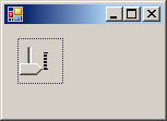
    tbrSlider->Orientation = Orientation::Vertical;

    Controls->Add(tbrSlider);
}
This would produce:

The dimensions of the track bars we have displayed so
far don't appear practical. This is because we were using the default
values. Like every control, the track bar has default dimensions and like
many controls, these default values are usually not suitable. This means
that every time you create a track bar, make sure you specify either its
Size property or its Width and its Height properties. Here
is an example:
void InitializeComponent()
{
    tbrSlider = gcnew TrackBar;
    tbrSlider->Location = Point(12, 12);
    tbrSlider->Width = 180;

    Controls->Add(tbrSlider);
}
This would produce:

|
 Practical Learning: Orienting a Track Bar Practical Learning: Orienting a Track Bar
|
|
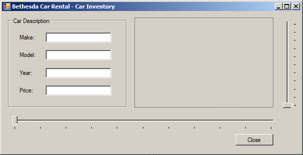
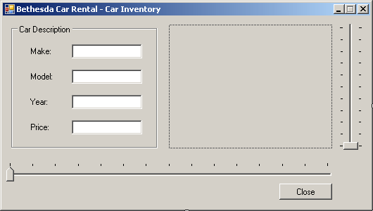
- Design the form as follows:
 |
| Control |
Text |
Name |
Additional Properties |
| GroupBox |
Car Description |
|
|
| Label |
Make: |
|
|
| TextBox |
Honda |
txtMake |
|
| Label |
Model: |
|
|
| TextBox |
|
txtModel |
|
| Label |
Year: |
|
|
| TextBox |
|
txtYear |
TextAlign: Right |
| Label |
Price: |
|
|
| TextBox |
|
txtPrice |
TextAlign: Right |
| PictureBox |
|
pbxCarImage |
SizeMode: CenterImage |
| TrackBar |
|
tbrImages |
Orientation: Vertical |
| TrackBar |
|
tbrReview |
|
| Button |
Close |
btnClose |
|
|
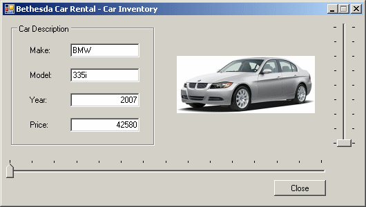
- Execute the application to test the form
- Close the form and return to your programming environment
As mentioned already, to use the track bar, the user
must change the position of the thumb. To change this position, the user can
drag the thumb, click the slider line, press one of the arrow keys, or press
the Page Up or Page Down keys. As the user drags the thumb, the control
fires a Scroll event. This event is of type EventArgs. Because
this is the default event of the control, to generate its skeleton code, you
can double-click the track bar on the control
When the user drags the thumb, the control holds a new
value known as the Value property. You also can assign a value to
this property to change the position of the thumb. The value of the Value
property must be an integer. After the user has changed it, to know the
value of the track bar, you can access its Value property. Here is an
example:
void InitializeComponent()
{
        tbrSlider = gcnew TrackBar;
        tbrSlider->Location = Point(12, 12);
        tbrSlider->Width = 180;

        tbrSlider->Value = 6;

        Controls->Add(tbrSlider);
}
This would produce:

|
 Practical Learning: Generating the Scroll Event Practical Learning: Generating the Scroll Event
|
|
- On the form, double-click the bottom track bar
- Return to the form and double-click the right track bar
- Return to the form
|
The Maximum and the Minimum Values
|
|
However the user moves the thumb, it must assume a value
between the limits allowed on the control. The Minimum property is
the lowest value that the thumb can assume within the track. The Maximum
value controls the opposite. The user is allowed to slide only between these
two values. These two properties are set in the Properties window using
their respective fields. By default, the minimum value is set to 0 and the
maximum is 10. To change the minimum or maximum values programmatically,
assign the desired value to the appropriate property. Here is an example:
void InitializeComponent()
{
        tbrSlider = gcnew TrackBar;
        tbrSlider->Location = Point(12, 12);
        tbrSlider->Width = 480;

        tbrSlider->Minimum = 8;
        tbrSlider->Maximum = 140;

        tbrSlider->Value = 86;

        Controls->Add(tbrSlider);
}
This would produce:

You can also set the minimum and the maximum values by
calling the TrackBar.SetRange() member function. Its syntax is:
public:
    void SetRange(int minimum, int maximum);
The first argument is the same as the Minimum
property and the second argument is the same as the Maximum property.
Here is an example:
void InitializeComponent()
{
        tbrSlider = gcnew TrackBar;
        tbrSlider->Location = Point(12, 12);
        tbrSlider->Width = 480;

        tbrSlider->SetRange(8, 140);

        tbrSlider->Value = 86;

        Controls->Add(tbrSlider);
}
Always make sure that the minimum value is lower than
the maximum. This safe measure will allow you to better control the current
value of the control. At design time, if you set the Minimum property
to a value higher than that of the Maximum, for example setting
Minimum to 66 while Maximum=10, the value of the Maximum
would be set to that of the Minimum. In this case, both properties
would have the same value. This makes the control unusable: if the
Minimum and the Maximum properties hold the same values, the user
cannot move the thumb. In the same way, at run time, avoid assigning
unpractical values to these properties.
A track bar is equipped with small bars �|� that serve
as indicators of the position occupied by the thumb. These bars are called
ticks. The ticks are positioned at same distances from each other. The
number of ticks available on a track bar, or the number of ticks you can
see, depend on the difference between the Minimum and the Maximum
values The higher the Maximum - Minimum difference, the more ticks
available. The lower this value, the fewer the ticks but this should not be
the reason you use a lower Minimum or a higher Maximum.
If the difference between the Maximum and the Minimum
properties causes the control to display too many ticks. Consider the
following example:
void InitializeComponent()
{
        tbrSlider = gcnew TrackBar;
        tbrSlider->Location = Point(12, 12);
        tbrSlider->Width = 400;
        tbrSlider->SetRange(8, 255);
        tbrSlider->Value = 125;

        Controls->Add(tbrSlider);
}

When this happens, you can reduce the number of ticks.
This is done using the TickFrequency property. Here is an example:
void InitializeComponent()
{
        tbrSlider = gcnew TrackBar;
        tbrSlider->Location = Point(12, 12);
        tbrSlider->Width = 400;
        tbrSlider->SetRange(8, 255);
        tbrSlider->Value = 125;

        tbrSlider->TickFrequency = 10;

        Controls->Add(tbrSlider);
}
This would produce:

The thumb�s visual display appears as a small standing
pentagon with two straight borders. Its appearance is set using the
TickStyle property which is based on the TickStyle enumeration.
When you add a new TrackBar control to a form, it is horizontally oriented,
the thumb points down, the tick marks are positioned under the sliding
field. In this setting, the TickStyle property is set to
BottomRight. To place the tick marks above the sliding field, change the
value of the TickStyle property to TopLeft; this also has the
effect of reversing the direction of the slider. Here is an example:
void InitializeComponent()
{
        tbrSlider = gcnew TrackBar;
        tbrSlider->Location = Point(12, 12);
        tbrSlider->Width = 400;
        tbrSlider->SetRange(8, 255);
        tbrSlider->Value = 125;
        tbrSlider->TickFrequency = 10;

        tbrSlider->TickStyle = TickStyle::TopLeft;

        Controls->Add(tbrSlider);
}
This would produce:

As a third option, you can have the tick marks on both
sides of the slider. To get this, set the TickStyle property to
Both. With this value, the thumb becomes a small rectangle (changing
from its pentagon shape):

|
 Practical Learning: Setting the Tick Style Practical Learning: Setting the Tick Style
|
|
- On the form, click the right track bar
- In the Properties window, click TickStyle and select Both from its
combo box
- On the form, click the bottom track bar
- In the Properties window, click TickStyle and select TopLeft from
its combo box

When the user presses one of the arrow keys, the thumb
moves by one tick. This unit is known as the SmallChange property. If
you want the thumb to move by more than one tick, you can assign the desired
value to this property. Alternatively, you can calculate a fraction of the
difference between the Minimum and the Maximum values then use
it as the SmallChange.
When the user presses either the Page Up (PgUp) or the
Page Down (PgDn) keys, the thumb moves by a value represented by the
LargeChange property. If the default value of this property is not
convenient for your application, you can change it to a new desired value or
you can use a fraction of the difference between the Minimum and the
Maximum properties then use it as the LargeChange.
|
 Practical Learning: Using a Track Bar Practical Learning: Using a Track Bar
|
|
- Double-click an unoccupied of the form
- Return to the form and double-click the Close button
- Change the file as follows:
System::Void tbrReview_Scroll(System::Object^  sender, System::EventArgs^  e)
{
	// Get the index of the current value of the track bar
    ReviewPosition = tbrReview->Value;

    // Based on the current index, retrieve the values of the
    // current car and assign each to the corresponding control
    txtMake->Text = Cars[ReviewPosition]->Make;
    txtModel->Text = Cars[ReviewPosition]->Model;
    txtYear->Text = Cars[ReviewPosition]->Year.ToString();
    txtPrice->Text = Cars[ReviewPosition]->Price.ToString();
    pbxCarImage->Image = Image::FromFile(Cars[ReviewPosition]->Picture);

    // To make the right track bar aware of the number
    // of pictures of each car, set its maximum property
    // according to the number of pictures (- 1)
    switch (ReviewPosition)
    {
        case 0:
            tbrImages->Maximum = 8;
            break;
        case 1:
            tbrImages->Maximum = 5;
            break;
        case 2:
            tbrImages->Maximum = 3;
            break;
        case 3:
            tbrImages->Maximum = 0;
            break;
        case 4:
            tbrImages->Maximum = 3;
            break;
        case 5:
            tbrImages->Maximum = 3;
            break;
        case 6:
            tbrImages->Maximum = 3;
            break;
        case 7:
            tbrImages->Maximum = 0;
            break;
        case 8:
            tbrImages->Maximum = 0;
            break;
        case 9:
            tbrImages->Maximum = 0;
            break;
        case 10:
            tbrImages->Maximum = 3;
            break;
        case 11:
            tbrImages->Maximum = 4;
            break;
        case 12:
            tbrImages->Maximum = 0;
            break;
        case 13:
            tbrImages->Maximum = 7;
            break;
        case 14:
            tbrImages->Maximum = 1;
            break;
        default:
            break;
    }

    tbrImages->Value = 0;
}

System::Void tbrImages_Scroll(System::Object^  sender, System::EventArgs^  e)
{
	// Check the position of the bottom track bar
    // Then, use the value of the right track bar
    // to locate the right picture
    switch (ReviewPosition)
    {
        case 0:
            pbxCarImage->Image = Image::FromFile(pictures0[tbrImages->Value]);
            break;
        case 1:
            pbxCarImage->Image = Image::FromFile(pictures1[tbrImages->Value]);
            break;
        case 2:
            pbxCarImage->Image = Image::FromFile(pictures2[tbrImages->Value]);
            break;
        case 4:
            pbxCarImage->Image = Image::FromFile(pictures4[tbrImages->Value]);
            break;
        case 5:
            pbxCarImage->Image = Image::FromFile(pictures5[tbrImages->Value]);
            break;
        case 6:
            pbxCarImage->Image = Image::FromFile(pictures6[tbrImages->Value]);
            break;
        case 10:
            pbxCarImage->Image = Image::FromFile(pictures10[tbrImages->Value]);
            break;
        case 11:
            pbxCarImage->Image = Image::FromFile(pictures11[tbrImages->Value]);
            break;
        case 13:
            pbxCarImage->Image = Image::FromFile(pictures13[tbrImages->Value]);
            break;
        case 14:
            pbxCarImage->Image = Image::FromFile(pictures14[tbrImages->Value]);
            break;
        default:
            break;
    }
}

System::Void Form1_Load(System::Object^  sender, System::EventArgs^  e)
{
    Cars = gcnew array<CCar ^>(15);

    pictures1  = gcnew array<String ^>(5);
    pictures2  = gcnew array<String ^>(3);
    pictures4  = gcnew array<String ^>(3);
    pictures5  = gcnew array<String ^>(3);
    pictures6  = gcnew array<String ^>(3);
    pictures10 = gcnew array<String ^>(3);
    pictures11 = gcnew array<String ^>(4);
    pictures13 = gcnew array<String ^>(7);
    pictures14 = gcnew array<String ^>(2);

    // Create the list of cars
    Cars[0] = gcnew CCar;
    Cars[0]->Make = "BMW";
    Cars[0]->Model = "335i";
    Cars[0]->Year = 2007;
    Cars[0]->Price = 42580;
    Cars[0]->Picture = "335iA.gif";

    Cars[1] = gcnew CCar;
    Cars[1]->Make = "Honda";
    Cars[1]->Model = "Accord";
    Cars[1]->Year = 2007;
    Cars[1]->Price = 24550;
    Cars[1]->Picture = "Accord1.gif";

    Cars[2] = gcnew CCar;
    Cars[2]->Make = "Chevrolet";
    Cars[2]->Model = "Avalanche";
    Cars[2]->Year = 2007;
    Cars[2]->Price = 36880;
    Cars[2]->Picture = "Avalanche1.gif";

    Cars[3] = gcnew CCar;
    Cars[3]->Make = "Volvo";
    Cars[3]->Model = "C70";
    Cars[3]->Year = 1997;
    Cars[3]->Price = 42320;
    Cars[3]->Picture = "C70.gif";

    Cars[4] = gcnew CCar;
    Cars[4]->Make = "Land Rover";
    Cars[4]->Model = "LR3";
    Cars[4]->Year = 2007;
    Cars[4]->Price = 46245;
    Cars[4]->Picture = "LR3a.gif";

    Cars[5] = gcnew CCar;
    Cars[5]->Make = "Honda";
    Cars[5]->Model = "Civic";
    Cars[5]->Year = 2000;
    Cars[5]->Price = 22665;
    Cars[5]->Picture = "Civic1.gif";

    Cars[6] = gcnew CCar;
    Cars[6]->Make = "Mazda";
    Cars[6]->Model = "Mazda5";
    Cars[6]->Year = 2007;
    Cars[6]->Price = 20845;
    Cars[6]->Picture = "Mazda5a.gif";

    Cars[7] = gcnew CCar;
    Cars[7]->Make = "Ford";
    Cars[7]->Model = "Escape";
    Cars[7]->Year = 1997;
    Cars[7]->Price = 22445;
    Cars[7]->Picture = "Escape.gif";

    Cars[8] = gcnew CCar;
    Cars[8]->Make = "Acura";
    Cars[8]->Model = "TSX";
    Cars[8]->Year = 2006;
    Cars[8]->Price = 26445;
    Cars[8]->Picture = "TSX.gif";

    Cars[9] = gcnew CCar;
    Cars[9]->Make = "Mazda";
    Cars[9]->Model = "Miata";
    Cars[9]->Year = 2008;
    Cars[9]->Price = 24180;
    Cars[9]->Picture = "Miata.gif";

    Cars[10] = gcnew CCar;
    Cars[10]->Make = "Ford";
    Cars[10]->Model = "F-150";
    Cars[10]->Year = 2006;
    Cars[10]->Price = 20475;
    Cars[10]->Picture = "F150a.gif";

    Cars[11] = gcnew CCar;
    Cars[11]->Make = "Volvo";
    Cars[11]->Model = "S40";
    Cars[11]->Year = 2008;
    Cars[11]->Price = 25285;
    Cars[11]->Picture = "S40a.gif";

    Cars[12] = gcnew CCar;
    Cars[12]->Make = "BMW";
    Cars[12]->Model = "750i";
    Cars[12]->Year = 2007;
    Cars[12]->Price = 88925;
    Cars[12]->Picture = "750Li.gif";

    Cars[13] = gcnew CCar;
    Cars[13]->Make = "Buick";
    Cars[13]->Model = "LaCrosse";
    Cars[13]->Year = 2002;
    Cars[13]->Price = 28685;
    Cars[13]->Picture = "LaCrosse1.gif";

    Cars[14] = gcnew CCar;
    Cars[14]->Make = "Ford";
    Cars[14]->Model = "E-150 XL";
    Cars[14]->Year = 2002;
    Cars[14]->Price = 26660;
    Cars[14]->Picture = "E150XLa.gif";

    // Create the list of pictures for each car
    pictures0 = gcnew array<String ^>(9);
    pictures0[0] = "335iA.gif"; pictures0[1] = "335iB.gif";
    pictures0[2] = "335iC.gif"; pictures0[3] = "335iD.gif";
    pictures0[4] = "335iE.gif"; pictures0[5] = "335iF.gif";
    pictures0[6] = "335iG.gif"; pictures0[7] = "335iH.gif";
    pictures0[8] = "335iI.gif";

    pictures1 = gcnew array<String ^>(6);
    pictures1[0] = "Accord1.gif"; pictures1[1] = "Accord2.gif";
    pictures1[2] = "Accord3.gif"; pictures1[3] = "Accord4.gif";
    pictures1[4] = "Accord5.gif"; pictures1[5] =  "Accord6.gif";

    pictures2 = gcnew array<String ^>(4)
    {
        "Avalanche1.gif", "Avalanche2.gif",
        "Avalanche3.gif", "Avalanche4.gif"
    };

    pictures4 = gcnew array<String ^>(4)
    {
        "LR3a.gif", "LR3b.gif", "LR3b.gif", "LR3d.gif"
    };

    pictures5 = gcnew array<String ^>(4)
    {
        "Civic1.gif", "Civic2.gif", "Civic3.gif", "Civic4.gif"
    };

    pictures6 = gcnew array<String ^>(4)
    {
        "Mazda5a.gif", "Mazda5b.gif", "Mazda5c.gif", "Mazda5d.gif"
    };

    pictures10 = gcnew array<String ^>(4)
    {
        "F150a.gif", "F150b.gif", "F150c.gif", "F150d.gif"
    };

    pictures11 = gcnew array<String ^>(5)
    {
        "S40a.gif", "S40b.gif", "S40c.gif", "S40d.gif", "S40e.gif"
    };

    pictures13 = gcnew array<String ^>(8)
    {
        "LaCrosse1.gif", "LaCrosse2.gif", "LaCrosse3.gif",
        "LaCrosse4.gif", "LaCrosse5.gif", "LaCrosse6.gif",
        "LaCrosse7.gif", "LaCrosse8.gif"
    };

    pictures14 = gcnew array<String ^>(2)
    {
        "E150XLa.gif", "E150XLb.gif"
    };

    // Call the Scroll event of the bottom track bar
    // as if it had been scrolled
    tbrReview_Scroll(sender, e);
}
- Return to the form and double-click the Close button
- Implement the event as follows:
System::Void btnClose_Click(System::Object^  sender, System::EventArgs^  e)
{
    Close();
}
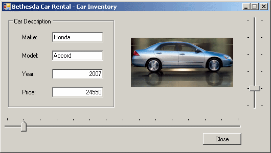
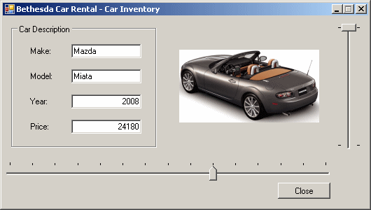
- Execute the application and test the track bar:
- Close the form and return to your programming environment
|
|
