Controls Containers
 |
Controls Containers |
The Form |
|
The form, implying the dialog box, is the primary object used to host, hold, or carry other controls of the application. Since we have had a thorough review of forms and dialog boxes already, we will not spend any more time on them. |
The Panel Control |
|
Introduction |
|
A panel is a visible rectangular object that can provide two valuable services for application design. A panel allows you to design good-looking forms by adjusting colors and other properties. A panel is also a regularly used control container because it holds and carries controls placed on it. When a panel moves, it does so with the controls placed on it. When a panel is visible, the controls placed on it can be visible too, unless they have their own visibility removed. When a panel is hidden, its child controls are hidden too, regardless of their own visibility status. This property also applies to the availability. Panels are not transparent. Therefore, their color can be changed to control their background display. A panel is a complete control with properties, methods, and events. |
|
Characteristics of a Panel |
|
Unlike the form, during design, a panel must primarily be positioned on another container which would be a
form or another panel. To add a panel to a container, you can click the Panel
button from the Toolbox and click in the desired location on the container.
A panel can be used as a button, in which case the user would click it to initiate an action. |
|
Property Sheets and Property Pages |
|
Overview |
|
As your application becomes crowded with various controls, you may find yourself running out of space. To solve such a problem, you can create many controls on a form or container and display some of them only in response to some action from the user. The alternative is to group controls in various containers and specify when the controls hosted by a particular container must be displayed. This is the idea behind the concept of property
pages.
In most other cases, a property page appears in a group with other pages. It functions like a group of pieces of paper placed on top of each
other:
To use a property page, the user clicks the header, also called a tab, of the desired page. This brings that page up and sends the others in the background:
If the user needs access to another page, he or she can click the desired tab, which would bring that page in front and send the previously selected to the back. The pages are grouped and hosted by an object called a property sheet. Like a form, the pages of a property sheet are simply used to carry or hold other controls. The major idea of using a property sheet is its ability to have many controls available in a relatively smaller container. |
|
Property Sheet Creation |
|
Property pages of a property sheet are also referred to as tab controls. In a .Net application, a property sheet is created using the TabControl control or class which serves as the property sheet. To implement a property sheet in your application, on the Toolbox, you can click the TabControl button and click in the form that would be used as the property sheet's platform. To create or add the actual property pages of the property sheet,
If you have added a page by mistake or you don't want a particular page anymore, you can remove it. To remove a property page, first click its tab to select it. Then,
Many of the effects you will need on pages have to be set on the TabControl and not on individual pages. This means that, to manage the characteristics of pages, you will change the properties of the parent TabControl control. At any time, whether working on the TabControl control or one of its tab pages, you should first know what object you are working on by selecting it. To select the TabControl control itself, you have two main options:
If you want the property sheet to occupy the whole form or to occupy a section of it, you can specify this using the Dock property. If you want the property pages to have bitmaps on their tabs, you should first add a series of images using an
ImageList control and then assign that control to the Images property of the
TabControl object.
By default, the navigation buttons would come up because the control uses a property that controls their availability. If you do not want the navigation arrows, you can set the MultiLine property of the TabControl control to true. This would create cascading tabs and the user can simply select the desired property page from its tab:
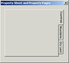
As you are adding pages to a TabControl control, the tabs of the pages are positioned on the top border of the TabControl area. You can reposition them to the left, the right, or the bottom borders of the control. The placement of the tab is set using the Alignment property of the TabControl. The possible values of this property are Top, Left, Right, and Bottom: |
| Alignment: Left | Alignment: Top |
 |
 |
| Alignment: Bottom | Alignment: Right |
 |
 |
|
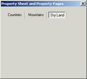
If you want to create a discrete property sheet and do not want to display the traditional tabs, you can replace the tabs with buttons. This is controlled by the Appearance property that presents three options: Normal (the default), Buttons, and FlatButtons. The Normal and the Buttons values can be used on all four views. The FlatButtons option is available only if the Alignment property is set to Top. |
| Appearance: Buttons | Appearance: FlatButtons |
 |
 |
|
After adding the TabControl control to your form and after adding one or more tab pages, the property pages are created where the TabPage control is positioned and its dimensions are used by the eventual property pages. This means that, if you want a different position, a smaller or larger property sheet, you must modify the dimensions of the TabControl control and not those of the tab pages, even though each tab page has a Location property and dimensions (the Size property). Like all other controls, the names of property pages are cumulative. As you add them, the first would be named tabPage1, the second would be tabPage2, etc. If you plan to programmatically refer to the tab pages, you should give them more explicit names. As done with any other control, to set the name of a property page, after selecting it, in the Properties window, change the value of the Name property. Probably the first obvious characteristic of a property page is the word or string that identifies it to the user. That is, the string that displays on the tab of a property page. This is known as its title or caption. By default, the captions are set cumulatively as the pages are added. Usually you will not use these titles because they are meaningless. To display a custom title for a property page, first select it and, on the Properties window, change the value of the Text property. You can also change the title of a property page programmatically, for example, in response to an intermediary action. To change the title of a page, assign a string to its Text property. Here is an example: System::Void Form1_Load(System::Object * sender, System::EventArgs * e)
{
tabPage3->Text = S"Senior Citizens";
}
If you had associated an ImageList control with the TabControl object and you want to use images on the title of a property page, specify the desired image using the ImageIndex property. You can use the images on some or all property pages. |
|
|
||
| Previous | Copyright © 2003-2015, FunctionX | Next |
|
|
||