IDE Objects: The Toolbox
|
IDE Objects: The Toolbox |
|
Dynamic Control Creation |
|
Introduction |
The objects used in a Windows application are defined in various assemblies. To add one of these controls to your application, you must first know the name of its class. With this information, you can declare a variable of its class. For example, a command button is an object of type Button that is based on the Button class. The Button class is defined in the System::Windows::Forms namespace of the System.Windows.Forms.dll assembly. Based on this, to create a button, you can declare a pointer to Button.
If you declare and completely create a control in a particular method, the control would be available only in that method and cannot be accessed outside. To make such a control available to other controls or methods of the same class, you should declare it outside of a method. Here is an example:
#pragma once
#using <mscorlib.dll>

using namespace System;
using namespace System::Windows::Forms;

__gc class CFundamentals : public Form
{
	Button *btnSubmit;

public:
	CFundamentals(void);
};
After declaring the variable, you can use the new operator to allocate memory for it:
CFundamentals::CFundamentals(void)
{
	btnSubmit = new Button();
}
This is also referred to as dynamically creating a control. After declaring the variable and allocating memory for it, the control is available but doesn't have a host, which makes it invisible. You can then call the Controls property of its parent to add the new control to its collection. The parent would then be responsible for hosting or carrying the new control. Here is an example:
CFundamentals::CFundamentals(void)
{
	btnSubmit = new Button();

	this->Controls->Add(btnSubmit);
}
Because there can be many controls used in a program, instead of using the constructor to initialize them, Visual Studio .NET standards recommends that you create a method called InitializeComponent to initialize the various objects used in your application. Then simply call that method from the constructor of your form.
|
Control Addition by Class Derivation |
If you are using a .NET Framework control, you must know the name of the class on which the control is based (and each control is based on a particular class). If you have examined the types of classes available but none implements the behavior you need, you can first locate one that is close to the behavior you are looking for, then use it as a base to derive a new class.
To derive a class from an existing control, you can use your knowledge of C++ inheritance to derive a new class. Here is an example:
public __gc class Numeric : public System::Windows::Forms::TextBox
{
};
If you want to perform some early initialization to customize your new control, you can declare a constructor. Here is an example:
public __gc class Numeric : public System::Windows::Forms::TextBox
{
public:
	Numeric() { }
};
Besides the constructor, in your class, you can add the properties, methods, and/or events as you see fit. You can also use it to globally set a value for a property of the parent class. Once the control is ready, you can dynamically use it like any other control. Here is an example:
| Header File |
#pragma once
#using <mscorlib.dll>

using namespace System;
using namespace System::Windows::Forms;

public __gc class Numeric : public System::Windows::Forms::TextBox
{
public:
	Numeric() { }
};

__gc class CFundamentals : public Form
{
private:
	Numeric *txtBox;
public:
	CFundamentals(void);
};
|
| Source File |
#include <windows.h>
#include ".\fundamentals.h"

CFundamentals::CFundamentals(void)
{
	txtBox = new Numeric();
	this->Controls->Add(txtBox);
}

int APIENTRY WinMain(HINSTANCE hInstance,
                     HINSTANCE hPrevInstance,
                     LPTSTR    lpCmdLine,
                     int       nCmdShow)
{
	// Instantiate an Exercise object
	CFundamentals *frmMain;

	// Allocate memory for the object, using the new operator
	frmMain = new CFundamentals();
	// Call the Run() static method of the Application
	// and pass it the instance of the class to display
	Application::Run(frmMain);

	// Everything went alright... We hope
	return 0;
}
|
|
The Properties Window |
|
Overview of Controls Properties |
A property is a piece of information that characterizes or describes a control. It could be related to its location or size. It could be its color, its identification, or any visual aspect that gives it meaning. The properties of an object can be changed either at design time or at run time. You can also manipulate these characteristics both at design and at run times. This means that you can set some properties at design time and some others at run time.
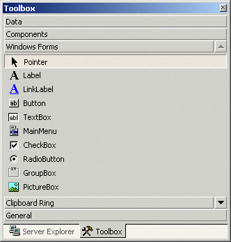
To manipulate the properties of a control at design time, first click the desired property from the Toolbox. Then add it to the form or to a container control. To change the properties of a control at design time, on the form, click the control to select it. Then use the Properties window:

The items in the Properties window display in a list
set when installing Microsoft Visual Studio. In the beginning, you may be regularly
lost when looking for a particular property because the list is not
arranged in a strict order of rules. You can rearrange the list. For
example, you can cause the items to display in alphabetic order. To do
this, in the title bar of the Properties window, click the Alphabetic
button  . To
restore the list, you can click the categorized button
. To
restore the list, you can click the categorized button  .
.
When a control is selected, the Properties window displays only its characteristics. When various controls have been selected, the Properties window displays only the characteristics that are common to the selected controls.
|
|
 and click the form
 and click the form
|
Properties Categories |
Each field in the Properties window has two sections: the property�s
name and the property's value:

The box on the right side of each property name represents the value of the property that you can set for an object. There are various kinds of fields you will use to set the properties. To know what particular kind a field is, you can click its name. To set or change a property, you use the box on the right side of the property�s name: the property's value, also referred to as the field's value.
|
Empty Fields |
 |
By default, these fields have nothing in their properties. Most of these properties are dependent on other settings of your program. For example, you can set a menu property for a form only after you have created a menu. To set the property on such a field, you can type in it or select from a list. |
|
|
|
Text Fields |
|
There are fields that expect you to type a value. Most of these fields have a default value.
To change the value of the property, click the name of the property,
type the desired value, and press Enter. While some properties, such as the
Text, would allow anything, some other fields expect a specific type of text, such as a numeric value. |
 |
|
|
Numeric Fields |
Some fields expect a numeric value. In this case, you can click the name of the field and type the desired value. If you type an invalid value, you would receive a message box notifying you of the error:

When this happens, click OK and type a valid value. If the value is supposed to be an integer, make sure you don't type it as a decimal number.
|
|
|
Expandable Fields |
 |
Some fields have a + button. This indicates that the property has a set of sub-properties that actually belong to the same property and are defined together. To expand such a field, click its + button and a � button will appear: |
 |
To collapse the field, click the � button. Some of the properties are numeric based, such as the Size. With such a property, you can click its name and type two numeric values separated by a comma. Some other properties are created from an enumerator or a class. If you expand such a field, it would display various options. Here is an example from the Font property:

With such a property, you should select from a list.
|
|
|
Boolean Fields |
 |
Some fields can have only a True or False value. To change their setting, you can either select from the combo box or double-click the property to toggle to the other value. |
|
|
|
Action Fields |
Some fields would require a value or item that needs to be
set through an intermediary action. Such fields display an ellipsis button
 . When you click the button, a dialog box would come up and you can set the value for the field. . When you click the button, a dialog box would come up and you can set the value for the field. |
 |

|
List-Based Fields |
To change the value of some of the fields, you would use their combo box to display the available values. After clicking the arrow, a list would display:

There are various types of list-based fields. Some of them display just two items. To change their value, you can just double-click the field. Some other fields have more than two values in the field. To change them, you can click their arrow and select from the list. You can also double-click a few times until the desired value is selected.
|
|
private: System::Void timer1_Tick(System::Object *  sender, System::EventArgs *  e)
{
	 DateTime right = DateTime::get_Now();
	 this->pgrSeconds->Value = right.Second;
}
|

|
Alignment Fields |
Some properties are used to specify the alignment of text or picture on the control. The field of such a property is equipped with an arrow like the one of a combo box. When you click the arrow of the field, it displays a window with 8 positions:

You will be asked to click the indicated position. Each position has a name based on the enumerator that controls the property. The values of this type of property are:
| TopLeft | TopCenter | TopRight |
 |
 |
 |
| MiddleLeft | MiddleCenter | MiddleRight |
 |
 |
 |
| BottomLeft | BottomCenter | BottomRight |
 |
 |
 |
|
Accessories for Controls Characteristics |
|
Introduction |
To help users interact with a computer, your application will use Windows controls. You as the programmer will decide what control is necessary for your particular application. There are various categories of controls you can use when creating an application:
Before creating applications and adding controls to it, there are some accessories that the .NET Framework uses to define or control their characteristics.
A control can be visually represented on the screen by a geometric point on a coordinate system. A point is a pixel on the monitor screen, on a form, or on any object of your application. A point is represented by its coordinates with regard to the object that "owns" the point:

To identify the concept of a point, the System::Drawing namespace provides the Point structure. One of the properties of the Point structure is X, which represents the horizontal distance of the point from the top-left corner of the object that owns the point. Another property, Y, represents the vertical measurement of the point with regards to the top-left corner of the object that owns the point.
To represent the size of something, the System::Drawing namespace defines the Size structure that is equipped with two main properties. There are four characteristics that define a Size value: its location and its dimensions. A Size value must have a starting point (X, Y) just as the Point object was illustrated earlier. The Width is the distance from the left to the right borders of a Size value. The Height property represents the distance from the top to the bottom borders of a Size value:

Based on this, to create a Size object, if you know only its location (X and Y), you can use the following constructor:
public: Size(Point pt);
After declaring a variable with this constructor, you can access its Width and Height properties to complete the definition of the Size object. If you already have the location of a Size object by other means, you may not be interested in (re)defining its location. In this case, you may only want to specify the dimensions of the variable. To do this, you can use the following constructor:
public: Size(int width, int height);
Besides Size, the System::Drawing namespace also provides the SizeF structure. It uses the same properties as Size except that its members float values.
A rectangle is a geometric figure that has four sides. To support this figure, the System.Drawing namespace provides the Rectangle and the RectangleF structures. A rectangle can be represented as follows:
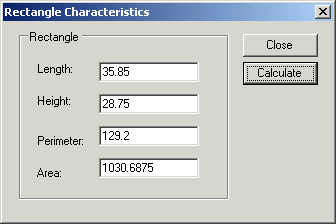
Like every geometric representation in your program, a rectangular figure is based on a coordinate system whose origin is located on a top-left corner. The object that "owns" or defines the rectangle also owns this origin. For example, if the rectangle belongs to a control that is positioned on a form, then the origin is on the top-left corner just under the title bar of the form, provided the form has a title bar.
To completely represent it, a rectangle is defined by its location and its dimensions. The location is defined by a point on the top-left corner of the rectangle. The distance from the left border of the object that owns the rectangle to the left border of the rectangle is represented by a property called Left. The distance from the top border of the object that owns the rectangle to the top border of the rectangle is represented by a property called Top. The distance from the left to the right borders of the rectangle is represented by a property called Width. The distance from the left to the right borders of the rectangle is represented by a property called Height. The distance from the left border of the object that owns the rectangle to the right border of the rectangle is represented by a property called Right. The distance from the top border of the object that owns the rectangle to the bottom border of the rectangle is represented by a property called Bottom. Based on this, a rectangle can be illustrated as follows:

To create a rectangle, you must provide at least its location and dimensions. The location can be represented by a Point value and the dimensions can be represented with a Size value. Based on this, you can use the following constructor to declare a Rectangle variable:
public: Rectangle(Point location, Size size);
This constructor requires that you define a Point and a Size in order to use it. If instead you know the integer values of the location and dimensions, you can use the following constructor to declare a Rectangle object:
public: Rectangle(int x, int y, int width, int height);
At any time, you can access or retrieve the characteristics of a Rectangle object as illustrated in the above picture from its properties. You use the same names we used in the picture.
Besides the Rectangle structure, the System::Drawing namespace provides the RectangleF structure that uses the same definition as Rectangle, except that it is defined with float values instead of integers.
|
|
||
| Previous | Copyright © 2004-2014 FunctionX, Inc. | Next |
|
|
||


 Practical
Learning: Introducing the Properties Window
Practical
Learning: Introducing the Properties Window