
Common Characteristics of Windows Controls
 |
Common Characteristics of Windows Controls |
To help users interact with a computer, your application will use Windows controls. You as the programmer will decide what control is necessary for your particular application. There are various categories of controls you can use when creating an application:
Before creating applications and adding controls to it, there are some accessories that the .NET Framework uses to define or control their characteristics.
A control can be visually represented on the screen by a geometric point on a coordinate system. A point is a pixel on the monitor screen, on a form, or on any object of your application. A point is represented by its coordinates with regard to the object that "owns" the point: 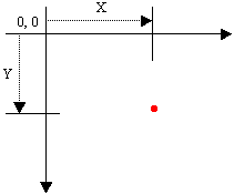 To identify the concept of a point, the System.Drawing namespace provides the Point structure. One of the properties of the Point structure is X, which represents the horizontal distance of the point from the top-left corner of the object that owns the point. Another property, Y, represents the vertical measurement of the point with regards to the top-left corner of the object that owns the point.
To represent the size of something, the System.Drawing namespace defines the Size structure that is equipped with two main properties. There are four characteristics that define a Size value: its location and its dimensions. A Size value must have a starting point (X, Y) just as the Point object was illustrated earlier. The Width is the distance from the left to the right borders of a Size value. The Height property represents the distance from the top to the bottom borders of a Size value: 
Based on this, to create a Size object, if you know only its location (X and Y), you can use the following constructor: public Size(Point pt); After declaring a variable with this constructor, you can access its Width and Height properties to complete the definition of the Size object. If you already have the location of a Size object by other means, you may not be interested in (re)defining its location. In this case, you may only want to specify the dimensions of the variable. To do this, you can use the following constructor: public Size(int width, int height); Besides Size, the System.Drawing namespace also provides the SizeF structure. It uses the same properties as Size except that its members float values.
A rectangle is a geometric figure that has four sides. To support this figure, the System.Drawing namespace provides the Rectangle and the RectangleF structures. A rectangle can be represented as follows:  Like every geometric representation in your program, a rectangular figure is based on a coordinate system whose origin is located on a top-left corner. The object that "owns" or defines the rectangle also owns this origin. For example, if the rectangle belongs to a control that is positioned on a form, then the origin is on the top-left corner just under the title bar of the form, provided the form has a title bar. To completely represent it, a rectangle is defined by its location and its dimensions. The location is defined by a point on the top-left corner of the rectangle. The distance from the left border of the object that owns the rectangle to the left border of the rectangle is represented by a property called Left. The distance from the top border of the object that owns the rectangle to the top border of the rectangle is represented by a property called Top. The distance from the left to the right borders of the rectangle is represented by a property called Width. The distance from the left to the right borders of the rectangle is represented by a property called Height. The distance from the left border of the object that owns the rectangle to the right border of the rectangle is represented by a property called Right. The distance from the top border of the object that owns the rectangle to the bottom border of the rectangle is represented by a property called Bottom. Based on this, a rectangle can be illustrated as follows: 
To create a rectangle, you must provide at least its location and dimensions. The location can be represented by a Point value and the dimensions can be represented with a Size value. Based on this, you can use the following constructor to declare a Rectangle variable: public Rectangle(Point location, Size size); This constructor requires that you define a Point and a Size in order to use it. If instead you know the integer values of the location and dimensions, you can use the following constructor to declare a Rectangle object: public Rectangle(int x, int y, int width, int height); At any time, you can access or retrieve the characteristics of a Rectangle object as illustrated in the above picture from its properties. You use the same names we used in the picture. Besides the Rectangle structure, the System.Drawing namespace provides the RectangleF structure that uses the same definition as Rectangle, except that it is defined with float values instead of integers.
Most of the controls you will use to create your applications are defined in the .NET Framework and, as mentioned in the previous lesson, each is based on a particular class. To provide them with basic and common characteristics, all visual Windows controls of the .NET Framework are based on a class called Control which is available in the System.Windows.Forms namespace of the System.Windows.Forms.dll assembly. Based on this, the characteristics common to .NET Framework graphical controls are accessed and managed from one point, then inherited by those controls.
Up to 2002, Microsoft Windows programmers relied on a library called Win32 to create applications for the operating system. The Win32 library was the only resource of classes (in fact structures), functions, etc, that gave functional instructions to the operating system. The other languages such as Pascal, Visual Basic, etc, used directly or indirectly these resources in their own "dialect" to communicate with Microsoft Windows. The Win32 library is still around (it can never disappear unless the operating system changes completely) and serves as the platform for Microsoft Windows programming. To harmonize programming for this platform, Microsoft created the .NET Framework as a substitute library. This is the library used in Microsoft Visual Studio .NET programming environment. Most of the functionality of Win32 has been redefined in the .NET Framework. The operations were implemented in various libraries or assemblies. Some other operations, such as those related to the Registry, were kept in the Microsoft.Win32 namespace. The Win32 library uses a concept called handle to represent each object of an application. A handle in Win32 is simply an unsigned integer used in place of a control. The new .NET Framework also uses handles to internally represent controls but defines a handle as a pointer to an integer. Based on this, every control has a handle. You have a choice of using it or not but it exists. The handle is created by the operating system when the application comes up. This means that you don't need to create it but you can access it to retrieve its value. To access the handle to a control, you can call its Handle property. In the .NET Framework, the Handle property is defined as an IntPtr value. To retrieve the handle of a control, you can access its Handle property. Here is an example: using System;
using System.Drawing;
using System.Collections;
using System.ComponentModel;
using System.Windows.Forms;
using System.Data;
namespace WindowsApplication3
{
/// <summary>
/// Summary description for Form1.
/// </summary>
public class Form1 : System.Windows.Forms.Form
{
/// <summary>
/// Required designer variable.
/// </summary>
private System.ComponentModel.Container components = null;
public Form1()
{
//
// Required for Windows Form Designer support
//
InitializeComponent();
//
// TODO: Add any constructor code after InitializeComponent call
//
this.Text = this.Handle.ToString();
}
. . .
}
}
Some controls, as we will see, are text-based, meaning they are meant to display or sometimes request text from the user. For such controls, this text is referred to as caption while it is simply called text for some other controls. This property is not available for all controls. If a control displays text, it then has a Text property in the Properties window. After adding such a control to a form, its Text field would hold the same text as its name. At design time, to change the text of the control, click its Text field and type the desired value. For most controls, there are no strict rules to follow for this text. Therefore, it is your responsibility to type the right value. The text provided in a Text field of a text-based control can only be set �as is� at design time. If you want the text to change while the application is running, you can format it. For example, such a control can display the current time or the name of the user who is logged in. These format attributes cannot be set at deign time. To change the text of a text-based control at run time, either assign a simple string or provide a formatted string to the Text property. Here is an example: private void button1_Click(object sender, System.EventArgs e)
{
this.checkBox1.Text = DateTime.Today.ToString();
}
To create a control, the primary piece of information you must provide is its name. This allows you and the compiler to know what control you are referring to when the program is running. Specifying the name of a control may depend on the technique you decide to use to create the control. After adding a control to a form, it automatically receives a name. In the Properties window, the control�s name displays in the (Name) field.
The default name of a newly added control reflects the name of its control. To differentiate newly added controls of the same class, the Properties window adds an incremental number. For example, if you click the TextBox button on the Toolbox and click the form, the control would be named TextBox1. If you add a second TextBox control, it would be named TextBox2. This causes the default names to be incremental. Since a program usually consists of many controls, it is usually a good idea to rename your controls and give them meaningful and friendlier names. The name should help you identify what the button is used for. To change the name of a control, on the Properties window, click the (Name) field, type the desired name and press Enter. You can also change the name of a control programmatically but you should avoid doing that unless you have a good reason to. If you want to change the name of a control, use the Properties window. To programmatically change the name of a control, access its Name property and assign a string, using the C# rules of variable names. Here is an example:
private void button1_Click(object sender, System.EventArgs e)
{
	this.checkBox1.Name = "chkPepperoni";
}
To retrieve the name of a control, access its Name property.
The controls added to a parent window are confined to the area of the body offered by that window. After adding it to a window, the control is positioned in the body of the parent using a Cartesian coordinate system whose origin is located on the top-left corner of the parent window. If the parent is a form, the origin is located just under the title bar to the left. The horizontal measurements move from the origin to the right. The vertical measurements move from the origin to the bottom: 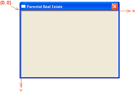 The distance from the control�s left border to the parent�s left border is referred to as the Left property. The distance from the control�s top border to the parent�s top border is referred to as the Top property. The Left and Top values are known as the control�s location. This can be illustrated as follows: 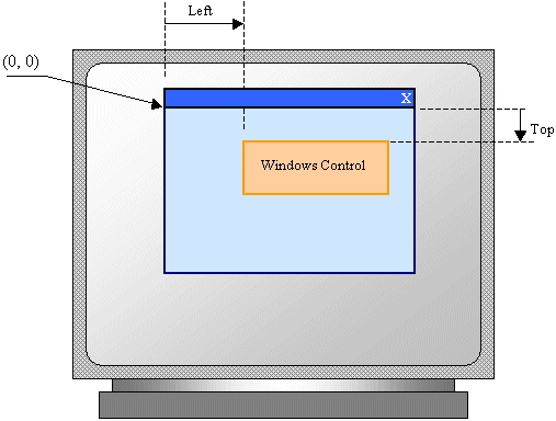 When you click a control on the Toolbox and click its parent window, the Left and Top values are set where the mouse landed. One of the operations you will perform during design consists of correctly positioning your controls to give them a better location and take advantage of the form's real estate. Various options are available to do this. To assist you with setting control's location, the form designer draws aligned dots on the form, forming columns and rows.
As mentioned already, a control is confined to the area made available by its parent. This section is called the client area. For a form, the client area is the body of the form without the title bar, its borders and other sections we have not mentioned yet such as the menu, scroll bars, etc: 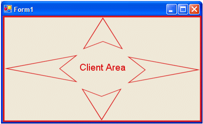
Besides the form, every control also has a client area. The role of the client area is to specify the bounding section where the control can be accessed by other controls positioned on it. Based on this, a control can be visible only within the client area of its parent. Since not all controls can be parent, we will come back to this property in future lessons. The client area is programmatically represented by a property called ClientRectangle.
In the next section we will review various ways of positioning controls on a parent. One technique we will review consists of moving one or more controls. In some cases, while working on one or more controls for better positioning, you may not want one particular control or a certain group of controls to be moved around. If you want to, you can "fix" a controls so that it cannot be moved (or resized) even if you click and start dragging it. This is referred to as locking the control or the group of controls. To lock a control, click in on the form. Then, in the Properties window, set its Locked Boolean property to True. To lock a group of controls, first select them on the form. Then, in the Properties window, set the Locked Boolean property to True.
One of the techniques you can use to change the location of a control or a group of controls consists of moving it. To move one control, click and hold the mouse on it, then drag in the desired direction, and release the mouse. This technique allows you to move a control one unit at a time in either direction. You can also click the control, then press one of the arrow keys to move one unit at a time, either left to move the control left, up to move the control up, right to move the control in the right direction, or down to move the control down. To move a control with more precision, click the control to select it, press and hold Ctrl, then click one of the arrow keys, either left to move the control left, up to move the control up, right to move the control in the right direction, or down to move the control down. To move a group of controls, select them first. Then click and drag any area in the selection to the desired location. Alternatively, once you have the controls, you can press one of the arrow keys to move the whole group. When moving either a control or a group using either the mouse or the keyboard, the control or the group would follow the grids on the form and it can move only one grid mark at a time. This allows you to have a better alignment of controls. If you want to move the control or the group in smaller units than those of the grid, press and hold Ctrl. Then press one of the arrow keys. Once the control or the group is positioned to your liking, release the Ctrl key. To programmatically move a control, which is equivalent to changing the values of the Left or the Top properties at run time, assign the desired respective values. If you set a negative value for the Left field, the left border of the control would be hidden. In the same way, a negative Top value would hide the top border of the control. Make sure you use valid integer values; otherwise you would receive an error when you compile the project. The location of a control is also defined by its Location property, which is a Point value we reviewed earlier. Based on this, you can set or change the location of a control using its Location property and passing it a Point.
During design, you may want to provide a good alignment of the controls to make the form appear more attractive and look professional. The Visual Studio provides various tools to assist you with this. To start, you must select controls that you want to align. The alignment will be based on the control that has dark surrounding handles. For the sake of this lesson, that control will be referred to as the base control. When more than one control is selected, you can use the Layout toolbar to align them.
If you have a certain control on the form and want to
position it exactly at equal distance between the left and the right borders of
the form, select the control, then click the Center Horizontally button on the
Layout toolbar
Horizontal alignment affects controls whose distance from the left border of the parent must be the same. To perform this type of alignment, the Layout toolbar provides the necessary buttons. The same actions can be performed using menu items of the Format group on the main menu. The options are as follows:
As seen above, the horizontal-oriented buttons allow moving controls left or right. Another option you have consists of moving control up or down for better alignment. Once again you must first select the controls. Then on the Layout toolbar or the Format group of the main menu, use the following options:
Another valuable option you have consists of controlling the alignment of objects with regards to the extreme borders of controls of the selected group.
You can also position one or more controls in the middle of
the form. To do that, select the control, then click the Center Vertically
button on the Layout toolbar
Suppose you have a group of horizontally aligned controls as follows:  Obviously the buttons on this form are not enjoying the most professional look. For one thing, the distance between the Continue and the Submit buttons is longer than the distance between the Submit and the Deny buttons. The Layout toolbar and the Format group of the main menu allow you to specify a better horizontal alignment of controls with regards to each other. The options available are:
Result: The Forms Designer will calculate the horizontal distances that separate each combination of two controls and find their average. This average is applied to the horizontal distance of each combination of two controls: |
|
 |
=> |  |
| Button | Name | Format |
| Increase Horizontal Spacing | Horizontal Spacing -> Increase |
|
Result: The Forms Designer will move each control horizontally, except the base control (the control that has darker handles) by one unit away from the base control. This will be done every time you click the Increase Horizontal Spacing button or the Format -> Horizontal Spacing -> Increase menu item: |
 |
=> |  |
 |
=> |  |
| Button | Name | Format |
| Decrease Horizontal Spacing | Horizontal Spacing -> Decrease |
|
Result: The Forms Designer will move each control horizontally, except the base control (the control that has darker handles) by one unit towards the base control. This will be done every time you click the Decrease Horizontal Spacing button or the Format -> Horizontal Spacing -> Decrease menu item: |
 |
=> |  |
 |
=> |  |
| Button | Name | Format |
| Remove Horizontal Spacing | Horizontal Spacing -> Remove |
|
Result: The Forms Designer will move all controls (horizontally), except for the left control, to the left so that the left border of a control touches the right border of the next control: |
 |
=> |  |
|
Vertical Spacing and Alignment |
|
Suppose you have a group of horizontally aligned controls as follows:  The text boxes on this form are not professionally positioned with regards to each other. Once again, the Layout toolbar and the Format group of the main menu allow you to specify a better vertical alignment of controls relative to each other. The options available are:
Result: The Forms Designer will calculate the total vertical distances that separate each combination of two controls and find their average. This average is applied to the vertical distance of each combination of two controls:
Result: The Forms Designer will move each control vertically, except the base control (the control that has darker handles) by one unit away from the base control. This will be done every time you click the Increase Horizontal Spacing button or the Format -> Horizontal Spacing -> Increase menu item:
Result: The Forms Designer will move each control, except the base control (the control that has darker handles) by one unit towards the base control. This will be done every time you click the Decrease Horizontal Spacing button or the Format -> Horizontal Spacing -> Decrease menu item:
Result: The Forms Designer will move all controls vertically, except for the top control, to the top so that the top border of a control touches the bottom border of the next control towards the top:
The distance from the left border to the right border of a control is referred to as its Width property. In the same way, the distance from the top to the bottom borders of a control is its Height value. This can be illustrated as follows: 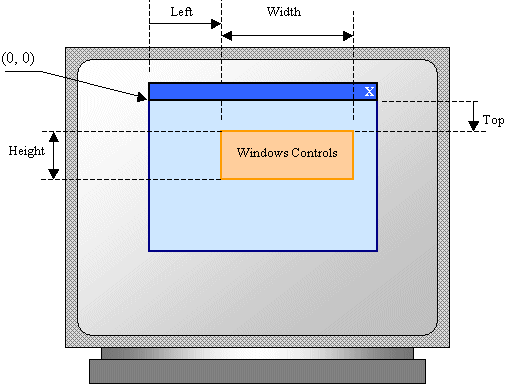 If you click a control�s button on the Toolbox and click its parent window, the control assumes some default dimensions in the body of the parent.
All graphical controls, including the form, can be resized using guiding mouse cursors. To resize a control, first select it. Except for the form, whenever a control is selected, there are eight handles around it. To resize the control, position your mouse on one of the handles. The mouse pointer will change, indicating in what direction you can move to resize the control.
To heighten or shrink a control by its lower border and one unit at a time, select the control, press and hold Shift. Then press the down arrow key as many times as necessary. Once satisfied, release the mouse and Shift. To heighten or shrink a control by its lower border by small units, select the control, press and hold Ctrl and Shift. Then press the down arrow key as many times as necessary. Once satisfied, release the mouse and Ctrl and Shift.
When a control has been added to a container, it occupies a Rectangle represented by the Bounds property. The syntax of this property is: public Rectangle Bounds {get; set};
At any time, to get the location and the dimensions of a control, you can call its Bounds property, which produces a Rectangle value.
Imagine you have added three controls to your form and, after spending some time designing them, they appear as follows:  The dimensions of the controls are not set professionally. As seen above, you can resize by dragging their borders but this might take a while if you want them to have the same width, the same height, or both the same height and width. The dimensions of a control or a group of controls are carried by a Size value. At design time, to change the dimensions of a control, first click it. Then, in the Properties window, change the values of its Size property. To change the dimensions of a group of controls, first select them. Then, in the Properties window, change the values of the Size field. The new value would be applied to all selected controls. Alternatively, the Form Designer provides tools to automatically do this for you. To synchronize the widths of a group of controls, first select them. Then, on the Layout toolbar or on the Format group of the main menu, select:
Result: All controls, except for the base control (the control that has the dark handles), will be resized horizontally so they have the same width as the base control:
To set the same height to a group of controls, first select them. Then, on the Layout toolbar or on the Format group of the main menu, select:
Result: All controls, except for the base control (the control that has the dark handles), will be resized vertically so they have the same height as the base control:
To set the same width and the same height to a group of controls, first select them. Then, on the Layout toolbar or on the Format group of the main menu, select:
Result: The Form Designer will calculate the sum of the heights of all controls and find their average height (AvgHeight). It will also calculate the sum of the widths of all controls and find their average width (AvgWidth). These averages will be applied to the height and the width respectively of each control:
If you position a (visual) control on a form, if the control is positioned on the top left section of the form, when the user resizes the form, the control�s position would appear static, it would not move. This could be a concern if the control is positioned on the right, the bottom or the lower right sections of the form. When the user resizes the form, the control�s position would not be updated. Sometimes you will want the control to have the same location and/or distance with regard to the bottom, the right, and/or the lower right corners of the form.
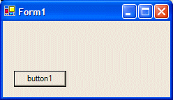
The ability to manage a control or a group of controls' location and size when the use resizes it is done using the Anchor property: 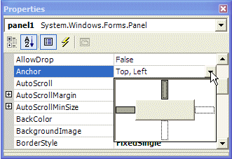 The Anchor property is created from the AnchorStyles enumerator. By default, when you add a control to a form, it is �glued� to the top left corner of its container. You can also set the control�s position with regards to its container�s right and bottom borders. The Anchor property can be used to "glue" one border of a control to its parent using one of the following values: |
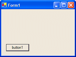
Bottom: The control bottom border will be the same even if the parent is heighten or shrunk
 |
 |
 |
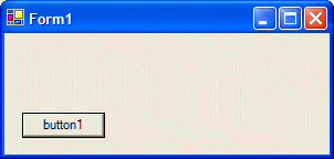
Left: The control left border will be the same even if the parent is widened or narrowed
 |
 |
 |
None: No anchoring is applied
 |
 |
 |
Right: The control right border will be the same even if the parent is widened or narrowed
 |
 |
 |
Top: The control top border will be the same even if the parent is heightened or shrunk
 |
 |
 |
|
In the same way, you can combine Anchor values to "glue" one or more corners of a control to its parent when the parent is resized. |
When a control is added to a host, depending on the control, it may be automatically positioned where the mouse landed. In some cases, you will want the control to be attached to a border or to a corner of its parent. This can be done using the Dock property: 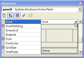 This property is managed through the DockStyle enumerator. To use this property, click the control and, in the Properties window, click the arrow of the Dock field. You can then select one of the following values: Bottom: The control will be attached to the bottom border of its parent:
Fill: The control will use the whole client area of its parent: Left: The control will be attached to the left border of its parent:
None: The control will be kept where it was positioned on the parent:
Right: The control will be attached to the right border of its parent:
Top: The control will be attached to the top border of its parent:
Controls used on Microsoft Windows are painted using a color known as Control. If you don't like the default color that paints the background of a control, you can access the BackColor field of the Properties window:  You can then select one of the preset colors from 3 windows represented with tabs:
Instead of a color, you may want to fill the control with a picture. To do this, you can access the control's BackgroundImage property. This provides an ellipsis button you can use to locate and select the desired picture.
A user can navigate through controls using the Tab key. When that key has been pressed, the focus moves from one control to the next. By their designs, not all controls can receive focus and not all controls can participate in tab navigation. Even controls that can receive focus must be primarily included in the tab sequence. At design time, the participation to tab sequencing is controlled by the Boolean TabStop property in the Properties window. Every visual control that can receive focus is already configured to have this property set to True. If you want to remove a control from this sequence, set its TabStop value to False. If a control has the TabStop property set to True, to arrange the navigation order of controls, you have two main options. At design time, you can click a control on the form. Then, on the Properties window, change the value of its TabIndex field. The value must be a positive short integer. The best and easiest way to arrange the tab sequence of controls is to manage it visually. To do this, first display the form. Then, on the main menu, click View. This causes a number to be positioned on every control of the form. Here is an example:
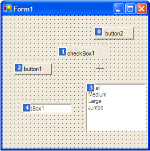 To arrange the sequence any way you like, click each control once in the desired order. Normally, static controls (such as the label, the picture box, the panel, etc) never receive focus when the application is running; therefore, you can skip such controls.
Microsoft Windows XP added a new feature to the way some controls display or behave when the mouse passes over them, making the controls significantly attractive and enhanced. This feature is neither automatically applied on controls nor available on all controls. Therefore, before using it, you must first find out if the control you want to use it on support it. A control that supports this feature should have the FlatStyle property. This property provides the following values:
If the application will be run on Windows XP, you can use the System value of the FlatStyle property. To make this style work, call the Application.EnableVisualStyles() method in the Main() method as follows: static void Main()
{
Application.EnableVisualStyles();
Application.Run(new Form1());
}
Do the following exercise if you are running an operating system that is not Windows XP
Do the following exercise if you are running a Windows XP operating system
A control is referred to as visible if it can be visually located on the screen. A user can use a control only if he or she can see it. As a programmer, you have the role of deciding whether a control must be seen or not and when. The visibility of an object is controlled by the its Visible property. This is a Boolean property. At design time, when you add a control to a parent, it is visible by default. This is because its Visible property is set to True in the Properties window. In the same way, if you programmatically create a control, by default, it is made visible once you add it to its parent's Controls property. If you don't want a control to primarily appear when the form comes up, you can either set its Visible property to False or set its parent�s visible property to False. Equivalently, at run time, to hide a control, assign a False value to either its Visible property or its parent�s Visible property. Keep in mind that when a parent gets hidden, it also hides its children. On the other hand, a parent can be made visible but hide one or some of its children. To check whether a control is visible at one time, apply a conditional statement (if or while) to its Visible property and check whether its value is True or False. In the following example, when the user clicks a button named button1, a text box named textBox1 gets hidden: private void button1_Click(object sender, System.EventArgs e)
{
this.textBox1.Visible = false;
}
Once a control is visible, the user can use it. Some controls allow the user only to read their text or view what they display. Some other controls allow the user to retrieve their value or to change it. To perform such operations, the user must first give focus to the control. The focus is a visual aspect that indicates that a control is ready to receive input from the user. Various controls have different ways of expressing that they have received focus. Button-based controls indicate that they have focus by drawing a dotted rectangle around their caption. In the following picture, the button on the right has focus: 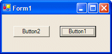 A text-based control indicates that it has focus by displaying a blinking cursor. A list-based control indicates that it has focus when one of its items has a surrounding dotted rectangle: 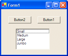 To give focus to a control, the user can press a key such as Tab. To programmatically give focus to a control, call the Focus() method. Here is an example: private void button2_Click(object sender, System.EventArgs e)
{
this.textBox1.Focus();
}
In the previous lesson, we saw how you can position controls visually or manually. In some cases, you end up with one control positioned on top of another. Of course the first remedy that comes in mind would consist of moving one of the controls away from the other. This would also imply sometimes that you would have to enlarge and/or heighten the controls' container. There are situations that either you don't want to resize the parent or you can't: your only solution is to have one control on top of another. Fortunately, you can cope with this situation by specifying, when needed, what control at what time should be displayed to the user. When one control is positioned on top of another, they use a third axis whose origin, like that or the other axes, is on the top-left corner of the parent. This third axis, also considered the z-axis, is oriented so that it moves from the monitor towards the user. The operating system is in charge of positioning and drawing the objects on the screen. You as the programmer can direct the operating system as to what object should be on top and what object should be behind. To support these changes the Control class uses two methods that its appropriate children derive also. When a control A is positioned behind a control be, this causes control be either partially or completely hidden. If you want the control A to change its z-order and become on top of control B, you can call its BringToFront() method. The syntax of this method is: public void BringToFront(); On the other hand, if a control B is positioned on top of a control A, if you want control B to become positioned behind control A, you can call control B's SendToBack() method. Its syntax is: public void SendToBack(); After the controls have been positioned, at any time, when you access a control, if you want to know whether that control is the most top object, you can call its GetTopLevel() method. Its syntax is: proteced bool GetTopLevel();
For the user to use a control, it must allow operations on it. For example, if a control is supposed to receive text, the user can enter characters in it only if this is made possible. To make a control available to the user, the object must be enabled. The availability of an object is controlled by the Boolean Enabled property. By default, after adding a control to a form, it is enabled and its Enabled property in the Properties window is set to True. An enabled control displays its text or other characteristics in their normal settings. If you want to disable a control, set its Enabled property to False. In the following picture, a text box and a button are disabled: 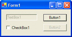 To find out whether a control is enabled or not, check its Enabled property state.
|
||||||||||||||||||||||||||||||||||||||||||||||||||||||
|
|
||
| Previous | Copyright © 2004-2010 FunctionX, Inc. | Next |
|
|
||