Text Formatting
|
Text Formatting |
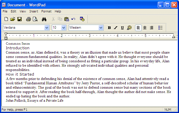
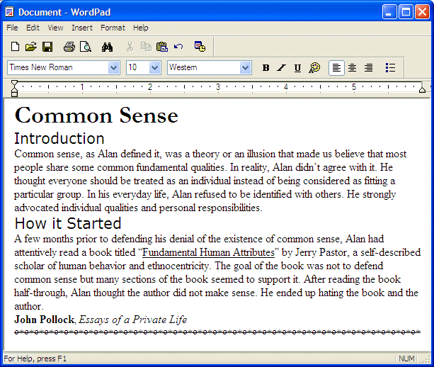
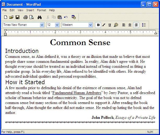
Text formatting consists of of changing individual characters, words, single paragraphs, or pages. This allows you to tremendously change the look of your text by applying different fonts, sizes, and styles such as making the text appear bold or italicized. Furthermore, you can underline portions of text and/or use different colors to emphasize a point. The ability to format text highly depends on the application your are using. Because this is a high detail of applications, some of them provide more features than others. In most cases, if you plan to create a highly formatted text, you may need to use a commercial application. Otherwise, Microsoft Windows installs WordPad that is equipped with all the fundamental tools used to format text. What is also available in WordPad is also available in commercial applications. This means that what we will review here can be applied in all or most word processors.
As mentioned already, what you need to format text depends on the application you are using. With WordPad, the most fundamental used to format text is the Formatting toolbar:
The Formatting toolbar is equipped with three combo boxes and a few buttons. Like any toolbar, to know what a button is used for, position the mouse on top of it, a tool tip will appear.
A font is a series of characters designed to draw symbols or readable letters. This design can be made by an individual or a company. After the design has been made, it is electronically made available to individual or companies that can use it to draw characters. Based on this, there are various ways you can get a font in order to it. Because it is designed, a font usually belongs to the designer or is copyrighted. This means that you should have some concerned with getting or using a font.
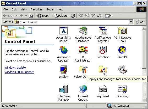
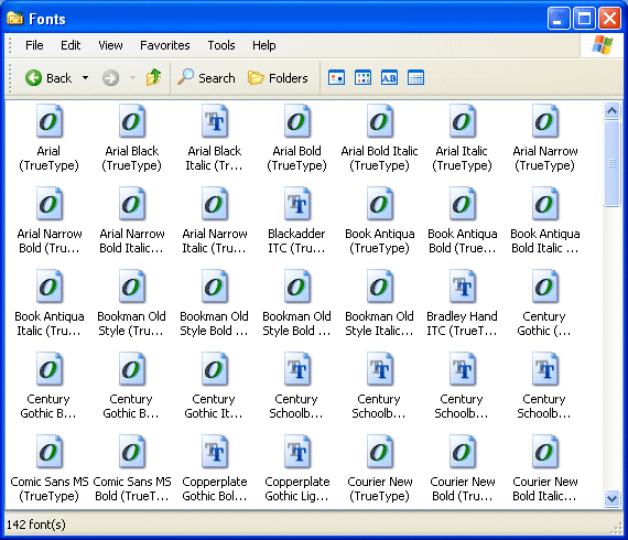
There are various ways you can get a font to your computer. When Microsoft Windows gets installed, it also installs various fonts that would be used in the various applications and can be used you. The list of fonts of a computer can be seen from the Fonts icon of Control Panel. Besides the default fonts, you can install new fonts to your computer. If you install some commercial applications such as Corel WordPerfect or Microsoft Office, it may install various fonts it would use. Once such fonts have been installed, they can be used by other applications of the same computer, not just the application that installed or needs them. Various web sites also sell or distribute fonts, free or for a fee. You can purchase a graphics package, such as Corel Gallery, that also includes fonts. Once you get and install such a package, you would have the option to also install or add fonts. |
|
|
|
|
Characteristics of a Font |
|
The Name of a Font |
|
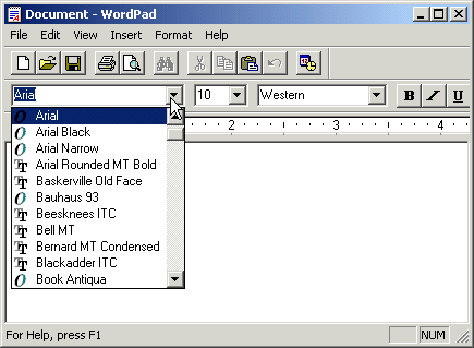
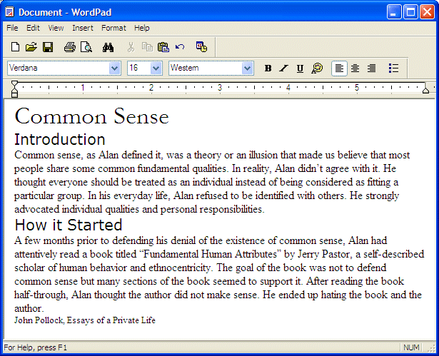
As seen in the list of Fonts above, there are various fonts and they have various differences. Before using a font, you should be familiar with its characteristics. The fundamental property of a font is its name and each font has one. In the Fonts list, you can first recognize a font by its name. Examples are Times New Roman, Arial, or Webdings. The application you use provides a tool to see the list of fonts before using it. In WordPad, you can see the list of fonts from the Fonts combo box from the Formatting toolbar:
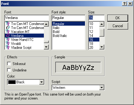
Alternatively, on the main menu of WordPad, you can click Format -> Font. This would open the Font dialog box:
Whether using the Font combo box of the Formatting toolbar or the Font dialog, you can easily select a font based on its name. |
|
Serif, Sans Serif, and Graphics Fonts |
|
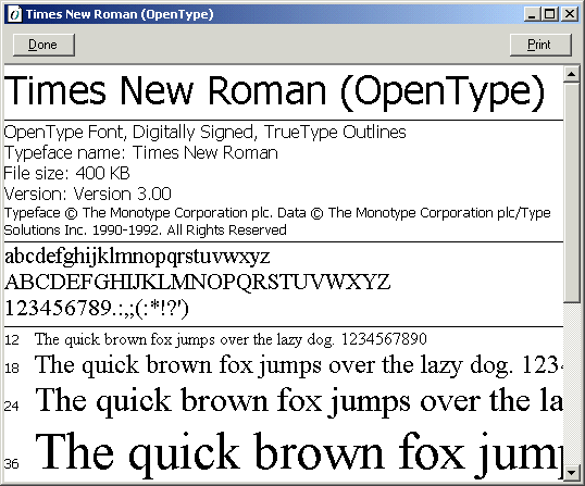
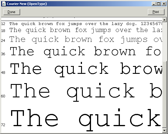
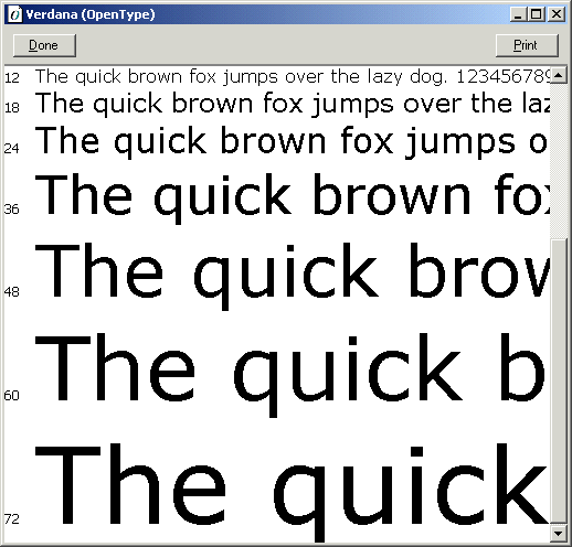
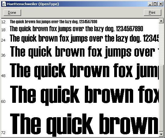
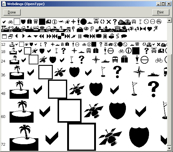
By their appearance, fonts are divided in three broad categories. A font is recognized as Serif if its characters are marked with fancy ends. Examples of popular Serif fonts are Times New Roman, Courier New, Georgia, or Garamond. Serif fonts are suitable in printable formats. If you observe the characters of paragraphs in a regular book, you may notice that they usually use a Serif font. A font is said to be Sans Serif if the ends of its characters don't display the fancy ends of Serif fonts. Examples of popular Sans Serif fonts are Arial, Verdana, Haettenschweiler, or Tahoma. Sans Serif fonts are usually used as headers of paragraphs or when users may spend a great deal of time reading. For example, most web pages display their text in Sans Serif fonts Serif and Sans Serif fonts are used to display readable characters. The last category of fonts display graphics as non-readable characters. Examples of graphics fonts are Webdings, Wingdings, or Wingdings 2. You use graphics fonts if you want to display small graphics without having to use a drawing application. |
|
|
|
|
Font Size |
|
One of the most important aspects of text formatting is to display characters or words in different heights. This is possible because the computer allows the characters to be drawn with a size of your choice. As you may have guessed, the first size issue of a font is related to individual characters. For example, the letter W is obviously wider than i. This has more to do with the human language or alphabet than the computer itself. The real aspect of the size of a font is related to its design. Once again, the application you use should provide you with the means to specify or change the size you want to apply to a font you are using. If you are using WordPad, you Font Size combo box of the Formatting toolbar is made just for that. You can also display the Font dialog box that is equipped with the Size combo box. By default, the sizes of fonts are defined in the combo boxes. In most cases, if you don't see a size you want to apply, you can directly provide yours. To do this, click the edit box section of the Size combo box, type the desired size and click somewhere else. The operating system would calculate the size and apply it to the text. |
|
|
|
|
Font Styles |
|
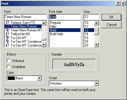
To further enhance the appearance of text, a font can use another characteristic referred to as style. Originally, the Microsoft Windows operating system proposes four styles but many commercial applications may provide additional styles. The application you use also lets you know what font styles are available and how to access them. If you are using WordPad, the font styles are represented with three buttons on the right side of the Formatting toolbar:
You can also access the font styles in the Font dialog box. The most regularly used style of a font is referred to as regular. It simply consists of displaying the characters in their normal settings. A character is referred to as bold if it appears
thicker than it would regularly display. The Microsoft Windows operating
system defined various degrees of boldness but, by default, it provides
only one to many applications. The bold style can be used to emphasize an
aspect of a word, a quote, or a section of a paragraph. To apply the bold
style, if you are using WordPad, you can use the Bold button A character
is italicized if it displays with an angle in the North-East direction. To
apply this style, in WordPad, you can use the Italic button A character is said to be
underlined if a horizontal line appears under it. By default, the
Microsoft Windows operating system provides one type of underline but
commercial applications may supply variations. To use the underline style
in WordPad, you can use the Underline button The last font style you can use is called strikeout. It allows you to strike a horizontal line in the center of one or more characters. To apply this style, if you are using WordPad, display the Font dialog box and click the Strikeout check box. |
|
Techniques of Using Font Styles |
|
So far, we mentioned that, to apply a style, you can use either its corresponding button on a toolbar or the Font dialog box of the application. In reality, the behavior depends on the state of the item that needs to be modified. By default, to apply a font style, you should first select a character, a word, or a group of words, and then apply the desired style. In reality, each style uses Boolean algebra. If the item selected already doesn't have the style that you want to apply, the selected style would apply. If the selected item already has the style that you try to apply, the existing style would be removed or restored. For example, if you select a word that is using the Regular style and you apply the Bold style, the selected word would receive the Bold style. Other the other hand, if you select a word that is already using the Bold style but you apply the Bold style, the selected word would loose the Bold style and would become Regular. Besides, or instead of, applying one style at a time, you can combine style. Once again, remember that the styles use a Boolean approach. If an item already has one style and you apply another style,, the new style would be added to (or coupled with) the existing style. Based on this, for example, you can apply the Bold to an already underlined word, the word would then become underlined and bolded. |
|
|
|
|
Paragraph Alignment |
|
Introduction |
|
Another aspect of text formatting involves the alignment of a paragraph of text. There are three options. You can align a paragraph to the left (the default), the center or the right section. |
|
Aligning a Paragraph |
|
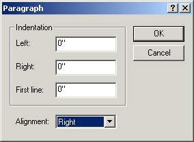
Before aligning a paragraph, you don't need to select any word in it. The position of the caret indicates what paragraph is selected. Therefore, to start, first position the caret anywhere inside the desired paragraph. To align it, if you are using WordPad, you can click one of the alignment buttons on the Formatting toolbar:
The alignment buttons behave like a group, similar to the radio buttons of a group box: only one of them can be clicked at a time. If you click a button that is already down, nothing would happen. If you click a button that is up, its alignment would be applied, the new button would be become down, and the previous button would become up. |
|
|
|
|
|
||
| Previous | Copyright © 2005-2016, FunctionX | Next |
|
|
||