|
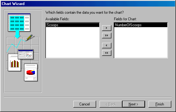
Like the Column, the Bar chart is used to compare values of the same category on a common scale. This time, the chart is drawn
horizontally. You create a Bar chart using the same process as the Column,
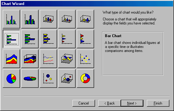
except that you should select the Bar in the second page of the wizard.
In the following chart, we will see the frequent number of scoops that customers
order.
 |
In the following exercise, we are referring to an issue that
has not been introduced previously. The reason is that we are going to
ask you to use a function that cannot be explained at this time. The
function we want you to use is called Choose(). We will explain it
when we get to the functions and expressions. The problem is that, the
chart we want to create is completely based on numbers from the Scoops
column. If we just use the number, Microsoft Access "thinks"
that we want to use a sum of the scoops and create a chart from it.
Instead, we want to get a sum of scoops by categories. That is, we want to
know the number of 1 scoop, or the number of 2 scoops, or the number of 3
scoops.
Therefore, in our own defense, here is what we propose to you. Since the
following exercise is for demonstration purposes, you can skip it and you
will not loose anything. Otherwise, simply do the exercise and trust us as
you have done so far. |
 Practical Learning: Creating a Bar Chart
|


